Amazon KDP guide, KDP book publishing
Book Cover Format: Technical Specifications
Mar
Okay so the book cover format thing is honestly where like 90% of new publishers mess up their first upload and I get messages about this constantly so let me just break down what actually works.
The Basic Dimensions You Actually Need
Right so Amazon’s gonna want your cover in specific pixel dimensions and this is where people get confused because there’s ebook covers and then there’s paperback covers which are completely different animals. For ebooks you need 2560 x 1600 pixels minimum but honestly I always go bigger like 2700 x 4050 because that gives you the 1.6 ratio they want and looks way sharper on those new Kindle devices.
The ratio thing is important – it’s gotta be between 1:1.3 and 1:1.5 ideally but 1.6 works perfectly and that’s what I stick with. If you go outside that range Amazon’s gonna squish your cover or stretch it and it’ll look weird on the product page.
File Size and Format Specs
Your file needs to be under 50MB which sounds like a lot but if you’re working with high-res images and lots of layers it adds up fast. I learned this the hard way when I was uploading a photography book cover at like 2am and kept getting error messages – turns out my PSD was 87MB and I had to flatten everything.
Save it as a JPEG or TIFF. PNG works too but JPEG is what I use 99% of the time. Quality setting around 10 or 11 in Photoshop, don’t go lower than 8 or you’ll see compression artifacts.
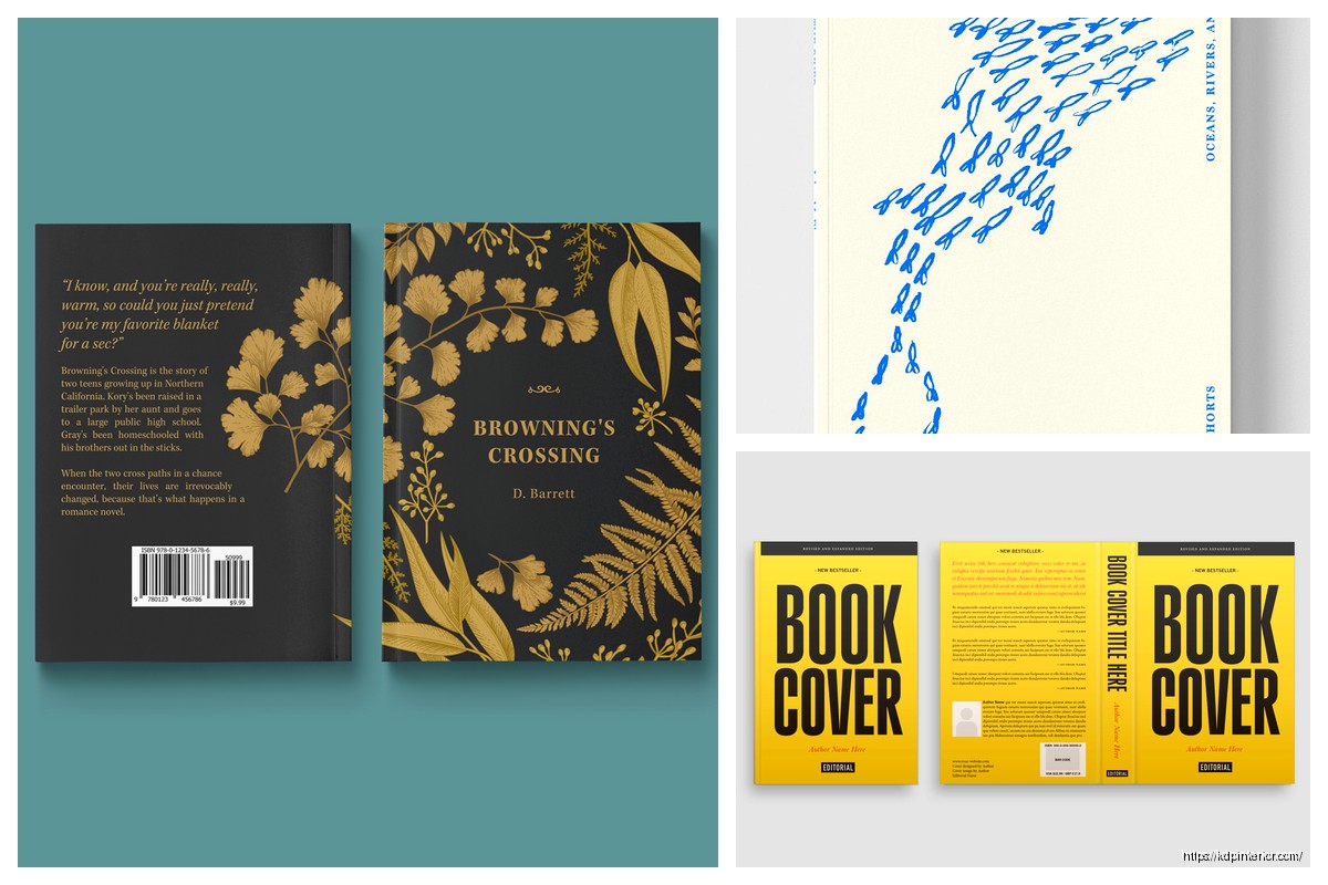
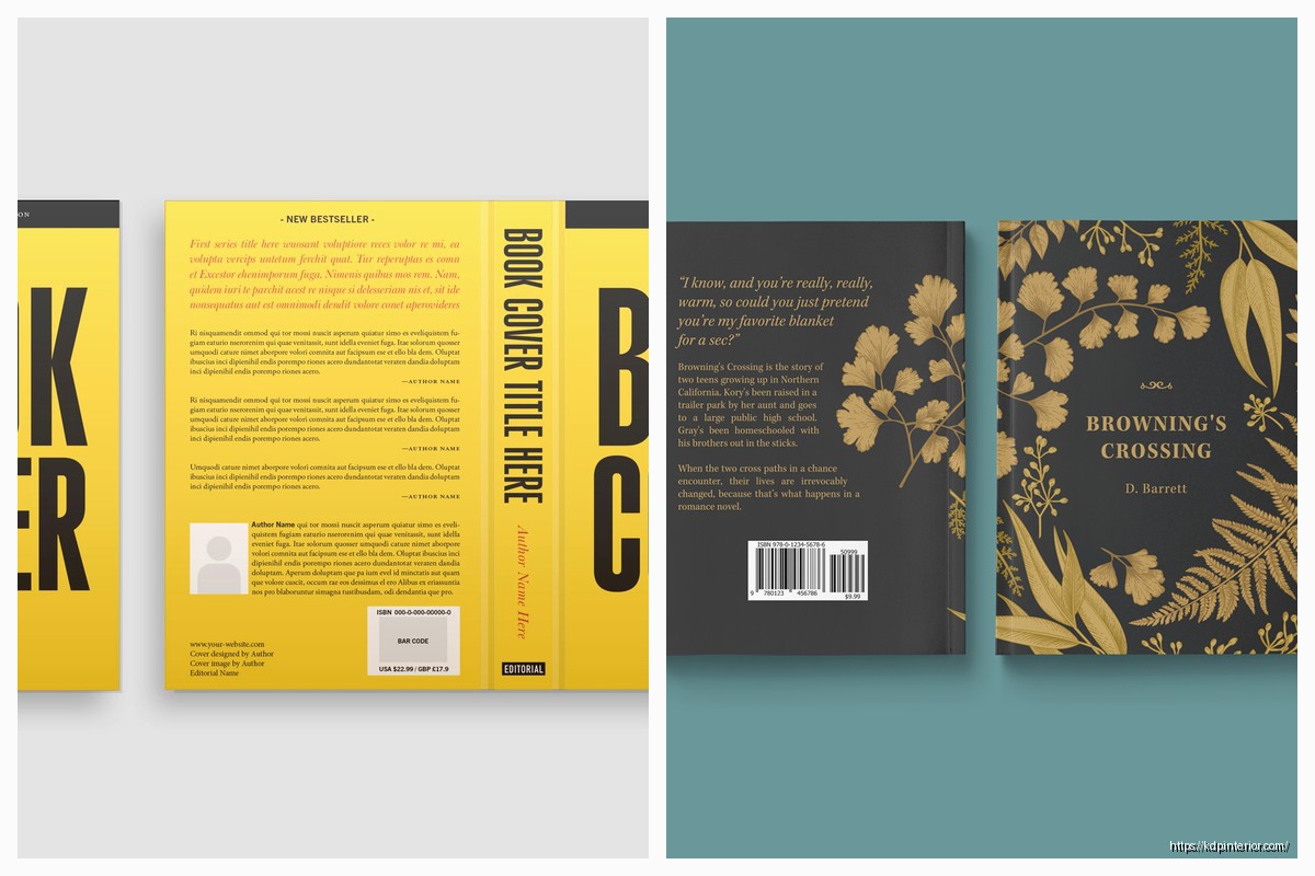
Paperback Covers Are Where It Gets Annoying
Okay so paperback is different because you need the full wrap – front cover, spine, back cover all in one file. Amazon has this cover calculator tool that you gotta use and it’s actually pretty helpful once you figure it out.
The width calculation is: (page count / 2) x paper thickness + cover width x 2 + spine width. But honestly just use their calculator because the paper thickness changes depending on whether you pick white or cream paper and it’s like 0.002252 inches for white and 0.0025 for cream or something ridiculous like that.
Bleed Settings You Can’t Ignore
This is huge – you need 0.125 inches of bleed on ALL sides including the spine. That means your important stuff like text and logos need to stay 0.25 inches away from the trim edge. I call this the safe zone and if you ignore it your text is gonna get cut off when they trim the books.
So if your book is 6×9 inches your actual cover dimensions are gonna be way bigger once you add the spine width and the bleed. For a 120-page book with white paper the spine is about 0.246 inches so your full cover width would be like 12.246 inches plus the bleed… you see why the calculator is necessary.
Color Mode and DPI Requirements
Always work in RGB for ebooks even though that sounds wrong if you’re used to print design. Amazon converts it on their end and RGB files are smaller. But for paperback you want CMYK because it’s actually going to a printer.
DPI needs to be 300 minimum for paperback, no exceptions. I’ve seen people try to upload 150 DPI covers because they look fine on screen and then wonder why the printed version looks blurry. For ebooks you can technically go lower but why would you when storage is cheap and it makes your cover look better on high-res devices.
The Spine Width Headache
Oh and another thing about spines – if your book is under 130 pages Amazon won’t even let you put text on the spine because it’s too narrow and it’ll look terrible anyway. I tried forcing it once with like 100-page journal and the text was so squished it was unreadable.
When you do have enough pages for spine text keep it simple. Book title and author name, that’s it. Font size needs to be at least 16pt or it’s gonna be hard to read on a bookshelf. I usually go with 18-20pt depending on the font.
Text and Font Considerations
Your title needs to be readable in thumbnail size which on Amazon is like 160 pixels tall. I test this by shrinking my cover down in Photoshop and if I can’t read the title clearly I make it bigger. Simple as that.
Don’t use more than two fonts on your cover unless you really know what you’re doing design-wise. I see covers all the time with like four different fonts and it looks chaotic. One for the title, maybe a different one for the subtitle or author name.
Sans serif fonts work better for thumbnails generally because they’re cleaner at small sizes. But serif fonts can work great for certain genres like historical fiction or literary stuff where you want that classic look.
Genre-Specific Format Stuff
Wait I forgot to mention – different genres have different expectations for cover layout and if you ignore this your book won’t sell as well even if the cover looks good objectively.
Romance readers expect the title at the top usually with the author name pretty prominent at the bottom. Thriller covers often have the title big and centered with dark moody colors. Cozy mystery has a totally different vibe with brighter colors and illustrated elements.
I spent like three hours last week analyzing top 100 covers in the self-help category because I was formatting a new book and the patterns are super obvious once you look. Title placement, color schemes, whether they use photos or graphics – it’s all genre-dependent.
Common Technical Mistakes That’ll Reject Your Upload
Amazon’s system will auto-reject covers that don’t meet specs so here’s what I’ve seen cause problems:
- Wrong color profile embedded in the file
- Transparent backgrounds on what should be a solid cover
- Text too close to trim edges
- Spine text not centered on the actual spine
- Resolution too low when they zoom in to check quality
- File corrupted during upload because internet cut out
That last one happened to me twice in one night and I was watching The Last of Us and kept having to restart the upload during commercial breaks… anyway make sure your internet is stable.
The Barcode Situation
Don’t put a barcode on your cover. Amazon adds that automatically on the back bottom right corner. If you put your own barcode it’ll look stupid with two of them. I see people do this all the time because they’re used to traditional publishing where you handle the barcode.
Same thing with the ISBN – don’t put it on your cover design. Amazon’s system handles all that stuff in the back matter automatically.
Software and Tools That Actually Work
You don’t need Photoshop honestly though I use it because I already know it. Canva works fine for covers and they have templates already sized correctly. GIMP is free and does everything you need if you’re on a budget.
For paperback covers there’s a tool called Book Brush that has templates with the bleed and safe zones already marked which is super helpful. BookBolt has cover templates too but it’s more focused on low-content books.
Testing Your Cover Before Upload
This is gonna sound weird but I always test my covers by texting them to myself and looking at them on my phone. That’s how most people are gonna see it first on Amazon’s mobile app so if it doesn’t work on a small phone screen it doesn’t work period.
Also print out a thumbnail-sized version on your home printer. Colors will look different in print than on screen and you might realize your dark blue background looks basically black when printed.
Hardcover Format Differences
If you’re doing hardcover through Amazon which not everyone knows you can do the specs are slightly different. The cover wraps around the boards so you need extra width and the spine calculation changes because hardcover boards are thicker than paperback pages obviously.
Bleed is still 0.125 inches but the safe zone should be a bit bigger like 0.375 inches from trim because hardcover binding is less precise than paperback. At least that’s been my experience – I’ve had hardcover text get closer to the edge than I expected.
Dust Jacket vs Case Laminate
With hardcover you can do a dust jacket which is that removable paper cover or case laminate where the design is printed directly on the board. Case laminate is cheaper and more durable but dust jackets look fancier.
Format-wise they’re basically the same except dust jackets have flaps that fold inside the front and back covers so you need to design those flap areas too. Usually author bio goes on the back flap and maybe a book description or blurb on the front flap.
Vector vs Raster for Cover Elements
If you’re using logos or text effects save those as vector when possible because they’ll scale better and stay sharp at any size. But for photos and complex artwork raster is fine as long as your resolution is high enough.
I made the mistake once of using a rasterized logo at 150 DPI and when I went to make promotional posters from the same cover file it looked pixelated blown up. Had to go back and redo it with the vector version.
Color Calibration Reality Check
Your monitor is probably not calibrated correctly and colors will look different when printed. This is just reality unless you’ve got a $500 monitor with a calibration tool. What looks like a nice warm beige on your screen might print as gray.
Order a proof copy always before you finalize. I don’t care how good your cover looks on screen – paper is different and you need to see it physically. I’ve had covers where the colors were way too dark in print and I had to lighten everything by like 20%.
Matte vs Glossy Finish Considerations
Amazon offers matte and glossy finishes for paperback and this actually affects how you should design your cover. Dark colors look richer with glossy but can show fingerprints. Matte hides fingerprints but can make colors look slightly duller.
I usually go matte for non-fiction and journals because it feels more professional and glossy for fiction because it pops more on bookstore shelves. But that’s just personal preference there’s no wrong answer really.
Okay so that’s basically everything I wish someone had told me before my first cover upload seven years ago. The main things are just nail your dimensions, keep text in the safe zone, use high enough resolution, and test it at thumbnail size before you commit to it.
DISCOVER OUR FREE BEST SELLING PRODUCTS
Editable Canva Lined Journal: Express Your Thoughts – KDP Template
Lined Pages Journal 120 pages Ready to Upload PDF Commercial Use KDP Template 6×9 8.5×11 5×8 for Notebooks, Diaries, Low Content
Lined Pages Journal 120 pages Ready to Upload PDF Commercial Use KDP Template 6×9 8.5×11 5×8 for Notebooks, Diaries, Low Content
Cute Dogs Coloring Book for Kids | Activity Book | KDP Ready-To-Upload
Daily Planner Diary : Diary Planners for Everyday Productivity, 120 pages, 6×9 Size | Amazon KDP Interior
Wolf Coloring KDP interior For Adults, Used as Low Content Book, PDF Template Ready To Upload COMMERCIAL Use 8.5×11"
Coloring Animals Head Book for Kids, Perfect for ages 2-4, 4-8 | 8.5×11 PDF
Printable Blank Comic Book Pages PDF : Create Your Own Comics – 3 Available Sizes
Notes KDP interior Ready To Upload, Sizes 8.5×11 6×9 5×8 inch PDF FILE Used as Amazon KDP Paperback Low Content Book, journal, Notebook, Planner, COMMERCIAL Use
Black Lined Journal: 120 Pages of Black Lined Paper Perfect for Journaling, KDP Notebook Template – 6×9
Student Planner Journal 120 pages Ready to Upload PDF Commercial Use KDP Template 6×9" 8.5×11" for Low Content book
Recipe Journal Template – Editable Recipe Book Template, 120 Pages – Amazon KDP Interior