Amazon KDP guide, KDP book publishing
Ebook Cover Generator: Automated Design Tools
Mar
Okay so I just spent like three nights testing these ebook cover generators because honestly my Photoshop subscription lapsed and I was NOT about to pay $55/month just to make a simple romance cover. Here’s what actually works.
The Tools That Don’t Suck
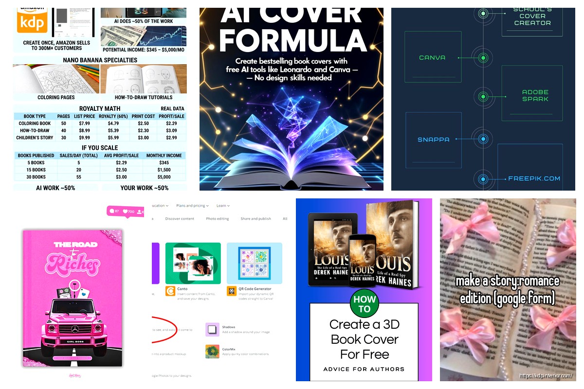
Canva is the obvious one everyone starts with and yeah it’s solid for low-content books. I’ve probably made 60+ covers there at this point. The free version gives you enough templates to get started but the paid version ($12.99/month) is where it’s at if you’re serious. You get like 600,000+ stock photos and the background remover tool which… okay that tool alone has saved me probably 40 hours of work this year.
BookBrush is the other one I use constantly. It’s specifically built for book covers so the templates actually understand things like spine width and bleed margins. Started at $9.99/month I think? They have this 3D mockup generator that makes your flat cover look like an actual book and honestly those mockups convert WAY better in ads than flat images.
DIYBookCovers is more niche but if you’re doing fiction in popular genres they have pre-made templates that look professional. Like actually professional, not “I made this in MS Paint” professional. One-time purchase options which is nice if you hate subscriptions.
Starting With Canva Because You Probably Will Anyway
Login, hit “Custom Size” and type in your dimensions. For ebooks I usually do 1600×2400 pixels because Amazon recommends that 1:1.6 ratio. Print books are different obviously but we’re talking ebooks here.
The template library is massive which sounds good but it’s actually overwhelming at first. Search by your genre – type “thriller book cover” or “romance book cover” and you’ll get templates that at least START in the right direction. I usually scroll through like 30 templates before picking one because… I don’t know, commitment issues I guess.
One thing nobody tells you – those templates are used by thousands of people. So you gotta customize heavily. Change the fonts, swap the images, adjust the colors. I learned this the hard way when someone emailed me saying my cover looked exactly like another book in my niche. Awkward.
The Font Situation
Fonts make or break covers and this is where I see most beginners mess up. Canva has decent fonts but they’re limited in the free version. For genres here’s what generally works:
Romance needs elegant serif fonts or flowing scripts. Think Playfair Display or Cinzel. But don’t go too swirly or it looks like a wedding invitation.
Thrillers want bold sans-serif fonts, all caps usually. Montserrat Bold or Bebas Neue. Something that screams “DANGER” without literally saying danger.
Non-fiction needs clean and trustworthy. Raleway, Open Sans, Lato. You want people to think “this person knows what they’re talking about” not “this person discovered WordArt in 2003.”
Oh and another thing – use maximum two fonts per cover. Title font and subtitle/author font. Three fonts makes it look like a ransom note.
BookBrush For When You Need More Control
Signed up for BookBrush last year when I was launching a series and needed consistent branding across six covers. Their template system works differently – you can save brand kits with your specific fonts, colors, and design elements.
The interface is clunkier than Canva honestly. Took me like a week to feel comfortable navigating it. But the export options are better. You can export for Kindle, IngramSpark, Draft2Digital all with the right specs automatically. No more googling “what size should my cover be for paperback” at 2am.
They have this feature called BoxShot that creates 3D mockups and you can customize the angle, add shadows, put multiple books together. I use these for Facebook ads constantly. My click-through rate went up like 30% when I switched from flat covers to 3D mockups in my ads. People apparently like seeing books that look like… books.
Wait I forgot to mention – BookBrush has a mobile app that’s actually usable. I’ve designed covers on my phone while waiting at the DMV. Not ideal but possible.
The Image Problem Everyone Hits
Stock photos are gonna be your main image source unless you’re hiring photographers (which… no, not for ebooks). Canva Pro gives you access to their library but you’ll also want accounts on:
Depositphotos – I have a subscription that gives me 50 images/month for like $29. The search is better than Canva’s library.
Unsplash and Pexels are free but everyone uses them so your cover might look familiar to readers. I use these for non-fiction mostly where the image matters less than the title.
Creative Fabrica if you need illustrations or graphic elements. I got a year subscription for $99 during Black Friday and it’s paid for itself ten times over.
Making Stock Photos Not Look Stock
This is gonna sound weird but the trick is layering. One photo looks stock. Two photos blended together with different opacity levels looks designed. I usually:
Put a background image at 100% opacity
Add a gradient overlay at 30-50% opacity to darken it
Place a second image (maybe a texture or subtle pattern) at 15-20% opacity
Then add text on top
This creates depth and makes it harder for people to recognize the original stock photo. My cat just jumped on my keyboard so that sentence took three tries to write.
Color Theory Stuff That Actually Matters
Okay so I’m not a designer but I’ve learned some things through trial and error and like 47 YouTube videos. Contrast is everything. Your title needs to pop against the background or people scrolling on their phones won’t see it.
Use complementary colors – blue and orange, purple and yellow, red and green. But not Christmas red and green unless you’re writing Christmas romance obviously.
Different genres have color expectations:
Romance: reds, pinks, purples, deep blues
Thriller: blacks, reds, dark grays
Fantasy: purples, teals, golds
Self-help: blues, greens, whites
Business: navy, gray, sometimes orange
You can break these rules but understand you’re breaking them. My best-selling planner has a yellow cover in a sea of blue competitors and it stands out on Amazon search results. But my thriller with a pink cover? Yeah that one didn’t sell.
The Actual Workflow I Use Now
After making probably 200+ covers here’s my current process that takes about an hour per cover:
Browse both Canva and BookBrush templates for 15 minutes. Screenshot any that feel close to what I want.
Search Depositphotos for images using my genre keywords. Download 3-4 options.
Open Canva or BookBrush depending on the project. Import my images.
Start with the background. Get the colors and overall vibe right first.
Add title text. Play with fonts for way too long. Usually end up with one of my go-to fonts anyway.
Add author name and subtitle if needed. Keep these smaller and less prominent than the title.
Export and upload to my phone. Look at it small on my phone screen because that’s how most people will see it on Amazon.
Show it to my wife who gives brutally honest feedback. She’s saved me from some truly terrible design choices.
Revise based on feedback. Export final version.
The Technical Export Stuff
Amazon wants covers minimum 1000 pixels on the shortest side, recommended 2560 pixels on the longest side. I do 1600×2400 for ebooks which is right in the sweet spot.
File format: JPG, RGB color mode, 72 DPI for ebook covers. Print covers need 300 DPI but that’s a whole different thing.
File size: keep it under 5MB. Usually mine are 500KB-1MB after export.
Both Canva and BookBrush let you download as JPG with quality settings. I use high quality but not maximum because the file size balloons unnecessarily.
Common Mistakes I Made So You Don’t Have To
Text too small. What looks good on your 27-inch monitor is tiny on a phone screen. Your title should be readable as a thumbnail.
Too many elements. I used to cram everything onto the cover – subtitle, tagline, series info, quotes. Now I keep it minimal. Title, author, maybe one small subtitle.
Wrong genre signals. My first thriller cover looked like literary fiction because I used a minimalist design. Sales were terrible until I redesigned with darker colors and bolder fonts.
Ignoring the thumbnail test. Always shrink your cover to thumbnail size before finalizing. If you can’t read the title, start over.
Using the template exactly as-is. Customize everything. Change colors at minimum.
Advanced Stuff Once You Get Comfortable
Series branding is huge if you’re writing multiple books. Keep the same fonts, color scheme, and layout across all covers in a series. Readers recognize the pattern and it builds trust.
I create templates of my own in Canva for series work. Design the first cover, then duplicate it and just swap the title and images for subsequent books. Keeps everything consistent and saves time.
A/B testing covers is something I started doing this year. Create two versions, run small Amazon ad campaigns to each, see which gets better click-through rates. Usually costs like $20-30 to test but it’s worth it for books you expect to sell long-term.
Seasonal updates for some books. My planner covers get refreshed every year with new colors and trends. The interior is basically the same but the new cover makes it look fresh.
When To Just Pay Someone
Look, automated tools are great for most low-content books, non-fiction, and genres where covers follow predictable patterns. But sometimes you gotta hire a designer.
If you’re launching a flagship fiction book you expect to make thousands from, spend $200-500 on a professional cover. Fiverr has decent designers but you get what you pay for. 99designs and Reedsy have better quality but higher prices.
I still use automated tools for 90% of my covers though. The math works out – if I can make a cover in an hour for $0-13 (my Canva subscription) versus $300 and a week of back-and-forth with a designer, the automated route wins for most projects.
The tools keep getting better too. AI features are being added to these platforms that help with background removal, image enhancement, even suggesting layouts. It’s honestly getting easier every year.
Just tested a new one called DesignWizard last week and it’s pretty similar to Canva but has some different templates. Might be worth checking out if you’re bored of Canva’s selection. Their pricing is comparable.
Anyway that’s basically everything I know about ebook cover generators after doing this for seven years. Start with Canva, branch out to BookBrush if you need more features, and don’t overthink it. A decent cover made in an hour is better than a perfect cover you never finish because you’re paralyzed by options.
DISCOVER OUR FREE BEST SELLING PRODUCTS
Editable Canva Lined Journal: Express Your Thoughts – KDP Template
Lined Pages Journal 120 pages Ready to Upload PDF Commercial Use KDP Template 6×9 8.5×11 5×8 for Notebooks, Diaries, Low Content
Lined Pages Journal 120 pages Ready to Upload PDF Commercial Use KDP Template 6×9 8.5×11 5×8 for Notebooks, Diaries, Low Content
Cute Dogs Coloring Book for Kids | Activity Book | KDP Ready-To-Upload
Daily Planner Diary : Diary Planners for Everyday Productivity, 120 pages, 6×9 Size | Amazon KDP Interior
Wolf Coloring KDP interior For Adults, Used as Low Content Book, PDF Template Ready To Upload COMMERCIAL Use 8.5×11"
Coloring Animals Head Book for Kids, Perfect for ages 2-4, 4-8 | 8.5×11 PDF
Printable Blank Comic Book Pages PDF : Create Your Own Comics – 3 Available Sizes
Notes KDP interior Ready To Upload, Sizes 8.5×11 6×9 5×8 inch PDF FILE Used as Amazon KDP Paperback Low Content Book, journal, Notebook, Planner, COMMERCIAL Use
Black Lined Journal: 120 Pages of Black Lined Paper Perfect for Journaling, KDP Notebook Template – 6×9
Student Planner Journal 120 pages Ready to Upload PDF Commercial Use KDP Template 6×9" 8.5×11" for Low Content book
Recipe Journal Template – Editable Recipe Book Template, 120 Pages – Amazon KDP Interior