Amazon KDP guide, KDP book publishing
Amazon KDP Paperback Cover Template: Print-Ready Files
Mar
Okay so the KDP paperback cover template thing is honestly where most people mess up their first launch and I’ve seen it happen like probably a hundred times at this point. You gotta download the actual template from KDP because their measurements are super specific and if you’re off by even a little bit your cover’s gonna get rejected or worse look like crap when it prints.
So first thing, you need to know your trim size. Most people go with 6×9 because it’s the standard paperback size and looks professional for pretty much any genre. But KDP offers like 8×10, 5×8, all these different options. The trim size matters because it changes everything about your template dimensions. I made the mistake early on of designing a cover before I even knew my page count and had to redo the whole thing because the spine width was completely wrong.
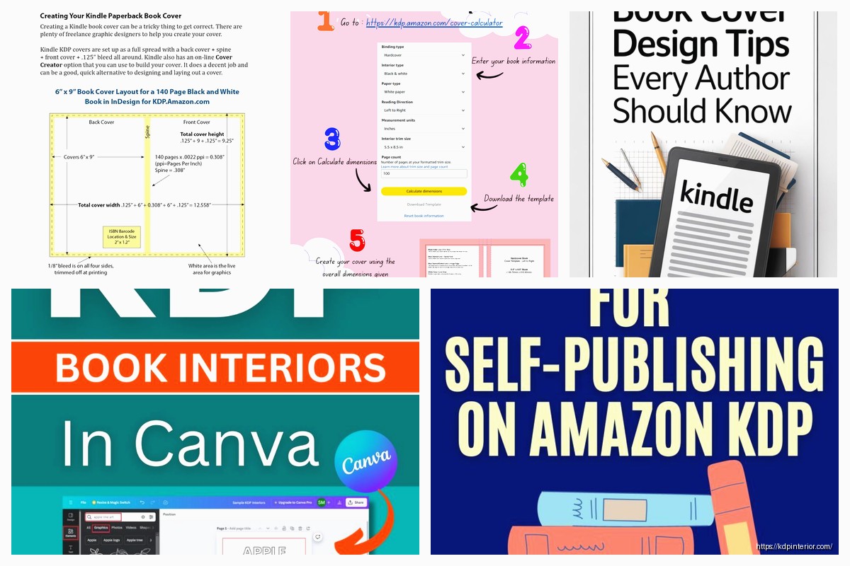
Here’s what you actually do. Go to your KDP bookshelf, click create a new paperback, fill in the basic info until you get to the cover section. There’s a calculator tool right there that asks for your trim size, page count, paper type (white or cream), and whether you want bleed or not. Always say yes to bleed unless you have a really specific reason not to. Bleed means your background colors or images extend past the trim line so when they cut the book there’s no white edges showing up if the cut is slightly off.
The calculator spits out a PDF template with guides and everything. Download that. It’ll have pink lines showing the trim area, blue lines for the bleed area, and this yellow spine area in the middle. Your spine width changes based on page count because obviously a 400 page book is thicker than a 100 page book. This is why you can’t just use a generic template from some random website.
For software honestly you can use whatever you want as long as it exports high-res PDFs. I use Affinity Designer now but I started with Canva Pro which actually works fine if you know what you’re doing. Photoshop is overkill unless you’re already comfortable with it. GIMP is free and works but the learning curve is kinda steep for no reason. The key thing is making sure your final file is 300 DPI minimum and in the right color mode.
Oh and speaking of color mode, this is super important. Your cover needs to be in RGB color mode for KDP even though most print stuff is usually CMYK. I know that sounds backwards but KDP specifically wants RGB. They convert it on their end. I spent like three hours one night trying to figure out why my blacks looked washed out and it was because I’d converted to CMYK thinking I was being smart.
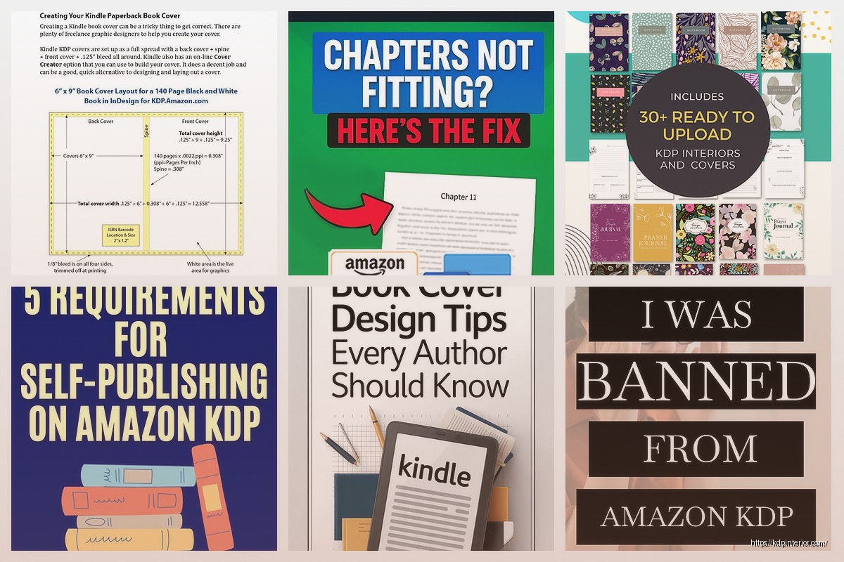
Let me break down the actual template zones because this confused me for way too long. The full cover width is gonna be your back cover width plus spine width plus front cover width plus the bleed areas. So for a 6×9 book with 200 pages it might be like 12.5 inches wide total or something like that, the calculator tells you exactly. The height is your trim height plus bleed on top and bottom.
The pink lines are your trim lines, that’s where they actually cut the paper. Nothing important should be right on these lines because slight variations in cutting could chop it off. Keep all your text and important design elements inside the blue safety zone which is usually about 0.125 inches inside the trim line. This is especially crucial for barcodes and your book title on the spine.
Wait I forgot to mention, KDP automatically adds the barcode to the bottom right of your back cover. You need to leave that area blank. There’s a white rectangle marked in the template showing exactly where it goes. Don’t put any dark colors or busy designs there or the barcode scanner won’t work properly and bookstores get annoyed.
The spine is tricky because it’s so narrow especially on thin books. If your book is under like 100 pages the spine might only be 0.2 inches wide and you literally can’t fit text on there. KDP won’t even let you. For books between 100-200 pages you can fit text but it needs to be small and you gotta be really careful with alignment. I use 16-20pt font usually depending on the spine width and a clean sans-serif font so it’s readable when the book is on a shelf.
My cat just knocked over my coffee but anyway, the front cover is obviously where most of your design effort goes. Standard stuff applies, make sure your title is readable in thumbnail size because that’s how 90% of people see it on Amazon. Subtitle if you have one, your author name, and some kind of visual that matches your genre. I’m not gonna get into design principles because that’s a whole other thing but just remember people are scrolling fast.
Back cover should have your book description or blurb, maybe an author bio, possibly some review quotes if you have them. I usually put a small author photo on the back too. Some people put their social media handles but honestly I don’t think anyone ever uses those from a physical book cover.
Here’s something that’s gonna sound weird but check your cover at actual size before you upload it. Like literally measure out 6×9 inches on your screen or print it out if you can. I’ve caught so many issues this way, text that looked fine at 100% zoom but was way too small in real life, or images that were pixelated when printed even though they looked sharp on screen.
File format for upload needs to be PDF. When you export make sure you’re flattening all layers, embedding all fonts, and not compressing the images too much. KDP’s uploader will tell you if there’s something wrong but it’s better to get it right the first time. The file size is usually gonna be pretty big, like 20-50 MB depending on how image-heavy your cover is. That’s normal.
Oh and another thing, the preview tool on KDP is actually pretty good now. After you upload your cover it shows you a 3D preview of what the book will look like and you can flip it around and stuff. Use this. I’ve caught spine alignment issues in the preview that I totally missed in my design software.
Common mistakes I see all the time: text too close to the spine crease so it’s hard to read, not accounting for the spine width properly so the front and back covers are slightly off center, forgetting about the barcode area, using images that are too low resolution, and not extending background colors all the way to the bleed edge.
That last one is super annoying because you think you’re done and then you upload it and KDP shows you these tiny white lines where your background didn’t quite reach the edge. Always extend your backgrounds like 0.25 inches past the trim line into the bleed area just to be safe.
For the actual design files I keep everything in layers. Background layer, image layers, text layers, everything separate until the very end when I export. This makes it way easier to make changes when KDP inevitably asks you to adjust something or when you realize you spelled a word wrong after you’ve already uploaded it which has definitely never happened to me multiple times.
The KDP cover template also includes these guides for where the spine starts and ends. Pay attention to these because you want your spine design to line up perfectly. If your spine image or color is off by even a pixel it’s gonna look sloppy when printed. I usually add a thin border or line right at the spine edges just to make sure everything lines up crisp.
Resolution is probably the biggest technical issue. You need 300 DPI minimum but honestly I go with 600 DPI for anything with fine details or text. The file size gets huge but print quality is noticeably better. If you’re using photos or illustrations make sure they’re high enough resolution at the size you’re using them. A photo that looks great at 2 inches wide might be pixelated if you stretch it to 6 inches.
Color matching between screen and print is always gonna be imperfect but you can get close. Bright colors tend to print slightly darker and less saturated than they appear on screen. Blacks especially, use rich black (like RGB 0,0,0 or close to it) not gray. I learned this the hard way when my “black” cover printed as dark gray and looked washed out.
Test prints are worth it if you’re doing this professionally. Order a proof copy before you publish, costs like 5 bucks plus shipping. I do this for every single book now because there’s always something that looks different in print than on screen. The paper color matters too, cream paper makes colors look warmer and slightly darker than white paper.
One more thing about fonts, make sure you have the license to use them commercially. Most free fonts are fine but some have restrictions. Also embed your fonts in the PDF or convert them to outlines/curves so there’s no chance of font substitution issues when KDP processes your file.
The spine text should read top to bottom when looking at the book spine with the front cover facing you. This is standard in most English-speaking markets. Some people do it backwards and it looks wrong on the shelf. Your title should be the most prominent thing on the spine, author name smaller below it.
If you’re doing a series make sure your spines have consistent design so they look good next to each other on a shelf. Same fonts, similar color schemes, maybe a series logo or number. I didn’t think about this with my first series and the spines are all different and it bugs me every time I see them.
Alright so that’s basically the whole process. Download the specific template for your exact book specs from KDP, design your cover using proper software at 300+ DPI, keep everything in the safety zones, leave room for the barcode, export as a PDF with embedded fonts, and check the preview before approving. It sounds like a lot but once you’ve done it a few times it becomes pretty automatic. The template does most of the hard work for you honestly you just gotta follow the guidelines and not try to get creative with the technical specs.
DISCOVER OUR FREE BEST SELLING PRODUCTS
Editable Canva Lined Journal: Express Your Thoughts – KDP Template
Lined Pages Journal 120 pages Ready to Upload PDF Commercial Use KDP Template 6×9 8.5×11 5×8 for Notebooks, Diaries, Low Content
Lined Pages Journal 120 pages Ready to Upload PDF Commercial Use KDP Template 6×9 8.5×11 5×8 for Notebooks, Diaries, Low Content
Cute Dogs Coloring Book for Kids | Activity Book | KDP Ready-To-Upload
Daily Planner Diary : Diary Planners for Everyday Productivity, 120 pages, 6×9 Size | Amazon KDP Interior
Wolf Coloring KDP interior For Adults, Used as Low Content Book, PDF Template Ready To Upload COMMERCIAL Use 8.5×11"
Coloring Animals Head Book for Kids, Perfect for ages 2-4, 4-8 | 8.5×11 PDF
Printable Blank Comic Book Pages PDF : Create Your Own Comics – 3 Available Sizes
Notes KDP interior Ready To Upload, Sizes 8.5×11 6×9 5×8 inch PDF FILE Used as Amazon KDP Paperback Low Content Book, journal, Notebook, Planner, COMMERCIAL Use
Black Lined Journal: 120 Pages of Black Lined Paper Perfect for Journaling, KDP Notebook Template – 6×9
Student Planner Journal 120 pages Ready to Upload PDF Commercial Use KDP Template 6×9" 8.5×11" for Low Content book
Recipe Journal Template – Editable Recipe Book Template, 120 Pages – Amazon KDP Interior