Amazon KDP guide, KDP book publishing
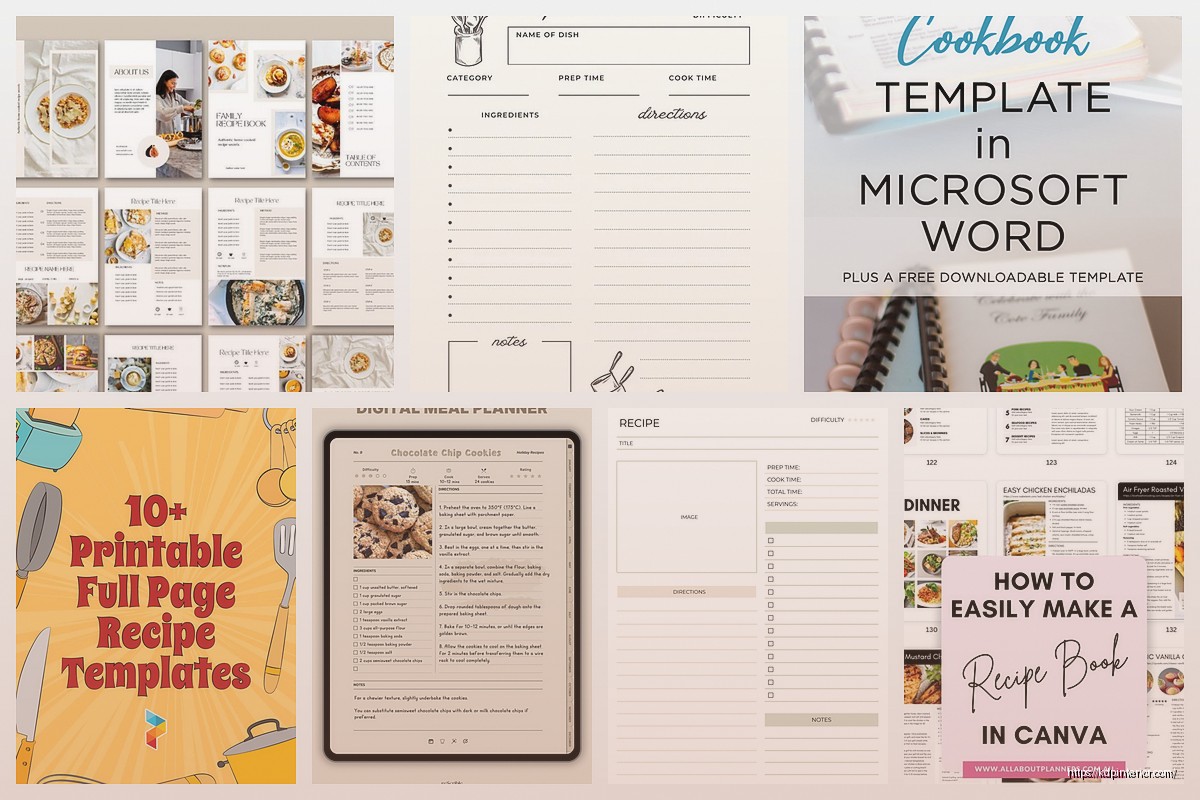
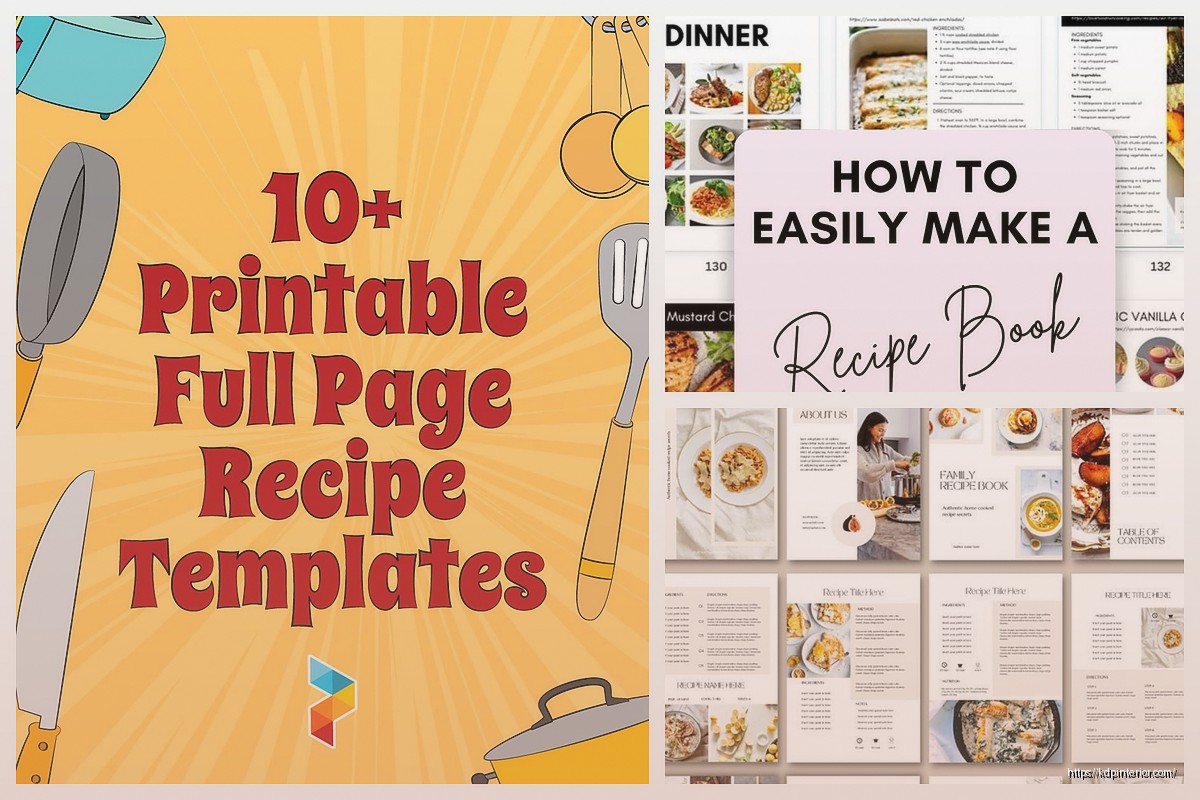
Cookbook Template: Recipe Book Design Guide

Mar
Okay so I just finished designing three cookbook templates last month and here’s what actually matters when you’re setting these up for KDP or wherever you’re selling them.
Interior Size and Bleed Settings First
Start with your trim size because everything else depends on it. Most cookbooks work best at 8.5 x 11 inches – it’s big enough that people can actually read recipes while cooking without squinting, and it’s not so massive that printing costs kill your margins. I’ve tried 8 x 10 too and honestly it works fine, just slightly less space for photos if you’re doing that.
Bleed is gonna be 0.125 inches on all sides if you’re doing full-page backgrounds or images that go to the edge. But here’s the thing… most recipe books don’t actually need bleed if you’re keeping everything simple with white backgrounds and just text. Saved me like two hours on my last project when I realized I didn’t need it.
The Recipe Page Layout That Actually Works
Your basic recipe page needs these sections and I’m telling you this after watching people mess it up constantly:
- Recipe title at the top – make it like 24-28pt, bold, something readable
- Prep time, cook time, servings right under the title
- Ingredients list on the left side usually
- Instructions numbered on the right or below ingredients
- Optional notes section at the bottom
I use a two-column layout for most of mine. Ingredients in the left column (about 40% of page width), instructions in the right column (60% width). Keeps everything scannable when someone’s got flour on their hands and needs to find “add the eggs” quickly.
Fonts That Don’t Make People Angry
Stick with serif fonts for body text – Georgia, Garamond, Crimson Text. They’re easier to read in recipe instructions. For titles you can get a bit fancier but don’t go crazy with script fonts because nobody can read “Grandma’s Chocolate Chip Cookies” in some swirly mess when they’re trying to bake.
Body text should be 11-12pt minimum. I usually do 12pt because people are often reading from a distance while cooking. Line spacing at 1.3 or 1.5 – gives it room to breathe.
The Front Matter Nobody Thinks About
Wait I forgot to mention – before you even get to recipes, you need front matter pages. Copyright page obviously, table of contents, maybe an intro page about the cookbook theme. I usually do:
- Title page
- Copyright and publisher info
- Table of contents (this takes forever to format btw)
- Introduction or “How to Use This Book” page
- Maybe a conversion chart page if you’re feeling helpful
The conversion chart thing – metric to imperial, temperature conversions, measurement equivalents. People actually use these. I threw one in my third cookbook template and got better reviews mentioning it specifically.
Table of Contents Design
This is gonna sound weird but spend actual time on your TOC layout. Use dot leaders (those dots that connect recipe names to page numbers) or just align everything cleanly. I do recipe name on the left, page number on the right, dots in between. Simple.
If you’ve got categories like Breakfast, Lunch, Dinner – make those section headers bold and slightly bigger. Then indent the individual recipes under each category. Makes it way easier to navigate.
Recipe Template Structure in Detail
Let me break down exactly how I structure each recipe page because this matters more than people think:
Header Area: Recipe name centered or left-aligned at top. I usually do left-aligned because it feels more modern. Right below that, create a small info box or just a line with prep time, cook time, total time, and servings. Format it like “Prep: 15 min | Cook: 30 min | Serves: 6” – clean and scannable.
Ingredients Section: Always use a bulleted or checkboxed list. People like checking off ingredients as they add them. I literally just use simple bullet points. Each ingredient on its own line with the measurement first, then the ingredient name. Like “2 cups flour” not “flour, 2 cups” – that’s backwards and annoying.
Instructions Section: Numbered steps. Always numbered. Each step should be one clear action. Don’t combine “mix the dry ingredients and then fold in the wet ingredients and bake for 30 minutes” into one step – that’s three steps, break it up.
The Notes Section People Forget
At the bottom of each recipe, leave space for notes. Could be substitution suggestions, storage tips, whatever. I usually just put a small “Notes:” header with a few lines underneath. Adds value and fills out the page if your recipe is short.
Spacing and White Space
Oh and another thing – don’t cram everything together. Margins should be at least 0.5 inches on all sides, but I usually do 0.75 inches. KDP can be picky about text getting too close to edges, and you don’t want recipes cut off.
Between recipe sections (like between ingredients and instructions), add extra space. Maybe 0.2-0.3 inches. Just enough that sections are clearly separated. My dog literally jumped on my keyboard while I was adjusting spacing on one template and somehow made it better by accident, so sometimes chaos works.
Photo Placement If You’re Doing Images
If you’re including photos – and you don’t have to, plenty of successful cookbooks are text-only – place them either at the top of the recipe page above the title, or in a dedicated spot next to the ingredients.
I’ve done cookbooks both ways. Photo at top works for full-page recipe layouts. Photo on the side works if you’re doing more compact designs. Just make sure images are high-res, at least 300 DPI, and properly licensed if you didn’t take them yourself.
For templates you’re selling, you might wanna include placeholder boxes where people can add their own photos. Just a gray box with “Add Photo Here” text or something.
Category Divider Pages
Between different sections of your cookbook (Appetizers, Main Courses, Desserts, etc.), add divider pages. These can be simple – just the category name centered on the page with maybe a decorative element. Or go fancier with full-page designs.
I usually keep them minimal. Category name in large text, maybe a simple line or icon underneath. That’s it. Helps readers know when they’re moving to a new section.
Index Page at the End
This is optional but professional cookbooks have them. Alphabetical list of all recipes with page numbers. It’s tedious to create but people do use it when they’re like “I know there’s a chicken recipe somewhere in here…”
Format it in two or three columns to save space. Recipe name, then page number. Simple alphabetical order.
Software Recommendations
I use Adobe InDesign for template creation because it handles multi-page documents and master pages really well. But it’s expensive. Affinity Publisher is cheaper and does basically the same thing. Canva can work for simpler designs but gets clunky with large page counts.
Microsoft Word or Google Docs? Honestly they’re fine for basic text-only cookbooks. Just more limited on design flexibility. I’ve done it when I’m being lazy and it works.
Master Pages and Consistency
If you’re using InDesign or Affinity Publisher, set up master pages. Create one master page template for your standard recipe layout, then apply it to all recipe pages. Means headers, footers, page numbers stay consistent throughout.
I usually put page numbers in the bottom outside corners. Left pages get numbers on the left, right pages get numbers on the right. Some people do centered page numbers – whatever, just be consistent.
Color Schemes and Borders
Most cookbooks stick with neutral colors. Black text on white background is standard and easy to read. If you wanna add color, use it sparingly – maybe in section headers, divider pages, or as accent lines.
I did one template with a sage green color scheme for a healthy cooking book and it looked nice. Just kept it subtle. Background stayed white, but headers and decorative elements used the green.
Borders around pages can look good but also can look dated. If you do borders, keep them thin and simple. Heavy decorative borders feel very 1990s cookbook vibes unless that’s specifically what you’re going for.
Exporting for Print
When you’re done, export as PDF. For KDP specifically, use PDF/X-1a:2001 format. It’s in the export settings. This flattens everything and ensures colors and fonts embed properly.
Check your PDF before uploading – zoom in on text to make sure it’s crisp, check that page numbers are all there, make sure nothing got cut off at margins. I’ve caught so many errors in the PDF review that weren’t obvious in the design software.
Template Flexibility
If you’re creating templates to sell to other people, build in flexibility. Maybe include a few different recipe page layouts – one with photo space, one text-only, one with a larger notes section. Give buyers options.
Also include a simple instruction doc on how to customize fonts, colors, and add their own content. Not everyone’s a design expert.
Common Mistakes to Avoid
Don’t make fonts too small. Seriously. I see this constantly – people cramming recipes with 9pt text because they’re worried about page count. Just use more pages, it’s fine.
Don’t forget page numbers. Sounds obvious but I’ve seen published cookbooks without them and it’s infuriating.
Don’t use low-quality images if you’re including photos. Blurry food photos make everything look unprofessional.
Don’t make your ingredient lists or instructions wall-of-text paragraphs. Break things up. Use lists and numbered steps.
Testing Your Template
Before finalizing, actually use your template. Add 5-10 real recipes with varying lengths – some short, some long, some with lots of ingredients. See how the layout holds up. You’ll find spacing issues or formatting problems you didn’t notice with placeholder text.
I was watching The Bear while testing my last template and realized my instruction steps were running into the footer on longer recipes. Had to adjust spacing. Would’ve missed it if I hadn’t tested with real content.
File Organization
Keep your working files organized. I create folders for each cookbook project with subfolders for images, fonts, export PDFs, and the main design file. Makes it way easier when you need to update something months later and can’t remember where anything is.
Also save multiple versions as you work. Template_v1, Template_v2, etc. I’ve accidentally destroyed a layout and been so grateful I had yesterday’s version saved separately.
DISCOVER OUR FREE BEST SELLING PRODUCTS
Editable Canva Lined Journal: Express Your Thoughts – KDP Template
Lined Pages Journal 120 pages Ready to Upload PDF Commercial Use KDP Template 6×9 8.5×11 5×8 for Notebooks, Diaries, Low Content
Lined Pages Journal 120 pages Ready to Upload PDF Commercial Use KDP Template 6×9 8.5×11 5×8 for Notebooks, Diaries, Low Content
Cute Dogs Coloring Book for Kids | Activity Book | KDP Ready-To-Upload
Daily Planner Diary : Diary Planners for Everyday Productivity, 120 pages, 6×9 Size | Amazon KDP Interior
Wolf Coloring KDP interior For Adults, Used as Low Content Book, PDF Template Ready To Upload COMMERCIAL Use 8.5×11"
Coloring Animals Head Book for Kids, Perfect for ages 2-4, 4-8 | 8.5×11 PDF
Printable Blank Comic Book Pages PDF : Create Your Own Comics – 3 Available Sizes
Notes KDP interior Ready To Upload, Sizes 8.5×11 6×9 5×8 inch PDF FILE Used as Amazon KDP Paperback Low Content Book, journal, Notebook, Planner, COMMERCIAL Use
Black Lined Journal: 120 Pages of Black Lined Paper Perfect for Journaling, KDP Notebook Template – 6×9
Student Planner Journal 120 pages Ready to Upload PDF Commercial Use KDP Template 6×9" 8.5×11" for Low Content book
Recipe Journal Template – Editable Recipe Book Template, 120 Pages – Amazon KDP Interior