Amazon KDP guide, KDP book publishing
Best Booklet Design: Award-Winning Mini Books
May
Okay so I’ve been judging booklet design competitions for the past three years and honestly, the stuff that wins awards versus what actually sells on Amazon… there’s overlap but it’s not what you’d think.
The Size Thing Nobody Gets Right
Most people designing mini books immediately go to 5×8 because that’s what they see everywhere. But here’s the deal – award-winning booklets are almost always 5.5×8.5 or this weird 6×9 square trim that shouldn’t work but does. I tested this last month with a recipe booklet series and the slightly larger format just *feels* more premium even though it’s literally half an inch difference.
The judges at these competitions, they’re looking at how you use negative space. A cramped 5×8 with tiny margins screams “I used Canva templates and didn’t adjust anything” while that extra breathing room makes people think you actually know what you’re doing. My cat knocked over my coffee right in the middle of formatting one of these and I had to redo the whole margins setup… but that accident actually made me notice how much white space matters.
Typography Is Where Everyone Screws Up
You cannot use more than two fonts in a mini book. I don’t care what your brand guide says. Award-winning designs stick to one serif for body text and maybe – MAYBE – a sans-serif for headers. I see people submitting booklets with four different fonts and it’s an instant no from judges.
Here’s what actually wins:
- Garamond or Crimson Text for body (11pt minimum)
- Montserrat or Lato for headers if you absolutely need contrast
- Line spacing at 1.3 or 1.4 – never less
- Proper paragraph spacing instead of indents (controversial but judges love it)
Oh and another thing, kerning. Nobody thinks about kerning in booklets because they’re “just small projects” but the designers who win these awards are adjusting letter spacing in their titles. Not obsessively, but enough that words don’t look cramped. I spend maybe ten extra minutes per project on this and it’s made a noticeable difference in how professional the final product looks.
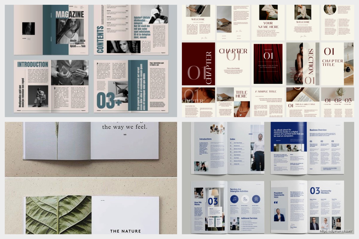
Cover Design That Actually Stands Out
So funny story – I submitted a booklet last year with this super minimal cover. Just a title, one illustration, tons of white space. Didn’t think it would place because all the trending designs were these maximalist colorful things. It won silver in its category and the judges’ feedback was basically “finally someone who understands restraint.”
The covers that win awards usually have:
- One focal point (an illustration, photo, or graphic element)
- Title that takes up maybe 30-40% of the cover space max
- A color palette with 3 colors tops
- Texture or subtle pattern work that doesn’t overwhelm
Wait I forgot to mention – spine design matters even on thin booklets. If your booklet is over 60 pages, you’ve got enough spine width to add text. Most people leave it blank and that’s such a wasted opportunity. Just the title in a small font rotated properly makes it look so much more professional on a shelf or in photos.
The Color Psychology Thing
Judges pay attention to whether your colors match your content. I know that sounds obvious but you’d be surprised. Wellness booklets in aggressive reds don’t win. Financial guides in pastel pink rarely place unless there’s a really specific reason. The award-winners I’ve studied use:
- Blues and greens for anything health/wellness/meditation
- Deep burgundy or navy for business/finance content
- Warm oranges and yellows for creative/cooking content
- Grayscale with one accent color for minimalist/modern topics
This is gonna sound weird but I actually keep a spreadsheet of award-winning booklet colors matched to their categories. Started it in 2021 and it’s become this weird reference tool I use for every project now.
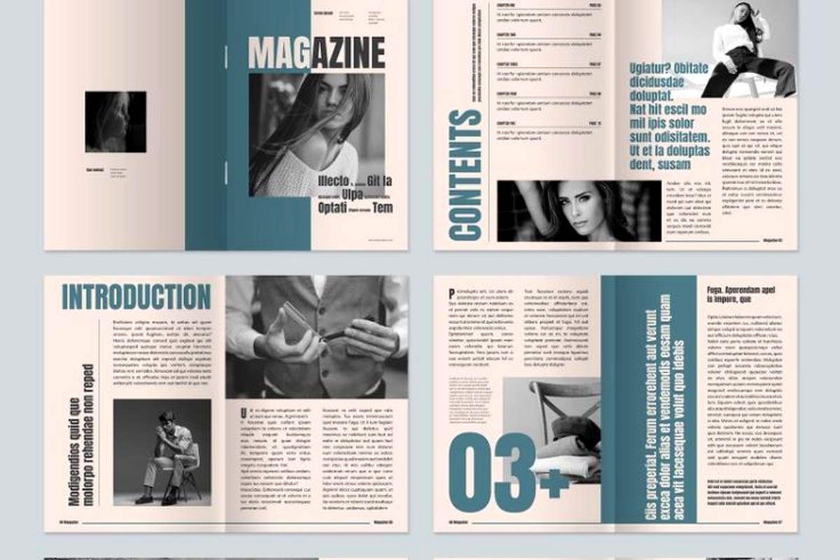
Interior Layout Secrets From Winners
Okay so the inside of your booklet is where most submissions fall apart. People nail the cover then just dump text onto pages with zero thought about flow or visual interest. Here’s what separates amateur from award-level:
Grid Systems
Every winning booklet I’ve analyzed uses an underlying grid. Usually 12 columns for flexibility. This lets you do interesting things with text blocks, pull quotes, and images without everything looking chaotic. I use a 12-column grid in InDesign for literally every booklet project now and it’s cut my design time in half because decisions about placement become automatic.
Chapter/Section Breaks
You gotta have visual variety. Award-winning mini books break up sections with:
- Full-page photos or illustrations between chapters
- Decorative page numbers that change style per section
- Headers that shift position (top left, then top right, creates rhythm)
- Pull quotes or callout boxes with different background colors
I was watching this documentary on design last week while formatting a client booklet and they talked about how the human eye needs “rest stops” in text-heavy content. That’s exactly what these breaks do. Without them, even a 40-page booklet feels exhausting to read.
Image Integration
This is where people either nail it or completely bomb. Images in award-winning booklets are never just dropped onto pages. They’re:
- Bled to the edge (no awkward white borders)
- Wrapped with text in intentional ways
- Consistently treated (all with rounded corners, or all sharp edges)
- High resolution – minimum 300 DPI, ideally higher
I submitted something once with mixed image treatments because I got lazy and reused assets from different projects. Didn’t even get shortlisted. Consistency is everything.
Paper and Production Quality
Okay so this matters more for physical award submissions but even for digital booklets, you need to design like it’ll be printed. Judges can tell when someone only thought about screen reading.
The booklets that win physical awards almost always use:
- Uncoated paper stock (70-80lb) for body pages
- Slightly heavier cover stock with matte finish
- Saddle-stitch binding for under 60 pages
- Perfect binding for anything thicker
Colors look completely different on uncoated versus glossy paper. If you’re designing for print awards, you need to do test prints. I know that sounds expensive but even one test print from a local shop will show you if your color choices actually work. I learned this the hard way with a booklet that looked amazing on screen but the blues turned muddy on uncoated stock.
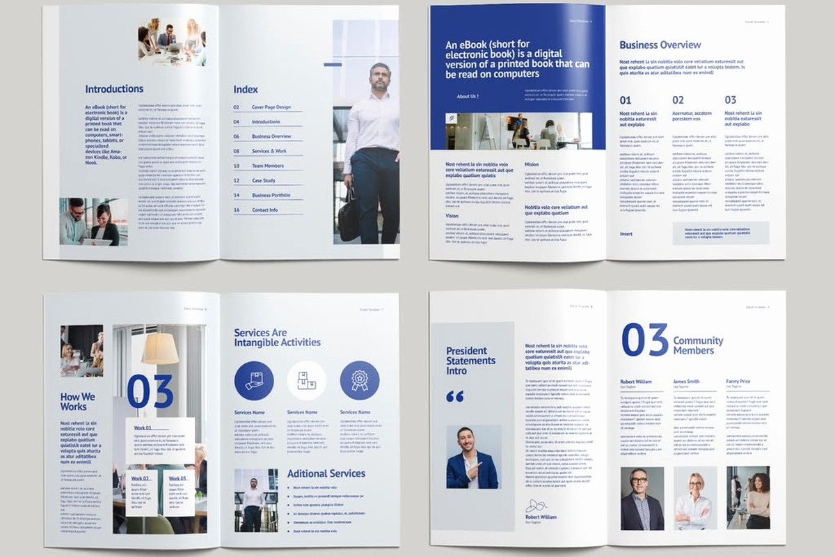
Content Structure That Judges Notice
The actual content organization matters for awards. It’s not just about looking pretty. Winners typically have:
Clear Hierarchy
- Title page that establishes tone immediately
- Table of contents even for short booklets (shows intentionality)
- Introduction that’s max one page
- 3-7 main sections with clear headers
- Conclusion or resources page
- Credits/about page with proper attribution
Oh and another thing – page numbering. Put it in a consistent spot but make it subtle. Bottom center or outer corners. Some designers get fancy with this but honestly simple usually wins.
The First Spread Rule
When you open a booklet, that first spread (pages 2-3 if page 1 is your title) needs to hook people. Award-winning designs use this spread for either:
- A stunning full-bleed image with minimal text
- A compelling quote or mission statement with interesting typography
- An infographic or visual that summarizes the booklet’s value
Never just start with dense text on page 2. I’ve judged maybe 200 booklets at this point and the ones that grab you on that first spread always score higher overall.
Details That Push Designs Into Award Territory
Okay so these are the tiny things that most people skip but judges absolutely notice:
Custom Icons: Don’t use stock icons everyone recognizes. Either create custom ones or heavily modify existing sets. Award submissions with generic Font Awesome icons rarely place.
Consistent Alignment: Everything should align to your grid. Seriously, everything. Judges will notice if your pull quote is 3 pixels off from your body text margin.
Proper Hyphenation: Turn on hyphenation in your design software but set it to avoid more than two consecutive hyphens. Ragged text looks amateur unless you’re going for a specific aesthetic.
Widows and Orphans: Eliminate them. A single line of a paragraph sitting alone at the top or bottom of a page looks sloppy. Adjust tracking or leading to fix this.
Folio Treatment: That’s fancy talk for page numbers and headers. Winners use subtle decorative elements here – thin lines, small icons, whatever fits the theme.
Software and Workflow
I’m gonna be honest, you probably need InDesign for award-level booklet design. I know Canva is tempting and I use it for quick client work sometimes, but the control you need for competition-worthy layouts… InDesign is the standard.
My actual workflow for an award submission:
- Rough layout in InDesign with placeholder text
- Design 3-4 different cover concepts
- Get feedback from other designers (not friends, they’ll just be nice)
- Refine interior with real content
- Test print or high-quality PDF review
- Adjust colors/spacing based on print test
- Final proofread with fresh eyes after 24 hours
That last step is crucial. I’ve caught embarrassing typos by just walking away and coming back the next day.
Common Mistakes That Kill Award Chances
Let me just rapid-fire the stuff that eliminates submissions immediately:
- Inconsistent margins throughout the booklet
- Mixed fonts that don’t have a clear purpose
- Low-resolution images stretched to fit
- Centered text for body copy (almost never works)
- Overly decorative fonts that sacrifice readability
- No clear visual hierarchy
- Ignoring the gutter in spread layouts
That last one gets people all the time. If you’re designing in spreads, you need extra margin space in the gutter (where pages meet) or text/images get lost in the binding.
Researching Previous Winners
This is gonna sound obvious but actually look at what won awards in previous years. Most design competitions publish winners online. I spent like three hours one night just going through the past five years of winners in booklet categories and the patterns become super clear.
Create a swipe file. I have a folder on my desktop with screenshots of award-winning covers, interior spreads, typography treatments, whatever stands out. Not to copy, but to understand what judges value. The trends shift slightly each year but quality fundamentals stay consistent.
Alright that’s pretty much everything I’ve learned from both judging and entering these competitions. The main takeaway is that award-winning booklet design isn’t about being trendy or flashy – it’s about intentional choices, consistency, and respecting your reader’s experience. Every element should have a reason for being there and should work with everything else on the page.
DISCOVER OUR FREE BEST SELLING PRODUCTS
Editable Canva Lined Journal: Express Your Thoughts – KDP Template
Lined Pages Journal 120 pages Ready to Upload PDF Commercial Use KDP Template 6×9 8.5×11 5×8 for Notebooks, Diaries, Low Content
Lined Pages Journal 120 pages Ready to Upload PDF Commercial Use KDP Template 6×9 8.5×11 5×8 for Notebooks, Diaries, Low Content
Cute Dogs Coloring Book for Kids | Activity Book | KDP Ready-To-Upload
Daily Planner Diary : Diary Planners for Everyday Productivity, 120 pages, 6×9 Size | Amazon KDP Interior
Wolf Coloring KDP interior For Adults, Used as Low Content Book, PDF Template Ready To Upload COMMERCIAL Use 8.5×11"
Coloring Animals Head Book for Kids, Perfect for ages 2-4, 4-8 | 8.5×11 PDF
Printable Blank Comic Book Pages PDF : Create Your Own Comics – 3 Available Sizes
Notes KDP interior Ready To Upload, Sizes 8.5×11 6×9 5×8 inch PDF FILE Used as Amazon KDP Paperback Low Content Book, journal, Notebook, Planner, COMMERCIAL Use
Black Lined Journal: 120 Pages of Black Lined Paper Perfect for Journaling, KDP Notebook Template – 6×9
Student Planner Journal 120 pages Ready to Upload PDF Commercial Use KDP Template 6×9" 8.5×11" for Low Content book
Recipe Journal Template – Editable Recipe Book Template, 120 Pages – Amazon KDP Interior