Amazon KDP guide, KDP book publishing
Cookbook Recipe Template: Individual Recipe Layout
Apr
Okay so the individual recipe layout is honestly where most people mess up their cookbooks and I see it constantly when people send me their drafts for feedback. You gotta think of each recipe page as its own standalone thing because readers don’t always go front to back, they’re flipping around looking for that one chicken dish or whatever.
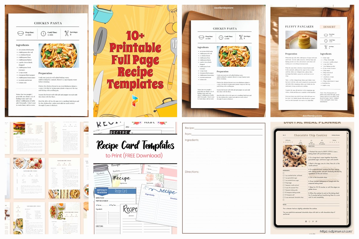
The basic structure I use now after testing like fifteen different formats is pretty straightforward but there’s nuance to it. At the top you want your recipe title, and this is gonna sound obvious but make it descriptive enough that someone knows what they’re making. “Chicken Dinner” is useless but “Garlic Herb Roasted Chicken with Lemon” tells them something. I usually do the title in whatever font matches my cookbook theme but make it at least 18-20pt so it’s readable.
Right under the title I always put a 2-3 sentence description. This is where you can get a tiny bit flowery but don’t go overboard because this isn’t a food blog from 2015. Something like “This quick weeknight pasta comes together in under 30 minutes and uses pantry staples. The creamy sauce has just the right amount of garlic without being overwhelming.” That kind of thing. It sets expectations and honestly helps with keywords if you’re doing ebook versions.
Then comes the metadata section and this is where template consistency really matters. I arrange mine like this:
Prep Time: however long
Cook Time: however long
Total Time: combined
Servings: number of people
Difficulty: Easy/Medium/Hard
Some people add calorie counts here and if you’re doing a diet-specific cookbook yeah you probably should, but for general cookbooks I skip it because the numbers can be legally tricky if you’re off. My lawyer friend mentioned something about liability once and I just… yeah I don’t include them unless it’s like a keto cookbook where people expect it.
The ingredients section needs to be crystal clear. I learned this the hard way when my mom tried making something from my first cookbook and called me confused because I’d written “flour” without specifying all-purpose. Now I’m super specific:
- 2 cups all-purpose flour
- 1 teaspoon baking powder
- ½ cup unsalted butter, softened
Notice how I put the quantity first, then the ingredient, then any prep notes in italics or after a comma. This matches how most professional cookbooks do it and there’s a reason – your eye naturally scans left to right and you want the measurement first when you’re gathering ingredients.
Oh and another thing, if a recipe has distinct sections like a crust and a filling, break up your ingredients list with subheadings. Like:
For the crust:
[ingredients]
For the filling:
[ingredients]
This seems small but it prevents people from accidentally mixing everything together when they shouldn’t.
The instructions section is where I see the most variation in what works. I’ve tested paragraph style, numbered steps, and bulleted steps. Numbered steps won hands down for user testing. People like being able to say “okay I’m on step 4” to their partner or whatever.
Each step should be ONE action or maybe two closely related actions. Don’t write “Preheat oven to 350°F, mix the dry ingredients in a large bowl, then cream the butter and sugar in a separate bowl until fluffy, about 3 minutes.” That’s three different steps and it’s overwhelming. Break it down:
- Preheat oven to 350°F and line a baking sheet with parchment paper.
- In a large bowl, whisk together flour, baking powder, and salt.
- In a separate bowl, cream butter and sugar until light and fluffy, about 3 minutes.
See how each one is digestible? I aim for steps that take roughly the same amount of time too, so people aren’t spending 30 seconds on step one and then 10 minutes on step two without warning.
Wait I forgot to mention the equipment list. Some templates include this and some don’t. I usually skip it for simple recipes but for anything that needs special equipment (stand mixer, food processor, specific pan sizes) I add a small equipment section right after the title or right before ingredients. Just a quick bulleted list so people know before they start if they even have what they need.
Temperature specifics matter more than you’d think. Always include both Fahrenheit and Celsius if you’re selling internationally, which you probably are if you’re on Amazon. I format it like “350°F (175°C)” right in the instruction step where it’s relevant.
For timing I learned to be realistic. My early cookbooks had prep times that assumed you were a cooking school graduate with everything pre-measured. Now I test with my friend Sarah who’s like… an average home cook, and I time HER. If she takes 15 minutes to prep, that’s what I write, not the 8 minutes it takes me after making the recipe fifty times.
This is gonna sound weird but I also include visual cues in the instructions now. Instead of just “cook until done” I write “cook until the edges are golden brown and the center is set but still slightly jiggly, about 25-30 minutes.” Give them something to LOOK for because everyone’s oven is different and times are approximations anyway.
Notes section at the bottom is optional but I almost always include one. This is where you put:
– Substitution suggestions
– Storage instructions
– Make-ahead tips
– Common mistakes to avoid
– Scaling information
I keep these as bullet points under a “Notes” or “Tips” heading. People actually read this section a lot because they’re looking for ways to modify recipes for what they have on hand.
The layout spacing is something nobody talks about but matters for readability. I leave decent white space between sections – at least one blank line between ingredients and instructions, between the title area and the description, all that. Cramped recipes look cheap and are harder to follow when you’re actually cooking with flour on your hands trying to find your place.
Oh and if you’re doing a print cookbook, consider whether the recipe fits on one page or spreads across two. Recipes that force you to flip the page mid-instruction are annoying. I try to keep each recipe contained on either one page or a two-page spread. Sometimes that means adjusting font size or spacing slightly but it’s worth it for user experience.
Photo placement is its own whole thing. I usually do one main photo either at the top taking up about 1/3 of the page, or on the opposite page if it’s a spread. Some templates have step-by-step photos which look great but are a TON more work. For low-content publishing I honestly skip those unless it’s a technique-heavy cookbook where visuals really help.
The styling should match your overall cookbook theme obviously. If you’ve got a rustic farmhouse vibe going, your recipe cards should feel cohesive with that. I use the same fonts, similar color schemes, maybe a subtle background texture or border that ties into the cover design.
One thing I tested recently was adding a difficulty rating system with little icons – like chef hats or spoons or whatever. People responded well to this in my survey but it adds design time so I only do it for premium cookbooks, not the quick $2.99 ones I pump out.
For dietary tags I’ll sometimes add little icons or text labels at the top near the title: [Vegetarian] [Gluten-Free] [Dairy-Free]. This helps people quickly scan if a recipe works for their needs without reading the whole ingredient list. But only tag what’s actually true – don’t say something’s gluten-free if you haven’t verified every ingredient including things like soy sauce which can contain wheat.
My cat just knocked over my coffee which is perfect timing I guess because I’m basically done with the main points. The last thing is consistency – whatever template layout you choose, stick with it for the ENTIRE cookbook. Don’t randomly change your format halfway through because you thought of something better. That looks unprofessional and confuses readers who’ve gotten used to your layout pattern.
I keep a master template file that I just duplicate and fill in for each new recipe. Saves time and ensures everything matches. The template has all the section headings, proper spacing, font sizes, everything locked in so I’m just swapping out the actual recipe content.
Test your template with a few recipes before you commit to doing your whole cookbook. Print them out or view them on different devices. Make sure the text is readable, the flow makes sense, nothing feels cramped or weirdly spaced. I’ve redone entire cookbook layouts because something looked fine on my computer but terrible on a Kindle.


DISCOVER OUR FREE BEST SELLING PRODUCTS
Editable Canva Lined Journal: Express Your Thoughts – KDP Template
Lined Pages Journal 120 pages Ready to Upload PDF Commercial Use KDP Template 6×9 8.5×11 5×8 for Notebooks, Diaries, Low Content
Lined Pages Journal 120 pages Ready to Upload PDF Commercial Use KDP Template 6×9 8.5×11 5×8 for Notebooks, Diaries, Low Content
Cute Dogs Coloring Book for Kids | Activity Book | KDP Ready-To-Upload
Daily Planner Diary : Diary Planners for Everyday Productivity, 120 pages, 6×9 Size | Amazon KDP Interior
Wolf Coloring KDP interior For Adults, Used as Low Content Book, PDF Template Ready To Upload COMMERCIAL Use 8.5×11"
Coloring Animals Head Book for Kids, Perfect for ages 2-4, 4-8 | 8.5×11 PDF
Printable Blank Comic Book Pages PDF : Create Your Own Comics – 3 Available Sizes
Notes KDP interior Ready To Upload, Sizes 8.5×11 6×9 5×8 inch PDF FILE Used as Amazon KDP Paperback Low Content Book, journal, Notebook, Planner, COMMERCIAL Use
Black Lined Journal: 120 Pages of Black Lined Paper Perfect for Journaling, KDP Notebook Template – 6×9
Student Planner Journal 120 pages Ready to Upload PDF Commercial Use KDP Template 6×9" 8.5×11" for Low Content book
Recipe Journal Template – Editable Recipe Book Template, 120 Pages – Amazon KDP Interior