Amazon KDP guide, KDP book publishing
KDP Print Cover Template: Physical Book Design
Mar
Okay so the KDP print cover template thing trips up literally everyone at first and I just walked someone through this yesterday while my cat was knocking over my coffee so lemme break down what actually matters.
Getting the Right Template Dimensions
First thing you gotta do is figure out your page count because that determines spine width and KDP’s calculator needs exact numbers. Go to the KDP cover calculator on their site and punch in your trim size, page count, and paper type. Most people do 6×9 which is standard for non-fiction and novels, but I’ve done everything from 5×8 to 8.5×11 depending on the project.
The white paper is thinner than cream so your spine width changes. I learned this the hard way on book #23 or something when I used the wrong paper type in the calculator and my cover came back with text wrapping onto the spine weird. Not a fun reupload situation.
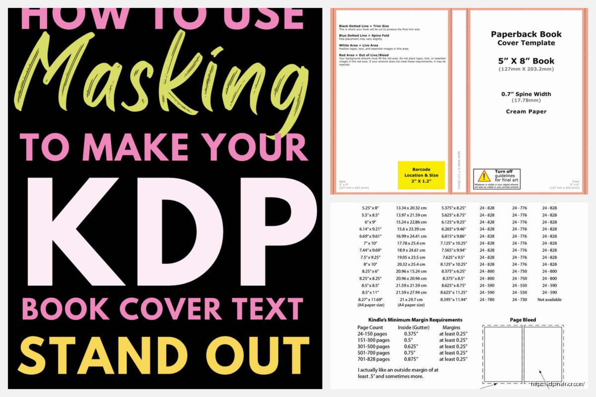
Download that PDF template they generate. It’ll have bleed areas marked in pink or red usually, safe zones in blue, and the spine area clearly marked. Don’t ignore those lines even though they’re annoying.
Bleed and Safe Zones Actually Matter
So the bleed is 0.125 inches on all sides for paperbacks. That means your background images or colors need to extend past where the actual trim happens. If you don’t do this you get white edges where the cutting blade doesn’t line up perfectly and it looks super unprofessional.
The safe zone is 0.125 inches INSIDE the trim line. Keep all your text and important design elements inside this zone or they might get cut off. I’ve seen people put their author name right at the edge and then half of it disappears after printing. KDP’s machinery isn’t precise enough to risk it.
Spine Width Calculation
This is where it gets finicky. Your spine width depends on page count times the paper thickness. For white paper it’s roughly 0.002252 inches per page, cream is 0.0025 inches per page. But honestly just use their calculator because doing math at 11pm when you’re trying to finish a cover leads to mistakes.
If your book is under 72 pages you can’t even have spine text which is kinda annoying but makes sense since there’s no room. I usually hit around 120+ pages before I bother putting anything on the spine besides maybe the title.
Software Options That Actually Work
I use Photoshop but that’s expensive if you’re just starting out. Canva Pro works fine and they actually have KDP cover templates built in now which is convenient. GIMP is free and does the job if you can handle the learning curve.
Wait I forgot to mention – whatever software you use needs to export at 300 DPI minimum. 72 DPI looks fine on screen but prints blurry and awful. Set your document to 300 DPI from the start or you’ll have to redo everything.
For a 6×9 book with let’s say 200 pages, your total cover dimensions are gonna be around 12.6 inches wide by 9.25 inches tall including bleed. The template tells you exact numbers but that’s the ballpark.
Design Elements and What Converts
Okay so funny story, I spent like three weeks designing this super artistic cover with watercolors and hand lettering for a journal and it sold terribly. Then I made a simple text-based cover in 45 minutes and that one actually moved copies. The thumbnail view on Amazon is everything.
Your title needs to be readable at thumbnail size. Like actually zoom out and check. If you can’t read it at 500px wide on your screen, nobody’s clicking it. I usually make my main title text way bigger than feels natural in the design because it needs to pop.
Front Cover Priorities
Title should be top third or center depending on your design. Subtitle if you have one goes underneath but smaller. Author name goes at the bottom usually. Don’t put it at the top unless you’re already famous.
Images or graphics should support the genre expectations. If you’re doing a cookbook your cover better have food on it. Low content planners need to show the planning pages somehow or at least suggest organization visually. I see people get creative with genres where they shouldn’t and then wonder why sales are flat.
Back Cover Layout
This is where you put your book description, author bio, and barcode space. Oh and another thing – KDP automatically adds the barcode so you need to leave a 2×1.2 inch white rectangle in the lower right corner of the back cover. If you put design elements there they’ll get covered up.
I usually do a shortened version of my Amazon description on the back, maybe 150-200 words max. Some bullet points of what’s inside. A short author bio if it’s relevant. Keep everything in the safe zone here too.
Spine Design Basics
If your book is thick enough for spine text, center it vertically and make sure it reads top to bottom when the book is laying face-up. That’s standard in the US market. Some European books go bottom to top but don’t do that for KDP.
Font size on the spine depends on width but I usually go with whatever fits comfortably with a bit of breathing room. You don’t want text touching the edges of the spine area because slight misalignment during printing will make it wrap onto the front or back cover.
Just title and author name usually. Maybe a small logo or publisher mark if you have one but keep it minimal.
Color Profiles and Technical Stuff
This is gonna sound weird but you need to use CMYK color mode not RGB. Printers use CMYK so if you design in RGB your colors will shift when it prints. That bright red you picked might come out more burgundy.
I learned this around book #15 when my “sunshine yellow” cover printed as mustard yellow and looked terrible. Now I always convert to CMYK before finalizing anything.
Some colors just don’t print well. Bright blues and purples can look muddy. If color accuracy is critical order a proof copy before you publish. It’s like $5 plus shipping and you can check the actual printed result.
File Format and Upload Requirements
Export as PDF for best results. Make sure you flatten all layers and embed fonts. KDP accepts other formats but PDF processes most reliably in my experience.
File size limit is 40MB which sounds like a lot but if you’re using high-res images it adds up fast. Compress your images before importing them into your design. I use TinyPNG or similar tools to get file sizes down without losing visible quality.
When you upload KDP’s previewer will show you a 3D mockup. Actually click through and check every page of that preview because sometimes things shift or fonts don’t embed properly. I caught a weird spacing issue once where my subtitle had disappeared entirely in the upload even though my file was fine.
Common Mistakes I See Constantly
Using the wrong template for your actual specs. Double check your page count is exact before downloading the template. Adding even 10 pages changes the spine width.
Not extending backgrounds to the bleed line. This one shows up immediately when the book prints.
Putting important text too close to edges. The safe zone exists for a reason and cutting tolerances are like a quarter inch sometimes.
Low resolution images that look fine on screen. Zoom to 100% in your design software and if it looks pixelated it’ll print pixelated.
Forgetting the barcode space. KDP will reject your cover or cover their barcode placement over your design elements.
Using fonts that don’t embed properly. Stick to standard fonts or make sure you have full licensing and embedding rights. Google Fonts are usually safe.
Testing Your Cover Design
Before you finalize anything, view your front cover at Amazon thumbnail size. Like literally resize it to 500px wide and see if you can read the title and understand the genre at a glance. If not, simplify or increase text size.
Print your cover template at actual size if you can. Most home printers do 8.5×11 so you won’t fit the whole thing but you can tile it or print sections to check text sizing and spacing. This helped me catch awkward spacing on spines before.
Look at your cover in grayscale. If it doesn’t have enough contrast in black and white the colors might not be distinct enough. Some monitors make colors look more separated than they really are.
Working With Pre-Made Templates
If you’re buying covers from Creative Fabrica or Book Bolt or wherever, make sure they specify KDP compatibility and provide the right dimensions. Some templates are for ebooks only or different platforms.
You’ll still need to adjust the template to your specific page count usually. The spine width is almost never gonna match exactly unless you get lucky. So you gotta move the back cover elements and adjust the spine in Photoshop or whatever you’re using.
Check the licensing before you publish. Most stock photos and templates are fine for commercial use but read the terms. I almost used a template once that was only for personal projects and caught it right before uploading.
Proof Copies Are Worth It
Seriously just order a proof copy before you make the book live. It costs maybe $5-8 depending on page count and you get to hold the actual physical product. Colors might be different than your screen. The paper texture affects how images look. Sometimes the cover feels too glossy or too matte and you wanna switch.
I’ve caught typos in proof copies that I missed on screen somehow. The physical format makes your brain read differently I guess.
Shipping takes like a week usually so factor that into your timeline. But it’s way better than publishing and then getting a bad review because your cover has issues you didn’t catch.
Oh and another thing – if you order a proof and then make changes, order another proof. I skipped this once thinking “oh I just fixed a small color thing” and it shifted my whole layout somehow. Had to unpublish and fix it after someone bought a messed up copy.
Quick Dimension Reference
For 6×9 books which is what most people do:
– 100 pages: roughly 12.18 inches wide total cover
– 200 pages: roughly 12.62 inches wide total cover
– 300 pages: roughly 13.06 inches wide total cover
Those include bleed on both sides. Height stays 9.25 inches with bleed for 6×9 trim.
For 8.5×11 workbooks or planners the covers get big, like 17+ inches wide depending on page count. Make sure your printer can handle the template size before you start designing.
The KDP calculator gives you exact numbers so use that every single time. Don’t assume dimensions from a previous book will work.
Anyway that’s the main stuff that actually matters from doing this like 200+ times. The interface looks complicated at first but once you’ve done two or three covers you get the workflow down and it goes faster each time.
DISCOVER OUR FREE BEST SELLING PRODUCTS
Editable Canva Lined Journal: Express Your Thoughts – KDP Template
Lined Pages Journal 120 pages Ready to Upload PDF Commercial Use KDP Template 6×9 8.5×11 5×8 for Notebooks, Diaries, Low Content
Lined Pages Journal 120 pages Ready to Upload PDF Commercial Use KDP Template 6×9 8.5×11 5×8 for Notebooks, Diaries, Low Content
Cute Dogs Coloring Book for Kids | Activity Book | KDP Ready-To-Upload
Daily Planner Diary : Diary Planners for Everyday Productivity, 120 pages, 6×9 Size | Amazon KDP Interior
Wolf Coloring KDP interior For Adults, Used as Low Content Book, PDF Template Ready To Upload COMMERCIAL Use 8.5×11"
Coloring Animals Head Book for Kids, Perfect for ages 2-4, 4-8 | 8.5×11 PDF
Printable Blank Comic Book Pages PDF : Create Your Own Comics – 3 Available Sizes
Notes KDP interior Ready To Upload, Sizes 8.5×11 6×9 5×8 inch PDF FILE Used as Amazon KDP Paperback Low Content Book, journal, Notebook, Planner, COMMERCIAL Use
Black Lined Journal: 120 Pages of Black Lined Paper Perfect for Journaling, KDP Notebook Template – 6×9
Student Planner Journal 120 pages Ready to Upload PDF Commercial Use KDP Template 6×9" 8.5×11" for Low Content book
Recipe Journal Template – Editable Recipe Book Template, 120 Pages – Amazon KDP Interior