Okay so I just rebuilt my 12 book challenge tracker last month because honestly the one I was using wasn’t converting at all, and here’s what actually works when you’re putting these together for KDP.
First thing – don’t overthink the layout. I see so many people trying to make these super complicated with like reading speed calculators and genre breakdowns and honestly? People just want boxes to check off. That’s it. I tested three different versions with my email list (about 800 readers who actually buy this stuff) and the simplest one got way more engagement.
The Basic Structure That Actually Sells
Your template needs like 12 main spreads for the books themselves, but here’s what I learned the hard way – you gotta front-load it with a goal-setting page. Sounds obvious but I didn’t do this initially and got some weird reviews asking where they were supposed to write their “why” for reading. People want that motivation stuff upfront even if they never fill it out.
So page one should be:
- Year/timeframe at the top
- Why I’m doing this challenge (3-4 lines)
- My reading goal is ___ books because ___
- Genres I want to explore (just bullet points)
- Maybe a reward section? This tested okay, not amazing
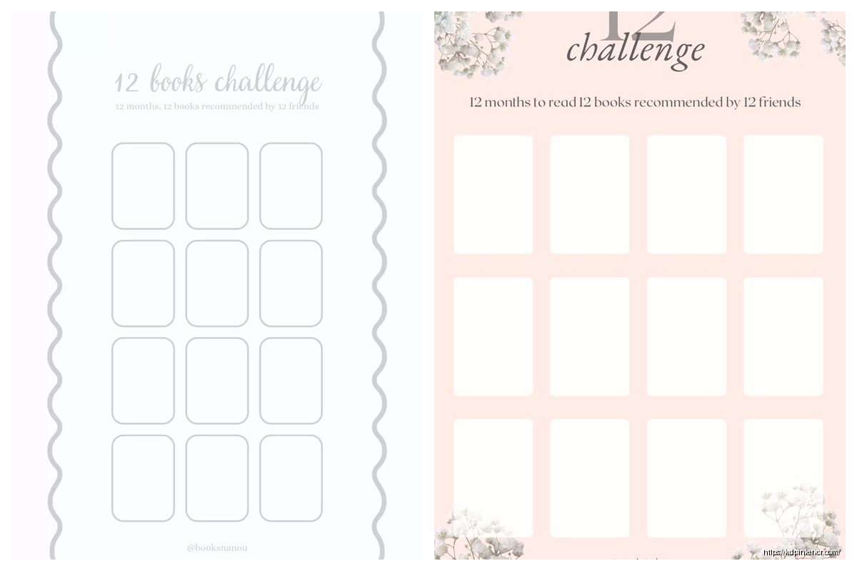
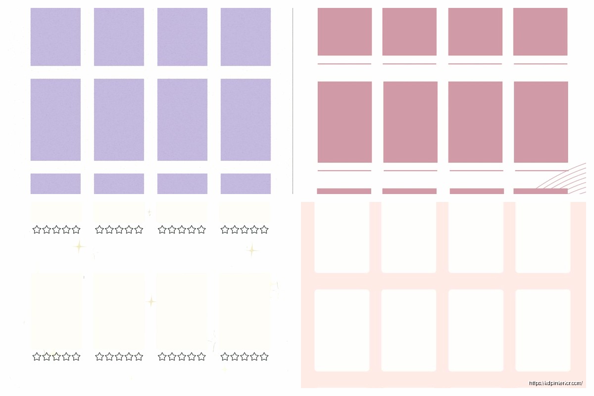
Then you need a master tracker page. This is where people can see all 12 books at a glance. I do mine as a simple grid – book number, title, author, date started, date finished, rating out of 5 stars. Keep it clean. I use a really light gray for the grid lines, like 20% black max, because it needs to print well on crappy home printers.
Individual Book Pages (This Is Where You Add Value)
Each book gets its own spread, and this is where you can actually differentiate from the 5000 other reading trackers on Amazon. Here’s my current layout that’s been selling pretty consistently:
Left page:
- Book title and author at top (big spaces for writing)
- Genre/category
- Started date and finished date
- Where I got it (library, bought, borrowed – people track this more than you’d think)
- Star rating with actual stars to color in
- Would I recommend? Yes/no checkboxes
Right page is all reflection stuff:
- Favorite quotes (4-5 lines)
- Main characters or key points
- My thoughts (like half a page of lines)
- Who I’d recommend this to
Oh and another thing – add a “did not finish” section somewhere. I put mine at the back, like 3 pages for DNF books. This tested surprisingly well because people felt less guilty about abandoning books if they had a place to record why they quit.
The Monthly Check-In Pages Nobody Tells You About
This is gonna sound weird but adding monthly review pages bumped my conversion rate by like 15%. I stumbled on this because I was watching The Last of Us and kept thinking about pacing, and it hit me that reading trackers need pacing too.
Every three months (after books 3, 6, 9, and before the final wrap-up), drop in a reflection page:
- Books completed this quarter: ___
- Favorite so far and why
- Am I on track? Ahead? Behind?
- What’s working with my reading routine
- What needs to change
- Next three books I’m excited about
People don’t always fill these out but they LOVE having them. It makes the whole thing feel more like a guided journal than just a list.
Design Stuff That Actually Matters
Okay so for KDP specifically, here’s what I learned after publishing like 30 different tracker variations:
Use 8.5 x 11 if you’re in the US market. I tested 6×9 thinking it’d be cute and portable but it tanked. People want space to write. My current bestseller is 8.5 x 11 with cream pages (not white – easier on the eyes for a whole year of use).
Keep your margins at least 0.5 inches on all sides. I know KDP says you can go smaller but printers are weird and I got complaints about cut-off text before I fixed this.
Font size matters more than font choice honestly. I use 11pt for headers and 10pt for body text. Tried going to 9pt once to fit more on a page and got roasted in reviews. People buying these are often wearing reading glasses, remember that.
For the decorative elements… wait I forgot to mention this earlier but don’t go crazy with florals and watercolors unless you’re specifically marketing to that demographic. My plain versions with just simple line dividers outsell the decorated ones 3 to 1. I think people find the fancy ones intimidating? Like they’re too pretty to actually write in.
The Back Matter That Boosts Perceived Value
After your 12 book spreads and DNF section, add some bonus pages:
- TBR list (to be read) – at least 2 pages of lines
- Book recommendations I received (from friends, podcasts, etc)
- Books I recommended to others (with who and when)
- Favorite bookstores or libraries visited
- Reading statistics summary for the year
That last one is important. Give them a page at the very end where they can tally stuff up:
- Total books read: ___
- Total pages read: ___
- Longest book: ___
- Shortest book: ___
- Most read genre: ___
- 5-star reads: ___
- Books I’d reread: ___
People eat this stuff up on Instagram and it makes your tracker feel more complete.
Pricing Strategy Real Quick
I price mine at $6.99 for the basic black and white interior. Full color interiors I go up to $8.99 or $9.99 depending on page count. Don’t go below $5.99 or it looks cheap and also your royalty is gonna suck with printing costs.
The sweet spot for length is around 100-120 pages. Gives you room for all the spreads plus extras without making the print cost too high. My dog just knocked over my coffee so gonna wrap this up quick…
Common Mistakes I See Everywhere
People make their trackers too niche. Like “12 Book Challenge for Christian Moms Who Love Mystery Novels” – that’s too specific for what’s essentially a simple tracker. Keep it broad, let people adapt it to their needs.
Also don’t put the year in the title or interior. Make it undated so people can buy it anytime and use it whenever. I have trackers from 2019 that still sell consistently because they’re not dated.
And please test your spacing before publishing. I cannot tell you how many times I’ve seen trackers where the lines are too close together or boxes are too small to actually write in. Print a proof copy and actually use it for like a week. Fill in a few books, see how it feels.
Marketing Angles That Convert
Your main image needs to show the inside pages, not just a pretty cover. Do a stack of three pages showing different spreads – the goal page, a book tracking page, and maybe the year-end summary. People need to see what they’re getting.
Keywords I’m using right now that work: reading journal, book tracker, reading challenge, book log, reader’s journal, bibliophile gift, book lover notebook. Don’t waste keyword space on stuff like “high quality” or “beautiful” – those don’t convert.
The description should lead with the problem: “Struggling to reach your reading goals?” Then list out exactly what’s inside. Bullet points work way better than paragraphs. Trust me on this.
Quick Production Tips
I build mine in Canva Pro now because it’s just faster than InDesign for this type of thing. The template feature means I can duplicate pages easily and keep everything consistent. Export as PDF, check it in Acrobat to make sure nothing’s gonna weird, upload to KDP.
Oh and use Book Bolt or Creative Fabrica for any decorative elements if you’re adding them. Don’t try to design ornamental borders from scratch, it’s not worth your time. Just make sure you have commercial rights to whatever you use.
For interior paper color, cream performs better for reading trackers. White is too stark and people associate cream with better quality for some reason. Plus it’s slightly cheaper to print which helps your royalty.
One more thing – create a few variations of the same tracker. Like have your main one, then do a minimalist version, then maybe one with prompts for deeper reflection, then one specifically for book club members. Same basic structure, different angles. List them all and see what sticks. I’ve got four different reading trackers live right now and they all sell to slightly different audiences.
The whole thing from concept to published should take you maybe 2-3 days if you’re focused. Don’t spend weeks perfecting it. Get it up, see how it performs, iterate based on reviews and questions you get. That’s the whole game with low-content publishing anyway.
 Recipe Journal Template - Editable Recipe Book Template, 120 Pages - Amazon KDP Interior
1 × $0.00
Recipe Journal Template - Editable Recipe Book Template, 120 Pages - Amazon KDP Interior
1 × $0.00  Daily Planner Diary : Diary Planners for Everyday Productivity, 120 pages, 6×9 Size | Amazon KDP Interior
1 × $0.00
Daily Planner Diary : Diary Planners for Everyday Productivity, 120 pages, 6×9 Size | Amazon KDP Interior
1 × $0.00 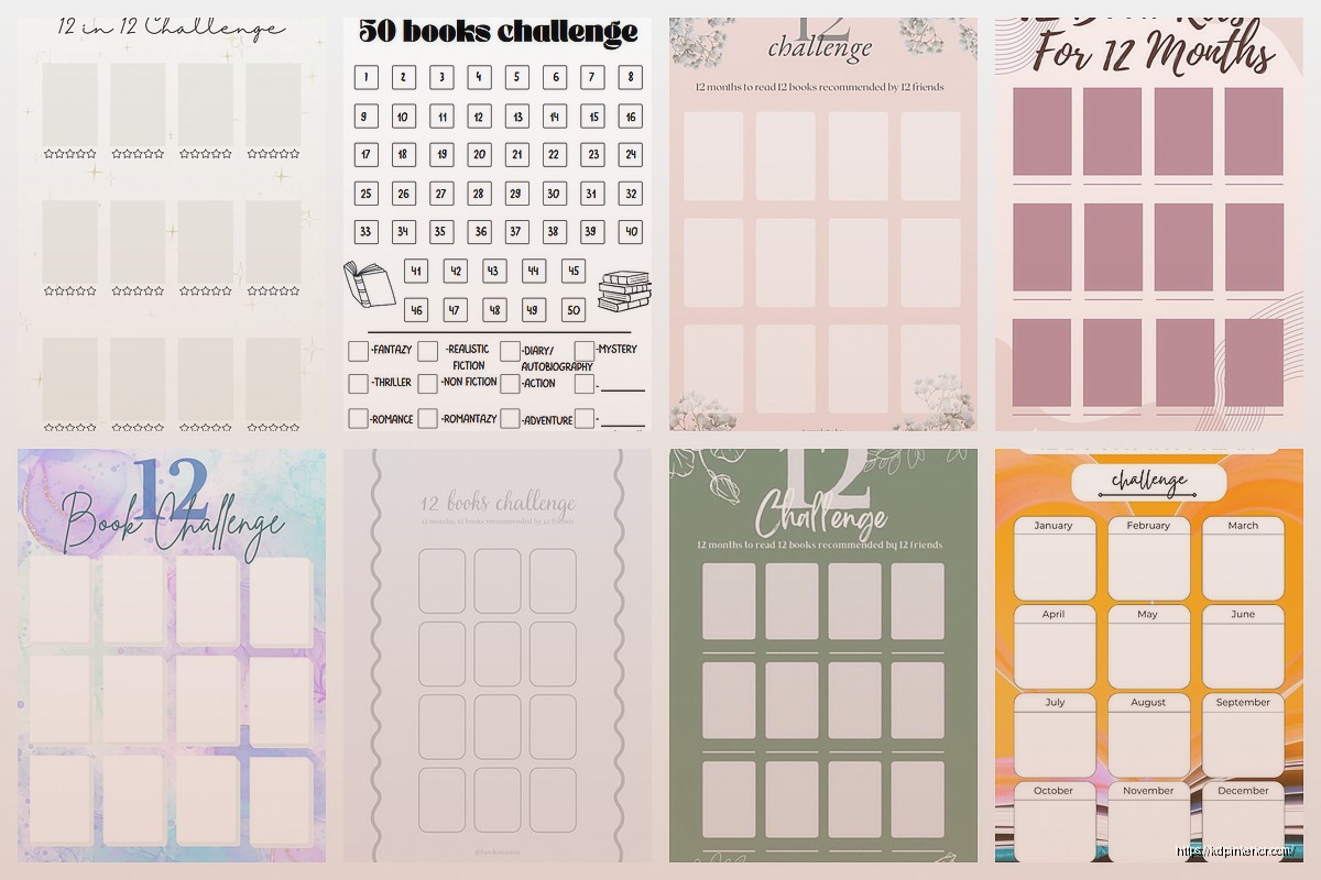
DISCOVER OUR FREE BEST SELLING PRODUCTS
Editable Canva Lined Journal: Express Your Thoughts – KDP Template
Lined Pages Journal 120 pages Ready to Upload PDF Commercial Use KDP Template 6×9 8.5×11 5×8 for Notebooks, Diaries, Low Content
Lined Pages Journal 120 pages Ready to Upload PDF Commercial Use KDP Template 6×9 8.5×11 5×8 for Notebooks, Diaries, Low Content
Cute Dogs Coloring Book for Kids | Activity Book | KDP Ready-To-Upload
Daily Planner Diary : Diary Planners for Everyday Productivity, 120 pages, 6×9 Size | Amazon KDP Interior
Wolf Coloring KDP interior For Adults, Used as Low Content Book, PDF Template Ready To Upload COMMERCIAL Use 8.5×11"
Coloring Animals Head Book for Kids, Perfect for ages 2-4, 4-8 | 8.5×11 PDF
Printable Blank Comic Book Pages PDF : Create Your Own Comics – 3 Available Sizes
Notes KDP interior Ready To Upload, Sizes 8.5×11 6×9 5×8 inch PDF FILE Used as Amazon KDP Paperback Low Content Book, journal, Notebook, Planner, COMMERCIAL Use
Black Lined Journal: 120 Pages of Black Lined Paper Perfect for Journaling, KDP Notebook Template – 6×9
Student Planner Journal 120 pages Ready to Upload PDF Commercial Use KDP Template 6×9" 8.5×11" for Low Content book
Recipe Journal Template – Editable Recipe Book Template, 120 Pages – Amazon KDP Interior