Okay so I just spent like three hours yesterday messing with Book Brush and Canva trying to get mockups that don’t look like garbage and here’s what actually works…
The thing nobody tells you is that 3D mockups are stupidly important for Amazon ads and your author website but most people use the wrong tools or make them look super fake. I learned this the hard way when my first romance series had covers that looked like they were floating in the void with weird shadows.
Why You Actually Need These Things
So your flat 2D cover is fine for the Amazon listing itself but when you’re running Facebook ads or building an email sequence or whatever, people scroll past flat images. Their brains just don’t register them as “real books” anymore. The 3D mockup tricks the brain into thinking it’s an actual physical object you can pick up, which sounds dumb but my click-through rates literally doubled when I switched from flat covers to 3D ones in my ads.
I use them for:
- Facebook and Amazon ads (the big one)
- Instagram posts when I’m promoting a new release
- My author website header
- Email newsletters – people actually click more
- Promo graphics for BookBub or other deal sites
The conversion difference is real. I tested this with my puzzle book series last year and the 3D mockups got 2.3x more clicks with the same ad spend.
The Tools That Don’t Suck
Alright so there’s basically three tiers here and you gotta pick based on your budget and how much you care about customization.
Book Brush (My Main Tool)
I use Book Brush probably 80% of the time now. It’s like $10/month or something and you can cancel whenever. The 3D mockup tool is stupidly easy – you literally upload your flat cover, pick a mockup style, and it generates it in like 30 seconds.
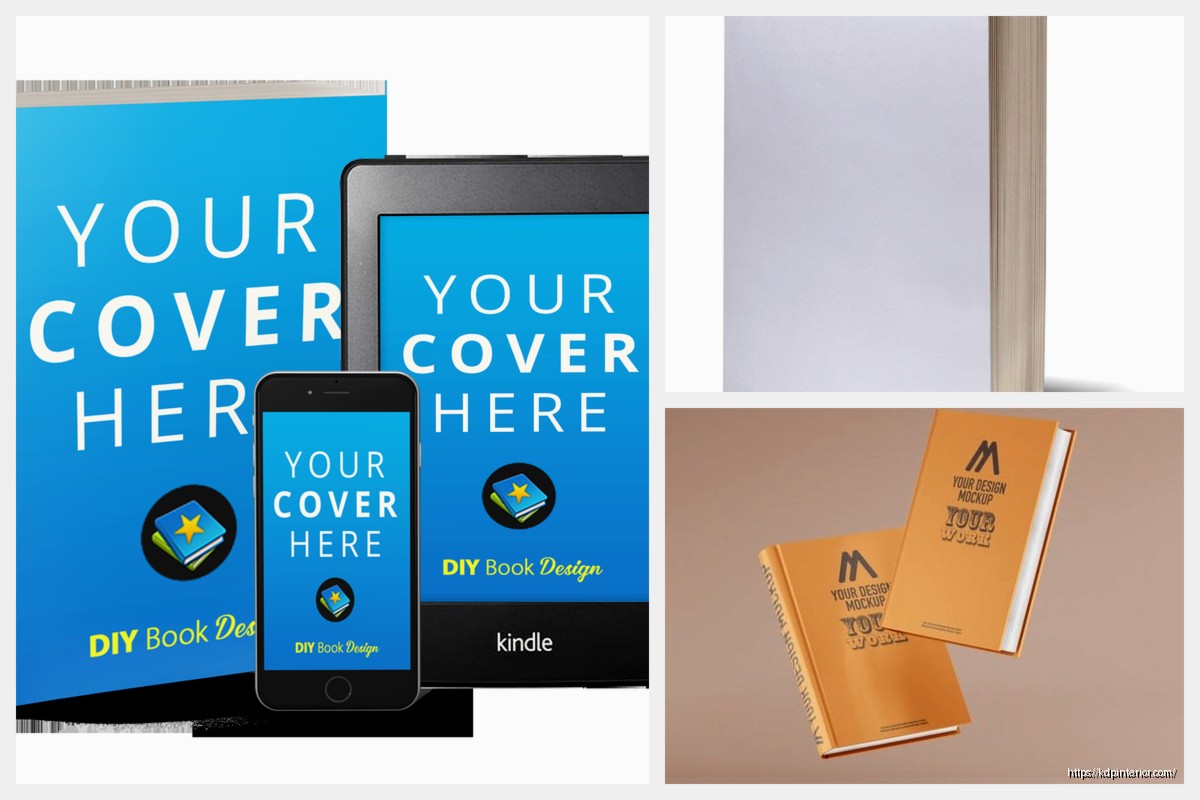
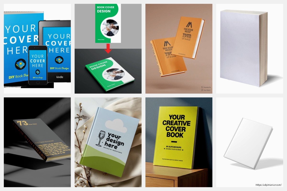
The templates are actually good. They have paperbacks, hardcovers, ebooks on tablets and phones, even stack configurations where you can show a series of 3-4 books together. That stacked look works crazy well for box set promos.
One annoying thing is the shadows can look a bit generic if you don’t tweak them, but there’s a shadow intensity slider that helps. I usually dial it down to like 60-70% so it doesn’t look like the book is floating under a spotlight.
Oh and another thing – Book Brush has these “scene” mockups where your book is sitting on a desk with coffee or whatever. I thought those would be cheesy but they actually perform really well on Instagram. My cozy mystery covers in the “reading nook” scene got way more engagement than I expected.
Canva
Canva added 3D book mockups maybe a year ago? They’re fine. Not as good as Book Brush for pure book mockups but if you’re already paying for Canva Pro for other design stuff, you might as well use them.
The workflow is slightly more annoying – you have to use their “Smart Mockup” feature and sometimes it doesn’t map your cover correctly if the dimensions are weird. I had this issue with a square children’s book where it kept stretching the image wrong.
But Canva is better if you want to build a whole promotional graphic around the mockup. Like if you want text overlays, background images, that sort of thing. I made a pretty decent “Now Available” graphic for a book launch using Canva’s mockup + their text tools.
The free version of Canva has like three mockup options which is basically useless, so you need Pro for this to be worth it.
Placeit (For When You Need Something Specific)
Placeit is owned by Envato and it’s either $15/month subscription or you pay per mockup (like $8 each which is insane). I only use this when I need something really specific that Book Brush doesn’t have.
They have thousands of mockup scenes. Books in someone’s hands, books on bookshelves, books at the beach, whatever. The quality is genuinely better than most tools – they use actual photography with smart object layers, so the lighting and shadows look realistic.
The problem is it’s expensive if you’re doing this regularly. I bought a month subscription last summer when I was launching a big series and needed like 20 different mockups for a whole campaign, but I cancelled right after.
Wait I forgot to mention – Placeit also does video mockups which is kinda cool. Like you can make a short video of pages turning or a book rotating. I used one for a TikTok ad and it did okay, but honestly static images still perform better for me most of the time.
The Technical Stuff Nobody Explains
Okay so your cover file matters way more than you think. Most 3D mockup tools want a flat 2D cover at specific dimensions.
For paperback mockups, you usually just need the front cover isolated. That should be at least 1600px on the shortest side, ideally 2400px or higher. If your cover is too small, the mockup will look blurry and pixelated, which defeats the whole purpose.
I export my covers from Photoshop or get them from my designer as high-res JPGs or PNGs. PNG is better if your cover has any transparency but honestly for most book covers JPG works fine and the file size is smaller.
Dimensions Get Weird
This is gonna sound weird but… the aspect ratio matters for how the 3D mockup bends the image. Book Brush and Canva both work best with standard Amazon KDP trim sizes.
For a typical 6×9 paperback, your front cover should be 1800x2700px (which is 6×9 at 300 DPI). If you’re doing a hardcover mockup, same deal.
Ebook mockups are different – they usually want a standard ebook cover ratio, which is usually 2:3 (like 1600x2400px). Most ebook covers are already in this ratio so you’re probably fine.
I screwed this up once with a wide format coloring book (8.5×11) and the mockup tool stretched it all weird. Had to manually adjust the perspective in Photoshop after exporting which was a pain.
Making Them Look Less Fake
The default mockup almost always looks too perfect and shiny. Real books have texture and they don’t reflect light like plastic toys. Here’s what I do to make them look better:
Adjust the lighting: Most tools let you tweak highlights and shadows. I usually reduce the highlight intensity by 20-30% so the cover doesn’t look like it’s made of glass.
Add slight wear if it makes sense: Some tools (especially Placeit) have options to add subtle texture or wear. This works great for like thriller or mystery books where you want a slightly used look, but don’t overdo it.
Background matters more than the book: A clean white background is fine for ads but looks boring on social media. I usually add a subtle gradient or use one of those blurred bookshelf backgrounds. Book Brush has a bunch of these built in.
Context sells: If you can show the book in a scene (on a table, in someone’s hands, next to a coffee mug), it performs way better than just a floating book. This is where Placeit shines but Book Brush has some scene options too.
The Shadow Problem
Shadows are what make or break a mockup looking realistic. Too dark and it looks like the book is in a cave. Too light and it looks like it’s floating.
I usually go for a soft shadow at about 40-50% opacity, positioned slightly to the bottom-right. That mimics natural indoor lighting pretty well.
Book Brush’s auto shadows are honestly pretty good now. They used to be terrible like two years ago but they updated something. Canva’s shadows are hit or miss – sometimes they look great, sometimes they look like a kid drew them in MS Paint.
My Actual Workflow
Okay so here’s what I do when I’m launching a new book and need marketing graphics:
- Get the final cover from my designer as a high-res PNG (front cover only, isolated)
- Open Book Brush and upload the cover
- Create 3-4 different mockup variations: standing paperback, angled paperback, ebook on phone, and maybe a stacked version if it’s part of a series
- Export all of them as high-res PNGs with transparent backgrounds
- Import into Canva and build out full promo graphics with text overlays, backgrounds, etc.
- Export different sizes for different platforms (square for Instagram, wide for Facebook ads, etc.)
The whole process takes maybe 30 minutes once you’ve done it a few times. I batch this stuff – when I have 3-4 books launching in a quarter, I’ll spend an afternoon making all the mockups at once.
My cat keeps walking on my keyboard while I’m doing this which is why I now save every 5 minutes obsessively…
For Amazon Ads Specifically
Amazon Sponsored Products ads work best with clean, simple mockups. I use a standing paperback mockup on a white or very light gray background. No fancy scenes, no extra text (Amazon already adds your title and stuff).
The important thing is the mockup needs to be eye-catching in a tiny thumbnail. That means good contrast and a clear view of the cover. Angled mockups work better than straight-on ones because they show dimension even when the image is small.
I export these at 1200x628px for Amazon ads. Technically you can go bigger but the file size gets annoying and Amazon compresses everything anyway.
Series Mockups Are Goldmines
If you have a series (and if you’re doing low-content or publishing regularly, you should), series stack mockups are insanely valuable for marketing.
Book Brush lets you stack up to 5 books in one mockup. I use this for:
- Box set promotions
- Email newsletter headers showing all books in a series
- Facebook ads for “read the whole series” campaigns
- Author website series pages
The trick is making sure the spines are visible if you’re doing a side-by-side stack. Some mockup tools hide the spines which looks weird. You want readers to see it’s a series of multiple books, not just one thick book.
I tested this last year with my puzzle book series – a single book mockup vs. a 3-book stack mockup in the same ad. The stack got 40% more clicks. People like seeing there’s more content available I guess.
Free Options If You’re Broke
Look, if you’re just starting out and literally cannot spend $10/month on Book Brush, there are free options but they’re gonna be more work.
DIY in Canva Free: You can manually create a 3D effect using shapes and shadows but it takes forever and looks okay at best. I did this for my first few books and it’s not worth your time honestly.
Mockup Generator (website): There’s a free tool called Mockup Generator that has basic book mockups. The quality is meh and you can’t customize much, but it’s free. You upload your cover and it spits out a mockup. Good enough for starting out.
Photoshop if you’re a masochist: If you know Photoshop, you can find free mockup templates (Smart Objects) on places like GraphicBurger or Freepik. You download the PSD file, replace the smart object with your cover, and export. This actually gives you the most control but the learning curve is steep.
I used free mockups for probably my first 20 books until I was making enough money to justify paying for tools. No shame in starting free, but upgrade as soon as you can because it saves so much time.
The Quality Threshold
Here’s the thing – readers can tell when your marketing looks cheap. They might not consciously notice, but a blurry or obviously fake mockup signals “unprofessional” which signals “bad book.”
I’m not saying you need Hollywood-level graphics, but your mockups should look clean and clear, especially in ads where you’re competing with traditionally published books that have big marketing budgets.
Once you’re making like $500+/month from your books, invest in decent mockup tools. It’s literally a business expense that improves conversion rates.
Mistakes I See Everywhere
People use mockups that are way too busy – like a book on a desk with flowers, coffee, glasses, a laptop, and a candle. It’s too much. Keep it simple. The book should be the focal point.
Wrong perspective – some mockups show the book at a weird angle where you can barely see the cover. What’s the point? The cover is your main selling tool.
Inconsistent branding across a series – if you’re showing multiple books, make sure they all use the same mockup style. Don’t mix hardcover mockups with paperback mockups for the same series unless you actually published both formats.
Too much shadow or glow effects – this was a trend like three years ago where people added these glowing auras around books. It looks dated now. Clean and simple wins.
Not testing different mockups in ads – I always run A/B tests with different mockup styles. Sometimes an ebook on a tablet outperforms a paperback mockup, sometimes not. You gotta test your specific audience.
Oh and people forget to update mockups when they update covers. If you get a new cover design, remake all your marketing graphics. I’ve seen authors running ads with old covers and it’s just confusing for readers.
Anyway that’s basically everything I know about book mockups after doing this for years. Start with Book Brush if you can afford it, batch your mockup creation so you’re not doing it constantly, and keep them simple and clean. The goal is to make your book look real and appealing enough that people click to learn more.
 Notes KDP interior Ready To Upload, Sizes 8.5x11 6x9 5x8 inch PDF FILE Used as Amazon KDP Paperback Low Content Book, journal, Notebook, Planner, COMMERCIAL Use
1 × $0.00
Notes KDP interior Ready To Upload, Sizes 8.5x11 6x9 5x8 inch PDF FILE Used as Amazon KDP Paperback Low Content Book, journal, Notebook, Planner, COMMERCIAL Use
1 × $0.00  Cute Dogs Coloring Book for Kids | Activity Book | KDP Ready-To-Upload
1 × $0.00
Cute Dogs Coloring Book for Kids | Activity Book | KDP Ready-To-Upload
1 × $0.00 
DISCOVER OUR FREE BEST SELLING PRODUCTS
Editable Canva Lined Journal: Express Your Thoughts – KDP Template
Lined Pages Journal 120 pages Ready to Upload PDF Commercial Use KDP Template 6×9 8.5×11 5×8 for Notebooks, Diaries, Low Content
Lined Pages Journal 120 pages Ready to Upload PDF Commercial Use KDP Template 6×9 8.5×11 5×8 for Notebooks, Diaries, Low Content
Cute Dogs Coloring Book for Kids | Activity Book | KDP Ready-To-Upload
Daily Planner Diary : Diary Planners for Everyday Productivity, 120 pages, 6×9 Size | Amazon KDP Interior
Wolf Coloring KDP interior For Adults, Used as Low Content Book, PDF Template Ready To Upload COMMERCIAL Use 8.5×11"
Coloring Animals Head Book for Kids, Perfect for ages 2-4, 4-8 | 8.5×11 PDF
Printable Blank Comic Book Pages PDF : Create Your Own Comics – 3 Available Sizes
Notes KDP interior Ready To Upload, Sizes 8.5×11 6×9 5×8 inch PDF FILE Used as Amazon KDP Paperback Low Content Book, journal, Notebook, Planner, COMMERCIAL Use
Black Lined Journal: 120 Pages of Black Lined Paper Perfect for Journaling, KDP Notebook Template – 6×9
Student Planner Journal 120 pages Ready to Upload PDF Commercial Use KDP Template 6×9" 8.5×11" for Low Content book
Recipe Journal Template – Editable Recipe Book Template, 120 Pages – Amazon KDP Interior