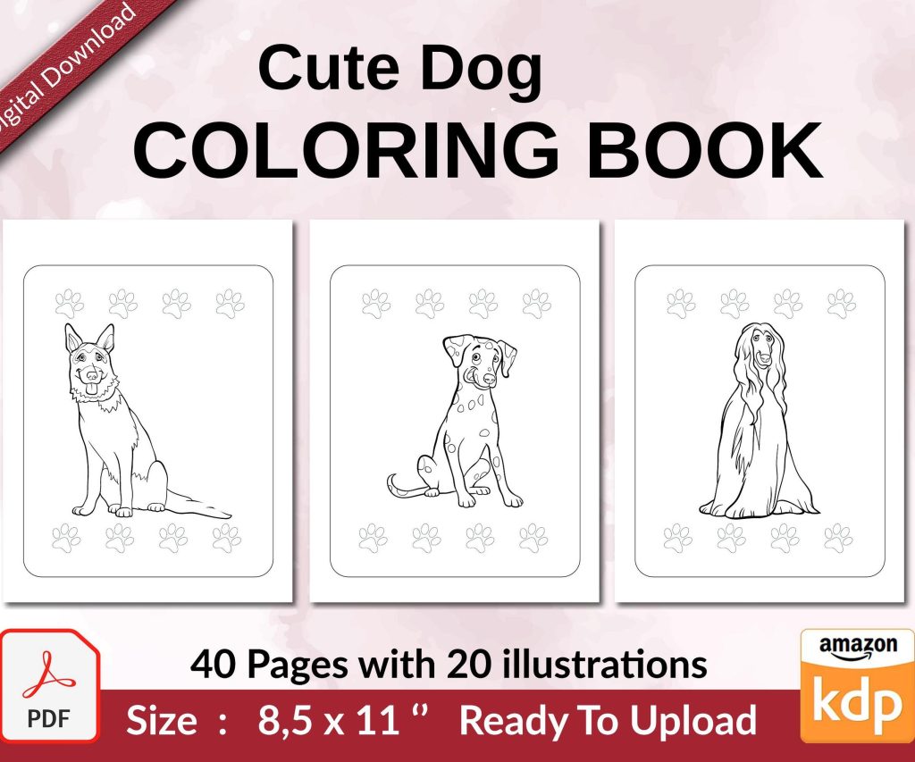
 Cute Dogs Coloring Book for Kids | Activity Book | KDP Ready-To-Upload
 Subtotal: $0.00
Amazon KDP guide, KDP book publishing
3D Book Mockup: Realistic Cover Visualization
03
Apr
Apr
Okay so I just spent like three hours yesterday testing different mockup tools because a client asked me which one actually makes covers look professional and honestly the rabbit hole goes deep.
The Free Route That Actually Works
Look, most people start with Canva’s book mockup templates and they’re… fine? Like if you need something quick for a Facebook post they’ll do the job. But here’s what I learned after publishing 200+ books – the lighting always looks flat. The shadows don’t match. Someone scrolling Amazon can tell it’s not a real photo even if they can’t articulate why.
I usually tell people to check out Placeit first because it’s like $15/month and you get unlimited downloads. The 3D renders are actually decent. They have this paperback lying on a wood table template that I’ve used probably fifty times. The thing is you gotta upload your full cover wrap not just the front cover which trips people up.
Wait I forgot to mention – your cover dimensions matter SO much here. If you’re doing KDP paperback you need the full wrap with spine and back cover. The calculator on KDP tells you exact pixels but basically for a 200-page book that’s like 6×9 inches you’re looking at around 12.5 inches wide total when it’s laid flat. I screwed this up on my third book and the mockup stretched everything weird.
The Professional Tools I Actually Use
Okay so Placeit is good for beginners but when I need something that looks like an actual product photographer shot it I use either Book Brush or Bookwright (yeah confusing names I know).
Book Brush is specifically made for authors and the interface makes sense if your brain works like mine which is kinda scattered. They have these “BoxShot” templates where you can rotate the book in 3D space and the lighting adjusts automatically. Cost is like $10/month I think? Maybe $15? I should check that but I’ve had it so long it just auto-renews.
The cool part is you can stack multiple books together. So if you’ve got a series you can show all three books standing up next to each other and it actually looks like someone arranged them on a shelf. The shadows between the books are what sell it – that’s the detail that makes people’s brains go “oh that’s real.”
The Settings Nobody Talks About
This is gonna sound weird but the biggest mistake I see is people using the default glossy finish setting on everything. Not every book should look glossy. If you’re doing a journal or a workbook you probably have matte laminate right? The mockup needs to match that or it looks off.
In Book Brush there’s a dropdown for “material finish” and most people skip right past it. I always set it to matte for low-content books and glossy for fiction covers with lots of color. Makes a huge difference in how the light reflects.
Oh and another thing – the background matters more than you think. I tested this last month with two identical mockups of a planner I published. One had a white background, one had a styled desktop scene with coffee mug and stuff. The styled one got like 40% more clicks in my Facebook ads. People want context I guess.
The Photoshop Route If You’re Brave
So if you already know Photoshop there are these smart object templates you can buy on Creative Market for like $12-20. Yellow Images has good ones too. You download a PSD file, open it, find the smart object layer, double click it, paste your cover in, save, and boom – it updates in the main file with all the lighting and perspective already done.
Sounds simple but I gotta tell you the first time I tried this I spent an hour trying to figure out why my cover kept appearing upside down. Turns out I was pasting it into the wrong layer. My cat knocked over my coffee during this whole ordeal which didn’t help.
The advantage here is total control. You can adjust shadows, add reflections, change the background to literally anything. The disadvantage is it takes way longer and if you don’t know what you’re doing with blend modes and stuff it can look worse than the automated tools.
Smart Object Templates Worth Getting
There’s this creator called Mr. Mockup who has really good paperback templates. The pages look like actual paper with slight yellowing on the edges. That detail is what separates amateur from pro mockups.
Also check out Pixeden – they have some free ones that are decent quality. The paperback stack template is pretty popular. You can show like five copies of your book stacked up which is useful for… honestly I’m not sure when you’d need that but I’ve used it for bundle promotions.
The 3D Software Nobody Thinks About
Okay so funny story – I have a friend who does product visualization for companies and he told me about using Blender which is free 3D software. I downloaded it and immediately got overwhelmed because there’s like nine thousand buttons and I’m trying to learn this at 11pm on a Tuesday which wasn’t my smartest move.
BUT if you find a book model template (they exist on Gumroad and stuff) you can import it into Blender, map your cover image onto it, and render it with realistic lighting. The results are honestly insane. Like you can add depth of field blur, adjust the lighting to look like golden hour, add a leather texture to make it look like a hardcover.
Is this overkill for most KDP publishers? Yeah probably. But if you’re launching a premium product or want mockups for your website that really stand out it’s worth learning. There are YouTube tutorials specifically for book covers in Blender.
What Actually Matters For Amazon Listings
Here’s the thing though – for your actual Amazon listing you can’t use a 3D mockup as your main cover image. Amazon wants the flat 2D design. So where do these mockups actually get used?
Social media mostly. I use them constantly for Instagram posts, Facebook ads, Pinterest pins. Also on your author website if you have one. Email newsletters. Promotional graphics. Basically everywhere except the actual Amazon product page.
Wait I should mention – some people use mockups in their A+ Content sections if they have brand registry. You can show your book series together or your book in a lifestyle setting. I haven’t tested whether this actually increases conversions but it looks more professional than just text descriptions.
The Sizing Thing That Trips Everyone Up
Different platforms need different sizes obviously. Instagram wants square images mostly (1080×1080) though they support other ratios now. Facebook ads work best at 1200×628. Pinterest loves tall images like 1000×1500.
Most mockup tools let you export at custom sizes but here’s what I do – I create the mockup at the highest resolution possible then resize in Canva or Photoshop as needed. Going from high res to low res works fine but going the other way makes things blurry.
For Facebook ads specifically I always make sure the book takes up at least 60% of the frame. If the book is too small people scrolling on mobile won’t see the cover details and won’t click.
Free Tools That Don’t Suck
If you’re just starting and don’t wanna spend money yet there’s Snappa which has some book mockup templates in their free plan. Limited downloads per month but enough to test things out.
Diybookcovers has a free mockup generator too – super basic but it works for getting something up quick. The shadows are kinda weak but again for social media posts it’s fine.
Adobe Express (used to be called Adobe Spark) has some book templates now. I tested them last week and they’re better than I expected. Not as good as the paid tools but way better than trying to make something from scratch if you’re not a designer.
The Details That Make It Look Real
Okay so this is where I get kinda picky but these details matter. Real books have:
- Slight imperfections in how they sit – they don’t stand perfectly straight
- Shadows that match the light source direction
- Page texture visible on the edges not just solid white
- Spine width that matches the actual page count
- Natural color variation not oversaturated covers
The spine width thing is huge. I see people using mockup templates where the book looks like 400 pages but it’s actually a 120-page book. The proportions look off. Most good mockup tools let you adjust spine thickness – use the actual measurement from your KDP cover template.
Lighting and Angles
Three-quarter view works best for most mockups. That’s where the book is angled so you see the front cover and part of the spine. Straight-on views look flat. Top-down views are trendy but don’t show the spine which has your title.
For lighting I usually go with soft natural light looks – like near a window lighting. Harsh shadows look dramatic but can hide cover details. You want people to be able to read your title and subtitle clearly.
Oh and another thing – if you’re showing a book lying flat make sure it looks like it’s actually resting on a surface not floating. Some templates have weak shadows that make the book look like it’s levitating which is… not the vibe.
Batch Creating Mockups For Series
If you’ve got multiple books this is gonna save you so much time. Most paid tools let you save template settings. So you set up the perfect angle and lighting once then just swap in different covers.
I do this with my planner series – same mockup style for all of them so there’s visual consistency. Takes like two minutes per book instead of starting from scratch each time.
Book Brush has a feature where you can upload multiple covers at once and it generates mockups in bulk. Haven’t tested it extensively but seems useful if you’re launching several books together.
Common Mistakes I See Constantly
Using ebook covers in paperback mockup templates. The dimensions are different and it stretches weird. If you’re showing a paperback use the paperback cover file.
Making the book too shiny. Not everything needs lens flare and glossy highlights like it’s a car commercial.
Forgetting the back cover exists. If you’re showing the book at an angle where the back would be visible don’t leave it blank or put random text there. Use your actual back cover design.
Using mockups that don’t match your genre. Like putting a romance novel in a mockup with a minimalist concrete background and geometric shapes. Context matters – romance readers expect different aesthetics than business book readers.
Tools For Specific Formats
Hardcover mockups are trickier than paperbacks. Book Brush handles them okay. There’s also a tool called Adazing that specializes in hardcover visualization but it’s pricier.
For ebook mockups showing on devices (like Kindle or iPad screens) I use Placeit again. They have tons of device mockup templates. Makes your ebook look more “real” than just showing the flat cover.
Spiral bound books which are common for some types of planners and workbooks – honestly hard to find good mockup templates for these. I usually use Photoshop smart objects from Creative Market for spiral bound stuff.
Look I’m gonna be real with you – you can spend hours perfecting mockups or you can get something decent up in 15 minutes and move on to actually marketing your book. The mockup matters but it’s not gonna make or break your book’s success. Your actual cover design and book content matter way more.
That said having professional-looking mockups does make your social media presence look more legit and probably helps with brand perception. So yeah worth doing but don’t obsess over it.
The tool I use most consistently is Book Brush because it’s specifically designed for authors and the learning curve is minimal. If you’re just starting that’s where I’d begin.
DISCOVER OUR FREE BEST SELLING PRODUCTS
Editable Canva Lined Journal: Express Your Thoughts – KDP Template
Lined Pages Journal 120 pages Ready to Upload PDF Commercial Use KDP Template 6×9 8.5×11 5×8 for Notebooks, Diaries, Low Content
Lined Pages Journal 120 pages Ready to Upload PDF Commercial Use KDP Template 6×9 8.5×11 5×8 for Notebooks, Diaries, Low Content
Cute Dogs Coloring Book for Kids | Activity Book | KDP Ready-To-Upload
Daily Planner Diary : Diary Planners for Everyday Productivity, 120 pages, 6×9 Size | Amazon KDP Interior
Wolf Coloring KDP interior For Adults, Used as Low Content Book, PDF Template Ready To Upload COMMERCIAL Use 8.5×11"
Coloring Animals Head Book for Kids, Perfect for ages 2-4, 4-8 | 8.5×11 PDF
Printable Blank Comic Book Pages PDF : Create Your Own Comics – 3 Available Sizes
Notes KDP interior Ready To Upload, Sizes 8.5×11 6×9 5×8 inch PDF FILE Used as Amazon KDP Paperback Low Content Book, journal, Notebook, Planner, COMMERCIAL Use
Black Lined Journal: 120 Pages of Black Lined Paper Perfect for Journaling, KDP Notebook Template – 6×9
Student Planner Journal 120 pages Ready to Upload PDF Commercial Use KDP Template 6×9" 8.5×11" for Low Content book
Recipe Journal Template – Editable Recipe Book Template, 120 Pages – Amazon KDP Interior