Amazon KDP guide, KDP book publishing
4 Panel Comic Strip Template: Sequential Art Layout
Apr
Okay so I just uploaded three new comic templates last week and the 4-panel format is honestly still my best seller, has been for like two years now. Here’s what actually works.
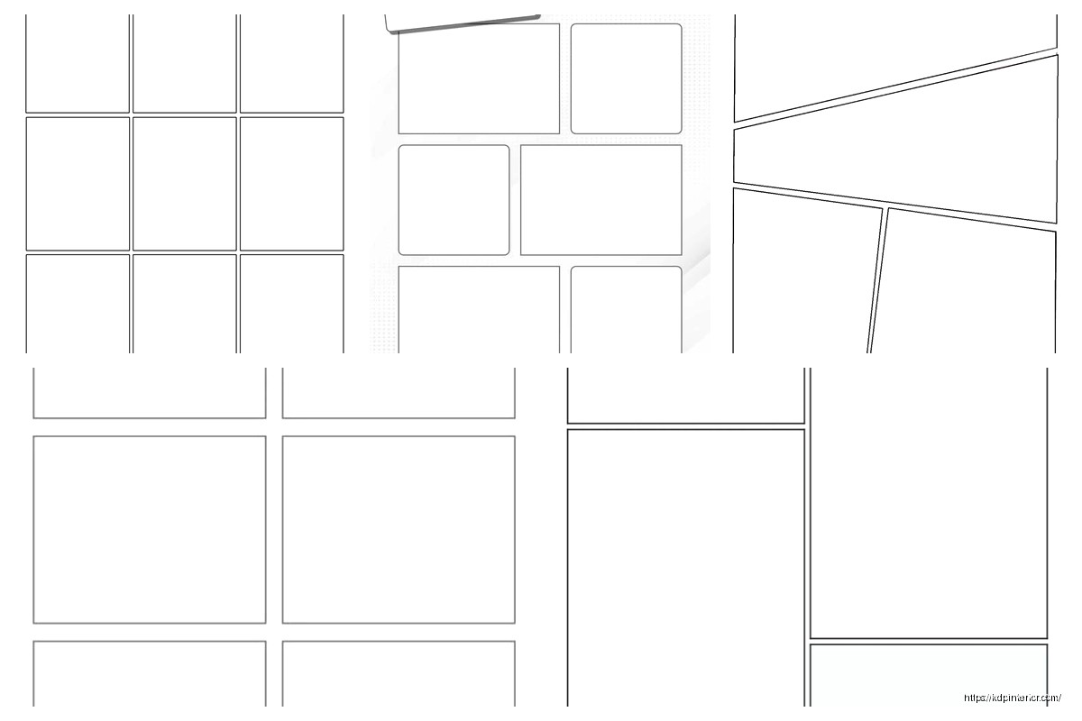
The basic structure is dead simple but people mess it up constantly. You need four equal panels arranged either horizontally or in a 2×2 grid. I’ve tested both extensively and the 2×2 grid sells better on Amazon because it looks more “professional” or something, even though newspaper strips are horizontal. Whatever, the market wants what it wants.
Setting Up Your Template Dimensions
Start with 8.5 x 11 inches if you’re doing print, 300 DPI minimum. I cannot stress this enough because I’ve had like fifteen people email me with blurry prints and it’s always because they worked at 72 DPI. For the 2×2 grid layout, each panel should be roughly 4 x 5 inches with about 0.25 to 0.5 inches of gutter space between them. The gutter is that white space separating panels and it’s super important for readability.
I use a 0.375 inch gutter personally because it’s thick enough to prevent visual confusion but not so thick that it wastes space. Oh and another thing, leave at least 0.5 inches margin from the page edge because printers will cut into anything closer than that. Learned that one the hard way when my first batch came back with chopped panels.
For digital-only templates you can go with 1800 x 2400 pixels at 300 DPI. Same proportions, just different units. Export as PNG with transparency if you want users to add their own backgrounds, or JPG if you’re giving them a complete template with borders already drawn.
Panel Border Styles That Actually Sell
This is gonna sound weird but border thickness matters way more than you’d think. I’ve A/B tested this extensively. A 3-4 point black stroke is the sweet spot. Thinner looks amateur, thicker feels like it’s trying too hard.
You’ve got a few options for border styles:
- Classic black rectangle – never goes out of style, works for any genre
- Rounded corners – softer feel, good for kid-friendly content or slice-of-life stuff
- Hand-drawn wobbly lines – only use this if your whole aesthetic is indie/alternative
- Double-line borders – gives a vintage newspaper strip vibe
I sell all four versions as separate templates because different buyers want different things. The classic rectangle outsells everything else 3-to-1 though. People say they want unique but they buy familiar.
Wait I forgot to mention, you can also do borderless panels where the gutter space is the only separator. Super modern look, very clean. Doesn’t sell as well for me but I keep one in my catalog because it rounds out the collection.
The Sequential Flow Problem
Here’s where most people screw up their comic templates. They don’t consider reading order. In Western markets, readers go left-to-right, top-to-bottom. So your 2×2 grid should be numbered:
Panel 1: Top left
Panel 2: Top right
Panel 3: Bottom left
Panel 4: Bottom right
You’d think this is obvious but I’ve seen published templates on Amazon where the flow is completely backwards. I actually bought one by accident for research and the panels were numbered 1-2-3-4 going DOWN the left side first, then down the right side. That’s manga reading order and unless you’re specifically marketing to manga creators, it’s wrong for the Western market.
For horizontal strips, just go left to right obviously. Number them or add subtle indicators if you’re selling these as blank templates for other creators.
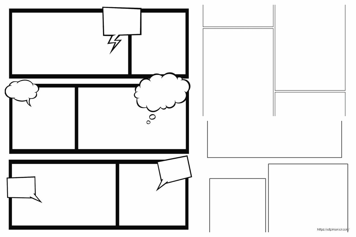
Text Space Considerations
Okay so funny story, my cat knocked over my coffee right as I was finalizing my first comic template and I had to redo the whole speech bubble spacing. But it actually made me think harder about text placement.
Each panel needs enough empty space for dialogue and sound effects. I typically design panels with the assumption that 30-40% of the space will be filled with text. This means your actual drawing area is smaller than the full panel.
Some creators add light guidelines showing “safe zones” for text at the top or bottom of each panel. I don’t do this in my templates because it looks cluttered, but I mention it in the product description. The top 20% and bottom 25% of each panel are prime real estate for speech bubbles.
If you’re creating templates for complete beginners, you might wanna include a version with pre-drawn speech bubble placeholders. I sell this as a separate “guided” version and it does okay, maybe 30% of the sales of my blank version.
File Format and Layer Setup
This is critical for templates you’re gonna sell. Always provide:
- PSD file with layers (panel borders on separate layers from background)
- High-res PNG (flattened, for people who don’t have Photoshop)
- PDF version (some people prefer printing directly from PDF)
In your PSD, organize layers like this from bottom to top:
- Background layer (white or transparent)
- Panel border layer
- Optional guide layer (panel numbers, safe zones – user can toggle off)
Keep it simple. Every additional layer is another thing that can confuse buyers. I learned this after getting support emails from people who couldn’t figure out how to hide the guide layer because I’d nested it in a folder within a folder. Just flatten your layer structure.
Color vs Black and White
Most comic strip templates should be black and white line art. That’s what sells. But I keep a few color variations in my catalog:
- Sepia-toned vintage look
- Light blue non-photo blue (traditional animation style)
- Colored panel borders (red, blue, green sets for kids)
The colored border sets are surprisingly popular for teachers and parents. They use them for educational activities or kids’ storytelling projects. Not my main market but it’s steady passive income.
Don’t bother with fully colored/illustrated background templates. Those don’t sell as templates because they’re too specific. Unless you’re creating a niche product for like… superhero city backgrounds or medieval castle scenes or whatever. That’s a different product category though.
Variations You Should Offer
Based on my sales data, here’s what actually moves:
Portrait vs Landscape orientation – offer both. Landscape is more traditional but portrait fits better in modern digital formats and social media.
With and without panel numbers – some creators want the numbers, some find them distracting. Make both versions.
Different gutter widths – I sell a “compact” version with 0.25 inch gutters and a “spacious” version with 0.5 inch gutters. The spacious outsells 2-to-1.
Blank vs with title area – adding a dedicated title space at the top of the page is useful for some creators. Reduces your panel size slightly but some people specifically search for this.
I bundle all these variations into a single product listing as “bonus files” which justifies a higher price point. Instead of selling one template for $2.99, I sell a pack of 8 variations for $9.99 and the conversion rate is actually better.
The KDP Publishing Strategy
If you’re putting these on Amazon KDP, you gotta think about search terms. People don’t search for “sequential art layout” – that’s too fancy. They search:
- “blank comic book”
- “comic strip template”
- “draw your own comic”
- “4 panel comic paper”
Use these exact phrases in your title and description. My best-selling comic template is literally titled “Blank Comic Strip Template: 4 Panel Layout for Drawing Comics and Cartoons” – boring but effective.
For the interior, you want 100-120 pages of the same template repeated. Yeah it’s repetitive but that’s what the market expects. Some people get creative and alternate between different panel configurations throughout the book. Those don’t sell as well because buyers want consistency.
Price it at $5.99 to $7.99 for a paperback. The production costs are minimal since it’s just black ink on white paper. Your royalty will be around $2-3 per copy which adds up nicely.
Common Mistakes to Avoid
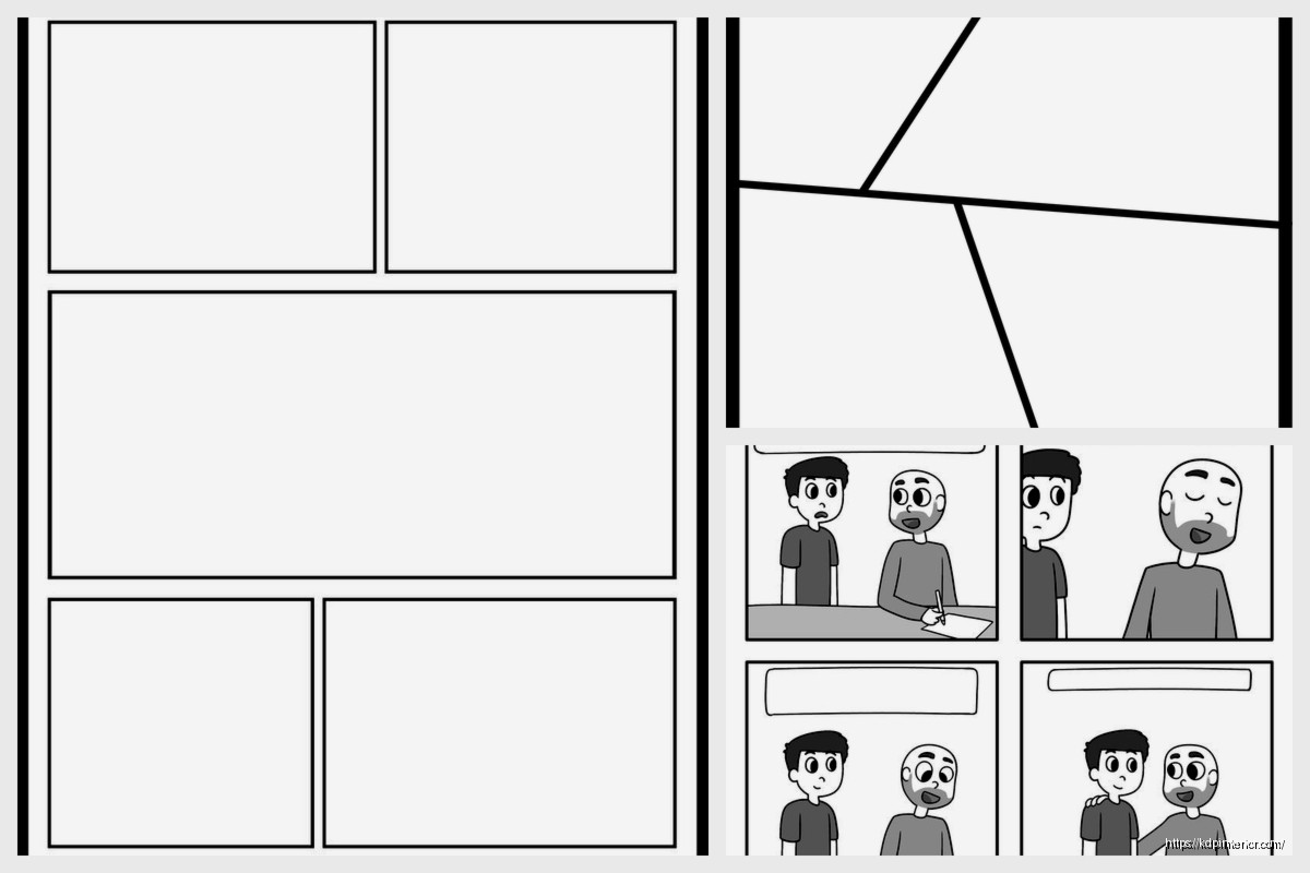
Don’t make panels too small. I see templates where people cram 6 or 8 panels on a page to “give more value” but then each panel is like 3×3 inches and impossible to draw in comfortably. Four panels is the sweet spot. It’s literally in the product name for a reason.
Don’t use decorative fonts for panel numbers. Just use Arial or Helvetica, size 10-12, in the corner. Nobody cares about fancy numbering.
Don’t add watermarks or branding in the actual drawing space. Put your copyright info in the margins or on a separate credits page. Buyers hate when the template itself has logos or website URLs cluttering it up.
Make sure your panels are actually equal sizes. I’ve seen templates where Panel 3 is weirdly 0.25 inches shorter than the others because someone eyeballed it instead of using guides. Use your software’s alignment tools, measure everything twice.
Testing Your Template
Before you publish, print it yourself and actually try drawing in it. I’m serious. Grab a pencil and sketch something in all four panels. You’ll immediately notice if the spacing feels cramped or if the gutters are too narrow.
I always do this while watching TV or something, just casual sketching. Caught so many issues this way – panels that looked fine on screen but felt weird with an actual pencil in hand.
Also test your PDF exports on different devices. Open it on your phone, your tablet, your computer. Make sure the line weights are visible at different zoom levels. A 3-point stroke might disappear when zoomed out on a phone screen. If it does, bump it to 4-point.
Pricing and Market Positioning
Individual digital templates: $2.99 to $4.99
Template bundles (5-10 variations): $9.99 to $14.99
Print books (KDP paperback): $5.99 to $7.99
Don’t undervalue your work but also don’t overprice. There’s a ton of competition in comic templates. I’ve found the $9.99 bundle price point is perfect – high enough to feel substantial, low enough that people impulse buy it.
Your Etsy pricing can be slightly higher than your personal website because Etsy buyers expect to pay more. But keep your KDP pricing competitive because Amazon’s algorithm favors products that move volume.
Oh and another thing, seasonal variations sell surprisingly well. I created a “Holiday Comic Strip Template” pack with small themed elements in the corners (tiny snowflakes, hearts, pumpkins) and it spikes every season. Same basic 4-panel layout, just minor decorative touches.
The key with templates is volume and consistency. One template won’t make you rich but 20 templates each selling 50 copies a month adds up fast. I’ve got 47 different comic-related templates in my catalog now and they collectively bring in $800-1200 monthly on autopilot.
Just keep the quality consistent, listen to customer feedback in reviews, and iterate. My version 3.0 of the basic 4-panel template sells way better than v1.0 did because I fixed all the little annoyances people mentioned over two years of reviews.
DISCOVER OUR FREE BEST SELLING PRODUCTS
Editable Canva Lined Journal: Express Your Thoughts – KDP Template
Lined Pages Journal 120 pages Ready to Upload PDF Commercial Use KDP Template 6×9 8.5×11 5×8 for Notebooks, Diaries, Low Content
Lined Pages Journal 120 pages Ready to Upload PDF Commercial Use KDP Template 6×9 8.5×11 5×8 for Notebooks, Diaries, Low Content
Cute Dogs Coloring Book for Kids | Activity Book | KDP Ready-To-Upload
Daily Planner Diary : Diary Planners for Everyday Productivity, 120 pages, 6×9 Size | Amazon KDP Interior
Wolf Coloring KDP interior For Adults, Used as Low Content Book, PDF Template Ready To Upload COMMERCIAL Use 8.5×11"
Coloring Animals Head Book for Kids, Perfect for ages 2-4, 4-8 | 8.5×11 PDF
Printable Blank Comic Book Pages PDF : Create Your Own Comics – 3 Available Sizes
Notes KDP interior Ready To Upload, Sizes 8.5×11 6×9 5×8 inch PDF FILE Used as Amazon KDP Paperback Low Content Book, journal, Notebook, Planner, COMMERCIAL Use
Black Lined Journal: 120 Pages of Black Lined Paper Perfect for Journaling, KDP Notebook Template – 6×9
Student Planner Journal 120 pages Ready to Upload PDF Commercial Use KDP Template 6×9" 8.5×11" for Low Content book
Recipe Journal Template – Editable Recipe Book Template, 120 Pages – Amazon KDP Interior