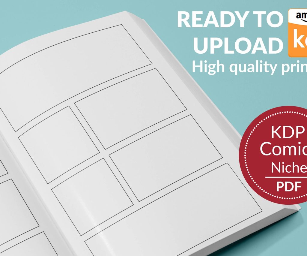
 Printable Blank Comic Book Pages PDF : Create Your Own Comics - 3 Available Sizes
 Subtotal: $0.00
Amazon KDP guide, KDP book publishing
6×9 Book Cover Template: Popular Size Design
14
Apr
Apr
Okay so the 6×9 size is basically the workhorse of self-publishing and I’m gonna walk you through why everyone uses it and how to actually make covers that don’t look like garbage.
First thing – 6×9 inches is popular because it’s that sweet spot between too small to read comfortably and too big to feel like a textbook. When you hold a 6×9 book it just feels… right? Like most trade paperbacks you’d grab at a bookstore. Amazon’s print costs are also pretty reasonable at this size and readers are used to it.
The Actual Template Dimensions You Need
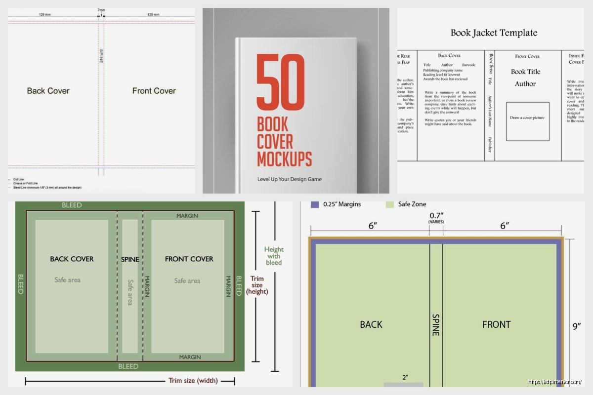
So here’s where people screw up constantly. You can’t just make a 6×9 rectangle in Canva and call it done. The full cover wrap is different from just the front cover.
For KDP paperback you need the FULL COVER which includes front, spine, and back. The width calculation is basically this – take your page count, divide by the paper type’s pages-per-inch number, add the 6-inch width twice (front and back), then add the bleed areas.
Wait let me back up because that’s confusing.
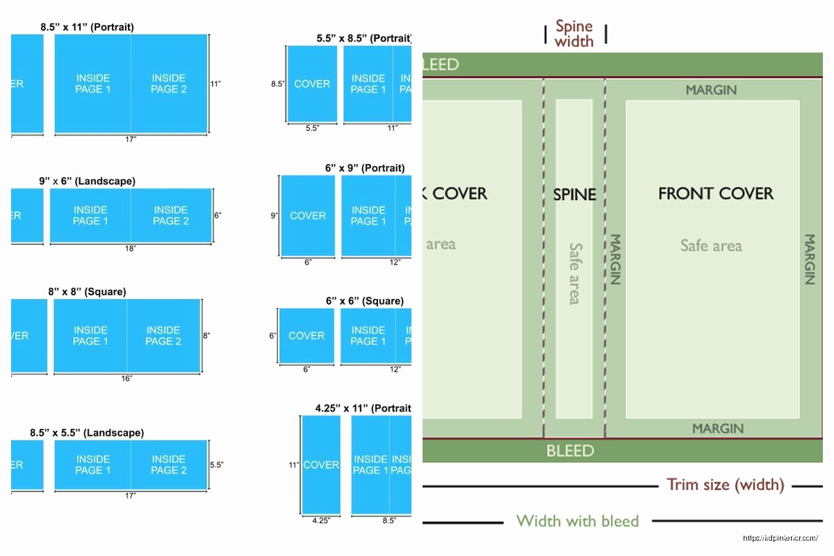
If you’re doing a front cover ONLY (like for ebook) it’s simple: 6 inches wide by 9 inches tall. But convert to pixels at 300 DPI which gives you 1800 x 2700 pixels. That’s your basic starting point.
For print covers the spine width changes based on page count. A 100-page book has a thinner spine than a 300-page book obviously. KDP has this cover calculator tool that does the math for you and honestly just use that instead of trying to calculate manually because I’ve messed it up even after doing this for years.
Design Software Options That Actually Work
I use a mix depending on the project and my caffeine level that day.
Canva is where most people start and honestly it’s fine for simpler covers. The free version works but Pro gives you way more fonts and the background remover tool which is clutch. Create a custom dimension at 1800 x 2700 pixels for the front cover. They have templates but most look super generic so I usually start from scratch.
Adobe InDesign is what I use for full print wraps when I need everything perfect. The learning curve is steeper though and the subscription cost is annoying. I usually only recommend this if you’re doing a ton of books.
Affinity Publisher is the one-time purchase alternative to InDesign and it’s pretty solid. I switched to this for like half my projects last year because the subscription fatigue with Adobe was getting real.
Oh and another thing – GIMP is free and works but the interface makes me want to throw my laptop sometimes. It’s capable of professional results but you gotta really commit to learning it.
Bleed and Safe Zones You Can’t Ignore
This is where I see the most mistakes with new publishers.
Bleed is the extra area around your cover that gets trimmed off during printing. KDP requires 0.125 inches (that’s 1/8 inch) of bleed on all sides. So your background images and colors need to extend into that bleed area or you’ll get white edges after trimming.
The safe zone is the opposite – it’s the area INSIDE where you keep all your important text and images. Keep everything at least 0.25 inches from the trim edge. I usually go 0.5 inches to be extra safe especially with titles.
I learned this the hard way when my first book had the author name partially cut off because I put it too close to the edge and the trimming wasn’t perfectly precise. Had to reorder the whole print run which was like $200 down the drain.
Design Elements That Work for 6×9 Covers
The vertical rectangle shape means you’ve got good real estate for typography. I tend to go with larger title text that takes up maybe the top third or half of the cover.
Typography choices: Sans-serif fonts read better as thumbnails on Amazon. Everyone says this but it’s true – your cover shows up tiny on search results so thick bold letters win. I use fonts like Montserrat, Bebas Neue, Oswald for titles pretty regularly. For subtitles or author names you can get fancier with serif fonts.
The contrast thing matters more than people think. Dark text on light backgrounds or vice versa. When I’m testing a cover I literally squint at it or view it at like 10% size to see if the title is still readable.
Image placement: If you’re using stock photos or illustrations the focal point should be in that top two-thirds area usually. The bottom third is where author name goes and maybe a subtitle or tagline.
This is gonna sound weird but I often design covers while watching TV (currently rewatching The Office for the millionth time) and that actually helps because I’m not overthinking every tiny detail. The covers that perform best are usually the ones I didn’t agonize over for hours.
Stock Resources I Actually Use
You need images that are royalty-free and high enough resolution.
Depositphotos is my main source. Their subscription gives you like 50-100 images per month depending on the plan. Quality is consistently good at 300 DPI or higher.
Unsplash and Pexels are free options and honestly pretty decent for certain genres. I use these for non-fiction covers a lot where I just need a clean background or simple concept image.
Creative Fabrica has been my go-to lately for fonts and graphic elements. One subscription gets you access to thousands of fonts plus illustrations, patterns, textures. The value is insane.
For genre fiction especially romance or thriller you kinda need those specific stock photo models that look like book covers. There are photographers who specialize in this – Wander Aguiar, Period Images, CJC Photography. They’re pricier but worth it if you’re in those genres.
Color Psychology and Genre Expectations
Different genres have color conventions that readers expect whether they realize it or not.
Romance uses a lot of reds, pinks, purples. Contemporary romance especially tends toward lighter, brighter colors. Dark romance goes for blacks and deep reds obviously.
Thrillers and mysteries are usually dark – blacks, dark blues, grays. Maybe a pop of red for danger/blood vibes.
Non-fiction business books love blues and blacks because it signals authority and professionalism. Self-help often uses brighter colors, oranges and teals are popular right now.
I tested this with a productivity planner I published – made one version with a navy blue cover and one with orange. The orange one outsold it 3 to 1 in the first month. Same interior, same description, just different cover color.
Text Hierarchy That Makes Sense
Your title should be the biggest element, period. I usually make it at least 2-3 times larger than the author name.
If you have a subtitle it should be smaller than the title but still readable. I see people make subtitles almost as big as titles and it just looks cluttered and confusing.
Author name placement depends on whether you’re established or not. If you’re Stephen King your name can be huge at the top. If you’re unknown like most of us your name goes smaller at the bottom and the title does the selling.
Series branding is another thing – if it’s book 3 in a series you need that series name and book number visible. I usually put this above the title in smaller text or sometimes as a banner across the top.
Spine Design for Print Books
The spine is weirdly important because that’s what people see when your book is on a shelf. Even though most sales are online, bookstores and libraries still matter.
Text on the spine should read from top to bottom (in the US at least – some countries do bottom to top). You need the title and author name minimum. If there’s room add a small publisher logo or series indicator.
For thin spines under like 100 pages there’s barely room for text. I’ve had books where the spine was so thin I could only fit the title vertically in a condensed font. It’s a pain but you work with what you’ve got.
The spine width calculator on KDP tells you exactly how wide it’ll be. White paper gives you a thinner spine than cream paper for the same page count which is something I didn’t know for like the first year I was publishing.
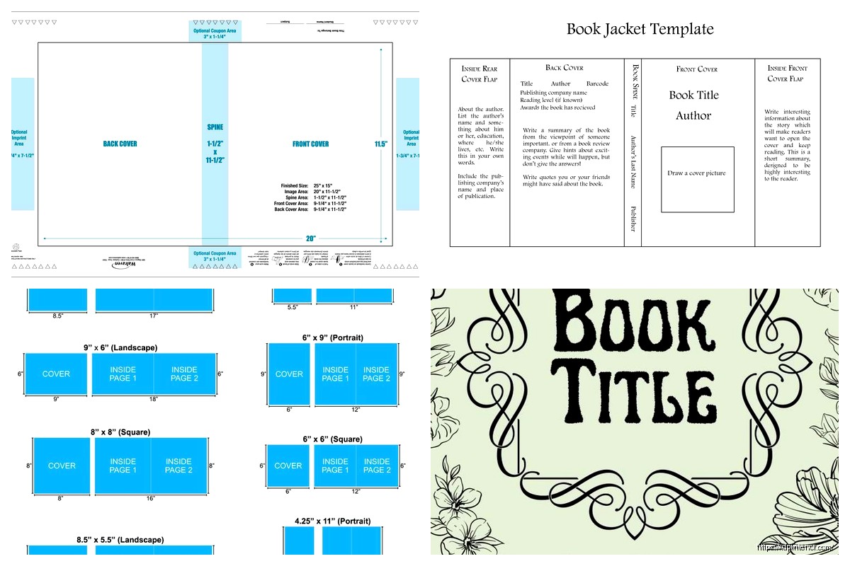
Back Cover Layout
Okay so the back cover needs a few specific things: book description (blurb), author bio maybe, barcode area, and sometimes author photo or review quotes.
The barcode goes in the bottom right corner and you need to leave that space blank. KDP puts it there automatically. The space should be about 2 x 1.25 inches clear of any important design elements or text.
Your blurb should be compelling but also formatted to be readable. I usually do like 150-200 words max, broken into 2-3 short paragraphs. Left-aligned text is easier to read than centered for longer copy.
Some people put review quotes or “what readers are saying” snippets on the back which works well if you have good reviews. For new books I just focus on a strong description that hooks the reader.
Wait I forgot to mention – matching the back cover design to the front matters for brand cohesion. Use the same fonts, similar color scheme, maybe a faded version of the front cover image as background. It should feel like one cohesive product.
File Formats and Upload Requirements
KDP wants a PDF for the cover file when you upload. Your design software should be able to export to PDF – just make sure it’s high resolution (300 DPI minimum).
The file size can’t exceed 40 MB which I’ve only hit once when I accidentally had like 10 layers of high-res images stacked. Usually covers are 2-8 MB.
RGB color mode vs CMYK is a thing people stress about. KDP’s printers use CMYK but they convert RGB files automatically. I’ve done both and honestly haven’t noticed a huge difference in the final product. The colors might shift slightly from screen to print but that happens regardless.
For ebook covers you just need the front cover as a JPEG or TIFF file, minimum 1000 pixels on the shortest side. I export at 1800 x 2700 which is way more than needed but gives Amazon flexibility for different devices.
Testing Your Cover Design
Before you finalize anything, test how it looks as a thumbnail. Upload it to your phone and view it at the size it would appear in Amazon search results. Can you read the title? Does it catch your eye scrolling past?
I also do this thing where I put my cover next to bestsellers in the same genre and see if it fits in or sticks out in a bad way. You want to meet genre expectations while still being distinctive enough to grab attention.
My cat knocked over my coffee on a cover design last week and honestly the forced break made me realize the color scheme was all wrong, so sometimes interruptions help? Anyway.
Black and white preview is another test – convert your cover to grayscale and see if it still has good contrast and visual hierarchy. Some people still use e-readers without color so this matters.
Common Mistakes I See Constantly
Using too many fonts. Stick to 2-3 max. One for title, one for author name, maybe one for subtitle if needed.
Cluttered designs with too much happening. Negative space is your friend. A simple bold design usually outperforms a busy complicated one.
Low resolution images that look pixelated or blurry. Always work at 300 DPI minimum for print.
Ignoring genre conventions completely. You can bend the rules but breaking them entirely confuses readers about what kind of book it is.
Not checking the cover on actual Amazon listings. The orange “Kindle Unlimited” banner covers part of your design so make sure important elements aren’t hidden behind it.
Title text that’s too thin or fancy to read easily. Readability beats artistic flair every single time for book covers.
Templates vs Custom Design
Pre-made templates can work if you customize them enough. The problem is like 500 other people bought the same template so you need to change fonts, colors, images to make it unique.
I use templates as starting points sometimes when I’m in a rush but always modify them significantly. Change the color scheme, swap out images, adjust the layout, use different fonts.
Custom designs take longer but perform better in my experience. I spent like 6 hours on a cover for a guided journal last month and it’s been my best seller this quarter. The template version I made in 30 minutes for comparison is sitting at like 1/10th the sales.
The return on investment for cover design is real. A professional-looking cover might cost you $200-500 if you outsource it or 5-10 hours if you DIY, but it can make the difference between 5 sales a month and 50 sales a month.
Okay I think that covers the main stuff you need to know about 6×9 templates. The rest is just practice and testing what works for your specific books and genres. Don’t overthink it too much in the beginning, just start making covers and you’ll get better with each one.
DISCOVER OUR FREE BEST SELLING PRODUCTS
Editable Canva Lined Journal: Express Your Thoughts – KDP Template
Lined Pages Journal 120 pages Ready to Upload PDF Commercial Use KDP Template 6×9 8.5×11 5×8 for Notebooks, Diaries, Low Content
Lined Pages Journal 120 pages Ready to Upload PDF Commercial Use KDP Template 6×9 8.5×11 5×8 for Notebooks, Diaries, Low Content
Cute Dogs Coloring Book for Kids | Activity Book | KDP Ready-To-Upload
Daily Planner Diary : Diary Planners for Everyday Productivity, 120 pages, 6×9 Size | Amazon KDP Interior
Wolf Coloring KDP interior For Adults, Used as Low Content Book, PDF Template Ready To Upload COMMERCIAL Use 8.5×11"
Coloring Animals Head Book for Kids, Perfect for ages 2-4, 4-8 | 8.5×11 PDF
Printable Blank Comic Book Pages PDF : Create Your Own Comics – 3 Available Sizes
Notes KDP interior Ready To Upload, Sizes 8.5×11 6×9 5×8 inch PDF FILE Used as Amazon KDP Paperback Low Content Book, journal, Notebook, Planner, COMMERCIAL Use
Black Lined Journal: 120 Pages of Black Lined Paper Perfect for Journaling, KDP Notebook Template – 6×9
Student Planner Journal 120 pages Ready to Upload PDF Commercial Use KDP Template 6×9" 8.5×11" for Low Content book
Recipe Journal Template – Editable Recipe Book Template, 120 Pages – Amazon KDP Interior