Amazon KDP guide, KDP book publishing
Amazon Book Cover Creator: Design Software Options
Mar
okay so I just tested like five different cover creators last week because honestly the Amazon KDP cover creator is… it exists but you’re gonna want better options
Canva is probably where you should start
Look I know everyone talks about Canva but there’s a reason. I was watching The Last of Us and just opened Canva on my laptop during a slow scene and had a decent cover mocked up in like 20 minutes. The free version gives you enough to work with but the Pro subscription ($13/month) is worth it if you’re serious about this.
Here’s what you actually do: search “book cover” in their templates and you’ll get hundreds of options. The kindle dimensions are 6×9 inches typically so set your custom dimensions to 1800×2700 pixels for ebook covers. For print you need the full wrap which includes spine and back cover but honestly start with just the ebook version.
The thing with Canva is the fonts… they have thousands and you can upload your own. I always use bold sans-serif fonts for non-fiction titles because they’re readable in thumbnails. That’s the trick nobody tells you – your cover needs to look good at like 150 pixels wide because that’s how people see it on Amazon search results.
the actual workflow I use
Pick a template that’s close to your genre. Don’t start blank unless you really know design. Change the background color or image first. Canva has a huge stock photo library included with Pro. Search for images related to your topic – if it’s a productivity book maybe a desk setup or minimalist workspace.
Then swap out the text. Make your title HUGE. Subtitle smaller. Your author name should be visible but not competing with the title. I usually do like 120pt for title, 40pt for subtitle, 30pt for author name but it depends on title length obviously.
oh and another thing – use the transparency tool on elements. You can layer images and adjust opacity to create depth. I did this last month with a planner cover where I had a watercolor texture at 30% opacity over a solid color and it looked way more professional than just a flat background.
if you want more control go with Affinity Publisher
This is gonna sound weird but I actually prefer Affinity over Adobe InDesign now. It’s a one-time payment of like $70 instead of Adobe’s stupid subscription model. I bought it two years ago and it’s paid for itself hundreds of times over.
The learning curve is steeper though not gonna lie. You need to understand layers, text frames, image placement. But once you get it… you can create covers that actually look traditionally published.
Download the KDP cover template calculator thing from Amazon – it gives you exact dimensions including spine width based on page count and paper type. Import that into Affinity as a guide layer. Then you’re building your cover with bleed margins already set correctly.
I use Affinity when I need to do complex text effects or when I’m working with multiple design elements that need precise alignment. Like I did this journal cover last month with a geometric pattern that repeated perfectly across the spine and it would’ve been a nightmare in Canva.
wait I forgot to mention BookBrush
So BookBrush is specifically made for book covers and marketing graphics. It’s $10/month and honestly if you’re only doing covers maybe not worth it but if you also need to make promo graphics for social media it’s pretty solid.
They have 3D mockup generators built in which is cool. You design your flat cover and it automatically wraps it onto a 3D book image. Customers like seeing that in your Amazon A+ content or on social media.
The template library is smaller than Canva but more focused. Everything is already sized correctly for Amazon. They have separate templates for ebook covers vs print covers vs boxset covers.
My cat just knocked over my water bottle so gimme a sec…
okay so where was I… BookBrush also has this feature where you can save your brand colors and fonts as presets. If you’re doing a series this is huge because you need consistent branding across all covers. I have like 8 different series and each one has its own color palette saved.
the mockup situation
BookBrush does mockups but honestly I also use Placeit sometimes. It’s another subscription ($15/month) but they have thousands of mockup templates. Coffee shop scenes, hands holding books, books on desks with laptops. You just upload your cover and it inserts it automatically.
This isn’t necessary for Amazon listings but if you’re building an email list or promoting on Instagram it makes your books look more real and appealing. I increased my click-through rate by like 30% when I started using lifestyle mockups instead of just flat cover images.
free options that don’t totally suck
If you’re really on a tight budget there’s GIMP which is basically free Photoshop. It’s clunky and the interface looks like it’s from 2005 but it works. You can do everything you need for a cover – layers, text effects, image manipulation. Just expect to spend time on YouTube learning it.
Pixlr is another free option that’s browser-based. It’s simpler than GIMP but still more powerful than the basic Amazon creator tool. Good middle ground if you want more control than Canva free but don’t wanna pay for anything yet.
There’s also Inkscape for vector graphics which is useful if you’re doing logos or icons for your cover. I used it to create a custom icon for a series of planners and then imported that into Canva for the actual cover layout.
what about Adobe Creative Cloud
Look Adobe Photoshop and InDesign are industry standard for a reason. If you’re already paying for Creative Cloud ($55/month) then yeah use them. Photoshop for image manipulation and compositing, InDesign for layout and text.
But here’s my honest opinion after 7 years doing this – unless you’re designing covers for other people as a service, the Adobe subscription isn’t worth it just for your own books. Affinity does 90% of what InDesign does for a one-time payment. Canva Pro does 80% of what you need for way less money.
I kept my Adobe subscription for like three years before I realized I was only using it maybe twice a month. Cancelled it and switched to Affinity and haven’t looked back. Saved myself $660 per year that I can spend on advertising instead.
stock photo resources because you’re gonna need them
Canva Pro includes stock photos but sometimes you need something specific. Unsplash and Pexels are completely free and have decent quality. I use them all the time for background images.
If you need something more specific – like a particular professional scenario or niche topic – then Depositphotos or Adobe Stock work but you’re paying per image. Usually $10-30 per photo depending on size and licensing.
this is gonna sound weird but I’ve had good luck with Creative Fabrica too. It’s mainly for crafters but they have tons of graphics, patterns, and design elements. $9/month and you get unlimited downloads. I grab textures and decorative elements from there constantly.
fonts matter more than you think
Your cover font is like 40% of whether it looks professional or amateur. Amazon genre browsers can spot a bad font from a mile away.
Google Fonts is free and has hundreds of options. Download them and install on your computer so you can use them in any software. For non-fiction I stick with: Montserrat, Oswald, Bebas Neue, Raleway, Roboto. These are clean, modern, readable.
For fiction it depends on genre but generally avoid anything too decorative for the title. You want impact and readability over fancy. Save the decorative fonts for small accent text if you use them at all.
Creative Market and Font Bundles sell font packs – sometimes you can get like 20 fonts for $15 during sales. I bought a bundle last year that I still use regularly. Make sure you check the commercial license though because some fonts restrict use on products for sale.
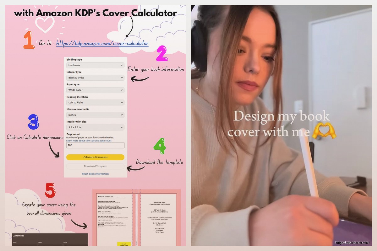
the Amazon KDP cover creator itself
Okay so I should probably mention the actual Amazon tool since that’s technically what this is about. It’s free, it’s built into KDP, and it’s… basic.
You upload a background image or choose from their limited stock images. Add text with limited font choices. That’s basically it. No layers, no effects, no real design control.
I only use it for quick tests honestly. Like if I wanna see how a color scheme might look I’ll throw together a rough version in the KDP creator just to preview it. But I never use it for my actual final covers anymore.
The one advantage is it automatically handles bleed and trim for print books. So if you’re doing a super simple cover – maybe a solid color with text – it could work. But you’re competing against people using professional design tools so your cover will look amateur next to theirs.
my actual workflow these days
I start in Canva to mock up ideas quickly. Play with layouts, colors, images. Get the overall concept right. Then if it’s a simple cover I’ll finish it in Canva.
If it needs more polish or complex elements I’ll move to Affinity Publisher. Import my Canva mockup as a reference layer and rebuild it with more precision. Add effects, adjust spacing perfectly, create custom shapes or patterns.
For print books I always use Affinity because I need that spine calculation to be exact and I want full control over bleeds. I’ve had too many print proofs come back weird from using Canva for print covers.
Then I run the final cover through Placeit or BookBrush to create mockups for marketing. Upload the flat cover file to Amazon KDP.
oh and another thing – always check your cover at thumbnail size before finalizing. Shrink it down to like 200 pixels wide and make sure the title is still readable. If it’s not, your font is too small or too decorative. This is super important because most people browse Amazon on mobile now.
common mistakes I see constantly
Too much text. Your cover is not a billboard for every feature of your book. Title, subtitle max, author name. That’s it.
Bad contrast. Light text on light background or dark on dark. Your title needs to pop. Use the squint test – if you squint and can’t immediately read the title your contrast sucks.
Wrong genre signals. Every genre has visual conventions. Romance has certain color palettes and imagery. Thrillers look different than cozy mysteries. Study bestselling covers in your category and notice the patterns.
Low resolution images. Your cover needs to be at least 2500 pixels on the longest side for Amazon. Anything less will look pixelated. Don’t upscale small images it just makes them blurry.
Ignoring the spine. For print books people see the spine on shelves. Make sure your title is readable on the spine and matches the front cover design style.
okay I think that covers most of it… start with Canva honestly, get comfortable with design basics, then level up to Affinity if you need more control. Don’t overthink it but also don’t use the Amazon creator unless you absolutely have to. Your cover is the first thing potential buyers see so it’s worth spending time to get it right
DISCOVER OUR FREE BEST SELLING PRODUCTS
Editable Canva Lined Journal: Express Your Thoughts – KDP Template
Lined Pages Journal 120 pages Ready to Upload PDF Commercial Use KDP Template 6×9 8.5×11 5×8 for Notebooks, Diaries, Low Content
Lined Pages Journal 120 pages Ready to Upload PDF Commercial Use KDP Template 6×9 8.5×11 5×8 for Notebooks, Diaries, Low Content
Cute Dogs Coloring Book for Kids | Activity Book | KDP Ready-To-Upload
Daily Planner Diary : Diary Planners for Everyday Productivity, 120 pages, 6×9 Size | Amazon KDP Interior
Wolf Coloring KDP interior For Adults, Used as Low Content Book, PDF Template Ready To Upload COMMERCIAL Use 8.5×11"
Coloring Animals Head Book for Kids, Perfect for ages 2-4, 4-8 | 8.5×11 PDF
Printable Blank Comic Book Pages PDF : Create Your Own Comics – 3 Available Sizes
Notes KDP interior Ready To Upload, Sizes 8.5×11 6×9 5×8 inch PDF FILE Used as Amazon KDP Paperback Low Content Book, journal, Notebook, Planner, COMMERCIAL Use
Black Lined Journal: 120 Pages of Black Lined Paper Perfect for Journaling, KDP Notebook Template – 6×9
Student Planner Journal 120 pages Ready to Upload PDF Commercial Use KDP Template 6×9" 8.5×11" for Low Content book
Recipe Journal Template – Editable Recipe Book Template, 120 Pages – Amazon KDP Interior