Okay so I was messing around with Amazon Cover Creator last Tuesday because one of my students kept asking if it’s even worth using or if you should just skip straight to Canva, and honestly… it’s more capable than people give it credit for, but there’s definitely a learning curve that nobody talks about.
Getting Started With the Tool
First thing – you can only access Cover Creator when you’re actually uploading a book through KDP. There’s no standalone version you can play with beforehand, which is annoying because you can’t just experiment without committing to a book project. When you get to the “Kindle eBook Cover” section during upload, you’ll see the option to “Launch Cover Creator” right under where it asks you to upload a cover file.
The interface loads and it’s… fine. Not amazing, not terrible. You get three main sections on the left sidebar: Layout, Background, and Text. That’s it. Super minimal compared to what you’re probably used to if you’ve touched any real design software.
Picking Your Layout Template
So the Layout section gives you maybe 20-30 pre-made templates, and here’s where it gets tricky – they’re organized by genre but the categories are kinda weird. Like there’s “Fiction,” “Non-Fiction,” “Kids,” “Comics” and then some random subcategories that don’t always make sense. I was looking for a journal template last week and found it under… Non-Fiction? Sure, okay Amazon.
Each template shows a tiny thumbnail preview. Click one and it loads into your workspace. The thing is, these templates are actually pretty decent starting points. They follow basic design principles – good contrast, readable text hierarchy, space for your title and author name. But they’re also very obviously templates, you know what I mean? Anyone who’s used Cover Creator will recognize them immediately.
Wait I forgot to mention – you can’t start from a completely blank canvas. You HAVE to pick a template first, then modify it. Which is honestly fine for most people but if you’re trying to do something totally unique, this isn’t the tool for that.
Background Options and Images
The Background tab is where things get interesting. You’ve got three options: solid colors, gradients, or images from their stock library.
The solid colors are just a color picker – standard stuff. Gradients give you two-color blends with a few different angle options. Nothing fancy but they work for minimalist designs.
Now the image library… okay so Amazon gives you access to thousands of stock photos, all royalty-free as part of using the tool. That’s actually huge because stock photos can get expensive fast. The search function is decent – type in “coffee” and you get actual coffee images, not random stuff. The quality varies though. Some images are clearly professional stock photos, others look like they were taken with a flip phone in 2008.
Image Placement Issues
Here’s something that drove me crazy – when you add an image background, you can’t really control the positioning that well. There’s a zoom slider and you can drag the image around, but there’s no crop tool, no way to adjust the focal point precisely. I was trying to center a sunset photo so the horizon line wasn’t cutting through my title text and it took like 15 minutes of tiny adjustments. My cat kept walking across my keyboard which didn’t help.
Oh and another thing – the images are organized into categories but there’s no way to filter by orientation or color scheme. So if you need a predominantly blue image for your color scheme, you’re scrolling through everything manually.
Working With Text Elements
The Text section is where you’ll spend most of your time. Each template comes with pre-made text boxes for title, subtitle, and author name. You can edit these or add new text boxes using the “Add Text” button.
Font selection is limited – you get maybe 30-40 fonts total. They’re all pretty safe, readable choices. Nothing too decorative or fancy. I actually think this is smart because it keeps people from making terrible font choices, but if you want something specific for your brand, you’re out of luck.
Font sizes go from tiny to huge using a slider. No specific point sizes listed, which is weird if you’re trying to be precise. You can also adjust letter spacing and line height, but again, it’s all slider-based. Not exact measurements.
Text Formatting Options
Each text box can be formatted with:
- Bold, italic, or regular weight
- Left, center, or right alignment
- Text color using the color picker
- Text opacity – this is actually useful for watermark-style effects
- Rotation – you can angle text which is cool for creative layouts
One thing that’s gonna frustrate you – there’s no text effects. No outlines, no shadows, no glow effects. Just flat text on your background. If you need your white text to pop against a light background, your only option is to add a semi-transparent shape behind it or pick a darker background.
Shapes and Graphics
This is gonna sound weird but the shapes section is both useful and incredibly limited at the same time. You get basic shapes – rectangles, circles, lines. That’s it. No stars, no arrows, no custom shapes.
But you CAN use these creatively. I’ve made decent-looking covers by layering semi-transparent rectangles to create color blocks for text. Stack a few circles in different colors for an abstract design. Use lines as dividers between title and author name.
Each shape has the same controls as text – color, opacity, size, rotation. You can layer them by using the “Send to Back” or “Bring to Front” buttons. This is actually pretty important for building up a design with depth.
The Preview Function
Okay so here’s something nobody tells you – the preview you see in Cover Creator while you’re designing isn’t exactly what your final cover will look like. Amazon shows you this nice big workspace, but you need to click the “Preview” button regularly to see how it’ll actually appear at thumbnail size.
This matters because what looks good at full size might be completely unreadable when it’s shrunk down to the size of a postage stamp on Amazon’s search results. I learned this the hard way with a journal cover where I used this elegant thin font that just disappeared at thumbnail size.
The preview shows you the cover in different contexts – as a thumbnail, on a product page, on a mobile device. Use this. Seriously, check it after every major change.
What Actually Works at Thumbnail Size
From testing literally hundreds of covers, here’s what I’ve learned works:
- High contrast between text and background – like black on white or white on dark colors
- Chunky, bold fonts for the main title
- Simple images without too much detail
- Limited color palette – three colors max usually reads better
- Bigger text than you think you need
Saving and Revisions
When you’re done designing, you click “Save Cover” and it processes for a few seconds, then gets attached to your book project. Here’s the annoying part – if you want to make changes later, you have to go back into your book’s details, scroll to the cover section, and click “Launch Cover Creator” again. Your previous design should load automatically.
Should. Sometimes it doesn’t and you’re starting over. This happened to me twice last month and I wanted to throw my laptop. Now I always take a screenshot of my final design just in case, with all the settings visible in the sidebar. That way I can recreate it if needed.
Real Talk on Limitations
Let’s be honest about what Cover Creator can’t do. You can’t upload your own images or graphics. You can’t use custom fonts. You can’t add textures or patterns beyond what’s in their library. You can’t do any photo editing – no filters, no adjustments, nothing. You can’t create dielines or work with spine text for paperback covers.
For paperbacks specifically, Cover Creator only makes front covers. You still need to create a full cover file with back cover and spine using other software if you want anything besides a blank back cover.
Wait I forgot to mention earlier – there’s no undo button. Like, at all. If you make a change and hate it, you’re manually changing it back. Save versions as you go if you’re experimenting.
When It Actually Makes Sense to Use This
Cover Creator is legitimately useful for:
- Testing book concepts quickly without hiring a designer
- Low-content books where the cover is super simple – like notebooks, journals, planners
- Creating placeholder covers while you work on getting a professional one made
- Books in categories where readers expect simple, clean covers – certain non-fiction niches
- When you’re on a tight budget and learning design basics
I’ve made covers in Cover Creator that sold just fine. Not amazing, but they converted. For a gratitude journal I launched last year, the Cover Creator version actually outperformed the Canva version I made first, probably because it was simpler and cleaner.
The Budget Reality
If you’re paying a designer $50-200 per cover and publishing multiple books per month, that adds up fast. Cover Creator lets you create unlimited covers at no extra cost beyond your KDP account. For someone publishing 10 low-content books a month, that’s potentially $500-2000 saved monthly.
But – and this is important – there’s a quality ceiling. You’re not gonna create bestseller-level covers with this tool. For your main books, the ones you’re really promoting and building a brand around, invest in proper cover design.
Quick Workflow Tips
After using this thing more times than I can count, here’s my actual workflow:
Start by browsing the bestsellers in your category on Amazon. Screenshot 5-10 covers you like. Look at what they have in common – colors, layout, text size, imagery style.
Pick a Cover Creator template that’s closest to that style. Ignore what category Amazon put it in, just find the layout that matches.
Swap the background first. If you’re using an image, search their library for something similar to what’s working in your category. If bestsellers are using solid colors or minimalist designs, go that route.
Adjust text sizes by checking the preview constantly. Start bigger than you think you need, then size down if necessary.
Keep your color palette limited. Pick three colors max and stick to them throughout the design.
Use shapes strategically to create separation between elements or add visual interest without cluttering things up.
Check the preview at thumbnail size one last time before saving. If you squint at the thumbnail and can’t read the title instantly, make the text bigger or increase the contrast.
Common Mistakes I See All the Time
People cram too much text on the cover. Your subtitle doesn’t need to be on there if it makes things cluttered. Sometimes less is more.
Using busy background images where you can’t read the text properly. If the image has a lot going on, add a semi-transparent rectangle behind your text.
Picking fonts that are too decorative or thin. Readability beats style every time when it comes to book covers.
Not checking how the cover looks at actual thumbnail size until after they’ve published. Then they’re stuck with it unless they wanna go through republishing.
Trying to match every single design element from a professional cover they saw. The tool has limits – work within them instead of fighting against them.
Okay so that’s pretty much everything I’ve figured out from actually using Amazon Cover Creator for real books that need to sell. It’s not perfect, it’s not gonna replace professional design, but it’s way more useful than people give it credit for if you understand what it can and can’t do.
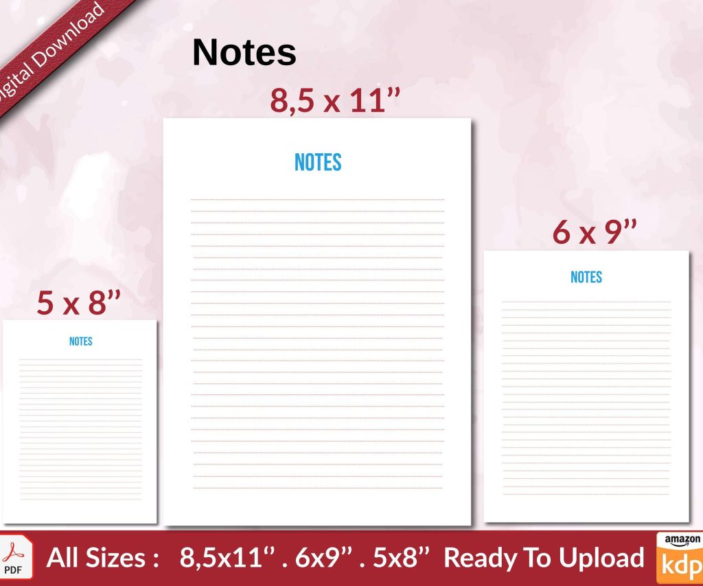 Notes KDP interior Ready To Upload, Sizes 8.5x11 6x9 5x8 inch PDF FILE Used as Amazon KDP Paperback Low Content Book, journal, Notebook, Planner, COMMERCIAL Use
1 × $0.00
Notes KDP interior Ready To Upload, Sizes 8.5x11 6x9 5x8 inch PDF FILE Used as Amazon KDP Paperback Low Content Book, journal, Notebook, Planner, COMMERCIAL Use
1 × $0.00 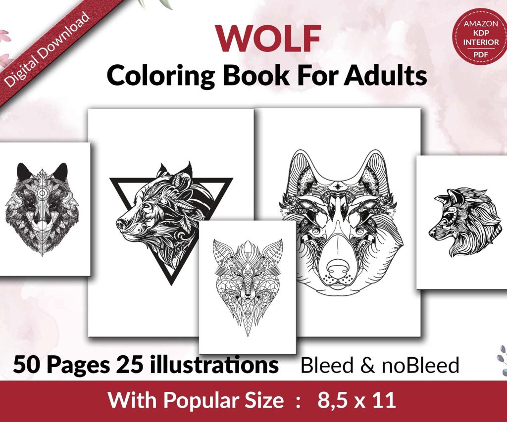 Wolf Coloring KDP interior For Adults, Used as Low Content Book, PDF Template Ready To Upload COMMERCIAL Use 8.5x11"
1 × $0.00
Wolf Coloring KDP interior For Adults, Used as Low Content Book, PDF Template Ready To Upload COMMERCIAL Use 8.5x11"
1 × $0.00 
DISCOVER OUR FREE BEST SELLING PRODUCTS
Editable Canva Lined Journal: Express Your Thoughts – KDP Template
Lined Pages Journal 120 pages Ready to Upload PDF Commercial Use KDP Template 6×9 8.5×11 5×8 for Notebooks, Diaries, Low Content
Lined Pages Journal 120 pages Ready to Upload PDF Commercial Use KDP Template 6×9 8.5×11 5×8 for Notebooks, Diaries, Low Content
Cute Dogs Coloring Book for Kids | Activity Book | KDP Ready-To-Upload
Daily Planner Diary : Diary Planners for Everyday Productivity, 120 pages, 6×9 Size | Amazon KDP Interior
Wolf Coloring KDP interior For Adults, Used as Low Content Book, PDF Template Ready To Upload COMMERCIAL Use 8.5×11"
Coloring Animals Head Book for Kids, Perfect for ages 2-4, 4-8 | 8.5×11 PDF
Printable Blank Comic Book Pages PDF : Create Your Own Comics – 3 Available Sizes
Notes KDP interior Ready To Upload, Sizes 8.5×11 6×9 5×8 inch PDF FILE Used as Amazon KDP Paperback Low Content Book, journal, Notebook, Planner, COMMERCIAL Use
Black Lined Journal: 120 Pages of Black Lined Paper Perfect for Journaling, KDP Notebook Template – 6×9
Student Planner Journal 120 pages Ready to Upload PDF Commercial Use KDP Template 6×9" 8.5×11" for Low Content book
Recipe Journal Template – Editable Recipe Book Template, 120 Pages – Amazon KDP Interior