Amazon KDP guide, KDP book publishing
Amazon KDP 6×9 Cover Template: Popular Size Guide
Mar
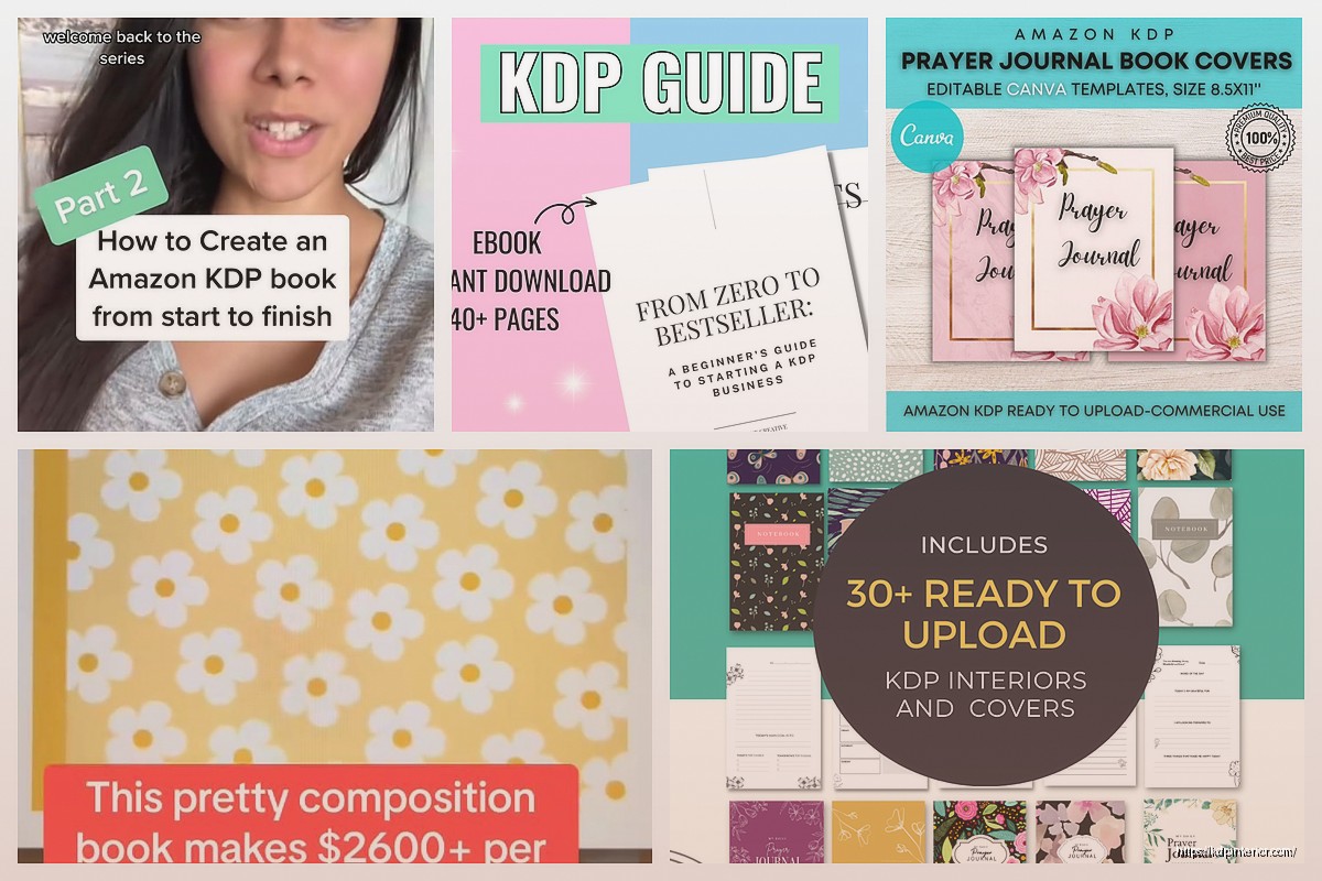
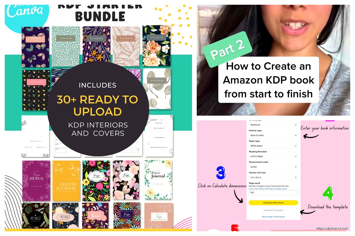
Okay so the 6×9 cover template thing trips people up way more than it should and I literally just walked someone through this yesterday while my cat was knocking stuff off my desk, so it’s fresh in my mind.
The Actual Dimensions You Need
Right so for a 6×9 book on KDP, you’d think the cover would just be 6×9 but nope, that’s just the trim size. The actual cover dimensions depend entirely on your page count because of the spine width. This is where everyone gets confused and honestly I did too when I started back in 2017.
The formula is basically: (2 × 6) + spine width for the width, and 9 inches plus bleed for the height. KDP requires 0.125 inch bleed on all sides, so your actual height becomes 9.25 inches. The width calculation is gonna change based on how thick your book is.
Calculating Spine Width
Here’s the deal with spine width – it’s based on page count and paper type. KDP has a calculator built into their cover template generator but I’m gonna give you the rough math because sometimes their tool is down or whatever.
For white paper (which most people use): multiply your page count by 0.002252 inches. So if you’ve got a 120-page book, that’s 120 × 0.002252 = 0.27024 inches for the spine.
For cream paper it’s slightly different: multiply by 0.0025 inches per page. Same 120-page book would be 0.3 inches.
So your full cover width for that 120-page white paper book would be: 12 inches (the two covers) + 0.27 inches (spine) + 0.25 inches (bleed on both sides) = 12.52 inches total width.
Getting The Template From KDP
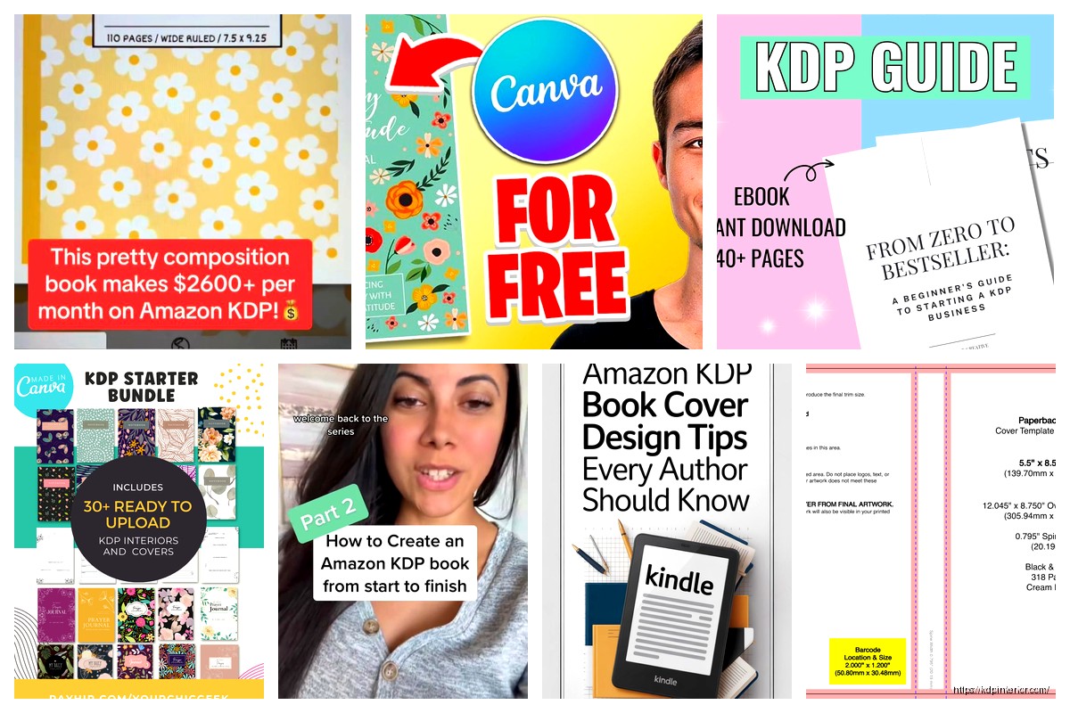
Look, the easiest way is to just let KDP generate it for you. When you’re setting up your paperback in KDP, there’s a section where you input your page count and paper type, and it spits out a template. You can download it as a PNG or PDF.
I always download the PNG because I work in Canva mostly these days, but if you’re using Photoshop or InDesign grab the PDF. The template has these pink guides showing you where the spine edges are, where the bleed area is, and the safe zone where your important text and images should stay.
The Safe Zone Is Actually Important
Okay so funny story – my third book ever, I put the title too close to the spine edge and when the physical copies arrived, part of the “T” was wrapped around onto the spine. Looked terrible. The safe zone is usually 0.125 inches inside the trim line, so for a 6×9 book, keep everything important at least that far from the edges.
Oh and another thing – the spine safe zone is even more critical. KDP recommends keeping text 0.0625 inches away from the spine edges because the cutting process isn’t perfectly precise every single time. I’ve had books where the spine was cut slightly off-center and I was really glad I followed that rule.
Design Software Options
You’ve got a few routes here depending on your budget and skill level.
Canva (What I Use Most)
Canva Pro is like $13/month and honestly worth it just for the resize function alone. You can create custom dimensions, so I’ll plug in 12.52 x 9.25 inches (or whatever my specific book needs). The free version works too but you’re limited on elements and can’t resize easily.
When you’re working in Canva with a KDP template, upload that PNG template as a background layer, then design on top of it. The guides show through so you know where everything should go. Just remember to delete or hide that template layer before you export, otherwise you’ll have pink lines all over your cover.
I usually export as PDF print for the best quality. KDP accepts PDF, TIFF, and JPG but PDF keeps everything crisp.
Photoshop If You’re Fancy
If you know Photoshop, set up your document at 300 DPI minimum – that’s super important for print. I learned this the hard way when I uploaded a 72 DPI cover once and it looked pixelated as hell on the proof copy.
Color mode should be RGB actually, not CMYK like you’d expect. KDP converts everything to their own color profile anyway, so RGB is fine and honestly gives you more vibrant colors in most cases.
Free Options That Actually Work
GIMP is free and basically Photoshop’s scrappy cousin. Little bit clunkier but it works. Same principles apply – 300 DPI, upload the template as a guide layer, design away.
There’s also this site called BookBrush (used to be called BookBrushes? I think they rebranded) that has pre-made templates you can customize. Some are free, some are paid. I’ve used it when I needed something quick and didn’t wanna start from scratch.
Common Mistakes I See All The Time
Wait I forgot to mention – resolution is probably the number one issue. Your cover needs to be at least 300 DPI or KDP might reject it. They say 72 DPI minimum but don’t do that, it’ll look blurry. I aim for 300-600 DPI depending on the project.
Image quality matters too. If you’re using stock photos, make sure they’re high-res. I’ve seen people grab images off Google that look fine on screen but are like 500 pixels wide, then they stretch them across a 6×9 cover and wonder why it looks terrible.
Spine Text Readable
For a 120-page book, your spine is gonna be somewhere around 0.27-0.3 inches wide. That’s not a lot of space. You can technically fit text on spines as narrow as 0.25 inches, but it needs to be simple – just title and author name, maybe not even both if the title is long.
I generally don’t put spine text on anything under 100 pages. It’s just too thin and looks cramped. Some of my notebooks and journals don’t have spine text at all because they’re only 80-90 pages.
Font size on the spine should be at least 16pt, though I usually go 18-20pt. And for the love of god use a readable font. I was watching this true crime documentary last week while designing a cover and got distracted, ended up using this super decorative script font on the spine that was basically illegible. Had to redo it.
Color Considerations For Print
Colors on screen don’t always match what prints, this is gonna sound weird but I always make my colors slightly more vibrant than I think they need to be. Print tends to dull things down a bit, especially darker colors.
Black should be true black – RGB 0,0,0. I’ve seen people use dark gray thinking it’s black and it prints weird.
White backgrounds are tricky because if your bleed isn’t set up right, you might get thin colored lines at the edges where the printer didn’t cut perfectly. I usually extend my background colors or images past the bleed line by a bit just to be safe.
Matte vs Glossy Finish
This doesn’t affect your template setup but it matters for how colors look. Glossy covers make colors pop more but show fingerprints like crazy. Matte is more professional-looking in my opinion and hides wear better.
I use glossy for children’s books or anything photo-heavy, matte for everything else. Just a personal preference thing but your colors will look different between the two finishes.
Text And Typography
Keep your title readable from thumbnail size because that’s how most people see it first on Amazon. I do this test where I shrink my cover down to like 200 pixels wide and see if I can still read the title. If not, the font’s too small or too fancy.
Author name doesn’t need to be huge unless you’re already famous. I keep mine pretty modest sized because nobody’s buying based on my name recognition yet, they’re buying based on the book concept and cover appeal.
Contrast is your friend – dark text on light background or vice versa. I see a lot of new publishers trying to put light gray text on a white background or something equally low-contrast and it just disappears.
Back Cover Layout
The back cover is part of your full wrap template and honestly I spend way less time on it than the front, but it still matters. You need a barcode area in the lower right corner – KDP places their barcode there automatically, so leave that space blank. It’s usually about 2 x 1.2 inches.
I put my book description on the back, maybe a short author bio, sometimes a headshot if I’m feeling it. Keep text in the safe zones again, at least 0.25 inches from all edges.
Oh and if you’re doing a series, the back cover is a good place to show other books in the series. I do this little grid of 3-4 other covers with “Also by Daniel Harper” above it. Helps with series readthrough.
File Format And Upload
KDP wants your cover as a single file – front cover, spine, and back cover all in one image. Export as PDF for best results, but high-quality JPG works too if your file size is getting huge.
File size limit is 40 MB which sounds like a lot but if you’re working with high-res images and effects, you can hit it. I’ve had to compress files before using tools like TinyPNG or just reducing the DPI slightly to like 400 instead of 600.
Make sure you flatten all layers before exporting. I’ve uploaded Photoshop files with layers still active and KDP accepted them but better safe than sorry.
The Proof Copy Step
Always order a physical proof before approving your book for distribution. The digital previewer on KDP is helpful but it’s not the same as holding the actual book. I’ve caught issues on proof copies that I never would’ve noticed on screen – colors looking different, text too close to edges, spine text not quite centered.
Proof copies are cheap, usually like $4-6 depending on page count, and shipping is whatever it is. Worth every penny to avoid having a crappy cover on your published book.
Quick Template Checklist
Before you upload, run through this mental checklist I use:
- Correct dimensions including bleed for your specific page count
- 300 DPI minimum resolution
- All important elements in safe zones
- Spine text readable and properly sized if using it
- Barcode area blank on back cover lower right
- Colors vibrant enough to survive printing
- File flattened and under 40 MB
- PDF or high-quality JPG format
I keep this list in a Google Doc because I still forget stuff sometimes even after doing this for seven years.
The 6×9 size is honestly the easiest to design for because it’s so standard. Once you get your first one done, the rest are basically the same process with different content. I can crank out a 6×9 cover in like 30-45 minutes now when I used to spend hours on them.
Just remember the spine width changes with page count so don’t try to reuse the exact same template dimensions for every book unless they’re all the same page count. That’s a mistake I made early on, designed like five covers using the same 12.5-inch width and then realized they were all different page counts and the spines were wrong. Had to redo all of them.
Anyway that’s basically the whole deal with 6×9 cover templates. It’s not complicated once you’ve done it a few times, just gotta pay attention to the details and use KDP’s calculator or do the math yourself for spine width.
DISCOVER OUR FREE BEST SELLING PRODUCTS
Editable Canva Lined Journal: Express Your Thoughts – KDP Template
Lined Pages Journal 120 pages Ready to Upload PDF Commercial Use KDP Template 6×9 8.5×11 5×8 for Notebooks, Diaries, Low Content
Lined Pages Journal 120 pages Ready to Upload PDF Commercial Use KDP Template 6×9 8.5×11 5×8 for Notebooks, Diaries, Low Content
Cute Dogs Coloring Book for Kids | Activity Book | KDP Ready-To-Upload
Daily Planner Diary : Diary Planners for Everyday Productivity, 120 pages, 6×9 Size | Amazon KDP Interior
Wolf Coloring KDP interior For Adults, Used as Low Content Book, PDF Template Ready To Upload COMMERCIAL Use 8.5×11"
Coloring Animals Head Book for Kids, Perfect for ages 2-4, 4-8 | 8.5×11 PDF
Printable Blank Comic Book Pages PDF : Create Your Own Comics – 3 Available Sizes
Notes KDP interior Ready To Upload, Sizes 8.5×11 6×9 5×8 inch PDF FILE Used as Amazon KDP Paperback Low Content Book, journal, Notebook, Planner, COMMERCIAL Use
Black Lined Journal: 120 Pages of Black Lined Paper Perfect for Journaling, KDP Notebook Template – 6×9
Student Planner Journal 120 pages Ready to Upload PDF Commercial Use KDP Template 6×9" 8.5×11" for Low Content book
Recipe Journal Template – Editable Recipe Book Template, 120 Pages – Amazon KDP Interior