okay so here’s what actually works for KDP covers in 2026
So I just updated like fifteen covers last month and the difference in click-through rates was honestly kinda wild. The thing nobody tells you about Amazon book covers is that you’re designing for a thumbnail that’s literally 120 pixels tall on most mobile screens. Like, all those intricate details you’re obsessing over? Nobody sees them until after they click.
First thing – and I cannot stress this enough – test your cover at thumbnail size before you do anything else. I use this trick where I open the image on my phone, walk across the room, and if I can’t read the title from my couch, it’s gonna fail. Sounds dumb but it’s saved me so many times. My cat knocked over my coffee during one of these tests last week and I almost lost a whole afternoon of work but anyway.
the font size thing everyone gets wrong
Your title needs to be HUGE. Like uncomfortably huge when you’re looking at it in Canva or Photoshop at full size. I’m talking minimum 100pt font for a standard 6×9 cover, and honestly I go bigger now. The subtitle can be smaller but not by much. I see so many covers with these elegant thin fonts that look gorgeous on a desktop monitor and then completely disappear on mobile.
Sans serif fonts are your friend for titles. I know, I know, everyone wants that fancy script font for their romance novel or that gothic serif for their thriller, but readability beats aesthetics every single time on Amazon. You can use decorative fonts as accents but the main title needs to be bold and clean.
Oh and another thing – contrast is literally everything. Light text on dark backgrounds or dark text on light backgrounds. That middle ground where you have like gray text on a medium blue background? That’s where covers go to die. I tested this with two identical covers except for contrast levels and the high-contrast version got 3x more clicks. Three times.
colors that actually convert
So this is gonna sound weird but I keep a spreadsheet of bestseller covers in my niches and I color-sample them. Not to copy them but to see what’s working RIGHT NOW in my categories. In 2026, the trend is shifting back to bolder, more saturated colors after a few years of those muted earthy tones.
For non-fiction, especially business and self-help, you’re looking at:
- Bold oranges and reds for action-oriented topics
- Deep blues and teals for trust and authority
- Black with bright accent colors for premium positioning
- White or cream backgrounds with one strong color for minimalist professional looks
Fiction is more genre-specific but like, cozy mystery readers expect certain color palettes. If you put out a cozy mystery with a dark red and black cover, you’re gonna confuse your audience. Romance has gotten more diverse with colors lately but there’s still that expectation of warmth – pinks, purples, teals, golds.
I made the mistake last year of designing a really cool cover with colors I personally loved and it tanked. Redesigned it to match genre expectations and sales picked up within a week. Your personal taste doesn’t matter as much as what your target readers are trained to look for.
the composition stuff nobody talks about
Rule of thirds works but honestly for KDP covers I’m more focused on visual hierarchy. The reader’s eye needs to know where to go immediately. Usually that’s:
- Main image or focal point
- Title
- Subtitle or author name
Don’t center everything. I see this constantly – people centering the title, centering the image, centering the author name. It looks static and boring. Offset things. Create visual interest. But also don’t go crazy with diagonal text unless you’re doing something very specific genre-wise.
Wait I forgot to mention – negative space is your best friend. Don’t fill every inch of your cover. Give elements room to breathe. Some of my best-performing covers are like 40% empty space. That breathing room actually makes the important elements stand out more.
images and where to get them
Stock photos are fine but you gotta be careful. Everyone’s using the same Depositphotos and Shutterstock images. I’ve seen the same business woman photo on like twenty different productivity books. If you’re using stock, modify it heavily. Change colors, add filters, combine multiple images, overlay textures.
For 2026 I’m seeing more illustrated and graphic design covers even in non-fiction spaces. Custom illustrations don’t have to be expensive – I found designers on Fiverr who do simple vector illustrations for $30-50 that look way more unique than stock photos. You can also use AI-generated images now but be super careful with licensing and make sure they’re allowed for commercial use. Amazon’s cracking down on that stuff.
If you’re doing photography yourself or hiring a photographer, remember it still needs to work at thumbnail size. Close-ups work better than wide shots. A face takes up more of the frame than a full body shot. Details matter more than scenes.
typography beyond just fonts
Okay so this is where I spent like three months learning stuff I should’ve known years ago. Letter spacing matters SO much. Tight letter spacing can make text look cramped and hard to read at small sizes. I usually increase tracking (letter spacing) by 50-100 for titles on covers.
Line spacing too – if you have a two-line title, give it room. Cramped lines read as one blob from far away. And don’t use more than two fonts on a cover. Three maximum if one is just for a small accent. I usually stick to two – one for the title and one for everything else.
Font pairing is its own thing but quick rule: pair a decorative or serif font with a clean sans serif. Or pair two sans serifs with very different weights. Don’t pair two decorative fonts unless you really know what you’re doing.
Oh and drop shadows and outlines on text – use them but subtly. A slight drop shadow can make text pop off a busy background. Heavy outlines usually look amateur unless you’re going for a very specific comic book or vintage style.
series branding stuff
If you’re doing a series, consistency is crucial but you also need variation. I use the same font, same general layout, same color palette, but change the main image and maybe one accent color per book. Readers should be able to spot your series instantly but also tell the books apart.
Number your series on the covers. I resisted this for so long because I thought it looked cluttered but readers actually appreciate it. Just make it small and tasteful. Top corner or bottom corner usually works.
technical specs you gotta know
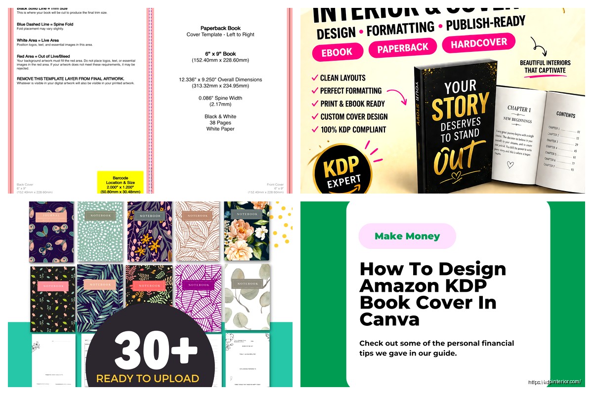
Amazon wants 2560 pixels on the longest side minimum. I always design at 3000px for the longest side because it gives you room if you need to resize later. 72 DPI is fine for digital but I usually work at 300 DPI out of habit from when I did print books.
RGB color mode, not CMYK. Save as JPG or TIFF. Keep file size under 50MB but honestly I’ve never had an issue keeping it under 5MB with high-quality JPG compression.
The aspect ratio matters – for a standard 6×9 book, your cover should be 2:3 ratio. For square books like coloring books or workbooks, obviously 1:1. Amazon will let you upload slightly different ratios but it might crop weirdly so just stick to the proper dimensions.
tools I actually use
I bounce between Canva Pro and Affinity Publisher depending on the project. Canva is stupid easy for quick covers and they’ve added way more features lately. Their background remover tool alone saves me tons of time. Affinity is better when I need more control over typography and layers, plus it’s a one-time purchase instead of subscription.
Photoshop is overkill for most KDP covers unless you’re doing heavy photo manipulation. The learning curve isn’t worth it when Canva and Affinity can do 95% of what you need.
For fonts, I use DaFont for free options and Creative Fabrica for premium stuff. Google Fonts is great too and all free for commercial use. Just make sure whatever font you use has a commercial license – that’s bit me before and it’s not fun.
testing and iteration
This is gonna sound like extra work but it’s worth it – create 3-5 variations of your cover concept. Different color schemes, different layouts, different fonts. Then poll your target audience. I use Facebook groups related to my niche or Reddit communities. Don’t ask “which is better” – ask “which would you click on” because that’s what actually matters.
You can also run these as ads with tiny budgets just to see which gets better CTR. Like $5 per variation on Amazon or Facebook ads. The data tells you way more than your personal preference does.
And honestly, don’t be afraid to change covers after launch. I’ve updated covers on books that were live for years and seen immediate sales increases. The market changes, trends shift, your design skills improve. There’s no rule that says you can’t iterate.
common mistakes I see everywhere
Using too many elements. Your cover isn’t a poster. It’s a billboard that someone’s driving past at 60mph. Keep it simple.
Ignoring genre conventions. Yeah you wanna stand out but you also need to signal to readers what kind of book this is. A sci-fi book with a cover that looks like women’s fiction is gonna confuse everyone.
Making the author name too big when you’re not famous yet. Unless you’re Stephen King, your name doesn’t sell the book. Make the title and imagery the focus.
Using low-quality images. Blurry, pixelated, or stretched images scream amateur. Spend the $10 on a proper stock photo or spend time finding free high-quality ones.
Not checking what the cover looks like on actual Amazon pages. Upload it, look at it on mobile, on desktop, in the search results, on the product page. I’ve been surprised so many times by how different a cover looks in context versus in my design software.
the subtitle and author name placement
Subtitles are crucial for non-fiction but they don’t need to be huge. Like maybe 30-40% the size of your main title. Place them where they don’t compete with the title for attention – usually underneath but sometimes above works if you have a design reason for it.
Author names can go top or bottom. Bottom is more traditional and usually safer. Top can work if you have a very strong focal image in the center and lower third. I’ve tested both extensively and honestly it varies by genre and specific design. Just make sure it’s readable.
For fiction, especially when you’re building a brand, your author name can be bigger. For non-fiction, keep it smaller unless you’re an established authority. There’s probably a whole psychology thing there but whatever, just follow what’s working in your genre.
Anyway that’s basically everything I’ve learned from designing like 200+ covers at this point. The main thing is just start designing, test stuff, look at what’s selling in your categories, and don’t be precious about your first attempts. My first covers were genuinely terrible but you learn by doing. And honestly, a decent cover that’s done and published beats a perfect cover you never finish.
 Editable Canva Lined Journal: Express Your Thoughts - KDP Template
1 × $0.00
Editable Canva Lined Journal: Express Your Thoughts - KDP Template
1 × $0.00  Printable Blank Comic Book Pages PDF : Create Your Own Comics - 3 Available Sizes
1 × $0.00
Printable Blank Comic Book Pages PDF : Create Your Own Comics - 3 Available Sizes
1 × $0.00 
DISCOVER OUR FREE BEST SELLING PRODUCTS
Editable Canva Lined Journal: Express Your Thoughts – KDP Template
Lined Pages Journal 120 pages Ready to Upload PDF Commercial Use KDP Template 6×9 8.5×11 5×8 for Notebooks, Diaries, Low Content
Lined Pages Journal 120 pages Ready to Upload PDF Commercial Use KDP Template 6×9 8.5×11 5×8 for Notebooks, Diaries, Low Content
Cute Dogs Coloring Book for Kids | Activity Book | KDP Ready-To-Upload
Daily Planner Diary : Diary Planners for Everyday Productivity, 120 pages, 6×9 Size | Amazon KDP Interior
Wolf Coloring KDP interior For Adults, Used as Low Content Book, PDF Template Ready To Upload COMMERCIAL Use 8.5×11"
Coloring Animals Head Book for Kids, Perfect for ages 2-4, 4-8 | 8.5×11 PDF
Printable Blank Comic Book Pages PDF : Create Your Own Comics – 3 Available Sizes
Notes KDP interior Ready To Upload, Sizes 8.5×11 6×9 5×8 inch PDF FILE Used as Amazon KDP Paperback Low Content Book, journal, Notebook, Planner, COMMERCIAL Use
Black Lined Journal: 120 Pages of Black Lined Paper Perfect for Journaling, KDP Notebook Template – 6×9
Student Planner Journal 120 pages Ready to Upload PDF Commercial Use KDP Template 6×9" 8.5×11" for Low Content book
Recipe Journal Template – Editable Recipe Book Template, 120 Pages – Amazon KDP Interior