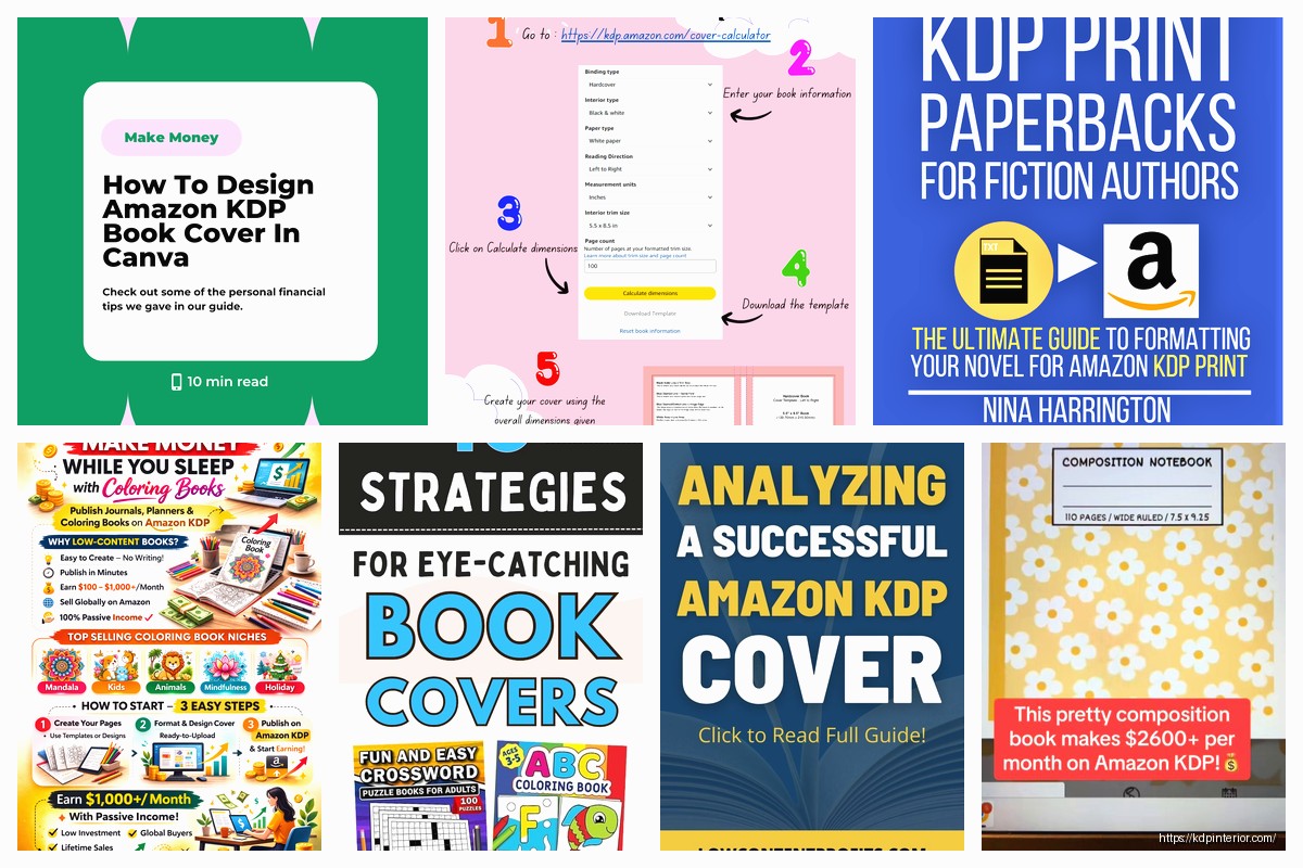
Okay so here’s the deal with KDP covers – I literally spent like three months testing different designs last year and lost probably $800 on covers that just tanked, so lemme save you that headache.
The Thumbnail Test Nobody Actually Does
First thing, and I cannot stress this enough, your cover needs to work at thumbnail size. Like shrink it down to the size of your actual thumbnail on your hand. Can you still read the title? Can you tell what the book is about in literally half a second? Because that’s all you get on Amazon search results.
I see so many designers making these gorgeous intricate covers with like twelve elements and fancy script fonts and… they’re completely unreadable at 120 pixels wide. Test this before you pay anyone. I use this trick where I upload the design to my phone and look at it while I’m like ten feet away from my screen. If I squint and can’t tell what it says, it’s gonna fail.
Font Size Reality Check
Your title font needs to be HUGE. Way bigger than feels comfortable when you’re looking at it full size. I’m talking like 40-50% of the cover height for the main title on most niches. Subtitle can be smaller but still readable.
And here’s something weird – sans serif fonts almost always perform better for low-content books. I tested this with my prayer journals last spring (while my cat kept walking across my keyboard, that was fun) and the clean sans serif outsold the pretty script version by like 3 to 1. People shopping on their phones need clarity over artistry.
Avoid these fonts entirely: anything that looks like Papyrus, Comic Sans obviously, and honestly most script fonts unless you’re doing wedding planners or very specific feminine niches. Even then, test it ruthlessly.
The Three-Second Rule
Someone scrolling Amazon should understand your book’s purpose in three seconds max. Color coding helps here – planners should look organized, journals can be warmer and more personal, activity books need energy and fun.
Color Psychology That Actually Matters
Okay so I’m gonna sound like every marketing course ever but colors genuinely do affect sales. Here’s what I’ve tested:
- Blue = trust, productivity, business stuff. Use it for planners, business journals, budget trackers
- Red = energy, urgency, passion. Good for fitness logs, recipe books, but can feel aggressive if overused
- Green = growth, health, money. Perfect for gratitude journals, garden planners, finance trackers
- Purple = luxury, spirituality, creativity. Works great for manifestation journals and premium positioning
- Yellow = caution here because it’s hard to read text on yellow backgrounds. Use as accent only
- Black/white = sophistication, minimalism. Safe choice that works for almost everything
But here’s the thing – you also gotta look at what’s already selling in your niche. Go to Amazon, search your main keyword, and screenshot the top 20 results. What colors dominate? If everyone’s using blue and you use orange, you’ll either stand out brilliantly or look completely out of place. Context matters.
I did this thing last month where I analyzed like 50 best-selling password logbooks and literally 80% were either black, blue, or had a tech/secure vibe. The few that used pink or floral designs? Way lower BSR. The market was telling me exactly what it wanted.
Contrast Is Your Best Friend
Light text on dark backgrounds or dark text on light backgrounds. That’s it. No medium gray text on medium blue backgrounds. No yellow text on white. My eyes hurt just thinking about it.
The easiest way to screw this up is using a busy background image and then trying to put text directly on it. You need either a solid color overlay or a clear space where the text sits. I usually do a semi-transparent dark rectangle behind white text or vice versa.
Background Images vs Solid Colors
Solid colors with simple geometric elements almost always win for me. They’re cleaner, more professional, and way easier to read at thumbnail size. Background images can work if they’re very subtle or blurred, but they need to support the text, not compete with it.
Exception: niche-specific imagery that immediately communicates purpose. Like a subtle coffee stain texture for a coffee tasting journal or light blueprint lines for a home renovation planner. But even then, keep it subtle.
Design Tools I Actually Use
Canva Pro – yeah everyone uses it but honestly it’s good enough for 90% of KDP covers. The templates are decent starting points and you can customize them enough to not look identical to everyone else’s. Costs like $13/month and worth it.
Creative Fabrica – subscription service for graphics, fonts, mockups. I use their elements to build custom covers in Canva. Way cheaper than buying individual graphics from Creative Market.
Adobe Illustrator – if you actually know design, but there’s a learning curve. I fumbled around with it for weeks before making anything decent.
Photopea – free Photoshop alternative that works in your browser. Good for quick edits when you don’t wanna open Canva.
Don’t waste money on Photoshop unless you’re already proficient. The subscription cost doesn’t make sense for most KDP publishers.
Working With Designers
If you’re outsourcing, here’s what I learned the hard way – be stupidly specific in your brief. Don’t just say “make me a prayer journal cover.” Give them:
- Exact dimensions (KDP cover calculator dimensions including spine)
- 3-5 example covers you like from Amazon
- Target audience (age, gender, interests)
- Color preferences and fonts to avoid
- Text hierarchy (what should be biggest, second biggest, etc)
- File format needed (PDF for print, JPG for ebook)
Fiverr can work but you gotta filter through a LOT of mediocre designers. I’ve had better luck with 99designs for important projects but it’s pricier. Upwork is middle ground.
Always ask for the source files so you can make edits later. You’d be surprised how many designers ghost after delivery.
The Subtitle/Description Balance
Your subtitle on the cover needs to do actual work. It should clarify what the book is or who it’s for. Not just decorative words.
Bad subtitle: “A Journey of Self Discovery” (says nothing)
Good subtitle: “90-Day Gratitude Journal with Prompts” (specific, clear value)
I see people trying to be poetic with their subtitles and like… save that for your book description. The cover needs to SELL, not inspire. There’s a difference.
Oh and another thing – if your niche is competitive, sometimes adding “for [specific audience]” in the subtitle helps. “Budget Planner for Moms” or “Fitness Journal for Beginners” immediately tells shoppers if this book is for them.
Series Branding Stuff
If you’re doing multiple books in a series or niche, keep the design template consistent. Same fonts, similar color schemes, recognizable layout. People should be able to spot your books as a collection.
I’ve got this whole line of productivity planners that all use the same font and layout style, just different accent colors. Makes creating new covers faster and builds brand recognition. Plus if someone buys one and likes it, they’ll recognize your other books immediately.
Template Building
Create a master template in Canva with your fonts, layout structure, and reusable elements saved. Then you can crank out new covers in like 20 minutes instead of starting from scratch each time. This is gonna sound obvious but I wasted so much time before I figured this out.
What Actually Converts
Based on my sales data across like 200+ books:
Clean, professional designs beat artistic ones – unless you’re in a creative/artistic niche obviously
Sans serif fonts beat script fonts – except wedding stuff and very feminine journals
Specific beats vague – “Meal Planner” beats “Food Journal”
Simple beats complex – three elements max on the cover
Contrast beats subtlety – people need to see it clearly
The books that made me the most money have the most boring covers honestly. My top seller is a password logbook with literally just text on a dark blue gradient background. No graphics, no fancy anything. It looks professional and secure and that’s what buyers wanted.
Meanwhile I spent $200 on this gorgeous illustrated cover for a gratitude journal and it barely sold. The market didn’t care about my artistic vision, they wanted something that looked credible and useful.
Sizing and Technical Specs
Use KDP’s cover calculator – don’t guess. Page count affects spine width and if you get this wrong your cover won’t upload properly.
For print books, remember the bleed area. Important elements need to stay at least 0.125 inches from the trim line or they might get cut off. Text especially – keep it at least 0.25 inches from edges to be safe.
Ebook covers are simpler – just 2560 x 1600 pixels minimum, but I usually do higher res just in case. JPG format, under 50MB but honestly keep it under 5MB for faster loading.
Common Technical Mistakes
Low resolution images that look pixelated – use 300 DPI minimum for print
Wrong color mode – use CMYK for print, RGB for ebook
Forgetting the spine – your cover needs front, spine, and back
Text in the bleed zone that gets cut off
File size too large for upload
I’ve had to redo covers because I forgot about the spine width changing when I added more pages. Annoying but fixable.
A/B Testing Your Covers
Here’s something most people don’t do – test different covers against each other. Upload one version, run ads or organic traffic for two weeks, track the conversion rate. Then swap to version two and compare.
I tested three different cover designs for a budget planner last year. Same interior, same price, different covers. The winner outsold the worst performer by 4x. Four times! Just from the cover difference.
You can’t do this simultaneously on KDP (against TOS to have duplicate books) but you can test sequentially or create different editions with legitimate differences.
Niche-Specific Considerations
Planners and organizers: need to look organized and professional. Clean lines, clear sections, structured feel.
Journals: can be warmer, more personal. But still readable at thumbnail size.
Activity books: need energy and fun. Bright colors, playful fonts, but not chaotic.
Logbooks and trackers: professional, trustworthy, no-nonsense. Think corporate vibes.
Coloring books: show what’s inside! A sample of the artwork as the cover usually works best.
Look honestly I’m running out of steam here but the main thing is just TEST everything. What works for my audience might bomb for yours. The only way to know is to put stuff out there, track your data, and iterate. I’ve probably redesigned covers for half my catalog at some point because the original versions weren’t converting.
Don’t get emotionally attached to a design. If it’s not selling, change it. Your bank account doesn’t care about your artistic integrity and neither do Amazon shoppers who are scrolling past your book in 0.5 seconds.
 Black Lined Journal: 120 Pages of Black Lined Paper Perfect for Journaling, KDP Notebook Template - 6×9
1 × $0.00
Black Lined Journal: 120 Pages of Black Lined Paper Perfect for Journaling, KDP Notebook Template - 6×9
1 × $0.00  Daily Planner Diary : Diary Planners for Everyday Productivity, 120 pages, 6×9 Size | Amazon KDP Interior
1 × $0.00
Daily Planner Diary : Diary Planners for Everyday Productivity, 120 pages, 6×9 Size | Amazon KDP Interior
1 × $0.00 
DISCOVER OUR FREE BEST SELLING PRODUCTS
Editable Canva Lined Journal: Express Your Thoughts – KDP Template
Lined Pages Journal 120 pages Ready to Upload PDF Commercial Use KDP Template 6×9 8.5×11 5×8 for Notebooks, Diaries, Low Content
Lined Pages Journal 120 pages Ready to Upload PDF Commercial Use KDP Template 6×9 8.5×11 5×8 for Notebooks, Diaries, Low Content
Cute Dogs Coloring Book for Kids | Activity Book | KDP Ready-To-Upload
Daily Planner Diary : Diary Planners for Everyday Productivity, 120 pages, 6×9 Size | Amazon KDP Interior
Wolf Coloring KDP interior For Adults, Used as Low Content Book, PDF Template Ready To Upload COMMERCIAL Use 8.5×11"
Coloring Animals Head Book for Kids, Perfect for ages 2-4, 4-8 | 8.5×11 PDF
Printable Blank Comic Book Pages PDF : Create Your Own Comics – 3 Available Sizes
Notes KDP interior Ready To Upload, Sizes 8.5×11 6×9 5×8 inch PDF FILE Used as Amazon KDP Paperback Low Content Book, journal, Notebook, Planner, COMMERCIAL Use
Black Lined Journal: 120 Pages of Black Lined Paper Perfect for Journaling, KDP Notebook Template – 6×9
Student Planner Journal 120 pages Ready to Upload PDF Commercial Use KDP Template 6×9" 8.5×11" for Low Content book
Recipe Journal Template – Editable Recipe Book Template, 120 Pages – Amazon KDP Interior