-
×
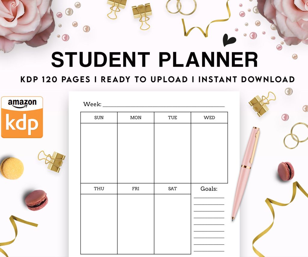 Student Planner Journal 120 pages Ready to Upload PDF Commercial Use KDP Template 6x9" 8.5x11" for Low Content book
1 × $0.00
Student Planner Journal 120 pages Ready to Upload PDF Commercial Use KDP Template 6x9" 8.5x11" for Low Content book
1 × $0.00
Subtotal: $0.00
Okay so the KDP Cover Creator is actually pretty decent if you’re just starting out or doing like super simple covers, and I tested it again last week because someone in my mastermind group was convinced it got better. Spoiler: it’s basically the same but here’s how to actually use it without wanting to throw your laptop.
So you’re logged into your KDP dashboard right? When you’re creating a new book or editing an existing one, you get to the part where it asks about your book cover. There’s gonna be two options – upload a cover you already made or “Launch Cover Creator.” That’s what you want. Click that second one.
Wait I forgot to mention – this only works for paperbacks and hardcovers. For ebooks you gotta upload your own cover file. KDP doesn’t let you create ebook covers with this tool which is kinda annoying but whatever.
The tool opens in a new window and honestly the interface looks like it hasn’t been updated since 2016 but it works. You’ll see your book dimensions already loaded based on what you entered earlier – trim size, page count, all that. Don’t mess with those unless you actually need to change your book specs.
First decision is picking between a few layout categories. You’ve got like Text Only, Image layouts, and Pattern layouts. I always skip Text Only because let’s be real, a cover with just text looks super amateur unless you’re already a bestselling author and people know your name.
The Image layouts are where most people should start. You can upload your own image or use one from their free stock library. And okay so funny story – I was making a notebook cover at like 2am while watching some true crime documentary and I accidentally used a photo of someone’s wedding because the thumbnail was tiny and I thought it was a flower arrangement. Didn’t notice until I ordered a proof copy. So yeah, actually look at the full images before selecting.
Their stock library is… fine? It’s not amazing but it’s free and royalty-free which matters. You’re not gonna find super unique stuff but for journals, notebooks, basic nonfiction – it works. I’ve used it for probably 30-40 of my low-content books when I was too lazy to design something custom.
If you’re uploading your own image, make sure it’s high resolution. Like minimum 300 DPI. The tool will let you upload lower quality stuff but it’ll look pixelated when printed and you’ll hate yourself when you see the proof. Been there.
File size limit is 40 MB which is pretty generous. I’ve never hit that limit even with huge image files. Accepted formats are JPEG, TIFF, and PNG. I usually go with PNG if my image has transparency or JPEG for everything else.
One thing that’s gonna sound weird but – upload an image that’s bigger than you think you need. The tool lets you zoom and position it, and if your image is too small you’ll just stretch it and it’ll look terrible. I learned this the hard way with a coloring book cover where I stretched a 1000px image across a 8.5×11 cover and it looked like it was printed in 1995.
Okay so once you’ve got your image or selected a stock photo, you can customize it. The controls are on the right side panel. You can adjust:
The drag and zoom thing is pretty intuitive. Just click and move stuff around. The opacity slider is actually useful if you want your image more subtle with text over it. I use that a lot for journal covers where I want a background pattern but don’t want it competing with the title.
Background colors – you get like a basic color picker. Nothing fancy. If you need a specific hex color you can enter it manually which is nice. I keep a spreadsheet of my brand colors for my different series and just copy-paste the hex codes.
This is where it gets a bit clunky honestly. You can add text for your title, subtitle, and author name. Each one is a separate text box you can customize.
Click “Add Text” and you’ll get options for:
The font selection is probably my biggest complaint. You don’t get access to like thousands of fonts. You get their pre-selected library and that’s it. Most are pretty standard – some serif, some sans-serif, a couple script fonts. Nothing super creative.
For my very first books I used the Cover Creator fonts and they’re fine but they don’t stand out. If you’re doing notebooks or journals where the cover doesn’t need to be super eye-catching, totally fine. For books where you’re competing in a crowded category? Ehhh you might want to make a custom cover elsewhere.
Font sizing is straightforward – just use the slider or type in a number. I usually start way too big and scale down. Better than starting too small and realizing your title is invisible in the thumbnail.
Oh and another thing – don’t sleep on the text effects. Adding a simple outline or drop shadow can make your text way more readable, especially if your background image is busy. I add a white outline to dark text or a black outline to light text pretty much always.
The shadow effect is hit or miss. Sometimes it looks good, sometimes it looks like a PowerPoint from 2003. Play around with it but don’t go crazy. Subtle is usually better.
You can layer multiple text elements which is useful. Like I’ll have my main title in one font, a subtitle in a different smaller font, and my author name in yet another style. Just click “Add Text” multiple times and position each element where you want it.
Here’s what a lot of people forget – you’re not just designing the front cover. The Cover Creator shows you the full wrap which includes spine and back cover.
For the spine, you can add your title and author name. The text runs vertically obviously. KDP will tell you if your spine is too narrow for text (happens with low page count books). If your book is under like 100 pages, you might not have room for spine text and that’s fine.
Back cover is where you add your book description or blurb. You can also add the same image from your front cover as a background, or use a different one, or just go with a solid color. I usually match the front cover style but make the back simpler.
Don’t forget to add your barcode space. Actually wait – KDP adds the barcode automatically so you need to make sure your back cover design doesn’t put important stuff in the bottom right corner where the barcode goes. The Cover Creator shows you a placeholder for where it’ll be.
You can add multiple text boxes on the back. I usually do:
Same text customization options as the front cover. I tend to use smaller font sizes on the back and keep it simple. Nobody’s buying your book based on the back cover design really, they just wanna read what it’s about.
My dog just knocked over my coffee while I’m writing this which is why there might be a typo somewhere, anyway…
Once you’re done designing, you gotta preview it. There’s a preview button that shows you how it’ll look. Actually look at this carefully. Zoom in and check:
That safe zone thing is important. The Cover Creator shows you guidelines for where your text and important images should stay. Anything outside that zone might get trimmed during printing. I’ve had covers where I put text too close to the edge and it got cut off. Super annoying.
If everything looks good, you can save it. The tool saves it directly to your KDP book setup – you don’t download a file or anything. It just applies to your book.
Yes thank god. If you need to make changes later, just go back to your book’s setup page and click “Launch Cover Creator” again. Your previous design will load and you can edit it. I’ve gone back and tweaked covers dozens of times after seeing how they look in the Amazon search results.
Okay real talk – the Cover Creator is fine for certain books but not everything. Here’s when I skip it and use Canva or hire a designer instead:
Fiction books: Your cover needs to compete with professionally designed covers. Cover Creator won’t cut it. Readers judge fiction books hard by their covers.
High-competition nonfiction: If you’re publishing in a category with tons of books, you need a standout cover. Cover Creator is too basic.
Books where you’re building a brand: If you’re creating a series or want a specific look across multiple books, you need more control than Cover Creator gives you.
When you need specific fonts or design elements: The tool is limited. If you have a vision that requires custom fonts, specific graphic elements, or complex layouts – go elsewhere.
I still use Cover Creator for my low-content books though. Notebooks, journals, planners, logbooks – stuff where the cover just needs to look clean and communicate what it is. For those it’s perfect and saves me hours.
People mess up the same things over and over with this tool:
Using low resolution images – seriously don’t do this. It’ll look like garbage printed.
Too much text – your cover isn’t a billboard. Keep text minimal and readable. I see people try to fit their entire book description on the front cover. Stop.
Ignoring the thumbnail – your cover needs to look good at tiny thumbnail size on Amazon. If your title isn’t readable when the cover is small, redesign it.
Choosing trendy fonts that’ll look dated quickly – stick with cleaner fonts that have staying power.
Not leaving enough white space – crowded covers look amateur. Give your elements room to breathe.
Forgetting about the spine – I mentioned this but people really do forget to design the spine and it ends up blank or weird.
When I use Cover Creator now, here’s my process:
I gather my images first. Either I’ve bought them from stock sites or I’m using my own photos. I resize them to be larger than needed – usually around 3000px on the shortest side.
I open Cover Creator and upload my background image. Position it how I want it.
Add my title text. I usually try 3-4 different fonts before picking one. Make it big enough to read in thumbnail.
Add subtitle if needed, author name. Keep these smaller and simpler than the title.
Design the back cover. I keep it super simple – usually just text on a solid color background that matches the front.
Add spine text if there’s room.
Preview everything. Check it on my phone to see how the thumbnail looks.
Save it and order a proof copy. This is crucial – always order a proof before publishing. Covers look different printed than on screen.
The whole process takes me maybe 20-30 minutes for a simple cover. Compare that to spending 2 hours in Photoshop or $150 hiring a designer, and for low-content books it’s totally worth it.
Oh wait I forgot to mention – if you’re doing a series of books, you can’t really save templates in Cover Creator. So if you want matching covers, you gotta recreate the design each time or save your settings somewhere else. I keep a Google doc with my font choices, colors, and layout notes for each series. Makes it faster to recreate similar covers.
The tool isn’t perfect but it’s free and it’s integrated right into KDP which is convenient. For beginners or for simple projects, it’s honestly all you need. Just don’t expect it to create bestseller-quality covers for competitive categories. Know its limitations and use it strategically.
DISCOVER OUR FREE BEST SELLING PRODUCTS
Editable Canva Lined Journal: Express Your Thoughts – KDP Template
Lined Pages Journal 120 pages Ready to Upload PDF Commercial Use KDP Template 6×9 8.5×11 5×8 for Notebooks, Diaries, Low Content
Lined Pages Journal 120 pages Ready to Upload PDF Commercial Use KDP Template 6×9 8.5×11 5×8 for Notebooks, Diaries, Low Content
Cute Dogs Coloring Book for Kids | Activity Book | KDP Ready-To-Upload
Daily Planner Diary : Diary Planners for Everyday Productivity, 120 pages, 6×9 Size | Amazon KDP Interior
Wolf Coloring KDP interior For Adults, Used as Low Content Book, PDF Template Ready To Upload COMMERCIAL Use 8.5×11"
Coloring Animals Head Book for Kids, Perfect for ages 2-4, 4-8 | 8.5×11 PDF
Printable Blank Comic Book Pages PDF : Create Your Own Comics – 3 Available Sizes
Notes KDP interior Ready To Upload, Sizes 8.5×11 6×9 5×8 inch PDF FILE Used as Amazon KDP Paperback Low Content Book, journal, Notebook, Planner, COMMERCIAL Use
Black Lined Journal: 120 Pages of Black Lined Paper Perfect for Journaling, KDP Notebook Template – 6×9
Student Planner Journal 120 pages Ready to Upload PDF Commercial Use KDP Template 6×9" 8.5×11" for Low Content book
Recipe Journal Template – Editable Recipe Book Template, 120 Pages – Amazon KDP Interior