-
×
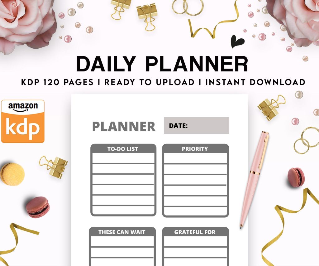 Daily Planner Diary : Diary Planners for Everyday Productivity, 120 pages, 6×9 Size | Amazon KDP Interior
1 × $0.00
Daily Planner Diary : Diary Planners for Everyday Productivity, 120 pages, 6×9 Size | Amazon KDP Interior
1 × $0.00
Subtotal: $0.00
Daily Planner Diary : Diary Planners for Everyday Productivity, 120 pages, 6×9 Size | Amazon KDP Interior
1 × $0.00 Subtotal: $0.00
Okay so the front cover is obviously where everyone starts but honestly the back cover is where I see most people completely drop the ball and it’s such a wasted opportunity because like… Amazon actually shows both in the preview now so you gotta think about them together.
Let me back up. Front cover first because that’s what sells the click. You need your title obviously, subtitle if you have one, and any imagery or design elements that communicate what the book IS in like 2 seconds. I’m talking thumbnail size because most people are browsing on mobile and your cover is gonna be the size of a postage stamp half the time.
The biggest mistake I see is people cramming too much text on there. Your title should be readable at thumbnail size – I literally test this by shrinking my design down to like 150px wide and if I can’t read it clearly, the font is too small or too fancy. Sans serif fonts generally work better for thumbnails than those fancy script fonts that everyone loves. Trust me I learned this the hard way with a cookbook I published in 2019 that had this gorgeous calligraphy font and nobody could read the damn title until they clicked through.
For the front cover dimensions you’re working with a ratio that’s basically standard book size – most people do 6×9 inches which comes out to 2700×4500 pixels at 300 DPI. That’s your safe zone. You can go bigger or smaller but that’s the sweet spot for most categories.
Colors matter more than you think. I spent like three weeks testing different color combinations for a planner series and the ones with high contrast between the background and text performed about 40% better in click-through. Not even joking. Dark background with light text or vice versa. The ones where I tried to be artistic with like… burgundy text on a dark purple background? Terrible numbers.
Oh and another thing about front covers – you need to think about your category. If you’re doing journals or planners you’re competing with thousands of other covers so you need to look professional but also stand out somehow. I usually add one unique element that’s different from the top 20 in my category. Maybe everyone’s using flowers so I use geometric patterns. Or everyone’s using gold foil effects so I go with a minimalist flat design.
The spine is where it gets tricky because the width depends on your page count. Amazon has this calculator but basically you take your page count, multiply by the paper thickness (0.002252 for white paper or 0.0025 for cream), and that gives you the spine width in inches. Then you convert to pixels at 300 DPI. For a 120-page book you’re looking at roughly 0.27 inches which is like… not a lot of space.
Most of my books under 100 pages I don’t even bother putting text on the spine because it’s too narrow and looks cramped. But if you’re over 120 pages you should definitely put the title and your author name. Make sure you’re using a font that’s at least 14pt, preferably bigger. And here’s something I wish someone told me earlier – rotate your text so people can read it when the book is lying face-up on a table. That means text runs from top to bottom on the spine.
Wait I forgot to mention bleed. You need 0.125 inches of bleed on all sides for print books. That means any background colors or images need to extend past your trim line by that much so you don’t end up with white edges if the cut is slightly off. I’ve had books come back with weird white slivers on the edge because I didn’t extend my background far enough and it’s super annoying.
Now the back cover… this is where it gets interesting because you have so much more flexibility. You need your book description obviously, but also this is where you can add value elements that don’t fit on the front.
I always include a “What’s Inside” section with bullet points. Like if it’s a journal I’ll list:
People actually read this stuff. I know because I’ve tested versions with and without these details and the ones with specific features convert better even though both versions are showing up in the same search results.
Your author bio can go on the back too but keep it short. Like 2-3 sentences max. Nobody’s buying a journal because of your life story but if you have relevant credentials throw them in there. “Created by a teacher with 10 years experience” or whatever.
The barcode goes on the back cover lower right usually. Amazon generates this automatically when you upload your files but you need to leave a white rectangle for it – about 2×1.2 inches with that 0.125 bleed around it. I usually put mine about 0.5 inches from the bottom and right edges. Make sure there’s nothing important behind it because it’ll get covered up.
This is gonna sound weird but I also test different background colors on the back versus the front. Sometimes I’ll do a complementary color that ties into the front cover design but isn’t identical. Like if the front is navy blue, maybe the back is a lighter blue or even white with navy accents. It creates visual interest when someone’s looking at the 3D preview.
Speaking of 3D previews – Amazon’s preview tool is actually pretty good now. You should definitely check how your cover looks in that before you publish because sometimes things that look good flat look weird when wrapped around a book spine. I had this one design where I put a pattern across the spine and it just… didn’t line up right when you looked at the 3D version. Had to redo the whole thing.
For text hierarchy on the back cover think about it like this: your book description is the most important thing, then your feature list, then author bio if you include one. I use different font sizes to create that hierarchy – usually 12pt for the main description, 10pt for features, maybe 8pt for the bio. Keep everything readable though. If you’re squinting at your screen to read it, it’s too small.
Oh and margins. Don’t put text too close to the edges on the back cover. I keep at least 0.25 inches from the trim line (plus the bleed) so nothing important gets cut off. This is especially important near the spine because the book curves there and text can disappear into the binding.
Templates are your friend here. I use Canva Pro for most of my covers now – yeah I know some designers are gonna hate me for saying that but it’s fast and they have templates that are already sized correctly. You can also use Adobe InDesign or Photoshop if you’re fancy. I started with GIMP because it’s free and honestly it works fine if you know what you’re doing.
The key with any tool is making sure you’re exporting at the right resolution. 300 DPI minimum for print. I’ve seen people upload 72 DPI covers that look fine on screen but print super pixelated. Amazon will usually reject them but not always, and then you get bad reviews about print quality.
File format matters too – PDF is what Amazon wants for the full cover (front, spine, back as one file). Make sure you’re saving as PDF/X-1a if you have that option. It flattens everything and makes sure colors stay consistent.
Color profiles… okay this gets technical but you want CMYK not RGB for print. RGB is what screens use, CMYK is what printers use. If you design in RGB your colors might look different when printed. I learned this with a bright red cover that came out kind of orangey because I didn’t convert the color profile. My cat knocked over my coffee while I was fixing that one and I had to redo like 15 files, it was a whole thing.
For fonts you gotta make sure you have the license to use them commercially. A lot of free fonts from random websites don’t include commercial licenses. Google Fonts are safe because they’re all open source. I probably use Montserrat or Open Sans on like half my covers at this point because they’re clean and readable.
Alignment is another thing people mess up. Your spine text needs to be perfectly centered or it looks sloppy. Same with your back cover text – use alignment guides in whatever software you’re using. Most programs have a snap-to-grid feature that helps with this.
If you’re doing a series you want consistency across covers. Same fonts, similar color schemes, same layout structure. People should be able to tell at a glance that books belong together. I have a planner series where every cover is the same layout just different colors and it makes them instantly recognizable.
Testing different versions is smart if you have time. I’ll sometimes create 2-3 variations and ask in Facebook groups which one people prefer. Or run them past friends who aren’t designers because they’ll give you the honest “I have no idea what this book is about” feedback that you actually need.
One more thing about the front cover – if you’re using stock photos make sure you have the extended license for print. Some stock sites require this for anything physical. Unsplash and Pexels are free and allow commercial use which is nice but everyone uses the same photos so your cover might look like 50 other books.
The back cover can have testimonials if you have them but honestly for low-content books nobody expects reviews on the back. That’s more of a novel thing. But if you have a bunch of books published and one did really well you could put “From the creator of [bestselling book]” or something.
I usually spend more time on the front cover than the back – maybe 70/30 split. The front sells the click, the back just needs to not screw up the sale once someone’s already interested. But both need to look professional because people do flip through the preview.
White space is underrated. Don’t fill every inch of your cover with stuff. Let it breathe a little. Some of my best-performing covers are super minimalist – just the title, one design element, and lots of empty space.
Anyway that’s basically the whole process. Make sure you proofread everything because typos on covers are embarrassing and you can’t fix them without unpublishing and losing reviews. And always order a proof copy before you go wide with marketing because screens lie and you wanna see what it actually looks like in your hands.
DISCOVER OUR FREE BEST SELLING PRODUCTS
Editable Canva Lined Journal: Express Your Thoughts – KDP Template
Lined Pages Journal 120 pages Ready to Upload PDF Commercial Use KDP Template 6×9 8.5×11 5×8 for Notebooks, Diaries, Low Content
Lined Pages Journal 120 pages Ready to Upload PDF Commercial Use KDP Template 6×9 8.5×11 5×8 for Notebooks, Diaries, Low Content
Cute Dogs Coloring Book for Kids | Activity Book | KDP Ready-To-Upload
Daily Planner Diary : Diary Planners for Everyday Productivity, 120 pages, 6×9 Size | Amazon KDP Interior
Wolf Coloring KDP interior For Adults, Used as Low Content Book, PDF Template Ready To Upload COMMERCIAL Use 8.5×11"
Coloring Animals Head Book for Kids, Perfect for ages 2-4, 4-8 | 8.5×11 PDF
Printable Blank Comic Book Pages PDF : Create Your Own Comics – 3 Available Sizes
Notes KDP interior Ready To Upload, Sizes 8.5×11 6×9 5×8 inch PDF FILE Used as Amazon KDP Paperback Low Content Book, journal, Notebook, Planner, COMMERCIAL Use
Black Lined Journal: 120 Pages of Black Lined Paper Perfect for Journaling, KDP Notebook Template – 6×9
Student Planner Journal 120 pages Ready to Upload PDF Commercial Use KDP Template 6×9" 8.5×11" for Low Content book
Recipe Journal Template – Editable Recipe Book Template, 120 Pages – Amazon KDP Interior