Okay so the cover dimensions thing trips up literally everyone when they start with KDP and honestly I still double-check the specs every time because messing this up means your book looks unprofessional or worse, gets rejected.
The Basic Numbers You Actually Need
Right so for ebooks it’s actually pretty straightforward. You want your cover at 2560 x 1600 pixels minimum. That’s the ratio KDP recommends and it works for pretty much everything. I always design at 2700 x 1800 just to have a bit of buffer because… I dunno, it makes me feel safer? The aspect ratio is 1.6:1 which means height needs to be 1.6 times the width.
Here’s where people screw up though – they think bigger is always better and upload like 5000 x 8000 pixel files. Amazon’s gonna compress that anyway and your file size balloons. Keep it under 50MB but honestly if your cover is over 10MB you’re doing something wrong with your export settings.
Paperback Covers Are Where It Gets Annoying
Oh man okay so paperbacks are a whole different beast because you’re dealing with a full wraparound cover. You need front cover, back cover, AND spine. Amazon has this cover calculator that you gotta use and I’m not even gonna pretend I memorize the formulas.
The calculator is at kdp.amazon.com/cover-calculator or something like that, just google “KDP cover calculator” and it’s the first result. You input your:
- Trim size (book dimensions)
- Page count
- Paper type (white or cream)
- Binding type (paperback or hardcover)
And it spits out the exact dimensions you need. The spine width changes based on page count which makes sense when you think about it – a 50 page book has a way thinner spine than a 300 page one.
Bleed and Safe Zones Because Amazon Will Crop Your Stuff
This is gonna sound tedious but you need to understand bleed. Bleed is the extra area around your cover that extends past where the book will actually be cut. For KDP it’s 0.125 inches (or 3.2mm) on all sides for paperbacks.
So if your book is 6×9 inches, your actual cover template needs to account for bleed. The image extends into that bleed area so when the printer cuts the book, you don’t end up with white edges if the cut is slightly off.
Then there’s the safe zone which is the area where you should keep all your important text and images. Usually that’s 0.125 inches INSIDE the trim line. So important stuff needs to stay at least a quarter inch from the edge when you factor in both bleed and safe zone.
Wait I forgot to mention – the spine also has a safe zone. You don’t wanna put text right at the edge of the spine because binding can obscure it. Keep text at least 0.0625 inches from the spine edges.
My Actual Workflow That Works
Okay so here’s what I actually do. I use Canva Pro for most of my covers now because I’m lazy and it’s fast, but I started with Photoshop and GIMP back in the day. For ebooks:
- Create new project at 2700 x 1800 pixels, 300 DPI
- Design the cover keeping the title in the top two-thirds because that’s what shows in thumbnails
- Export as JPG at high quality (not maximum, high is fine)
- Check file size – should be 2-5MB usually
For paperbacks it’s more involved and honestly I usually use Amazon’s Cover Creator for simple projects or hire it out for anything I’m serious about. But when I do them myself:
- Run the cover calculator, download the template
- Open template in Photoshop or whatever
- The template shows you exactly where front, spine, and back go plus all the safe zones
- Design within those guides
- Make sure your spine text reads top to bottom (this is standard)
- Export as PDF for best quality
Common Screw-ups I See All The Time
People make the spine text too big and it wraps onto the front or back cover. Your spine width is what it is – if your text doesn’t fit you gotta use a smaller font or abbreviate. I did a journal once where I tried to cram “Daily Productivity Journal for Entrepreneurs” on a 200-page spine and it looked ridiculous.
Another thing – using RGB color mode instead of CMYK for paperbacks. Ebooks are fine with RGB because they’re digital, but print uses CMYK and the colors shift. That bright blue you picked? It’s gonna print darker and more muted. I learned this the hard way on my third book and the covers came back looking muddy.
Oh and low resolution images. If you grab something off Google Images that’s 800×600 pixels and stretch it across your cover, it’s gonna look pixelated and terrible. Always use high-res stock photos or graphics. I use Depositphotos and Shutterstock mostly, sometimes Creative Fabrica for graphics.
The Thumbnail Test You Gotta Do
Here’s something that sounds obvious but people skip – look at your cover as a tiny thumbnail. Like actually shrink it down to 150 pixels tall and see if you can still read the title. Because that’s how 90% of people will first see your book on Amazon.
I literally keep a “thumbnail test” file on my desktop where I paste covers at tiny sizes. If I can’t read it clearly while squinting at my phone from across the room (yeah I actually do this, my cat judges me), the text is too small or the contrast is too low.
Your title needs to pop. High contrast between text and background. If you’re putting white text on a light background or black text on a dark background, add a stroke or shadow or something. Actually stroke usually works better than drop shadow for readability.
Templates and Tools That Don’t Suck
KDP’s Cover Creator is actually not terrible for simple stuff. It’s limited but if you’re doing a no-content book or something basic, it works. The templates are kinda generic looking though.
Canva has premade KDP cover templates at the right dimensions which is handy. You can customize them pretty heavily. I use this for probably 60% of my covers now because I can bang one out in 30 minutes instead of spending three hours in Photoshop.
For Photoshop people, there are templates on Creative Market and Etsy. Some are good, some are garbage. Read reviews. I bought a bundle once that looked great in the preview but the layers were a mess and nothing was labeled properly. Waste of $30.
GIMP is free and works fine if you’re on a budget. The interface is less intuitive than Photoshop but it handles all the same file types and has the tools you need. There’s a learning curve though.
File Format Stuff That Matters
For ebooks, upload JPG or TIFF. JPG is smaller and loads faster so that’s what I use. Save at quality level 10 or 11 out of 12 – you don’t need maximum quality and it just bloats the file.
For paperbacks, PDF is best. When you export, make sure you’re flattening all layers and embedding fonts. I’ve had uploads rejected because fonts weren’t embedded and Amazon couldn’t render the text properly.
PNG works too but the files are huge for no real benefit on print covers. Stick with JPG or PDF.
Typography Tips That’ll Make Your Covers Look Pro
Don’t use more than two fonts on a cover. Title font and maybe a different font for subtitle or author name. Three fonts starts looking messy unless you really know what you’re doing.
Fonts need to be bold enough to read at thumbnail size. Those elegant thin serif fonts look beautiful up close but disappear when scaled down. I learned this watching Succession one night and designing a cover at the same time – kept switching between the show and checking my cover, realized I couldn’t read the title without my glasses.
Hierarchy matters. Your title should be the biggest thing, subtitle smaller, author name smaller still. Sometimes you can flip author name and title if you’re a big name author but for most of us starting out, title dominates.
Color and Contrast Real Talk
Look at bestsellers in your category and notice the color schemes. There are trends. Right now in self-help there’s a lot of bold colors with minimalist designs. In thriller there’s dark covers with red accents. You don’t have to follow trends exactly but you should be aware of them.
Contrast is more important than pretty colors. A cover can be ugly color-wise but if it has high contrast it’ll still catch eyes. A gorgeous low-contrast cover will get scrolled past.
Test your cover in grayscale. If it still looks good and the text is readable, your contrast is probably fine. If everything mushes together, you need more contrast.
The Spine Width Thing That Confuses Everyone
Spine width is calculated based on page count and paper type. White paper is slightly thicker than cream, so white paper = wider spine for the same page count.
For a 200-page book on white paper, you’re looking at roughly 0.45 inches spine width. But don’t guess – use the calculator every single time because it changes with different trim sizes too.
If your book is under 100 pages the spine might be too narrow for text. In that case just leave it blank or put a small graphic. Amazon recommends at least 0.25 inches spine width before adding text.
Hardcover Dimensions Because Why Not
Hardcovers are available now but honestly I haven’t done many because the production costs are high and they don’t sell as well for most niches. But the dimensions work similarly – you use the cover calculator, it gives you the template with dust jacket dimensions.
The dust jacket wraps further around the front and back covers than a paperback, so there are extra flaps. The calculator handles all this. Just know that hardcover spines are generally wider than paperback spines for the same page count.
International Marketplaces and Dimensions
Good news – the dimensions are the same across all Amazon marketplaces. A cover you design for Amazon.com works on Amazon.co.uk, Amazon.de, etc. You don’t need different versions for different countries.
The only thing that might change is adding translations of your title or subtitle if you’re publishing in multiple languages, but the physical dimensions stay consistent.
Okay so that’s basically everything I wish someone had told me when I started. The biggest thing is just using Amazon’s calculator for paperbacks and not trying to wing it. And checking your covers at thumbnail size before you upload because that’s genuinely how people will see them first and… yeah just do that test every time.
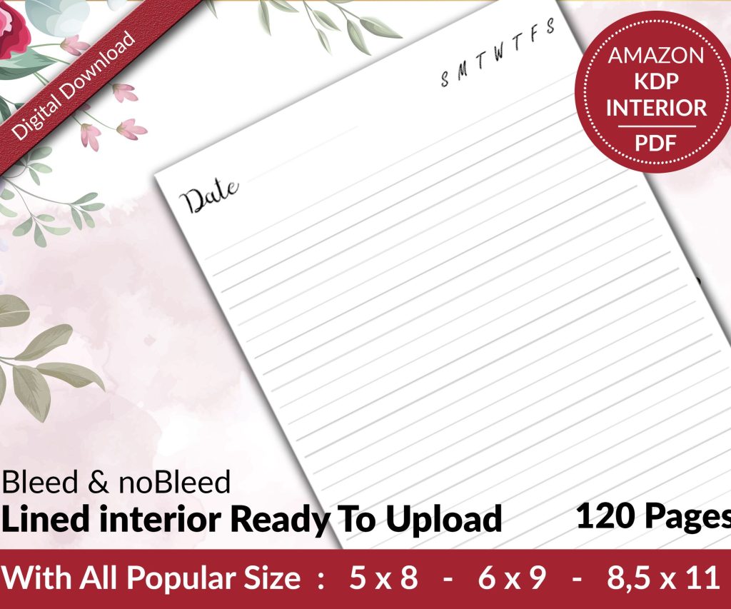 Lined Pages Journal 120 pages Ready to Upload PDF Commercial Use KDP Template 6x9 8.5x11 5x8 for Notebooks, Diaries, Low Content
1 × $0.00
Lined Pages Journal 120 pages Ready to Upload PDF Commercial Use KDP Template 6x9 8.5x11 5x8 for Notebooks, Diaries, Low Content
1 × $0.00  Editable Canva Lined Journal: Express Your Thoughts - KDP Template
1 × $0.00
Editable Canva Lined Journal: Express Your Thoughts - KDP Template
1 × $0.00 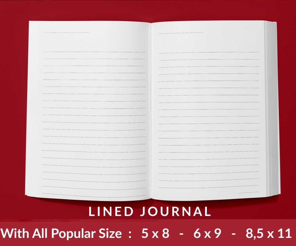 Lined Pages Journal 120 pages Ready to Upload PDF Commercial Use KDP Template 6x9 8.5x11 5x8 for Notebooks, Diaries, Low Content
1 × $0.00
Lined Pages Journal 120 pages Ready to Upload PDF Commercial Use KDP Template 6x9 8.5x11 5x8 for Notebooks, Diaries, Low Content
1 × $0.00 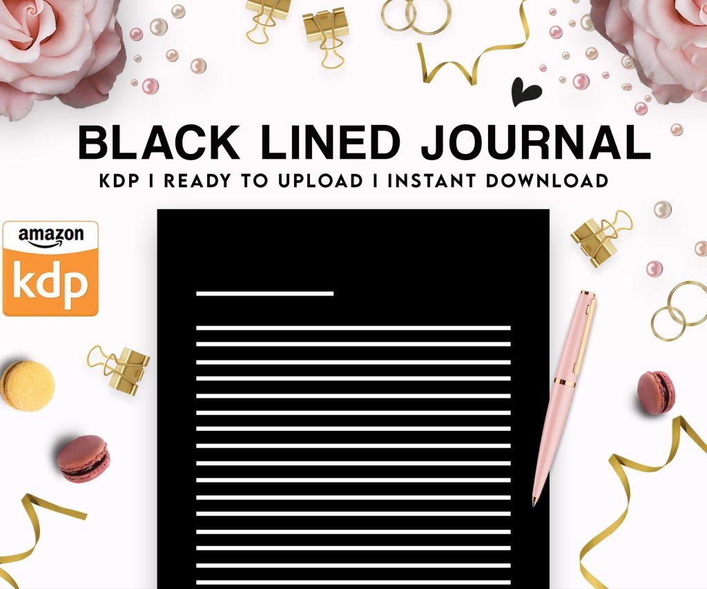 Black Lined Journal: 120 Pages of Black Lined Paper Perfect for Journaling, KDP Notebook Template - 6×9
1 × $0.00
Black Lined Journal: 120 Pages of Black Lined Paper Perfect for Journaling, KDP Notebook Template - 6×9
1 × $0.00 
DISCOVER OUR FREE BEST SELLING PRODUCTS
Editable Canva Lined Journal: Express Your Thoughts – KDP Template
Lined Pages Journal 120 pages Ready to Upload PDF Commercial Use KDP Template 6×9 8.5×11 5×8 for Notebooks, Diaries, Low Content
Lined Pages Journal 120 pages Ready to Upload PDF Commercial Use KDP Template 6×9 8.5×11 5×8 for Notebooks, Diaries, Low Content
Cute Dogs Coloring Book for Kids | Activity Book | KDP Ready-To-Upload
Daily Planner Diary : Diary Planners for Everyday Productivity, 120 pages, 6×9 Size | Amazon KDP Interior
Wolf Coloring KDP interior For Adults, Used as Low Content Book, PDF Template Ready To Upload COMMERCIAL Use 8.5×11"
Coloring Animals Head Book for Kids, Perfect for ages 2-4, 4-8 | 8.5×11 PDF
Printable Blank Comic Book Pages PDF : Create Your Own Comics – 3 Available Sizes
Notes KDP interior Ready To Upload, Sizes 8.5×11 6×9 5×8 inch PDF FILE Used as Amazon KDP Paperback Low Content Book, journal, Notebook, Planner, COMMERCIAL Use
Black Lined Journal: 120 Pages of Black Lined Paper Perfect for Journaling, KDP Notebook Template – 6×9
Student Planner Journal 120 pages Ready to Upload PDF Commercial Use KDP Template 6×9" 8.5×11" for Low Content book
Recipe Journal Template – Editable Recipe Book Template, 120 Pages – Amazon KDP Interior