-
×
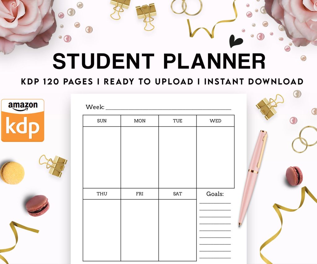 Student Planner Journal 120 pages Ready to Upload PDF Commercial Use KDP Template 6x9" 8.5x11" for Low Content book
2 × $0.00
Student Planner Journal 120 pages Ready to Upload PDF Commercial Use KDP Template 6x9" 8.5x11" for Low Content book
2 × $0.00
Subtotal: $0.00
Okay so the case laminate hardcover specs on KDP are honestly not as complicated as people make them seem but there ARE some gotchas that’ll mess you up if you don’t pay attention. I literally uploaded three wrong files last month because I wasn’t thinking about the spine width calculator properly.
First thing – case laminate is different from dust jacket. I know that sounds obvious but you’d be surprised how many people in the Facebook groups mix these up. Case laminate means the cover wraps around the boards and gets laminated directly onto them, no dust jacket involved. It’s that glossy finish you see on most modern hardcovers.
The dimensions depend entirely on your page count and paper type. KDP has this calculator tool and you HAVE to use it every single time. I’ve tried estimating before like “oh this is similar to my last book” and nope, even 10 pages difference can throw off your spine width enough that your cover looks misaligned.
Here’s what you need before you even open Photoshop or whatever:
– Final page count (must be divisible by 2, and KDP needs minimum 75 pages for hardcover)
– Your trim size
– Paper type (white or cream)
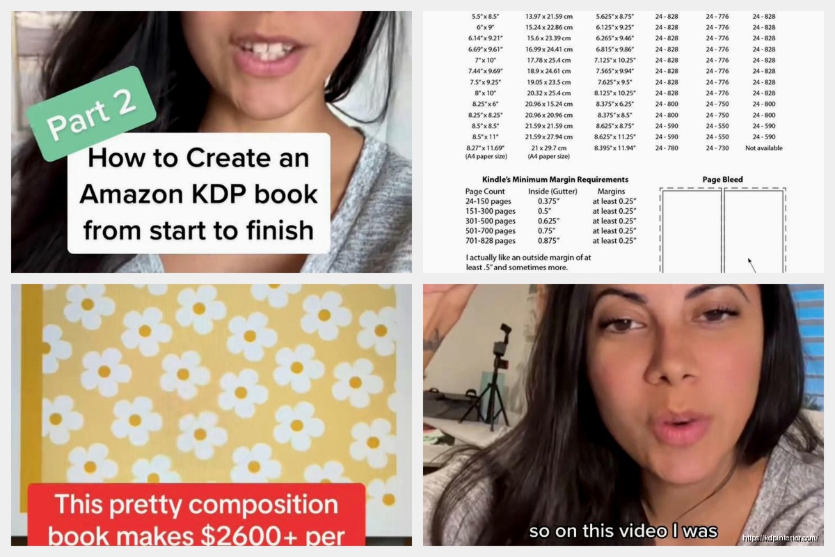
KDP supports these trim sizes for case laminate hardcovers:
The 6 x 9 is like the default everyone uses for nonfiction. I use it for probably 70% of my books. The 8.5 x 11 works great for workbooks or planners if you’re doing low-content stuff.
So you go to the KDP cover calculator – just google “kdp cover calculator” it’s the first result. You plug in your specs and it spits out the exact dimensions you need.
The template gives you a full wraparound dimension. For a 6 x 9 book with 200 pages on white paper, you’re looking at something like 12.275 inches wide by 9.250 inches tall. But here’s the thing… that width includes the front cover, the spine, and the back cover all in one continuous image.
Okay this is gonna sound obvious but the bleed area is 0.125 inches (1/8 inch) on ALL sides. That means any background color or image needs to extend into that bleed area. I’ve had books come back where the edge of the cover was white because I didn’t extend my background far enough.
The safe zone is 0.125 inches INSIDE the trim line. So you’ve got bleed going out, trim line, then safe zone going in. Anything important – text, logos, images you don’t want cut off – needs to stay inside that safe zone.
The spine is the tricky part because you’ve also got safe zones there. KDP recommends keeping text at least 0.0625 inches (1/16 inch) away from the edges of the spine. On thin books this basically means don’t put text on the spine at all. I learned this the hard way with a 150-page book where the title wrapped onto the front cover slightly. Looked terrible.
Your file needs to be:
The RGB vs CMYK thing trips people up constantly. Your monitor displays in RGB so what you see on screen will look more vibrant than the printed version. I always make my colors slightly more saturated than I think they need to be because CMYK printing dulls them down a bit.
Oh and another thing – if you’re using Canva or similar tools, make sure you’re downloading as PDF Print, not PDF Standard. The Print version handles colors better for physical printing.
The spine width formula changes based on paper type and page count. White paper is thinner than cream paper, so same page count = different spine width.
For white paper it’s roughly:
(page count × 0.0025) + 0.175 inches
For cream paper:
(page count × 0.00271) + 0.175 inches
But honestly just use KDP’s calculator because they update these formulas sometimes and I don’t wanna be responsible for your cover being wrong lol
The 0.175 is the board thickness on both sides. The case laminate wraps around boards that are about 0.0875 inches thick each.
Typical spine layout from top to bottom:
– Author name
– Title
– Publisher logo or imprint (if you have one)
Some people flip this and put title on top. Honestly it depends on your genre. Check bestsellers in your category and copy what they do.
For books under 130 pages or so, I usually skip the spine text entirely. It’s too narrow to read anyway and risks looking amateurish if it’s cramped or misaligned.
I use Adobe InDesign for most of my covers now but I started with Canva and GIMP. Here’s the thing – you CAN make a professional hardcover with free tools, you just gotta be more careful about color modes and resolution.
If you’re using Canva, you need the paid version to download as CMYK. The free version only exports RGB which means KDP will reject it or the colors will be way off. I paid for Canva Pro for like two years before switching to Adobe.
Photoshop works great if you’re comfortable with it. Just make sure you set up your document in CMYK from the start. Converting RGB to CMYK after the fact doesn’t work as well.
My cat just knocked over my coffee cup which is perfect timing because I needed a break anyway…
Wrong barcode placement – KDP adds the barcode automatically on the back cover, bottom right. You don’t design one yourself. But you DO need to leave space for it. The barcode area is about 2 x 1.2 inches and needs to be in the safe zone on the back cover, lower right corner.
I’ve seen people design covers with text or important images right where the barcode goes. KDP will just slap that barcode on top of your design and it looks awful.
Spine text alignment – the text should read correctly when the book is lying face-up on a table. That means reading from top to bottom. Some European books do bottom to top but in the US market, always top to bottom.
Not accounting for the board thickness – the spine isn’t flat, it’s got depth because of those boards. Your wrap template accounts for this with that 0.175 measurement but visually you need to understand that the spine image will wrap around a 3D edge. High contrast designs can look weird at this transition point.
This frustrated me for MONTHS when I started. My covers looked amazing on screen – vibrant blues, rich blacks – and then the printed version arrived looking muddy and dull.
Two things happening here:
First, monitors are backlit and show RGB color which has a way bigger color gamut than CMYK printing can reproduce. Those bright digital colors literally cannot be printed with standard CMYK inks.
Second, KDP uses different paper and printing processes than like, a professional offset printer would use. The paper has some texture and absorbency that affects color saturation.
What I do now: I have a printed color swatch book of CMYK values and I reference it when choosing colors. Sounds old school but it works. You can buy these on Amazon for like $30.
Also I keep one copy of every book I print as a reference. When I’m designing a new cover, I pull out previous books to remind myself how colors actually turn out.
Rich black vs. regular black is a whole thing. Regular black in CMYK is 0/0/0/100 (just the K channel). Rich black adds in other colors like 60/40/40/100 to make it deeper and more saturated.
For large black areas like backgrounds, use rich black. For thin text, use regular black because rich black can cause registration issues where the colors don’t align perfectly and you get blurry edges.
When you download the template from KDP’s calculator, you get a PNG file with guides showing the trim lines, safe zones, and spine area. This is super helpful.
I create a new document with the exact dimensions from the calculator, then place this template PNG on a locked layer at the bottom. Then I design on layers above it. This way I can always see where my safe zones are but the template layer won’t accidentally get included in the export.
Make sure your document is:
– CMYK color mode
– 300 DPI resolution
– Dimensions matching the calculator exactly (including bleed)
The full bleed dimension is what matters. So if the calculator says 12.275 x 9.25, your document is 12.275 x 9.25, not the trim size.
Front cover: your title, subtitle if you have one, author name, maybe a tagline or series info. Plus whatever imagery or design you’re using. Keep all text in the safe zone.
Spine: author name and title at minimum. Some people add a small publisher logo. Remember the safe zones here are tighter – stay at least 1/16 inch from the spine edges.
Back cover: book description or blurb, author bio, maybe testimonials or review quotes, your author photo if you want. And don’t forget to leave space for that barcode in the bottom right.
Inside flaps – wait no, case laminate doesn’t have flaps. That’s dust jackets. See, I still mix these up sometimes and I’ve been doing this for years.
In InDesign I export as PDF/X-1a:2001 which automatically handles a lot of the technical requirements. In Photoshop you’d flatten all layers and Save As PDF with CMYK color profile.
Before uploading to KDP, I always:
KDP’s previewer tool will show you how the cover wraps around the book in 3D which is helpful for catching spine alignment issues.
Always, ALWAYS order a proof copy before you publish. The proof costs you basically just printing and shipping, and it’s worth every penny.
I’ve caught issues with proof copies that I never would’ve seen on screen – colors that looked fine digitally but clashed in person, text that was technically in the safe zone but felt too close to the edge, spine titles that weren’t quite centered.
Order the proof, wait for it to arrive (usually like a week), check it carefully in good lighting, and then either approve it or upload a revised version.
One time I skipped this step because I was in a hurry to publish before Christmas and yeah… the spine text was off-center by enough that it looked sloppy. Had to take the book down, fix it, and reupload. Lost two weeks of potential sales during prime season.
This isn’t exactly about the template but it matters – hardcovers are expensive to print. Your printing cost will be way higher than paperback, which means you gotta price higher to make any royalty.
For a 200-page 6×9 hardcover, printing cost is around $8-9. If you price at $24.99, your royalty after Amazon’s cut is maybe $4-5. Compare that to a paperback of the same book where printing might be $3 and royalty could be $5-6 even at a lower retail price.
Point being, make sure your cover design justifies the hardcover price point. It should look premium and professional because readers are paying premium prices.
Okay I think that covers the main stuff about case laminate specs and templates. The key things are using KDP’s calculator for exact dimensions, staying in the safe zones, exporting in CMYK at 300 DPI, and ordering proofs before publishing. Everything else you’ll figure out as you go.
DISCOVER OUR FREE BEST SELLING PRODUCTS
Editable Canva Lined Journal: Express Your Thoughts – KDP Template
Lined Pages Journal 120 pages Ready to Upload PDF Commercial Use KDP Template 6×9 8.5×11 5×8 for Notebooks, Diaries, Low Content
Lined Pages Journal 120 pages Ready to Upload PDF Commercial Use KDP Template 6×9 8.5×11 5×8 for Notebooks, Diaries, Low Content
Cute Dogs Coloring Book for Kids | Activity Book | KDP Ready-To-Upload
Daily Planner Diary : Diary Planners for Everyday Productivity, 120 pages, 6×9 Size | Amazon KDP Interior
Wolf Coloring KDP interior For Adults, Used as Low Content Book, PDF Template Ready To Upload COMMERCIAL Use 8.5×11"
Coloring Animals Head Book for Kids, Perfect for ages 2-4, 4-8 | 8.5×11 PDF
Printable Blank Comic Book Pages PDF : Create Your Own Comics – 3 Available Sizes
Notes KDP interior Ready To Upload, Sizes 8.5×11 6×9 5×8 inch PDF FILE Used as Amazon KDP Paperback Low Content Book, journal, Notebook, Planner, COMMERCIAL Use
Black Lined Journal: 120 Pages of Black Lined Paper Perfect for Journaling, KDP Notebook Template – 6×9
Student Planner Journal 120 pages Ready to Upload PDF Commercial Use KDP Template 6×9" 8.5×11" for Low Content book
Recipe Journal Template – Editable Recipe Book Template, 120 Pages – Amazon KDP Interior