Amazon KDP guide, KDP book publishing
Amazon KDP Journal Template: Interior Design Library
Mar
Okay so I literally just finished uploading like three journal templates last week and the interior design thing is actually way easier than people make it sound. Let me walk you through what I keep in my library because honestly once you’ve got these base files set up you can just remix them forever.
The Core Templates You Actually Need
So first thing – you don’t need like 50 different templates. I wasted probably six months building out all these fancy variations when really you need maybe 5-6 solid base templates and then you just… change colors and headers. That’s it.
The main ones I use constantly are lined pages, dotted pages, blank pages, half-and-half layouts (lined on top, blank on bottom), and then habit trackers. Those five cover like 90% of what sells. The other stuff is just me getting bored and making weird combinations that sometimes work.
For the actual specs – and this is gonna sound obvious but I see people mess it up all the time – you need to work in the trim size you’re publishing in. I mostly do 6×9 because it’s the sweet spot for production costs and people actually like that size for journaling. So my base template is 6.25″ x 9.25″ to account for bleed. Amazon wants that 0.125″ bleed on all sides.
Setting Up Your Master Files
I use Canva Pro for most of this now because honestly Adobe got too expensive and Canva added bleed settings last year which changed everything. But if you’re using Affinity or Photoshop or whatever, same principles apply.
Create your 6.25 x 9.25 document. Set up guides at 0.125″ from each edge – that’s your safety zone where nothing important should live. Like don’t put page numbers right at the edge or they’ll get cut off and you’ll get those annoying customer complaints.
The margins inside the safety zone matter too. I usually do 0.5″ on the top, bottom, and outside edge, then 0.75″ on the inside (the spine side) because books need that gutter space or writing gets lost in the binding. Learned that one the hard way when my first journal had people complaining they couldn’t write on the inside edge.
Line Spacing and Grid Measurements
This is where people get weirdly perfectionist but also it does matter. For lined journals, I settled on 0.25″ spacing between lines after testing like eight different variations. It’s not too cramped, not too spacious. Some people do 0.3″ for a more generous feel but then you get fewer lines per page and it feels less valuable somehow?
Dotted journals – I do a 0.2″ grid. That’s a dot every 0.2 inches both horizontally and vertically. Makes it good for bullet journaling, sketching, whatever. The dots themselves should be subtle, like 10-15% opacity in a gray. Not black dots, that’s too harsh.
Oh and another thing – I make my dots actual circles, not squares or random shapes. Sounds dumb but I bought a competitor’s journal once to check it out and they used square dots and it just looked… off. My cat knocked over my coffee while I was measuring all this out and I had to redo an entire template but whatever, that’s the life.
Color Schemes and Branding Elements
So here’s what I keep in my library as far as color goes. I have maybe 10-12 color palettes saved with specific hex codes. Things like “Minimalist Neutral” (beiges and grays), “Productivity Bold” (navy, orange, teal), “Feminine Soft” (blush, sage, cream), you get it.
When I create a new journal, I’m not picking colors from scratch. I’m opening one of these palettes and applying it to my base template. The lines might go from gray to sage green. The header text might go from black to navy. Takes like five minutes instead of an hour of choosing colors.
For headers and footers – if you’re adding them – keep them simple. I usually do a thin decorative line (like 0.5pt weight) at the top of the page, maybe a small text element that says the journal purpose if it’s specific. “Daily Reflection” or “Gratitude Log” or whatever. Font size around 8-10pt, something readable but not dominant.
Page Number Positioning
Wait I forgot to mention page numbers. You want them but they’re weirdly tricky. I put mine centered at the bottom, about 0.3″ from the page edge (but still within that safety zone). Font size 9pt usually. And here’s the thing nobody tells you – start your page numbering on page 1 of the actual journal content, not including your title page or copyright page or whatever front matter you have.
Amazon’s gonna add its own page count based on your total file but your internal numbering should make sense to the user. I usually do Roman numerals (i, ii, iii) for front matter if I include numbered pages there at all, then switch to regular numbers (1, 2, 3) for the journal pages.
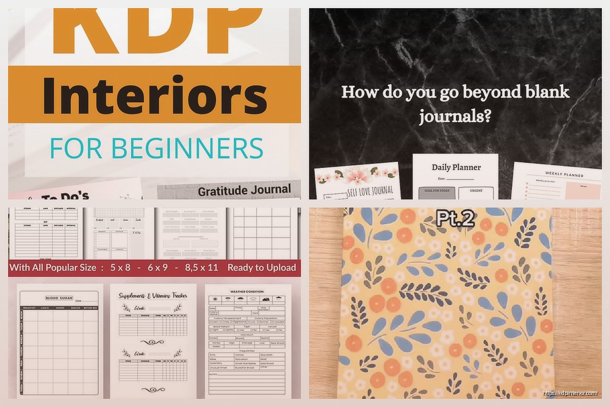
Building Specialty Pages
Okay so beyond basic lined or dotted pages, you’re gonna want some variety pages. This is where your interior design library gets actually useful.
I have templates for monthly calendar spreads – just a simple grid, seven columns, however many rows you need for the month. I don’t pre-fill dates because then it’s dated and you can’t sell it year-round. Just label the columns S M T W T F S and let people fill in their own dates.
Habit tracker pages – usually a grid with 31 rows (for days) and like 6-10 columns (for habits to track). Little checkbox circles in each cell. Super popular right now, everyone wants to track their water intake or whatever.
Goal setting pages with sections for different timeframes. Like “This Month,” “This Quarter,” “This Year” as separate areas with lines underneath. People eat that stuff up.
Weekly spread pages with boxes for each day. I do these in a vertical layout, seven boxes stacked, each one gets about an inch of space with lines inside.
The Assembly Process
Here’s how I actually build a full journal interior. I’ve got all these master templates saved as individual files or pages. When I’m creating a new journal, I’m not designing from scratch – I’m assembling.
Let’s say I’m making a goal-setting journal. I’ll pull:
– Title page (customized with the new journal name)
– Copyright page (stays basically the same every time)
– Maybe a “How to Use This Journal” page
– Monthly calendar template x12 (one for each month)
– Weekly planning pages x52
– Some blank lined pages for notes
– Habit tracker pages sprinkled throughout
– Goal review pages at quarterly intervals
I’m literally copy-pasting these pages into a new document in the right order. Then I go through and make sure the color scheme is consistent, the headers match, everything flows.
The whole process takes maybe 2-3 hours for a 120-page journal once you have your library built. Without the library, you’re looking at days or weeks of design work.
File Organization That Doesn’t Suck
This is gonna sound boring but I gotta mention it because my file organization was a disaster for like two years. Now I have folders set up like this:
Master Templates folder with subfolders for:
– Base Pages (lined, dotted, blank, etc)
– Specialty Pages (calendars, trackers, etc)
– Headers and Footers
– Color Palettes
– Font Pairings
Then I have a separate folder for each journal project where I assemble everything.
I name my files with super obvious names. “Lined-Page-6×9-25inch-spacing-Gray.pdf” instead of like “Template-Final-v3.pdf” because future me needs to know what the hell this is without opening it.
PDF Export Settings
When you’re exporting your final interior file for Amazon, it needs to be a single PDF with all your pages. Amazon wants PDF format specifically for interiors (don’t send them a Word doc or whatever).
Settings that matter:
– High quality / print quality (not web quality)
– Embed all fonts
– Flatten transparency
– CMYK color mode not RGB (this matters for print even though most people skip it)
– 300 DPI minimum
The file size is gonna be chunky. Like a 120-page journal interior might be 50-100MB depending on how complex your pages are. That’s normal. Don’t try to compress it down or you’ll get quality issues.
Oh and make sure your pages are actually in the right order before you export. I’ve definitely uploaded journals where pages were out of sequence and didn’t catch it until someone left a review mentioning it. Not my best moment.
Testing Before You Upload
So this is tedious but important – order a proof copy before you go live with any new template design. Amazon makes this pretty easy, you can order author copies at cost.
Check for:
– Line spacing actually working for real handwriting
– Margins being comfortable
– Page numbers in the right spots
– No weird cutting off at edges
– Color looking how you expected (it’ll be slightly different than your screen)
I usually order 2-3 proofs when I’m testing a new base template, write in them for a few days, see if anything annoys me. Then I make adjustments.
The thing is, once you’ve tested your base templates and they work, you don’t need to proof every single journal you make from them. Just proof when you’re trying something new or making significant changes.
Variations to Keep in Your Library
Beyond the basics, here are some variations I keep on hand that sell well:
Different line styles – solid lines, dashed lines, dotted lines all as separate templates. Some people have strong opinions about line style apparently.
Different ruling colors – I have the same lined page in gray, light blue, light purple, beige. Takes zero effort to keep all these versions and then you can match different aesthetics.
Mixed layouts – like alternating lined and blank pages, or lined pages with a small blank box at the top for doodles or dates. These feel more premium than just straight lined pages.
Prompted pages – pages with actual questions or prompts at the top, then lines below. “What I’m grateful for today:” or “Today’s priorities:” stuff like that. Good for specific niche journals.
Section dividers – decorative pages that just say “SECTION TWO” or whatever, with some design elements. Helpful for longer journals.
Software Alternatives Worth Knowing
I mentioned Canva but real quick on other options. If you’re just starting and budget is tight, you can use Google Drawings or even PowerPoint honestly. Not ideal but functional.
Affinity Publisher is like $50 one-time and it’s actually great for this kind of work. Better than Canva for really precise control.
Adobe InDesign is the “professional” option but it’s expensive and overkill for KDP journals unless you’re doing really complex layouts.
I’ve tried Bookwright and some other book-specific tools but they’re usually more limiting than just using a general design program.
The key is picking something and actually learning it instead of hopping between programs. I wasted so much time switching between software thinking the next one would be easier.
Anyway that’s basically what I keep in my interior design library and how I use it. Once you build this stuff out once, publishing new journals becomes stupid fast. You’re just remixing existing pieces instead of starting from zero every time.
DISCOVER OUR FREE BEST SELLING PRODUCTS
Editable Canva Lined Journal: Express Your Thoughts – KDP Template
Lined Pages Journal 120 pages Ready to Upload PDF Commercial Use KDP Template 6×9 8.5×11 5×8 for Notebooks, Diaries, Low Content
Lined Pages Journal 120 pages Ready to Upload PDF Commercial Use KDP Template 6×9 8.5×11 5×8 for Notebooks, Diaries, Low Content
Cute Dogs Coloring Book for Kids | Activity Book | KDP Ready-To-Upload
Daily Planner Diary : Diary Planners for Everyday Productivity, 120 pages, 6×9 Size | Amazon KDP Interior
Wolf Coloring KDP interior For Adults, Used as Low Content Book, PDF Template Ready To Upload COMMERCIAL Use 8.5×11"
Coloring Animals Head Book for Kids, Perfect for ages 2-4, 4-8 | 8.5×11 PDF
Printable Blank Comic Book Pages PDF : Create Your Own Comics – 3 Available Sizes
Notes KDP interior Ready To Upload, Sizes 8.5×11 6×9 5×8 inch PDF FILE Used as Amazon KDP Paperback Low Content Book, journal, Notebook, Planner, COMMERCIAL Use
Black Lined Journal: 120 Pages of Black Lined Paper Perfect for Journaling, KDP Notebook Template – 6×9
Student Planner Journal 120 pages Ready to Upload PDF Commercial Use KDP Template 6×9" 8.5×11" for Low Content book
Recipe Journal Template – Editable Recipe Book Template, 120 Pages – Amazon KDP Interior