Okay so the Word formatting thing for KDP manuscripts is honestly way simpler than people make it out to be, but there are like three spots where everyone screws up and then wonders why their book looks janky on Kindle devices.
First thing – and I cannot stress this enough – start with a blank Word document. Don’t use some template you downloaded from random websites because half of them have weird embedded styles that’ll mess with KDP’s conversion process. I learned this the hard way back in 2018 when I uploaded a romance novel template I found and the chapter headings kept breaking across pages. Spent two hours troubleshooting before I realized the template had custom paragraph styles with page break settings I didn’t even know existed.
Page Setup Basics That Actually Matter
Go to Layout tab, click Margins, set everything to 0.5 inches. Some people say you need bigger margins but honestly KDP’s converter is gonna do its own thing anyway for ebooks. The margins matter more for paperbacks but that’s a different animal entirely.
Page size doesn’t really matter for ebooks – KDP converts everything to reflowable text anyway. I usually just leave it at standard 8.5 x 11 while I’m working because that’s what Word defaults to and I’m lazy. Your readers aren’t gonna see “pages” the way you see them in Word, they’re gonna see text that adapts to their device screen.
Font choice though… okay so here’s where I see people get weird. Use standard fonts. Times New Roman, Garamond, Georgia, Arial. Size 12pt for body text. I personally use Garamond because it feels slightly more “booky” but that’s just me being pretentious. The key thing is KDP will actually preserve your font choice for ebooks if you use standard ones, but if you use something exotic, it’ll default to the reader’s chosen font anyway.
Paragraph Formatting Is Where The Magic Happens
This is gonna sound overly simple but just use the paragraph settings properly instead of hitting Enter a bunch of times to create space. Go to the Home tab, find that little arrow in the bottom right of the Paragraph section – that opens the full dialog box.
For body text paragraphs:
- First line indent: 0.3 inches (not tab key, actual indent setting)
- Spacing after: 0pt
- Line spacing: 1.15 or 1.5, whatever looks good to you
- Alignment: Left (not justified – justified text can create weird spacing on small screens)
I used to do justified text because it looks more professional in print, but then I was reading one of my own books on my phone and noticed these huge gaps between words where the justification algorithm freaked out. Changed everything to left-aligned after that.
Chapter Headings and Page Breaks
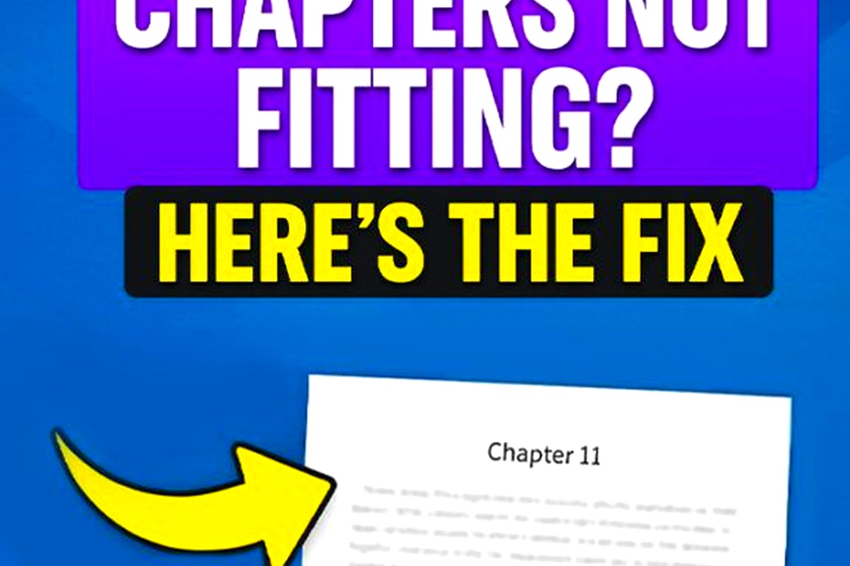
Okay this is the big one where people mess up constantly. Do NOT just hit Enter a bunch of times to start a new chapter on a new page. Use actual page breaks. Put your cursor at the end of the previous chapter, go to Insert tab, click Page Break. Or just hit Ctrl+Enter. This tells KDP “hey, new section here” and it’ll handle it properly across all devices.
For chapter headings themselves, use Heading 1 style. Click on your chapter title, then in the Styles section on Home tab, click Heading 1. This does two things – it creates a proper heading hierarchy AND it automatically generates your Table of Contents later.
Wait I forgot to mention – before you apply Heading 1, you gotta modify the style to look how you want. Right-click on Heading 1 in the styles gallery, click Modify, then set:
- Font: whatever you’re using for body text, or something complementary
- Size: 16pt or 18pt
- Alignment: Center (or left if you prefer)
- Spacing: maybe 24pt before, 12pt after
The spacing thing is important because it creates visual breathing room without you manually adding blank lines that might render inconsistently.
The Front Matter Nobody Talks About
Your manuscript needs front matter even if you think it doesn’t. At minimum you need a title page and a copyright page. Some people add dedication, also by pages, whatever.
Title page is dead simple – just your book title, subtitle if you have one, and your author name. Center it, make the title bigger (like 24pt), add a page break after.
Copyright page should have:
- Copyright © [year] [your name]
- All rights reserved statement
- ISBN if you’re doing paperback (ebooks don’t need it)
- Any disclaimer if it’s fiction (“this is a work of fiction” etc)
I usually add my website and social media links here too because why not, free marketing.
Table of Contents Generation
If you did the Heading 1 thing properly for all your chapters, generating a TOC is stupidly easy. Put your cursor where you want the TOC (usually right after copyright page), go to References tab, click Table of Contents, choose Automatic Table 1 or 2.
Word will generate a clickable TOC based on all your Heading 1 styles. This is crucial for ebooks because readers expect to be able to jump to chapters. On Kindle devices, this becomes the “Go To” menu.
One weird thing – sometimes the TOC picks up headings you didn’t want included. If that happens, you probably accidentally applied a heading style somewhere. Just find it, change it back to Normal style, then right-click your TOC and hit Update Field.
Images and Graphics
Oh man, images in KDP manuscripts are their own beast. If you’re doing a text-only book, skip this section. But if you’ve got illustrations, diagrams, whatever, here’s the deal.
Insert images using Insert > Pictures, then immediately right-click the image, choose Wrap Text > In Line with Text. This is super important. If you use any other wrapping option (square, tight, whatever), KDP’s converter might position it weird or just break entirely.
Size your images appropriately – I usually go no wider than 4 inches for ebooks. KDP recommends images be at least 300 DPI but honestly for most illustrations 150 DPI is fine and keeps file size down.
Center your images using the paragraph alignment. And add a page break before and after if it’s a full-page illustration. My cat just jumped on my keyboard so sorry if there’s any typos in this section, had to retype part of it.
Special Formatting Elements
Scene breaks are tricky. You know those little decorative breaks between scenes in a chapter? Don’t use images for these in ebooks. Just use a centered line with symbols:
* * *
Or use a specific symbol like:
◆
Make sure there’s a blank line before and after. This renders consistently across all devices.
For italics and bold, use the actual formatting buttons (or Ctrl+I and Ctrl+B). Don’t use underline though – in digital text, underlines signal hyperlinks, so readers will try to click them and get confused.
Hyperlinks and Back Matter
Speaking of hyperlinks, you can absolutely include them in your manuscript. I always link my author website in the About the Author section at the end. To add a link, select the text, hit Ctrl+K, paste your URL.
Back matter is where you can get creative with marketing. I typically include:
- About the Author page
- Other books by me (with links to Amazon)
- Newsletter signup link
- Request for reviews
The review request thing actually works – I’ve seen a 20-30% increase in reviews since I started adding a polite “if you enjoyed this, please consider leaving a review” page at the end.
Common Mistakes That’ll Screw You Over
Using tabs to indent paragraphs. Just don’t. Use the First Line Indent setting I mentioned earlier. Tabs create inconsistent spacing across devices.
Extra line breaks everywhere. One Enter between paragraphs is plenty. If you want more space, use the spacing after setting in paragraph formatting.
Smart quotes turned off. Go to File > Options > Proofing > AutoCorrect Options > AutoFormat As You Type, and make sure “Straight quotes” with “smart quotes” is checked. Smart quotes (the curly ones) look way more professional than straight quotes.
Not using styles. Seriously, use the built-in styles for headings, modify them to look how you want, but use them. It makes everything consistent and makes TOC generation automatic.
Headers and footers in the document. KDP doesn’t use these for ebooks, so just leave them blank. Page numbers don’t exist in reflowable ebooks anyway.
Final Checks Before Upload
Okay so before you upload to KDP, do these checks:
Run spell check one more time. I know you’ve already done it seventeen times but trust me, do it again. I once published a book with “pubic” instead of “public” in the description and didn’t notice for three days.
Check your chapter headings are all consistent. Same font, same size, same spacing.
Make sure every chapter has a page break before it.
Verify your TOC is complete and links work. Click on each chapter link in the TOC to make sure it jumps to the right spot.
Look for any weird formatting artifacts – random blank pages, odd spacing, images that don’t fit right.
Save it as a .doc or .docx file. KDP accepts both but .docx is newer and generally handles formatting better.
The KDP Preview Tool Thing
After you upload, KDP has this online previewer that shows you what your book will look like on different devices. Use it. Seriously. I see so many people skip this step and then get bad reviews about formatting issues.
Check your book on the Kindle, phone, and tablet views in the previewer. Look for:
- Chapter headings displaying correctly
- Paragraph indents working
- Scene breaks showing up
- Images positioned properly
- TOC functioning
If something looks wrong, don’t just hope it’ll be fine. Download your manuscript, fix it, and re-upload. The preview tool is surprisingly accurate to what readers will actually see.
One last thing – KDP also lets you download a preview file to send to your actual Kindle device or app. I always do this and read through at least the first few chapters on my phone because that’s how most people read ebooks now. Desktop previews don’t always catch issues that show up on mobile.
The whole formatting process probably takes me 30-45 minutes for a standard novel once you know what you’re doing. First few times it’ll take longer because you’re learning where everything is, but it becomes pretty automatic. Way better than paying someone $100+ to format a straightforward text manuscript when you can do it yourself in under an hour.
 Recipe Journal Template - Editable Recipe Book Template, 120 Pages - Amazon KDP Interior
1 × $0.00
Recipe Journal Template - Editable Recipe Book Template, 120 Pages - Amazon KDP Interior
1 × $0.00  Daily Planner Diary : Diary Planners for Everyday Productivity, 120 pages, 6×9 Size | Amazon KDP Interior
1 × $0.00
Daily Planner Diary : Diary Planners for Everyday Productivity, 120 pages, 6×9 Size | Amazon KDP Interior
1 × $0.00 
DISCOVER OUR FREE BEST SELLING PRODUCTS
Editable Canva Lined Journal: Express Your Thoughts – KDP Template
Lined Pages Journal 120 pages Ready to Upload PDF Commercial Use KDP Template 6×9 8.5×11 5×8 for Notebooks, Diaries, Low Content
Lined Pages Journal 120 pages Ready to Upload PDF Commercial Use KDP Template 6×9 8.5×11 5×8 for Notebooks, Diaries, Low Content
Cute Dogs Coloring Book for Kids | Activity Book | KDP Ready-To-Upload
Daily Planner Diary : Diary Planners for Everyday Productivity, 120 pages, 6×9 Size | Amazon KDP Interior
Wolf Coloring KDP interior For Adults, Used as Low Content Book, PDF Template Ready To Upload COMMERCIAL Use 8.5×11"
Coloring Animals Head Book for Kids, Perfect for ages 2-4, 4-8 | 8.5×11 PDF
Printable Blank Comic Book Pages PDF : Create Your Own Comics – 3 Available Sizes
Notes KDP interior Ready To Upload, Sizes 8.5×11 6×9 5×8 inch PDF FILE Used as Amazon KDP Paperback Low Content Book, journal, Notebook, Planner, COMMERCIAL Use
Black Lined Journal: 120 Pages of Black Lined Paper Perfect for Journaling, KDP Notebook Template – 6×9
Student Planner Journal 120 pages Ready to Upload PDF Commercial Use KDP Template 6×9" 8.5×11" for Low Content book
Recipe Journal Template – Editable Recipe Book Template, 120 Pages – Amazon KDP Interior