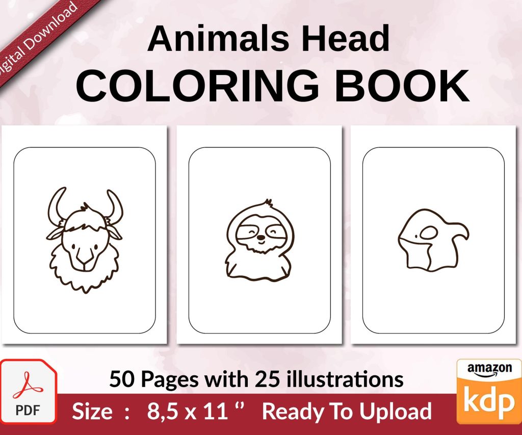
 Coloring Animals Head Book for Kids, Perfect for ages 2-4, 4-8 | 8.5x11 PDF
 Subtotal: $0.00
Amazon KDP guide, KDP book publishing
Amazon KDP Paperback Template: Interior Formatting
25
Mar
Mar
Okay so the interior formatting thing for KDP paperbacks is honestly where most people screw up their first upload, and I’ve literally seen hundreds of books get rejected because of margins that are like half an inch off or bleed settings that make no sense.
First thing you gotta know is that Amazon has these templates you can download directly from KDP, and honestly just use them. I know everyone wants to be fancy and create their own from scratch in Word or whatever, but the templates already have the margins, bleeds, and page sizes set up correctly. You can find them when you’re in the paperback content setup – there’s a link that says “download a formatted template” or something like that.
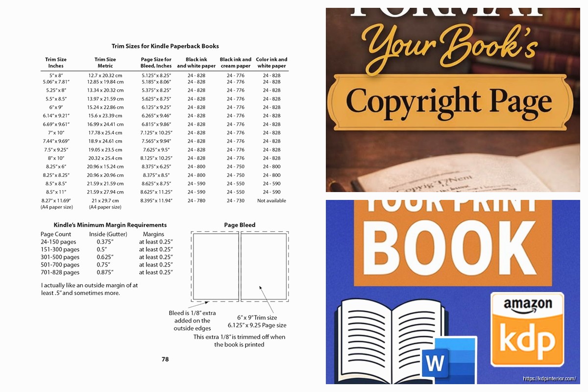
The trim size matters way more than you think. Most people go with 6×9 for non-fiction or novels because it’s the standard and readers expect it. I’ve done 5×8 for some poetry collections and it looked good, but 6×9 is like the safe bet. The template changes based on your trim size AND your page count, which is annoying because you won’t know your exact page count until you format everything. So I usually estimate high, download that template, then if I end up with fewer pages I just grab a new template.
Interior type is either black and white or color. Just pick black and white unless you actually have color images inside, because color printing costs like 5x more and your royalties tank. I made that mistake once with a journal that had these tiny colored borders and it wasn’t even worth it.
So once you’ve got your template downloaded, it’ll be a Word doc or you can get InDesign templates too if you’re fancy. I mostly use Word because it’s faster and honestly good enough for basic books. The template already has these weird margins that look wrong – like the inside margin (gutter) is huge compared to the outside. That’s on purpose because of the binding. Pages near the spine need more space or the text gets lost in the fold.
Here’s what I actually do: I copy all my content into the template and then start formatting chapter by chapter. Don’t mess with the page setup or margins that are already there. Like seriously don’t touch them. I did that on my third book thinking I knew better and the whole thing printed with text running into the spine.
For fonts, stick with something readable. Times New Roman, Garamond, Bookman – these are classics for a reason. I usually go with 11pt or 12pt for body text. Some people do 10pt to save pages and reduce printing costs, but it can look cramped. Chapter titles I’ll bump up to like 16pt or 18pt, bold them, and usually center them.
Line spacing is usually 1.15 or 1.5. Single spacing looks too tight for a printed book, but double spacing wastes pages. I’ve settled on 1.15 for most of my books and it feels right when you’re holding the physical copy.
Oh and another thing – paragraph formatting. You can either do indented first lines with no space between paragraphs (traditional book style) or block paragraphs with space between them (more modern, like blog posts). Pick one and stay consistent. The template usually has indents set up already. First paragraph after a chapter heading typically isn’t indented though, that’s like a typography rule or something.
Page numbers are weirdly tricky. They go in the header or footer, and you usually want them on the outside edges – so right side on right-hand pages, left side on left-hand pages. The template should have this set up already with different odd/even page headers. Don’t put page numbers on your title page or copyright page. I usually start numbering at 1 on the first page of Chapter 1 or the Introduction.
Headers can have your book title or chapter name, but keep them small and subtle. I do like 9pt or 10pt, usually in italics. Right-hand pages might have the book title, left-hand pages have the chapter name. Or just keep it simple and don’t use headers at all except for page numbers.
Blank pages are gonna happen because chapters should start on right-hand pages (odd numbered pages). So if Chapter 1 ends on page 47, you’ll have a blank page 48, then Chapter 2 starts on page 49. That’s normal. Don’t freak out about it.
Images and graphics need to be at least 300 DPI for print quality. I learned this the hard way when I included some screenshots in a tech guide and they came out blurry as hell. If you’re doing a book with lots of images, embed them directly in the Word doc but make sure they’re high resolution first. And watch your file size – KDP has upload limits.
Tables and charts can be a pain in Word. They don’t always translate perfectly to print. I usually create them in Word but then check the PDF proof really carefully because sometimes borders disappear or cells resize weird.
Wait I forgot to mention bleed. If your book has images or colored backgrounds that go to the edge of the page, you need bleed. That means the image extends 0.125 inches beyond the trim line so when they cut the pages there’s no white edge showing. The templates with bleed have guides showing you where the trim line is versus where the bleed edge is. Keep all your important text and images inside the trim line though.
Most low-content books and text-only books don’t need bleed. I only use bleed templates when I’m doing something with full-page images or decorative borders.
Okay so funny story – I was formatting this planner once at like 2am while watching some true crime thing on Netflix, and I accidentally set the whole document to landscape orientation instead of portrait. Uploaded it, approved the proof, and didn’t realize until the physical copy showed up and it was basically a calendar instead of a planner. Had to redo the whole thing.
Front matter is your title page, copyright page, maybe a dedication or table of contents. These go before your main content. Back matter is stuff like your author bio, links to your other books, acknowledgments. These go after. Both count toward your total page count.
Copyright page should be simple – your name, copyright year, “All rights reserved,” ISBN if you want to include it. I usually add a disclaimer like “no part of this book may be reproduced” blah blah. You can find templates for copyright pages online.
For the title page, keep it clean. Book title, subtitle if you have one, your author name. Don’t go crazy with fonts and graphics unless it really fits your brand.
Section breaks are useful if you’re dividing your book into parts. Insert a section break in Word, then you can restart page numbering or change headers for different sections. I use this when I have a preface that’s numbered with roman numerals (i, ii, iii) and then the main content starts at 1.
Widows and orphans – these are single lines of a paragraph that get stranded at the top or bottom of a page. They look sloppy. Word has settings to prevent them automatically (Paragraph settings, Line and Page Breaks tab, check “Widow/Orphan control”). I always turn this on.
Hyphenation can be automatic or manual. Automatic hyphenation in Word sometimes breaks words in weird places, so I usually leave it off for fiction and only turn it on for non-fiction with narrower columns.
If you’re doing a book with two columns (like some reference books), the template won’t have that set up. You’ll need to format that yourself, and honestly it’s a pain. Make sure your font size is still readable at that width.
Footers with chapter names or quotes can look nice but they’re extra work. Most of my books just have page numbers and that’s it.
Once everything’s formatted, you gotta save it as a PDF to upload to KDP. Use “Save as PDF” in Word and check the PDF carefully before uploading. Zoom in to 200% or 300% and scroll through every page. I’ve caught formatting glitches this way that didn’t show up in the Word doc.
Things to check in your PDF: margins look right, no text is cut off, images are clear, page numbers are correct, blank pages are where they should be, chapters start on odd pages, fonts look consistent.
KDP has this previewer tool after you upload that shows you what the printed book will look like. Use it. Scroll through the whole thing. I still order a physical proof copy for every single book because screens lie. The actual printed book will show you spacing issues, font problems, margin weirdness that you didn’t notice on screen.
Common mistakes I see all the time: inconsistent fonts (like switching between Times New Roman and Arial randomly), margins too small so text gets cut off in binding, images too low resolution, forgetting page numbers entirely, not starting chapters on odd pages, having like 50 blank pages at the end because they didn’t delete the rest of the template.
Oh and the page count needs to be at least 24 pages for KDP paperbacks. If your content is shorter, you gotta add filler or it won’t let you publish. I’ve added bonus content, lined pages for notes, even just blank pages with a small footer saying “notes” to hit that minimum.
Printing costs are based on page count and whether it’s black/white or color interior. More pages = higher printing cost = lower royalty per book. So there’s this balance between making your book look good with decent spacing and keeping costs down. I usually don’t stress too much about saving 10 pages unless it’s a really thick book.
For low-content books like journals or planners, the interior is mostly just repeated pages. You can create one page layout, copy it a bunch of times, and boom you’ve got 100 pages. Just make sure your margins are perfect because any small error gets multiplied across every page.
My dog just knocked over my coffee so anyway yeah that’s basically it for interior formatting, test everything in a physical proof before you go wide with distribution because fixing formatting errors after publication is annoying and you’ll have to reupload and wait for review again.
DISCOVER OUR FREE BEST SELLING PRODUCTS
Editable Canva Lined Journal: Express Your Thoughts – KDP Template
Lined Pages Journal 120 pages Ready to Upload PDF Commercial Use KDP Template 6×9 8.5×11 5×8 for Notebooks, Diaries, Low Content
Lined Pages Journal 120 pages Ready to Upload PDF Commercial Use KDP Template 6×9 8.5×11 5×8 for Notebooks, Diaries, Low Content
Cute Dogs Coloring Book for Kids | Activity Book | KDP Ready-To-Upload
Daily Planner Diary : Diary Planners for Everyday Productivity, 120 pages, 6×9 Size | Amazon KDP Interior
Wolf Coloring KDP interior For Adults, Used as Low Content Book, PDF Template Ready To Upload COMMERCIAL Use 8.5×11"
Coloring Animals Head Book for Kids, Perfect for ages 2-4, 4-8 | 8.5×11 PDF
Printable Blank Comic Book Pages PDF : Create Your Own Comics – 3 Available Sizes
Notes KDP interior Ready To Upload, Sizes 8.5×11 6×9 5×8 inch PDF FILE Used as Amazon KDP Paperback Low Content Book, journal, Notebook, Planner, COMMERCIAL Use
Black Lined Journal: 120 Pages of Black Lined Paper Perfect for Journaling, KDP Notebook Template – 6×9
Student Planner Journal 120 pages Ready to Upload PDF Commercial Use KDP Template 6×9" 8.5×11" for Low Content book
Recipe Journal Template – Editable Recipe Book Template, 120 Pages – Amazon KDP Interior