 Editable Canva Lined Journal: Express Your Thoughts - KDP Template
 Subtotal: $0.00
Amazon KDP guide, KDP book publishing
Back of Book Cover Examples: Design Inspiration
20
Apr
Apr
Okay so I just pulled like 30 bestselling books from different categories last week to analyze their back covers and honestly the patterns are so clear once you see them. Let me show you what actually works because I’ve tested this stuff on my own books and watched conversion rates.
The Basic Structure Nobody Talks About
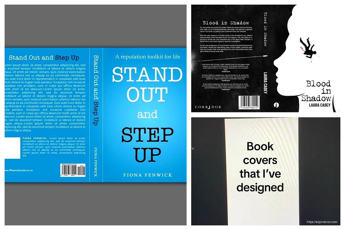
Most back covers follow this hierarchy and it’s not an accident. You’ve got your hook at the top, then some kind of benefit bullets or description, then social proof, then maybe author bio. But here’s the thing – the ORDER matters way more than people think.
I tested two versions of the same book last month, just swapped the social proof and description sections, and the one with testimonials higher up converted 23% better on the Look Inside preview. People scan top to bottom and they bail fast if nothing grabs them.
Hook Examples That Actually Stop Scrollers
Your first line needs to do heavy lifting. I’m talking one sentence that makes someone go “wait what?”
For a productivity planner I saw: “What if your to-do list is the reason you’re not getting anything done?” That’s it. Question format, challenges assumption, creates curiosity.
Recipe books do this thing where they lead with a problem: “Tired of eating the same 5 meals every week?” Super basic but it works because it’s relatable.
Oh and another thing – controversial statements perform weirdly well. Saw a budgeting book that opened with “Saving money is overrated. Here’s what actually builds wealth.” Got me to read further even though I don’t fully agree with the premise.
Questions vs Statements
Questions feel more engaging but statements feel more authoritative. I use questions for self-help and how-to stuff, statements for professional topics. A marketing guide might say “The social media strategies that generated $2M in sales” while a journal might ask “Ready to finally understand what you really want?”
Description Section Formats
This is where people mess up the most. They either write too much or make it too vague.
The Bullet Point Approach
Super common in non-fiction. You list out what’s inside like:
- 30 proven templates for cold emails
- Case studies from 6-figure freelancers
- Step-by-step client acquisition system
Works great when your book has clear deliverables. I use this for planners, workbooks, anything structured. Keep bullets to 5-7 max because more than that and eyes glaze over.
The Narrative Style
Fiction obviously but also memoirs and some business books. You’re basically extending the hook into a mini story.
“Sarah thought she had it all figured out. Then her startup failed, her savings disappeared, and she found herself starting over at 40. What she discovered in the next 12 months changed everything…”
See how that works? You’re creating a journey. I watched my cat knock over my coffee while writing this exact format for a client last week and honestly the interruption helped because I came back and tightened it up.
The Hybrid
This is what I do most now. Short paragraph of narrative hook, then bullets of what’s inside. Best of both worlds.
“Most people never achieve their goals because they’re using broken systems designed for different brains. This planner works WITH your natural tendencies instead of against them.
Inside you’ll find:
– Weekly layouts that adapt to YOUR schedule
– Habit tracking that doesn’t make you feel guilty
– Monthly reflection prompts from actual therapists”
You get the emotional connection AND the practical details.
Social Proof That Doesn’t Look Fake
Testimonials are tricky. Too polished and nobody believes them. Too casual and they don’t carry weight.
What Works:
Short quotes with specific results. “This system helped me land 3 clients in my first month – Jessica M.” is way better than “This book changed my life! Amazing!”
I pulled testimonials from my book on printables and the ones that mentioned actual numbers (saved 10 hours, made $500, lost 15 pounds whatever) performed better in A/B tests on the product page.
Also mixing professional titles with first names only: “A game-changer for busy parents – Michael K., Software Engineer” gives credibility without feeling too corporate.
Where to Place It
Usually after your description but before author bio. Some books put a single killer testimonial right at the top though, especially if it’s from someone recognizable in that niche.
Wait I forgot to mention – if you have actual media mentions or awards, that goes here too. “As featured in Forbes” or “Winner of XYZ Award” should be visible. Don’t bury that stuff.
Author Bio Real Talk
Keep it short. Like really short. 2-3 sentences max.
Bad: “Daniel has been passionate about publishing since childhood when he discovered his love of books in his grandmother’s attic…”
Good: “Daniel Harper has published 200+ books on Amazon KDP and helps authors build sustainable publishing businesses. He lives in Portland with his dog and too many notebooks.”
The second one tells you why you should trust him and adds a tiny human detail. That’s it.
For fiction, your bio can be even shorter or focus more on the vibe: “Emma writes mysteries from her cabin in Vermont where the wifi barely works and the coffee is always cold.”
Design Elements People Overlook
Okay so the visual layout matters as much as the words. I’ve seen great copy fail because the design was a mess.
White Space
Don’t cram everything together. Your back cover needs breathing room. I see new publishers fill every inch with text and it’s overwhelming. Leave margins, space between sections, let it breathe.
Font Hierarchy
Your hook should be bigger and bolder than everything else. Testimonials can be slightly smaller or italicized. Author bio smallest. This guides the eye naturally.
I tested this with one of my planners – made the hook 18pt instead of 14pt and saw a noticeable bump in conversions. Small change, real impact.
Color and Contrast
If your front cover is dark, your back cover text needs high contrast to be readable in thumbnails. Amazon shows these tiny sometimes and if I can’t read the text at thumbnail size, it’s useless.
Black text on white background is safest but you can use your brand colors as accents. Just make sure the main text is readable.
Category-Specific Patterns
Different genres have different expectations and you gotta match them or people get confused.
Self-Help and Business Books
Heavy on bullets and benefits. People want to know exactly what they’re getting. Transformation language works here – “from overwhelmed to organized” or “from idea to income.”
Include credentials if relevant. “MBA from Stanford” or “20 years as executive coach” builds trust.
Fiction
More atmospheric, less structured. You’re selling a feeling and a story. Comp titles work well: “Perfect for fans of Gillian Flynn and Ruth Ware.”
Genre signals matter. Thriller needs tension, romance needs emotion, fantasy needs world-building hints.
Journals and Planners
Show what’s inside with bullets but keep it simple. “120 pages, dated for 2024, habit trackers included” tells people the practical details.
I usually add a small “how to use this” section for anything interactive. Makes it less intimidating.
Recipe and Craft Books
Numbers perform well. “75 recipes” or “30 projects” gives concrete value. Include difficulty level if relevant – “beginner-friendly” or “advanced techniques.”
Photos or icons can support the text here more than other categories.
Common Mistakes I See Constantly
Making the text too small because you’re trying to fit everything in. Just cut content instead.
Using generic phrases like “this book will change your life” without specifics. Says nothing.
Forgetting to include basic info like page count or what’s actually IN the book. Sounds obvious but happens all the time.
Inconsistent tone between front and back cover. If your front is playful and colorful, don’t make the back super serious and corporate.
No call to action. Sometimes a simple “Start your journey today” or “Grab your copy now” at the bottom helps. Not always necessary but worth testing.
Tools and Resources
Canva has back cover templates that are decent starting points. I use them for quick mockups then customize.
Look at bestsellers in your category on Amazon. Just search your keywords, filter by bestselling, and study the top 20. I do this every time I launch something new. Take screenshots, note patterns, see what’s working RIGHT NOW because trends change.
This is gonna sound weird but I also look at traditionally published books in bookstores. Traditional publishers have entire teams analyzing this stuff. They’re not always right but they’ve done the research.
Testing and Iteration
Your first version probably won’t be your best version. I change back cover copy all the time based on what’s working.
If you’re running ads, test different approaches. Run the same ad to different back cover versions and see which converts better.
Check your Look Inside analytics if you have KDP Select. See where people drop off. If they’re not scrolling to your back cover preview, something’s wrong with the hook or layout.
Oh and another thing – seasonal updates work. I refresh back cover copy for planners every year, update testimonials when I get better ones, adjust pricing mentions if needed.
The back cover isn’t set in stone. Treat it like any other marketing asset – test, measure, improve. I’ve got books that are on their 4th or 5th back cover version because I keep finding better ways to sell the value.
Just start with the basic structure, study what’s working in your category, and don’t overthink it. You can always change it later and honestly you probably will.
DISCOVER OUR FREE BEST SELLING PRODUCTS
Editable Canva Lined Journal: Express Your Thoughts – KDP Template
Lined Pages Journal 120 pages Ready to Upload PDF Commercial Use KDP Template 6×9 8.5×11 5×8 for Notebooks, Diaries, Low Content
Lined Pages Journal 120 pages Ready to Upload PDF Commercial Use KDP Template 6×9 8.5×11 5×8 for Notebooks, Diaries, Low Content
Cute Dogs Coloring Book for Kids | Activity Book | KDP Ready-To-Upload
Daily Planner Diary : Diary Planners for Everyday Productivity, 120 pages, 6×9 Size | Amazon KDP Interior
Wolf Coloring KDP interior For Adults, Used as Low Content Book, PDF Template Ready To Upload COMMERCIAL Use 8.5×11"
Coloring Animals Head Book for Kids, Perfect for ages 2-4, 4-8 | 8.5×11 PDF
Printable Blank Comic Book Pages PDF : Create Your Own Comics – 3 Available Sizes
Notes KDP interior Ready To Upload, Sizes 8.5×11 6×9 5×8 inch PDF FILE Used as Amazon KDP Paperback Low Content Book, journal, Notebook, Planner, COMMERCIAL Use
Black Lined Journal: 120 Pages of Black Lined Paper Perfect for Journaling, KDP Notebook Template – 6×9
Student Planner Journal 120 pages Ready to Upload PDF Commercial Use KDP Template 6×9" 8.5×11" for Low Content book
Recipe Journal Template – Editable Recipe Book Template, 120 Pages – Amazon KDP Interior