-
×
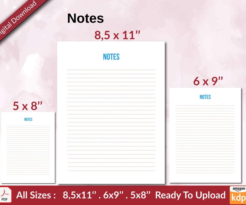 Notes KDP interior Ready To Upload, Sizes 8.5x11 6x9 5x8 inch PDF FILE Used as Amazon KDP Paperback Low Content Book, journal, Notebook, Planner, COMMERCIAL Use
1 × $0.00
Notes KDP interior Ready To Upload, Sizes 8.5x11 6x9 5x8 inch PDF FILE Used as Amazon KDP Paperback Low Content Book, journal, Notebook, Planner, COMMERCIAL Use
1 × $0.00
Subtotal: $0.00

Canva is a versatile design tool that empowers users to create captivating visuals with ease. As designers, we understand that every element in a design plays a significant role in conveying our message effectively.
Finding the best Canva font pairings is a quest for creating stunning compositions that capture attention and resonate with the audience. The right combination can transform a design from ordinary to extraordinary, enhancing its visual impact and making it truly memorable.
In this article, we delve into the realm of font pairings and present to you the 15 best Canva font pairings for 2023.
Whether you’re designing a website, a social media post, a flyer, or any other visual project, these suggestions will provide you with inspiration and guidance.
So, let’s dive in and explore the power of font combinations in Canva, and unlock a world of creativity and visual excellence.
Typography is the art and technique of arranging type in a visually pleasing and effective manner to ensure that the text is legible, readable, and aesthetically appealing.
It encompasses various aspects such as font style, structure, and overall appearance. In the realm of design, it plays a crucial role in conveying the intended message, establishing visual hierarchy, and evoking emotions.
But why is typography so important in design? The answer lies in its ability to enhance the overall user experience and capture the attention of the audience.
Here are a few key reasons why it holds immense significance:
1. Communication and Legibility
Typography acts as a medium for communication by transforming words into a visual representation.
It enables the audience to easily read and understand the content, making it a vital aspect of conveying information effectively.
2. Visual Hierarchy:
Through careful selection and arrangement of the best Canva fonts, typography helps establish a visual hierarchy within a design.
It guides the viewer’s eye, highlighting important elements, and organizing information in a structured and intuitive manner.
3. Brand Identity:
Typography plays a crucial role in shaping a brand’s identity. By using consistent inspiring fonts across various design assets, such as logos, websites, and marketing materials, typography helps establish a cohesive and recognizable brand image.
4. Emotional Impact:
Fonts have the power to evoke specific emotions and create a desired atmosphere within a design. Whether it’s a bold and confident font for a fashion brand or a whimsical script for a children’s book cover, it sets the tone and elicits the intended emotional response.
5. Differentiation and Creativity:
With a vast array of fonts available, typography allows designers to express their creativity and differentiate their work. By carefully selecting unique and visually appealing font pairings, they can create captivating and memorable experiences for their audience.
The concept of font pairings is the practice of combining two or more fonts in a design to create a harmonious and visually appealing composition.
The selection of the best Canva font combinations is crucial as it can greatly impact the overall aesthetic and effectiveness of your design.
Choosing the right variations holds immense importance for several reasons:
First and foremost, it helps establish a cohesive visual identity by ensuring consistency and coherence throughout your design, as they create a sense of unity and professionalism, enhancing the overall impression of your work.
Moreover, fonts have their unique characteristics, such as boldness, elegance, playfulness, or formality, and by strategically combining fonts that complement each other, you can enhance the tone and atmosphere of your design.
When it comes to pairing fonts effectively, there are some basic principles to keep in mind.
Firstly, consider contrast. Pairing fonts with contrasting styles, such as a bold and clean sans-serif with a delicate script, creates visual interest and ensures readability. Contrast can be achieved through variations in font weight, style, or serif versus sans-serif choices.
Secondly, aim for complementary characteristics. Fonts that have similar proportions, x-heights, or overall visual styles tend to harmonize well together. Choosing those that share certain design elements creates a sense of cohesion while still allowing for differentiation.
Another principle to consider is hierarchy. Establishing a clear visual hierarchy in your design can be achieved by using different font pairings for headings, subheadings, and body text. Selecting fonts that naturally complement each other and create a visual distinction helps guide the reader’s eye and enhances readability.
Lastly, trust your instincts and experiment. While there are guidelines and principles to assist you, font pairing is ultimately a creative process.
Don’t be afraid to explore different combinations, adjust the spacing, or even mix different font families to find a combination that truly resonates with your design vision.
Here is a list of the best fonts on Canva:
Shrikhand, with its bold and rounded appearance, creates a playful and friendly vibe that complements the clean and modern lines of Tenor Sans.
This pairing strikes a balance between whimsy and professionalism, making it ideal for designs that require a touch of creativity without sacrificing readability.

League Spartan, a bold and geometric sans-serif font, exudes strength and impact. When paired with the elegant and classic serif font Libre Baskerville, it creates a harmonious contrast between modernity and tradition.
This combination is perfect for designs that aim to strike a balance between boldness and sophistication.
Lemonada Semi Bold, with its rounded shapes and friendly appearance, pairs seamlessly with the versatile and legible Open Sans Bold.
This combination offers a modern and approachable feel, making it suitable for designs that require clarity and a touch of friendliness.
Lovelo, a bold and condensed font with a futuristic appeal, pairs exceptionally well with Gistesy, a script font that adds a touch of elegance and uniqueness.
The contrast between the boldness of Lovelo and the flowing nature of Gistesy creates a captivating and eye-catching effect, making this pairing ideal for attention-grabbing designs.
Combining Lovelo’s boldness with Montserrat’s clean and geometric sans-serif style results in a balanced and visually appealing pairing.
Lovelo adds impact and personality, while Montserrat provides a modern and versatile backdrop. This combination is well-suited for designs that require a contemporary and stylish look.
Anton, a bold and condensed font, pairs harmoniously with the flowing and elegant script font Nexa Script. Aileron Regular, a clean and versatile sans-serif, complements the duo by adding clarity and readability.
This is perfect for designs that aim to strike a balance between boldness, elegance, and professionalism.
Julius Sans One, with its bold and distinctive letterforms, combines effortlessly with the condensed and modern Archivo Narrow. Source Sans Pro, a clean and legible sans-serif font, adds versatility and clarity to the mix.
This trio creates a strong and impactful combination suitable for designs that require a bold and contemporary look.
Chewy, a fun and energetic script font, pairs beautifully with League Spartan’s bold and geometric appearance. This creates a playful and eye-catching effect, making it perfect for designs that seek to convey a sense of vibrancy and enthusiasm.
Chloe, a graceful and elegant script font, pairs seamlessly with Moontime, a clean and modern sans-serif. The pairing exudes sophistication and charm, making it ideal for designs that require a touch of romance and refinement.
High Cruiser, with its retro-inspired and bold letterforms, complements the thin and delicate appearance of Fraunces Thin.
This pairing creates a unique blend of vintage and modern aesthetics, making it perfect for designs that seek to evoke nostalgia and a contemporary vibe simultaneously.
Yellowtail, a dynamic and expressive script font, pairs beautifully with the versatile and legible Open Sans Bold and Light.
This combination balances playfulness with clarity, making it suitable for designs that require a touch of creativity while maintaining readability.
Bellaboo, a charming and whimsical script font, pairs effortlessly with the clean and versatile Arimo. Space Mono, a monospaced font with a futuristic touch, adds a unique element to the mix.
This combination is ideal for designs that aim to create a sense of fun, while still maintaining a modern and well-organized appearance.
Archivo Black, a bold and impactful font, combines beautifully with the condensed Archivo Narrow. Arialle, a clean and legible sans-serif, adds versatility and readability to the trio.
This is suitable for designs that require a bold and contemporary look with a touch of elegance.
Libre Baskerville, with its classic and timeless serif style, stands confidently on its own. This font exudes elegance and sophistication, making it ideal for designs that require a refined and traditional touch.
Versailles, a decorative and ornate script font, pairs gracefully with the clean and minimalist Open Sans Light.
This pairing creates a beautiful contrast between elegance and simplicity, making it perfect for designs that aim to convey a sense of luxury and modernity.
Using font pairings in Canva is a straightforward process that can significantly enhance your design. Follow these step-by-step instructions to select and apply fonts effectively:
Now that you know how to access them, here are some Tips for Using Font Pairings Effectively:
Font pairings are an essential part of creating eye-catching visuals. With the 15 best Canva font pairings for 2023, you’ll have access to all the tools you need to create stunning designs that capture attention and resonate with your audience.
Unlock a world of creativity by exploring the power of font combinations we’ve shown you throughout this guide. Try out these pairings today and see the difference they make to your design projects!


DISCOVER OUR FREE BEST SELLING PRODUCTS
Editable Canva Lined Journal: Express Your Thoughts – KDP Template
Lined Pages Journal 120 pages Ready to Upload PDF Commercial Use KDP Template 6×9 8.5×11 5×8 for Notebooks, Diaries, Low Content
Lined Pages Journal 120 pages Ready to Upload PDF Commercial Use KDP Template 6×9 8.5×11 5×8 for Notebooks, Diaries, Low Content
Cute Dogs Coloring Book for Kids | Activity Book | KDP Ready-To-Upload
Daily Planner Diary : Diary Planners for Everyday Productivity, 120 pages, 6×9 Size | Amazon KDP Interior
Wolf Coloring KDP interior For Adults, Used as Low Content Book, PDF Template Ready To Upload COMMERCIAL Use 8.5×11"
Coloring Animals Head Book for Kids, Perfect for ages 2-4, 4-8 | 8.5×11 PDF
Printable Blank Comic Book Pages PDF : Create Your Own Comics – 3 Available Sizes
Notes KDP interior Ready To Upload, Sizes 8.5×11 6×9 5×8 inch PDF FILE Used as Amazon KDP Paperback Low Content Book, journal, Notebook, Planner, COMMERCIAL Use
Black Lined Journal: 120 Pages of Black Lined Paper Perfect for Journaling, KDP Notebook Template – 6×9
Student Planner Journal 120 pages Ready to Upload PDF Commercial Use KDP Template 6×9" 8.5×11" for Low Content book
Recipe Journal Template – Editable Recipe Book Template, 120 Pages – Amazon KDP Interior