-
×
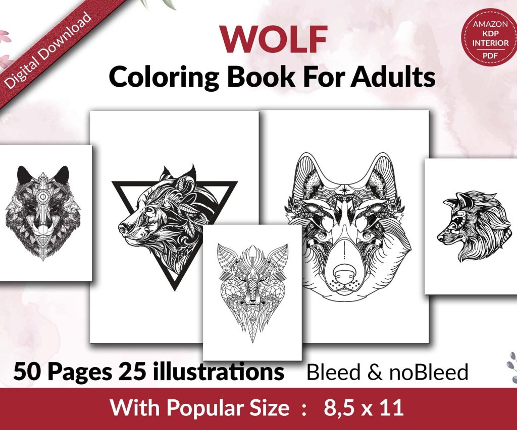 Wolf Coloring KDP interior For Adults, Used as Low Content Book, PDF Template Ready To Upload COMMERCIAL Use 8.5x11"
1 × $0.00
Wolf Coloring KDP interior For Adults, Used as Low Content Book, PDF Template Ready To Upload COMMERCIAL Use 8.5x11"
1 × $0.00
Subtotal: $0.00
Okay so I just redesigned three biography layouts last week and here’s what actually matters when you’re trying to make someone’s life story readable and not a total snoozefest.
First thing – chronological isn’t always your friend. I know, sounds backwards, but hear me out. I was working on this musician’s biography and going straight birth-to-present made the most interesting stuff (the 1980s comeback) get buried on page 140. Nobody’s making it that far unless they’re already superfans.
What worked better was starting with the peak moment – that sold-out Madison Square Garden show – then flashing back. Gives readers a reason to care about the childhood poverty stuff, you know? They already know this person becomes someone worth reading about.
The thematic approach is gonna work best for creative people or anyone whose life doesn’t follow a traditional career path. I used it for an artist’s biography and instead of “Early Life, Education, First Job” we did “Finding Color, Breaking Rules, Teaching Others.” Way more engaging.
This is gonna sound weird but I tested this with my own mother’s memoir project. Dense paragraphs of life story? She put it down after 20 minutes. Same content with better spacing, shorter paragraphs, section breaks? She read for two hours straight.
People need breathing room in life stories. These books are already emotionally heavy – you’re asking readers to connect with someone’s entire existence. If the page looks like a wall of text, the brain just… nope.
Keep paragraphs under 6 lines for the main narrative. Use section breaks (just a blank line or a decorative element) every 2-3 pages. Insert pull quotes or sidebar moments to break up long sections.
Oh and another thing – chapter length matters more than you’d think. I used to do these 30-page chapters because that’s what traditional books do, right? But for biographies, 12-15 pages per chapter keeps momentum going. Readers can finish a chapter in one sitting, feel accomplished, keep going.
Okay so funny story – I did this whole elaborate photo section in the middle of a biography, traditional style, 16 glossy pages. The test readers literally said they forgot about the photos by the time they finished the book. Total waste.
What works better is integrating photos into the narrative where they’re relevant. Technology makes this easier now than it used to be. When you’re talking about someone’s wedding, put the wedding photo right there. Don’t make readers flip to a photo section and try to remember which chapter that relates to.
The margin approach is my favorite for print books because it doesn’t interrupt reading flow but keeps visuals present. For ebooks though, forget margins – they don’t translate well. Go with the chapter opener approach instead.
Alright so I’m gonna be honest, I used to overthink this. Spent hours choosing between 47 different serif fonts. Here’s the truth – just pick a readable serif for body text (Garamond, Caslon, Minion Pro) and stick with it.
Where typography actually affects biography readability:
Body text size: 11pt minimum for print, 12pt is safer for older audiences. Life stories skew toward older readers who don’t wanna squint.
Line spacing: 1.3 to 1.5 leading. Tighter than that gets exhausting over 200+ pages.
Chapter titles: This is where you can get creative. I like using a contrasting sans-serif that’s bold and clear. Makes chapter starts obvious when someone’s flipping through.
Pull quotes: Different font, slightly larger, maybe italicized. These need to visually pop because they’re your best tool for breaking up dense narrative sections.
Wait I forgot to mention – don’t use more than two font families in the whole book. Body text font plus one accent font for titles and quotes. Three or more starts looking like a ransom note.
This changed everything for me. Biographies have this problem where you need to include context – historical events, explanations of outdated references, background on other people mentioned – but dropping it all in the main narrative kills pacing.
Sidebars solve this. Put the contextual stuff in a shaded box or bordered section off to the side. Readers who need it can read it, readers who don’t can skip it without losing the story thread.
I was watching The Crown last night actually and realized they do this visually – they’ll show the main story but then cut to archival footage for context. Same principle.
Keep sidebar text smaller than body text but not tiny – 9pt when body is 11pt works. And don’t overdo it. One sidebar every 5-6 pages maximum or you’re just creating visual chaos.
Every chapter start is a mini book cover. It’s a reset moment where you can lose the reader if it’s boring or win them over if it’s engaging.
What I do: First page of each chapter gets special treatment. Chapter number and title obviously, but also consider adding:
A relevant date or age marker (“Age 24” or “Summer 1967”). An epigraph – short quote that sets the tone. A one-sentence preview of what’s coming. A small decorative element that relates to the chapter theme.
The date/age thing is huge for biographies because readers lose track of where they are in the timeline. That simple marker at each chapter start keeps everyone oriented.
Drop caps (that big decorative first letter) work really well for biography chapter openings. Signals a fresh start, adds visual interest. Just make sure the drop cap is actually readable – I’ve seen some that are so decorative you can’t tell what letter it is.
First paragraph of each chapter can be formatted differently too. Maybe small caps for the first few words, or a slightly larger font size. Something that eases readers into the new section.
Most people stick a timeline in the back and call it done. But there’s way more you can do that actually adds value:
Visual timeline: Not just a list of dates – make it a designed spread with photos, icons, or illustrations marking key moments.
Index: Yes really. For biographies of notable people, an index makes the book more useful as a reference. Readers can find specific events or people mentioned.
Source notes: Even for popular biographies (not academic), showing your sources builds credibility. Can be as simple as “Chapter 3 details came from interviews with…”
Where are they now: If the biography doesn’t go up to present day or if it’s about multiple people, a quick update section is gold.
Recommended reading: Other books about the same era, person, or topic.
My dog just knocked over my coffee which is probably a sign I should wrap this up but lemme hit one more thing.
Biography length usually means you’re looking at 250-400 pages minimum. That affects binding choices. Paperback is fine up to about 400 pages, after that you’re gonna want to consider hardcover because thick paperbacks don’t stay open well.
For trim size, 6×9 is standard but honestly feels cramped for biographies with photos. 7×10 or 8×10 gives you way more layout flexibility. The extra cost is usually worth it if you’re including visual elements.
And if you’re doing ebook versions – don’t just convert your print layout. Ebooks need reflowable text, so all that careful margin work and sidebar placement? Doesn’t translate. You gotta design ebook layouts separately, which is annoying but necessary.
Print out 20-30 pages of your layout with actual content. Not lorem ipsum – real text from the biography. Then:
Read it yourself in different lighting conditions. Give it to someone in your target age range. Time how long it takes to read 10 pages. Check if they noticed and used the sidebars. Ask if they ever felt lost in the timeline.
I learned this the hard way after printing 500 copies of a biography where the photo captions were too small and nobody could read them. Expensive lesson.
The biggest mistake I see is people treating biography layout like novel layout. Novels can get away with being simple because the story carries everything. Biographies need more structure, more visual hierarchy, more navigation tools. You’re not just telling a story – you’re documenting a life. The design needs to support that weight without being heavy-handed about it.
Also margins – I almost forgot margins. You need wider inner margins than you think, especially for thick books. Nothing worse than text disappearing into the binding. At least 0.75 inches inner margin, preferably 1 inch for books over 300 pages.
DISCOVER OUR FREE BEST SELLING PRODUCTS
Editable Canva Lined Journal: Express Your Thoughts – KDP Template
Lined Pages Journal 120 pages Ready to Upload PDF Commercial Use KDP Template 6×9 8.5×11 5×8 for Notebooks, Diaries, Low Content
Lined Pages Journal 120 pages Ready to Upload PDF Commercial Use KDP Template 6×9 8.5×11 5×8 for Notebooks, Diaries, Low Content
Cute Dogs Coloring Book for Kids | Activity Book | KDP Ready-To-Upload
Daily Planner Diary : Diary Planners for Everyday Productivity, 120 pages, 6×9 Size | Amazon KDP Interior
Wolf Coloring KDP interior For Adults, Used as Low Content Book, PDF Template Ready To Upload COMMERCIAL Use 8.5×11"
Coloring Animals Head Book for Kids, Perfect for ages 2-4, 4-8 | 8.5×11 PDF
Printable Blank Comic Book Pages PDF : Create Your Own Comics – 3 Available Sizes
Notes KDP interior Ready To Upload, Sizes 8.5×11 6×9 5×8 inch PDF FILE Used as Amazon KDP Paperback Low Content Book, journal, Notebook, Planner, COMMERCIAL Use
Black Lined Journal: 120 Pages of Black Lined Paper Perfect for Journaling, KDP Notebook Template – 6×9
Student Planner Journal 120 pages Ready to Upload PDF Commercial Use KDP Template 6×9" 8.5×11" for Low Content book
Recipe Journal Template – Editable Recipe Book Template, 120 Pages – Amazon KDP Interior