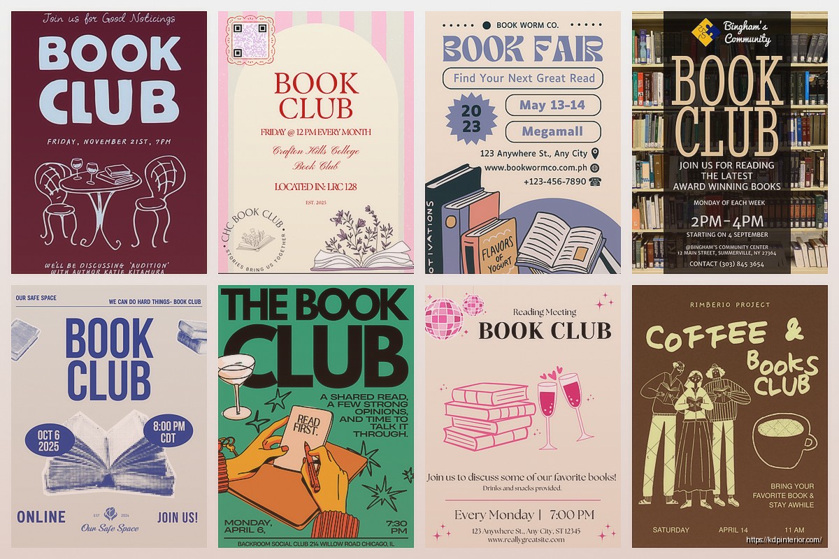
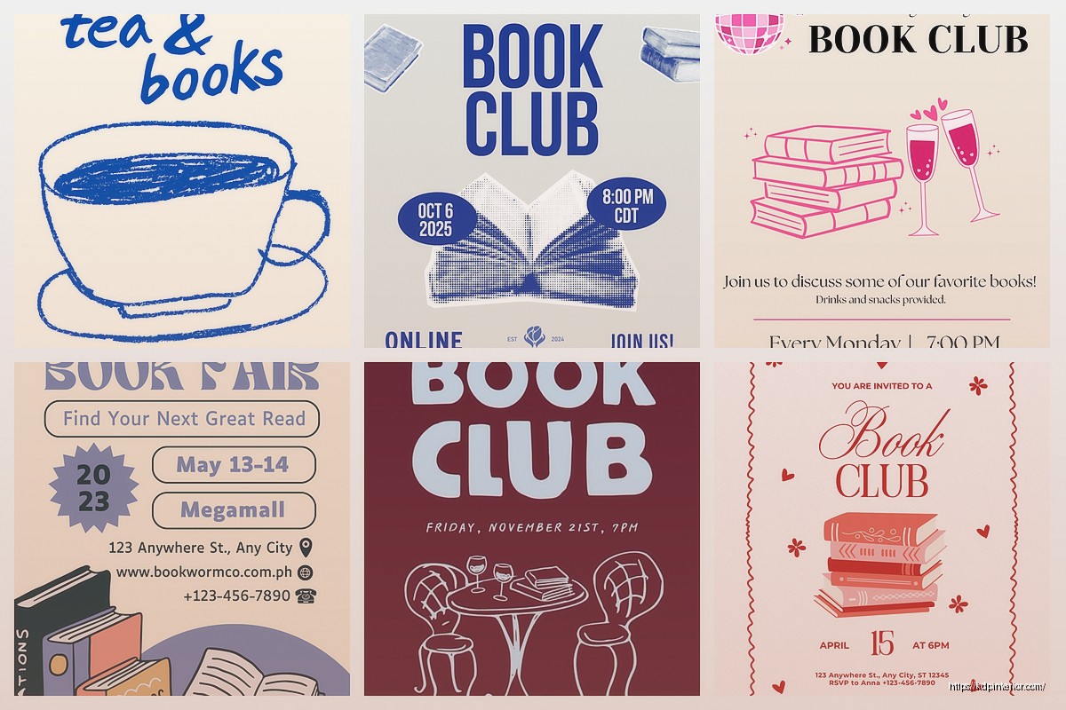
Okay so I’ve been making book club flyers for clients for like three years now and the biggest mistake everyone makes is overcomplicating them. You really just need like four elements max and people lose their minds adding clipart of teacups and stacks of books everywhere.
Here’s what actually works – start with Canva’s free templates but don’t use them as-is because then your flyer looks like every other book club in your neighborhood. I usually grab the “Book Club Meeting” template and immediately delete like 60% of what’s on there. Keep the layout structure but swap everything else.
The must-have elements are: book title and author (obviously), meeting date and time, location OR zoom link, and one discussion question to hook people. That’s it. You can add more but those four things are non-negotiable.
Template Structure That Actually Gets People To Show Up
So the header should be your book title in the biggest font – like 72pt minimum if you’re printing 8.5×11. I tested this last month with two different flyers for the same meeting and the one with the huge title got 40% more RSVPs. People are skimming these things on community boards or scrolling past them on Facebook, you gotta grab attention immediately.
Right under the title put the author name but make it smaller, maybe 24pt. Then here’s something weird but it works – add a one-sentence hook about why THIS book for THIS meeting. Not a summary, a hook. Like “Are we all just faking adulthood or is it just me?” for a contemporary fiction pick. Or “Let’s talk about whether you’d survive the apocalypse better than these characters” for dystopian stuff.
The middle section is your meeting details and this is where people screw up the hierarchy. Date and time need to be in a box or different background color so they stand out. I use Canva’s frame elements for this – just a simple rectangle with slightly different shade. Put the date bigger than the time because that’s what people need to check their calendar against first.
Location details – if it’s someone’s house just put the address and maybe “street parking available” if that’s relevant. If it’s a library or coffee shop, put the full name of the place because there might be multiple locations. Oh and another thing, if it’s virtual include BOTH the platform name and a note about whether cameras are expected. “Zoom meeting – cameras optional” gets better turnout than just dropping a link.
The RSVP Section Nobody Gets Right
You need to make RSVPing as easy as possible which means multiple options. I always include: email, phone number, and usually a Facebook event link or Google Form. Yeah it’s extra work setting up a Form but it’s like 2 minutes and then you have automatic tracking.
Put a deadline for RSVPs too – “Please RSVP by [date]” – even if you don’t actually need a headcount. It creates urgency and people are more likely to commit when there’s a deadline. I learned this from running my own book club for five years before I started making these professionally.
Here’s something I forgot to mention earlier – color schemes matter way more than you think. I spent a whole week testing different color combos and warm colors (oranges, reds, yellows) got more engagement for contemporary and romance book clubs, while cool colors (blues, greens, purples) worked better for mystery and sci-fi. It’s not a hard rule but it’s a pattern I noticed.
Design Elements That Don’t Make It Look Like A Church Bulletin
Fonts – you need exactly two. One for headers, one for body text. I usually go with a serif font for the book title (makes it look classy) and a clean sans-serif for everything else. Google Fonts has tons of free options. My go-to combos are Playfair Display + Open Sans or Cormorant + Montserrat.
Don’t center-align everything. I see this constantly and it makes flyers look amateurish. Left-align your body text, you can center the title if you want but even that works better left-aligned sometimes. Play with it.
Images – this is gonna sound counterintuitive but you don’t actually need the book cover on the flyer. Like it’s nice to have but if you’re space-constrained or the cover doesn’t photograph well, skip it. The title and author name are enough. When I DO use covers, I make them big – at least a third of the flyer – or I don’t use them at all. Those tiny thumbnail covers in the corner do nothing.
White space is your friend. My cat just jumped on my keyboard sorry – anyway yeah, don’t fill every inch of the flyer. Leave breathing room around your text blocks. It makes everything more readable and looks more professional.
Templates For Different Book Club Vibes
For casual neighborhood book clubs you want something friendly and approachable. Handwritten-style fonts for accents (not body text though), warm colors, maybe a simple illustration element like a coffee cup or reading glasses. Keep it simple, one-page, printable in black and white if needed.
Professional or workplace book clubs need cleaner design – think corporate but not boring. Stick with two colors max, structured layout, clear hierarchy. These should look good on an email or printed on office paper. I usually go landscape orientation for these because they display better in email.
Virtual book clubs need digital-first design which means brighter colors since they’ll be viewed on screens, clickable elements if you’re distributing as PDF, and make sure all text is readable on mobile. Test this by looking at it on your phone – if you can’t read it easily, the font’s too small.
Genre-specific clubs can get more thematic but don’t go overboard. Mystery book club doesn’t need magnifying glass clipart everywhere. Maybe use a darker color scheme and angular fonts but keep it subtle. Romance book club can have softer colors and curves in the design elements but again, subtle.
The Weekly vs Monthly Meeting Template Difference
If you’re promoting weekly meetings you need a template system where you can swap out the book info quickly. I made a master template in Canva with locked elements for all the standing info (club name, meeting time, location, RSVP contacts) and only the book details and date change. Saves so much time.
Monthly meetings can be more elaborate since you’re only making one flyer a month. You can add discussion questions (2-3 max), a brief book description, maybe a quote from the book. There’s more space to build anticipation.
Wait I should mention series templates – if your book club has been running for a while, create a consistent look across all your flyers. Same color scheme, same fonts, same layout structure. People start recognizing them and it builds brand recognition, which sounds corporate but actually just means people know what to look for.
Printing vs Digital Distribution
For printing: use 300 DPI minimum, CMYK color mode, and download as PDF from Canva. I print at FedEx usually because their color quality is consistent. An 8.5×11 flyer costs like 50 cents in color. Print on cardstock if you’re posting on community boards so it doesn’t look wimpy next to all the garage sale signs.
For digital: export as PNG for social media (better quality than JPEG for graphics with text), size it for the platform you’re using. Instagram is square so 1080×1080, Facebook events are 1920×1080. Canva has presets for all of these which is honestly why I stick with it even though there are fancier design tools.
Email distribution – attach as PDF but ALSO include the key details in the email body because people are lazy and won’t open attachments. I learned this the hard way when I sent out flyers as attachments only and got like three responses.
The Discussion Question Hook
This is the secret weapon nobody uses enough. At the bottom of your flyer, add one compelling discussion question about the book. Not “What did you think of the ending?” but something specific that makes people want to show up to hear what others say.
Examples that worked for my clients:
– “Would you have made the same choice as Sarah in chapter 12?”
– “Who’s the real villain in this story?”
– “Rate this family’s dysfunction on a scale of ‘quirky’ to ‘call the police'”
That last one was for a literary fiction pick and it got shared like crazy on social media because it was funny and specific. The question should give just enough context to intrigue people who’ve read the book without spoiling anything.
Quick Template Hacks
Use Canva’s Brand Kit feature even for personal book clubs – upload your preferred fonts and colors once, then every template you make can pull from that. Consistency without thinking about it.
Duplicate your template before editing it for a new meeting so you always have the clean version to go back to. I’ve lost count of how many times I’ve accidentally saved over a template and had to recreate it.
Set up templates for different seasons if your book club meets year-round. Summer flyers can be brighter and more casual, winter ones can be cozier with darker colors. It’s a small touch but it makes each flyer feel fresh.
Oh and if you’re promoting on social media, make a square version AND a story version of every flyer. Different aspect ratios for different platforms and honestly stories get more views than feed posts now anyway.
Common Mistakes To Avoid
Too much text – if your flyer has more than 50 words you’ve probably overdone it. People won’t read paragraphs on a flyer, they’re just scanning for the essentials.
Unreadable fonts – decorative fonts are fine for the title but body text needs to be simple. If you can’t read it from three feet away, it’s not gonna work on a community board or in a scrolling feed.
Missing the actual meeting time – I’ve seen flyers that have the date but not the time or vice versa. Sounds obvious but it happens more than you’d think.
No clear call to action – “RSVP by Friday” or “Join us!” or “Grab your copy and come discuss” – something that tells people what to do next.
Forgetting about accessibility – use high contrast between text and background, don’t put text over busy images where it’s hard to read, include alt text if you’re posting digitally.
The flyers that work best are honestly pretty boring when you look at them objectively. Clear hierarchy, readable fonts, essential information only, one visual focal point. But that simplicity is what makes people actually read them and show up to meetings instead of just scrolling past another cluttered design.
 Cute Dogs Coloring Book for Kids | Activity Book | KDP Ready-To-Upload
1 × $0.00
Cute Dogs Coloring Book for Kids | Activity Book | KDP Ready-To-Upload
1 × $0.00  Printable Blank Comic Book Pages PDF : Create Your Own Comics - 3 Available Sizes
1 × $0.00
Printable Blank Comic Book Pages PDF : Create Your Own Comics - 3 Available Sizes
1 × $0.00 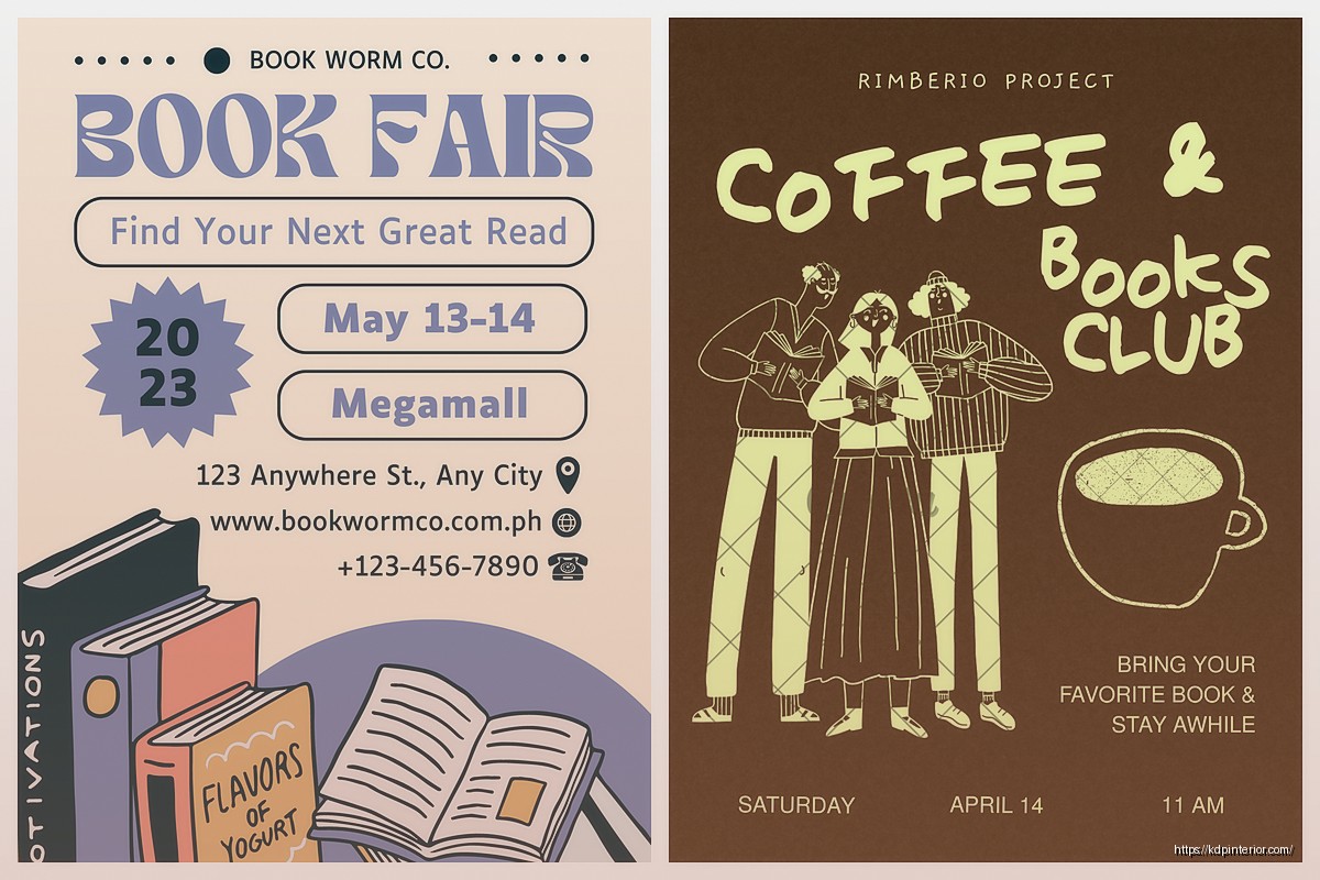
DISCOVER OUR FREE BEST SELLING PRODUCTS
Editable Canva Lined Journal: Express Your Thoughts – KDP Template
Lined Pages Journal 120 pages Ready to Upload PDF Commercial Use KDP Template 6×9 8.5×11 5×8 for Notebooks, Diaries, Low Content
Lined Pages Journal 120 pages Ready to Upload PDF Commercial Use KDP Template 6×9 8.5×11 5×8 for Notebooks, Diaries, Low Content
Cute Dogs Coloring Book for Kids | Activity Book | KDP Ready-To-Upload
Daily Planner Diary : Diary Planners for Everyday Productivity, 120 pages, 6×9 Size | Amazon KDP Interior
Wolf Coloring KDP interior For Adults, Used as Low Content Book, PDF Template Ready To Upload COMMERCIAL Use 8.5×11"
Coloring Animals Head Book for Kids, Perfect for ages 2-4, 4-8 | 8.5×11 PDF
Printable Blank Comic Book Pages PDF : Create Your Own Comics – 3 Available Sizes
Notes KDP interior Ready To Upload, Sizes 8.5×11 6×9 5×8 inch PDF FILE Used as Amazon KDP Paperback Low Content Book, journal, Notebook, Planner, COMMERCIAL Use
Black Lined Journal: 120 Pages of Black Lined Paper Perfect for Journaling, KDP Notebook Template – 6×9
Student Planner Journal 120 pages Ready to Upload PDF Commercial Use KDP Template 6×9" 8.5×11" for Low Content book
Recipe Journal Template – Editable Recipe Book Template, 120 Pages – Amazon KDP Interior