 Editable Canva Lined Journal: Express Your Thoughts - KDP Template
 Subtotal: $0.00
Amazon KDP guide, KDP book publishing
Book Cover Canva: Design Platform Tutorial
17
May
May
Okay so Canva is honestly the easiest way to make book covers if you’re just starting out with KDP, and I’ve been using it for like five years now because even though I know how to use Photoshop I just… don’t want to deal with all that anymore.
First thing you gotta do is sign up at canva.com and yeah you can use the free version but honestly the Pro subscription is worth it if you’re serious about this. It’s like $13/month or something and you get way more templates and photos and the background remover tool which is clutch. I went free for my first maybe 20 covers and kept running into walls where I couldn’t use certain elements.
Setting Up Your Canvas Size
So when you open Canva don’t just pick a random template. Book covers have specific dimensions and this trips people up constantly. For KDP you need to think about trim size first. Most books are either 6×9 inches or 8.5×11 inches for like workbooks and planners.
Here’s what you do – click “Create a design” then “Custom size” and here’s where it gets important. KDP wants 300 DPI for print quality but Canva doesn’t really show DPI the same way. What you need to do is multiply your inches by 300.
For a 6×9 book cover that’s just the FRONT cover:
– Width: 6 x 300 = 1800 pixels
– Height: 9 x 300 = 2700 pixels
For 8.5×11:
– Width: 8.5 x 300 = 2550 pixels
– Height: 11 x 300 = 3300 pixels
Type those pixel dimensions into Canva and boom you’ve got the right size. Oh and another thing – if you’re doing a paperback with a spine you need to create a full wraparound cover but honestly for ebooks just do the front cover first and learn that before you stress about spines and back covers.
Finding and Using Templates
So once your canvas is open go to the left sidebar and click “Templates” – Canva has literally thousands of book cover templates now. Type “book cover” in the search and you’ll see a million options. The ones with the little crown icon are Pro only which is annoying if you’re on the free plan.
Here’s my actual workflow and I tested this literally last week when I was making a cover for a gratitude journal. I search for templates but I almost never use them exactly as they are. Like I’ll find one that has a layout I like – maybe text at the top and an image at the bottom – and then I completely change the colors, swap the fonts, replace the images. Think of templates as starting points not final products.
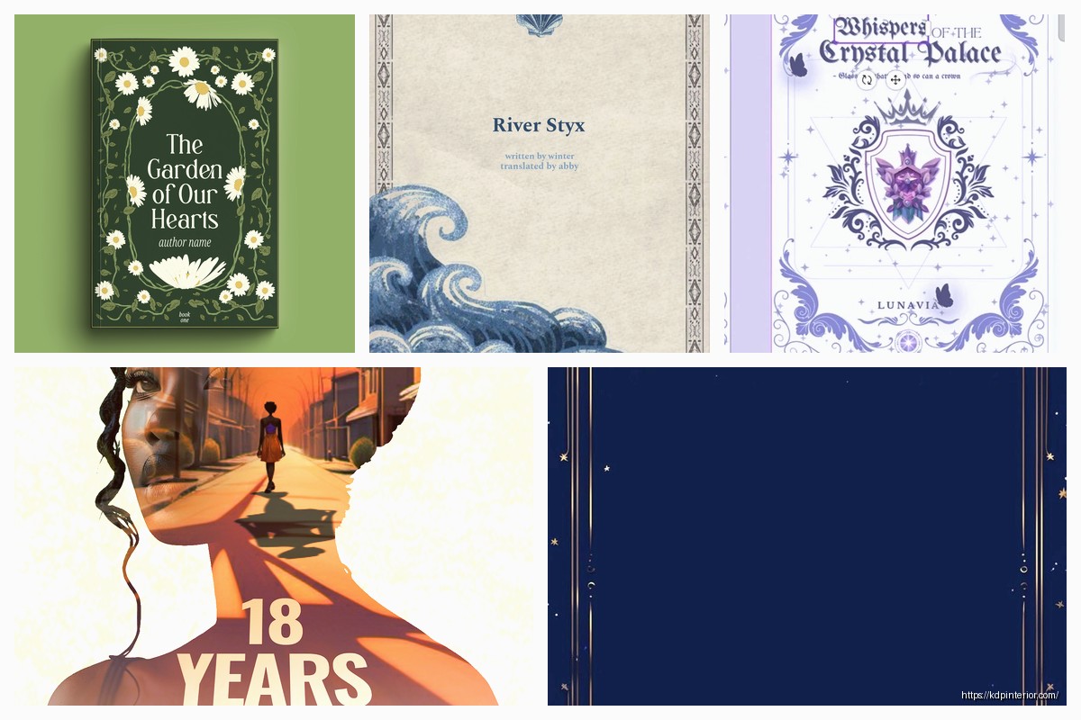
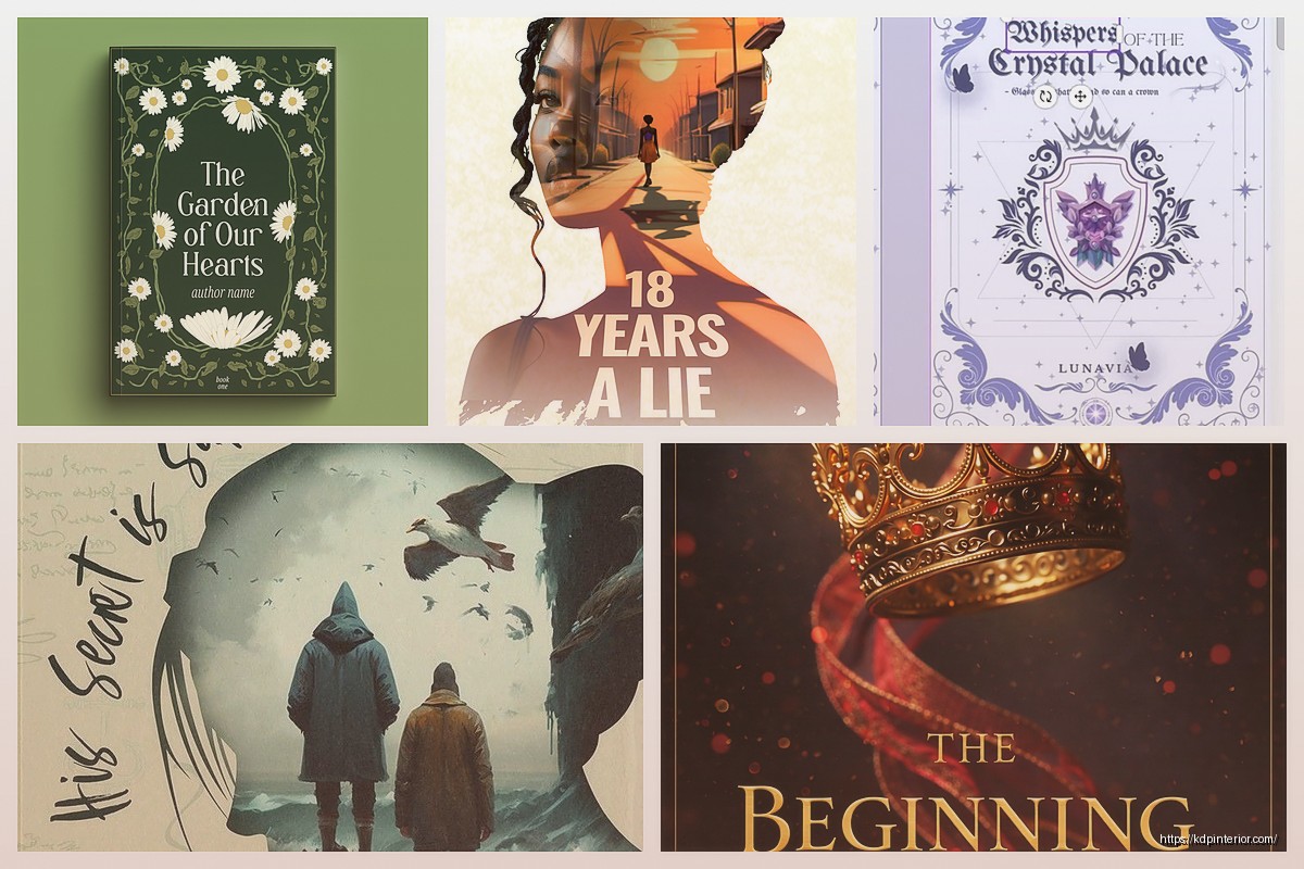
You can filter by color too which is super helpful. If you’re doing a romance book you probably want reds and pinks, thriller maybe dark blues and blacks. I made the mistake early on of just picking templates I thought looked cool without thinking about genre expectations and my covers looked totally off.
Working With Text and Fonts
Click on any text element in a template to edit it. Type your book title and author name obviously. Now fonts… this is where people get weird and pick like 47 different fonts. Don’t do that.
Use maximum two fonts per cover, maybe three if one is just for a small subtitle. I usually do:
– One bold attention-grabbing font for the title
– One clean readable font for the author name
In the left sidebar click “Text” then scroll down to “Font” and you’ll see all available fonts. Pro has way more but free still has decent options. For genres here’s what generally works:
Romance – elegant serif fonts or script fonts (but make sure they’re readable as thumbnails)
Thriller/Mystery – bold sans-serif or distressed fonts
Self-help/Business – clean modern sans-serif
Fantasy – decorative fonts with medieval or mystical vibes
The big mistake I see is people making text too small. Your cover needs to look good as a tiny thumbnail on Amazon. I literally shrink my browser window down to check this constantly while designing.
To resize text just click on it and drag the corners or use the number up in the toolbar. You can also adjust letter spacing (they call it “Spacing” in the toolbar) which can make titles look more dramatic.
Text Effects That Actually Work
Click on your text then look for “Effects” in the toolbar. You can add outlines, shadows, lifts (which is like a 3D effect), and backgrounds. For book covers I use:
– Outline: helps text pop against busy backgrounds
– Shadow: adds depth, makes text feel more premium
– Background: good when your image is too busy and text gets lost
Wait I forgot to mention – you can curve text too. Click the text, hit “Effects,” then choose “Curve” and slide it. This is great for circular designs or when you want that vintage look.
Images and Graphics
Okay so this is where Canva really shines compared to trying to find stock photos elsewhere. Click “Elements” in the left sidebar and you get photos, graphics, shapes, lines, stickers, all kinds of stuff.
For photos type what you need in the search – “woman reading” “mountain landscape” “coffee cup” whatever fits your book. Free users can use photos without the crown icon. Pro users get everything plus the ability to remove backgrounds instantly.
Here’s a trick I use all the time – layer multiple images with transparency. Like I’ll put a photo of a sunset, then add a geometric shape over it at 50% transparency, then text on top. Creates depth and makes your cover less generic. To adjust transparency click the element then look for “Transparency” in the toolbar (it’s a checkered icon).
Graphics and illustrations are under Elements too. These are great for non-fiction covers especially. I was watching The Last of Us while designing a productivity planner cover last month and kept getting distracted but basically I used simple line icons and geometric shapes instead of photos and it looked super professional.
Colors and Backgrounds
To change background color click anywhere on the background then look for the color tile in the toolbar. You can pick from preset colors or enter a specific hex code if you’re trying to match a brand.
Gradients are your friend. Instead of a solid color click the background, then in the color picker you’ll see “Gradient” as an option. Two-color gradients look modern and professional without being too busy. I probably use gradients on like 60% of my covers now.
You can also use solid colors with texture. Upload a paper texture or grunge texture (you can find free ones online) and set it at low transparency over your background color. Adds that subtle professional touch.
Using the Background Remover
This is Pro only but honestly it’s the main reason I pay for Pro. Say you have a photo of a person but there’s a distracting background. Click the photo, then in the toolbar click “Edit image” and you’ll see “Background remover” or “BG Remover.”
One click and Canva removes the background. It’s not perfect every time – sometimes you gotta manually erase bits using the restore/erase tools – but it’s way faster than doing it manually. Then you can put that person against any background you want.
I use this constantly for creating composite covers where I’m mixing different images together.
Filters and Adjustments
Click any photo then “Edit image” and you get filters (like Instagram) and manual adjustments. The adjustments let you change:
– Brightness
– Contrast
– Saturation
– Blur
– And a bunch more stuff
I usually pump up contrast a bit on most photos to make them pop more. And sometimes I’ll desaturate colors slightly to make text stand out better. My cat jumped on my keyboard the other day while I was adjusting saturation and somehow made the cover look better so sometimes happy accidents happen.
Aligning and Organizing Elements
When you have multiple elements on your cover they need to line up properly or it looks amateur. Select an element and you’ll see purple alignment lines appear as you drag it around. These snap to center, edges, and other elements.
You can also select multiple elements (hold Shift and click each one) then use the alignment tools in the toolbar:
– Align left/center/right
– Align top/middle/bottom
– Distribute spacing evenly
The “Position” button in the toolbar lets you layer elements. “Forward” brings something to the front, “Backward” sends it behind. This is crucial when you’re stacking images, shapes, and text.
Downloading Your Cover
Once you’re done click the “Share” button (top right) then “Download.” Here’s what you need to know:
File type: PNG is best for ebooks and print. JPG works too but PNG preserves quality better.
Make sure “Transparent background” is NOT checked unless you specifically want that.
For print covers KDP wants PDF sometimes so you can choose PDF Print instead. This maintains the quality and color profiles better for printing.
Download it and then – this is important – check it on your phone. Like actually AirDrop it to your phone or email it to yourself and look at it as a thumbnail. Does the text read clearly? Does it look good small? If not go back and make text bigger or bolder.
Common Mistakes to Avoid
Too much text – your cover isn’t a billboard. Title, subtitle if needed, author name. That’s it.
Ignoring genre conventions – every genre has visual expectations. Study bestsellers in your category and notice patterns.
Low contrast – if your text blends into your background people can’t read it. Always check this.
Using too many fonts or colors – stick to 2-3 fonts max and a cohesive color palette.
Not checking thumbnail size – this is huge. Most people see your cover tiny on Amazon. Design for that.
My Actual Process Start to Finish
When I’m making a cover I usually:
1. Research bestsellers in my genre for 10-15 minutes
2. Create custom size canvas in Canva
3. Browse templates for layout inspiration
4. Replace everything in the template or start from scratch with a background
5. Add title text and mess with fonts for way too long
6. Add images or graphics
7. Adjust colors and transparency until it feels right
8. Add author name
9. Check alignment of everything
10. Download as PNG
11. Check on phone
12. Usually go back and make text bigger
13. Download final version
The whole process takes me maybe 30-45 minutes now but when I started it would take hours because I’d second-guess every choice.
Oh and save your designs in Canva – they stay in your account so you can go back and edit later. I’ve gone back to covers from three years ago to make tweaks or create series covers with the same style.
One more thing – you can create brand kits in Canva Pro where you save your fonts and colors. Super helpful if you’re doing a series and want consistency across all covers. You can also save templates you create yourself for reuse.
Honestly just start playing around with it. Make a few practice covers for fake books to learn the tools without pressure. That’s what I did and even though those first covers were terrible I learned the interface way faster than watching tutorials.

DISCOVER OUR FREE BEST SELLING PRODUCTS
Editable Canva Lined Journal: Express Your Thoughts – KDP Template
Lined Pages Journal 120 pages Ready to Upload PDF Commercial Use KDP Template 6×9 8.5×11 5×8 for Notebooks, Diaries, Low Content
Lined Pages Journal 120 pages Ready to Upload PDF Commercial Use KDP Template 6×9 8.5×11 5×8 for Notebooks, Diaries, Low Content
Cute Dogs Coloring Book for Kids | Activity Book | KDP Ready-To-Upload
Daily Planner Diary : Diary Planners for Everyday Productivity, 120 pages, 6×9 Size | Amazon KDP Interior
Wolf Coloring KDP interior For Adults, Used as Low Content Book, PDF Template Ready To Upload COMMERCIAL Use 8.5×11"
Coloring Animals Head Book for Kids, Perfect for ages 2-4, 4-8 | 8.5×11 PDF
Printable Blank Comic Book Pages PDF : Create Your Own Comics – 3 Available Sizes
Notes KDP interior Ready To Upload, Sizes 8.5×11 6×9 5×8 inch PDF FILE Used as Amazon KDP Paperback Low Content Book, journal, Notebook, Planner, COMMERCIAL Use
Black Lined Journal: 120 Pages of Black Lined Paper Perfect for Journaling, KDP Notebook Template – 6×9
Student Planner Journal 120 pages Ready to Upload PDF Commercial Use KDP Template 6×9" 8.5×11" for Low Content book
Recipe Journal Template – Editable Recipe Book Template, 120 Pages – Amazon KDP Interior