-
×
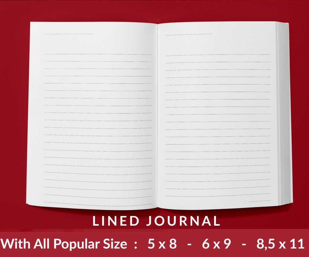 Lined Pages Journal 120 pages Ready to Upload PDF Commercial Use KDP Template 6x9 8.5x11 5x8 for Notebooks, Diaries, Low Content
1 × $0.00
Lined Pages Journal 120 pages Ready to Upload PDF Commercial Use KDP Template 6x9 8.5x11 5x8 for Notebooks, Diaries, Low Content
1 × $0.00
Subtotal: $0.00
Okay so I just spent like three hours yesterday redesigning covers in Canva for a client’s romance series and honestly the process is way more straightforward than people make it out to be, you just gotta know which buttons to actually click.
First thing – yeah you can use the free version but if you’re serious about doing more than like two covers, just get Canva Pro. It’s $120 a year or something and the difference is huge because you get access to the background remover tool and way more stock photos that don’t look like… stock photos. I resisted upgrading for probably six months when I started and it was dumb, I wasted so much time trying to work around the limitations.
When you first log in, don’t use their “book cover” template right away. I know that sounds backwards but hear me out – their default book cover dimensions are sometimes weird and not exactly what KDP wants. Instead, go to “Custom Size” and punch in the exact dimensions you need. For a standard 6×9 paperback with a thin spine (like under 150 pages), I usually design just the front cover at 1800×2700 pixels. That’s 300 DPI which is what you want for print.
KDP ebook covers need to be 2560×1600 pixels minimum but honestly I always do mine at 1600×2560 (portrait) because that’s what shows up in the Kindle store. For print, it gets complicated because you need the spine width calculation and then the full wrap-around cover. There’s a calculator on KDP but – wait I forgot to mention – if you’re just starting out, design for ebook first. Get that working, make some sales, THEN worry about print because print covers are honestly a pain with the bleed areas and everything.
This is where people mess up constantly. They pick these super busy backgrounds with like seventeen things happening and then wonder why their cover looks amateur. My cat literally walked across my keyboard last week while I was working on a thriller cover and somehow made the background solid black and you know what? It looked better than the gradient I had going.
Go into Elements on the left sidebar, type “texture” or “gradient” and just… scroll. The pro account gives you these really nice subtle textures that add depth without being distracting. For non-fiction I usually go with solid colors or very minimal gradients. For fiction it depends on genre but thriller and mystery readers expect darker, moodier backgrounds. Romance can go lighter but not always – dark romance is huge right now and those covers are almost all black or deep red backgrounds.
Oh and another thing – if you’re using a photo background, make sure it’s not too busy behind where your text is gonna go. You can darken specific areas by adding a rectangle shape, making it black, then adjusting the transparency. I usually set it to like 40-60% transparency and just put it behind the text area.
Okay so this is gonna sound harsh but if your cover looks bad, it’s probably the fonts. I see people using like Papyrus or Comic Sans or whatever came with their computer and it’s just… no. Canva has hundreds of fonts but you only need to know about maybe ten good ones.
For bold, attention-grabbing titles (thriller, action, some romance):
For elegant, sophisticated looks (literary fiction, upmarket women’s fiction):
For contemporary, friendly vibes (contemporary romance, self-help):
The trick is you almost never use just one font. I typically use two – one for the title, one for the author name. Sometimes three if there’s a subtitle but that’s getting complicated. Make sure they contrast enough. Like don’t use two serif fonts together, pair a serif with a sans-serif.
Your title should be HUGE. Like way bigger than you think. I’m talking 80-120 point font at minimum on a standard cover. The author name can be smaller but not tiny – readers need to see it in the thumbnail. This is critical because your cover is gonna show up as like a 200-pixel thumbnail on Amazon and if people can’t read the title, they’re scrolling past.
Test this by zooming out in Canva or literally texting the cover to yourself and looking at it on your phone. If you can’t read it easily on a phone screen, make it bigger.
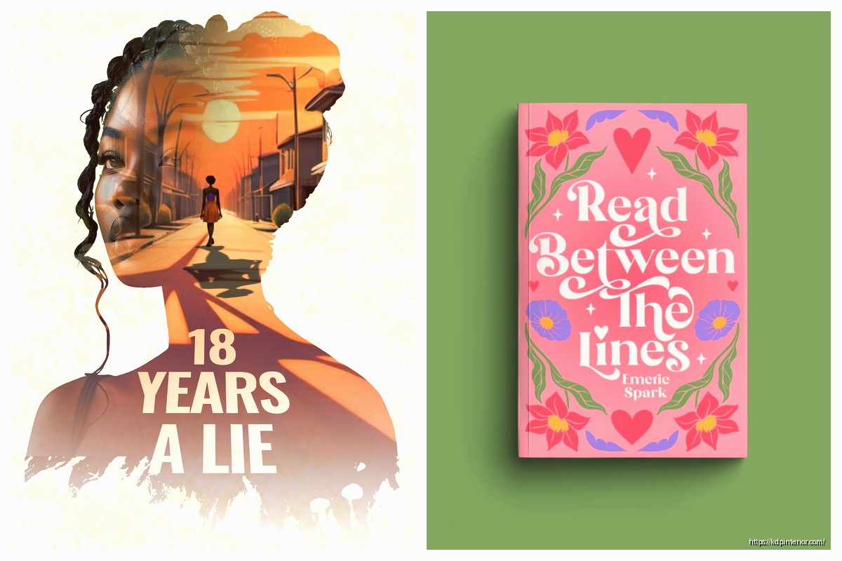
Wait I forgot to mention – know your genre expectations. Every genre has visual tropes that readers expect to see. Romance has couples or symbolic objects (roses, rings). Thriller has dark atmospheric stuff or faces obscured. Fantasy has illustrated elements or magical symbols. You gotta at least nod to these conventions or readers won’t pick up your book because they won’t know what it is.
In Canva, go to Elements and search for what you need. If you have Pro, you get access to thousands of good photos. For a romance cover I just did, I searched “couple silhouette” and found this perfect image of two people about to kiss. Dropped it in, used the background remover (Pro feature) to isolate them, then positioned them in the lower third of the cover.
The background remover is honestly magic. Click on the image, hit “Edit image” at the top, then “BG Remover” and it just… does it. Sometimes you gotta clean up the edges manually with the eraser tool but it’s pretty accurate.
This is gonna sound basic but layers matter so much. Everything in Canva is layered – what’s on top shows up in front. You can rearrange by right-clicking and choosing “Send to back” or “Bring to front.” I usually build covers in this order:
You can also group elements together by selecting multiple things (hold Shift while clicking) and then right-click and choose “Group.” This is super helpful when you’ve got your title looking perfect with like a shadow effect and a background shape and you don’t wanna accidentally move just one piece.
Okay so funny story – I used to think adding effects was cheating or would make covers look cheap. Then I watched what traditionally published books were doing and realized they use effects constantly, just subtle ones.
Text effects in Canva are under the “Effects” button when you select a text box. The ones I actually use:
Shadow – adds depth, makes text pop off the background. I usually do a subtle shadow with low transparency, not the harsh default. Adjust the blur and distance sliders until it looks right.
Lift – similar to shadow but gives a floating effect. Great for titles.
Outline – adds a stroke around letters. Be careful with this, it can look dated quickly. But for certain genres like cozy mystery it works.
Neon – actually decent for sci-fi or contemporary covers if you want that modern glow effect. My editor uses this on all her tech thriller covers.
For images, click on them and hit “Edit image” then scroll through the filters. I usually just adjust brightness/contrast manually rather than using filters because filters can be heavy-handed. Sometimes I’ll add a slight blur to background images so they don’t compete with the text.
You don’t need to be a designer to get this right, you just need to know that certain colors work together and others don’t. Canva actually has a color palette generator – click on a color in your design and it’ll suggest complementary colors.
Generally:
I try to limit covers to 2-3 main colors max. More than that and it starts looking chaotic unless you really know what you’re doing.
This matters more than people think. Romance covers are often red, pink, purple, or teal. Thriller and mystery go dark – black, navy, deep red, grey. Non-fiction business books love blue and white because it signals trust and professionalism. Self-help often uses bright, optimistic colors like yellow or orange.
You can break these rules but you should know you’re breaking them. I did a romance cover in all grey once because the story was dark and it… didn’t sell well until I added some red accents.
Alright so putting it all together, here’s what I literally do when I sit down to design:
The whole process takes me maybe 20-30 minutes now but when I started it was like two hours per cover. You get faster.
Too much text on the cover. Your title and author name, that’s it. Maybe a short tagline if it’s non-fiction but even then, be careful.
Low contrast between text and background. If your title is light blue on a white background, nobody can read it. There should be obvious contrast.
Using too many fonts. Two fonts, maybe three. That’s the limit.
Ignoring genre conventions. Yes you wanna be unique but not so unique that readers don’t recognize what genre your book is.
Not testing the thumbnail size. This is the biggest one honestly. Your cover needs to work at 200 pixels wide.
Wait I should mention – even though I said don’t use Canva’s default templates, they’re actually useful for inspiration. Search “book cover” in templates and just scroll through. You’ll start seeing patterns in how professional covers are structured. Then create your own custom document and recreate what you liked.
I’ve definitely copied the layout structure from templates before while changing everything else – colors, fonts, images. That’s not stealing, that’s learning composition.
When you’re done, hit “Share” then “Download.” Choose PNG format and make sure the quality is set to highest (there’s a slider in the download options if you have Pro). Don’t use JPG unless you absolutely have to because it compresses the image and can make text look fuzzy.
For KDP ebook, just upload that PNG directly. For print covers you need to use their cover calculator to get the right dimensions including spine and back cover, but that’s a whole different thing that I’m not getting into right now because it’s almost midnight and I’m watching this documentary about fonts that’s way more interesting than it should be.
One last thing – save multiple versions as you work. Canva auto-saves but I always duplicate the design (there’s a button in the toolbar) before making major changes. I’ve got like forty versions of some covers because I kept tweaking things.
DISCOVER OUR FREE BEST SELLING PRODUCTS
Editable Canva Lined Journal: Express Your Thoughts – KDP Template
Lined Pages Journal 120 pages Ready to Upload PDF Commercial Use KDP Template 6×9 8.5×11 5×8 for Notebooks, Diaries, Low Content
Lined Pages Journal 120 pages Ready to Upload PDF Commercial Use KDP Template 6×9 8.5×11 5×8 for Notebooks, Diaries, Low Content
Cute Dogs Coloring Book for Kids | Activity Book | KDP Ready-To-Upload
Daily Planner Diary : Diary Planners for Everyday Productivity, 120 pages, 6×9 Size | Amazon KDP Interior
Wolf Coloring KDP interior For Adults, Used as Low Content Book, PDF Template Ready To Upload COMMERCIAL Use 8.5×11"
Coloring Animals Head Book for Kids, Perfect for ages 2-4, 4-8 | 8.5×11 PDF
Printable Blank Comic Book Pages PDF : Create Your Own Comics – 3 Available Sizes
Notes KDP interior Ready To Upload, Sizes 8.5×11 6×9 5×8 inch PDF FILE Used as Amazon KDP Paperback Low Content Book, journal, Notebook, Planner, COMMERCIAL Use
Black Lined Journal: 120 Pages of Black Lined Paper Perfect for Journaling, KDP Notebook Template – 6×9
Student Planner Journal 120 pages Ready to Upload PDF Commercial Use KDP Template 6×9" 8.5×11" for Low Content book
Recipe Journal Template – Editable Recipe Book Template, 120 Pages – Amazon KDP Interior