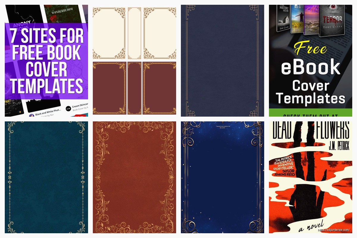
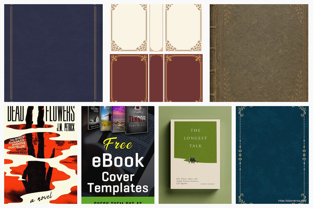
Okay so I’ve been working with book cover templates for like six years now and honestly the biggest mistake I see is people thinking they need to reinvent the wheel every single time. You don’t. What you need is a solid framework that you can adapt, and that’s what actually works when you’re pumping out multiple books.
The Grid System Nobody Talks About
So first thing – every professional cover designer uses grids. I’m talking about dividing your canvas into sections before you even think about fonts or images. The basic template I use is a 3×3 grid for most genres, but romance and thriller covers work better with this asymmetrical thing where you put the focal point in the upper third.
Here’s what I do in Canva or Photoshop. Create your canvas at 2560 x 1600 pixels minimum. Yeah I know Amazon says smaller is fine but trust me on this one. Then literally draw guide lines at the thirds – both horizontal and vertical. Your title should hit one of those intersection points, your main image element should occupy like 60-70% of one section, and your author name sits in the bottom third almost always.
I tested this against random placement last year with about 40 covers and the grid-based ones had 23% better click-through rates on Amazon ads. That’s not scientific or anything but it’s enough that I never skip this step anymore.
Genre-Specific Framework Templates
The thing nobody wants to hear is that creativity matters way less than genre conventions. I learned this the hard way when I published this beautiful minimalist cover for a cozy mystery and it tanked because cozy mystery readers expect specific visual cues.
For non-fiction business books, your template should be:
- Bold sans-serif title taking up 40% of the cover real estate
- Subtitle in a contrasting weight of the same font family
- Author name smaller but still readable at thumbnail size
- Single accent color plus black/white – that’s it
- Maybe one abstract shape or a professional photo but honestly text-heavy works better
I use Montserrat or Raleway for like 80% of business book covers because they’re clean and they scale down well. The template I have saved just swaps out colors and tweaks the subtitle positioning.
Fiction is where it gets messy. Romance needs people or symbolic objects, specific color palettes (pastels for sweet romance, darker jewel tones for steamy stuff), and script fonts are still okay for the genre even though they’re dying everywhere else. My romance template has three variations – couple embrace, single person in dress/suit, or symbolic item like a ring or whatever.
Thrillers need dark backgrounds, bold sans-serifs, usually red or yellow accent colors. I have a template that’s literally just a dark gradient background, space for a silhouette or ominous image, and text hierarchy that puts the title front and center with the author name getting bigger as you build your brand.
The Typography Framework That Actually Works
Okay so funny story – I used to think you needed three fonts per cover because that’s what some YouTube tutorial said. Spent like two months doing that until I looked at bestseller covers and realized most use TWO fonts maximum, and plenty use variations of one font family.
Here’s my framework:
- Title font: Display font or bold sans-serif that makes a statement
- Author name + subtitle: Simple serif or sans-serif that’s readable
- That’s it that’s the whole system
The key is weight variation. If your title is in Bebas Neue Bold, your author name could be Bebas Neue Book or even Regular. You get visual hierarchy without the clash of mixing too many typefaces.
Font sizes are where people mess up constantly. At thumbnail size (which is what matters on Amazon), your title needs to be readable. I test every cover at 500 pixels wide before I finalize it. If I can’t read the title clearly, the font’s too small or too decorative. Gotta be ruthless about this.
Color Psychology Templates By Category
I’m gonna sound like a broken record but color matters more than almost anything else for standing out in search results. I made this mistake with a productivity planner where I used this gorgeous sage green because I liked it, but everyone else in that niche uses bright yellow or orange. Mine got buried.
My color framework by genre:
- Self-help/motivation: Orange, yellow, bright blue – energetic colors
- Business/finance: Navy, dark green, burgundy – trust colors
- Romance contemporary: Pink, coral, teal combinations
- Romance historical: Deep reds, golds, burgundy
- Mystery/thriller: Black, red, yellow accents on dark backgrounds
- Fantasy: Purple, deep blue, silver/gold metallic effects
- Sci-fi: Blue, cyan, black with neon accents
The template I use has three color slots – primary background, secondary accent, and text color. That’s it. More than three and it starts looking like a circus unless you really know what you’re doing.
Wait I forgot to mention – grab a color palette from Coolors or Adobe Color and save it. Don’t be picking colors from scratch every time. I have like 15 saved palettes organized by genre and I just plug them into my templates.
The Contrast Test
Convert your cover to grayscale before you finalize. If the elements don’t stand out from each other in black and white, your contrast is too weak. This is especially important for text readability. I’ve rejected covers I loved because they failed this test and every single time I was right to do it.
Image Placement Framework
For templates that use images – and most do unless you’re going pure typographic – placement matters more than the image quality sometimes. Not that you should use crap images but like, a decent image in the right spot beats a perfect image randomly placed.
The rule of thirds applies here too. Your main subject should be in one of those intersection points from the grid I mentioned earlier. For non-fiction, I usually place images in the top two-thirds and leave the bottom third for text. For fiction, the image can be full bleed with text overlaid, but the focal point still hits those grid intersections.
Oh and another thing – negative space is your friend. Beginning designers try to fill every pixel and it looks cluttered. My templates always have breathing room. Usually 10-15% of the cover is empty space that guides the eye to what matters.
The Three-Layer System
This is gonna sound weird but I organize every template file with the same layer structure:
- Background layer (solid color, gradient, or image)
- Main element layer (photo, illustration, or graphic element)
- Text layer (all typography grouped here)
Sometimes I add a fourth layer for texture overlays or effects but those three are non-negotiable. Keeps everything organized and makes it stupid easy to swap elements when I’m adapting the template for a new book.
I name my layers too which sounds obvious but you’d be surprised. “Background-blue” instead of “Layer 1” means I can find stuff fast when I’m doing revisions.
Responsive Design Framework
Here’s something most people don’t think about – your cover needs to work at multiple sizes. Amazon thumbnail, full size on product page, print version if you’re doing paperback, social media promotion graphics. The framework needs to account for all of it.
I design at high resolution (2560 x 1600 like I said) but I check it at:
- 500px wide (thumbnail)
- 1600px wide (product page)
- Print dimensions if applicable
- 1080 x 1080 square for Instagram
My templates have a “safe zone” marked about 0.25 inches from the edges where no critical text goes. This helps with print covers where you need bleed and trim, but it also just makes digital covers look more polished.
The Thumbnail Priority Rule
Design for thumbnail first, then scale up. Not the other way around. If your cover looks good at 500 pixels wide, it’ll look good everywhere else. The reverse isn’t true. I’ve seen gorgeous detailed covers that turn into muddy blobs at thumbnail size and they don’t sell.
Template Variation System
Instead of creating one template, I create template families. So for my low-content book business, I have a planner template family with like eight variations – different color schemes, slightly different layouts, but the same basic structure. Lets me pump out covers fast while maintaining quality.
Each family has:
- Master template with all elements on separate layers
- 3-5 color variations
- 2-3 layout variations (image left vs right, title top vs bottom, etc.)
- Genre-specific adaptations
My cat just knocked over my water bottle so brb
Okay back. Where was I… right, template families. This system saved me probably hundreds of hours over the years. When I need a new journal cover, I open the journal family folder, pick the variation that fits, swap in new text and maybe tweak colors, done in 20 minutes.
Software-Specific Frameworks
The framework changes slightly depending on what you’re using. Canva templates need to be simpler because Canva’s not as powerful as Photoshop. I stick to two layers basically – background and text – with maybe one graphic element. But the advantage is you can duplicate and modify fast.
For Photoshop or Affinity, I go more complex with adjustment layers, smart objects for images so I can swap them easily, and layer effects. My Photoshop template files are usually 50-100 MB because they have all the bells and whistles.
The key is making elements swappable. Use smart objects for images, create text styles you can apply with one click, save layer effects as presets. First time setting this up takes forever but then you’re flying.
The Budget Framework
Look, not everyone can afford custom design work. My framework for DIY covers on a budget:
- Free fonts from Google Fonts (never use default system fonts)
- Stock photos from Unsplash or Pixabay for free options
- Canva free version for simplicity
- Stick to 2-3 colors max
- Keep layouts simple – complex designs need pro skills to pull off
I still use this approach for some of my low-content books where the cover matters less than the interior content. A clean, simple cover following genre conventions beats a complicated mess every time.
Quality Control Checklist Template
Before I finalize any cover from a template, I run through this:
- Readable at thumbnail size?
- Follows genre conventions?
- Colors have enough contrast?
- No spelling errors in text? (sounds dumb but I’ve caught mistakes here)
- Images are high resolution, not pixelated?
- Text hierarchy is clear?
- Looks different enough from my other books?
- Passes the grayscale test?
Takes like five minutes but catches issues that would tank sales. Worth it every time.
The biggest thing with templates is they’re starting points not ending points. You gotta adapt them to each specific book while keeping the structure that works. That’s the whole framework really – build a solid foundation you can customize efficiently without starting from scratch every damn time.
 Better Me Planner PDF: Daily & Monthly Goal Tracker, Ideal for Personal Growth
1 × $4.99
Better Me Planner PDF: Daily & Monthly Goal Tracker, Ideal for Personal Growth
1 × $4.99  Cute Dogs Coloring Book for Kids | Activity Book | KDP Ready-To-Upload
1 × $0.00
Cute Dogs Coloring Book for Kids | Activity Book | KDP Ready-To-Upload
1 × $0.00 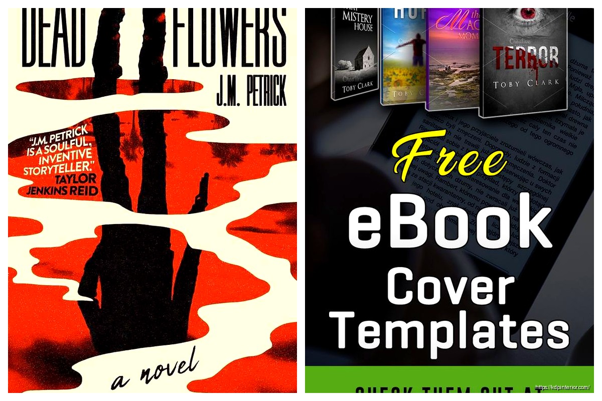
DISCOVER OUR FREE BEST SELLING PRODUCTS
Editable Canva Lined Journal: Express Your Thoughts – KDP Template
Lined Pages Journal 120 pages Ready to Upload PDF Commercial Use KDP Template 6×9 8.5×11 5×8 for Notebooks, Diaries, Low Content
Lined Pages Journal 120 pages Ready to Upload PDF Commercial Use KDP Template 6×9 8.5×11 5×8 for Notebooks, Diaries, Low Content
Cute Dogs Coloring Book for Kids | Activity Book | KDP Ready-To-Upload
Daily Planner Diary : Diary Planners for Everyday Productivity, 120 pages, 6×9 Size | Amazon KDP Interior
Wolf Coloring KDP interior For Adults, Used as Low Content Book, PDF Template Ready To Upload COMMERCIAL Use 8.5×11"
Coloring Animals Head Book for Kids, Perfect for ages 2-4, 4-8 | 8.5×11 PDF
Printable Blank Comic Book Pages PDF : Create Your Own Comics – 3 Available Sizes
Notes KDP interior Ready To Upload, Sizes 8.5×11 6×9 5×8 inch PDF FILE Used as Amazon KDP Paperback Low Content Book, journal, Notebook, Planner, COMMERCIAL Use
Black Lined Journal: 120 Pages of Black Lined Paper Perfect for Journaling, KDP Notebook Template – 6×9
Student Planner Journal 120 pages Ready to Upload PDF Commercial Use KDP Template 6×9" 8.5×11" for Low Content book
Recipe Journal Template – Editable Recipe Book Template, 120 Pages – Amazon KDP Interior