Amazon KDP guide, KDP book publishing
Book Cover Examples: Design Inspiration Gallery
Apr
Okay so I just spent like three hours last night going through my old cover files because someone in my mastermind asked about this and honestly it made me realize how much the whole cover game has changed since I started in 2017.
Where I Actually Look for Cover Ideas
So first thing – Amazon itself is your best research tool and most people completely mess this up. They’ll go look at bestsellers in their niche and think “cool I’ll copy that” but that’s backwards. You need to look at what’s selling RIGHT NOW in your specific sub-category, not just the main category.
Like if you’re doing gratitude journals, don’t just search “journals” – go to Amazon, type your exact keyword, filter by newest releases from the last 90 days, then sort by bestseller rank. The covers that are ranking well in that timeframe? That’s your current trend data. I do this every single time before I design anything new.
Pinterest is actually way better than people think but you gotta use it right. Don’t just search “book covers” because you’ll get a million fantasy novel covers and that’s probably not what you need. I search stuff like “minimalist journal cover” or “workbook cover layout” or “planner aesthetic 2024” – way more specific. Then I create secret boards for different niches so I can compare patterns.
Breaking Down What Actually Works
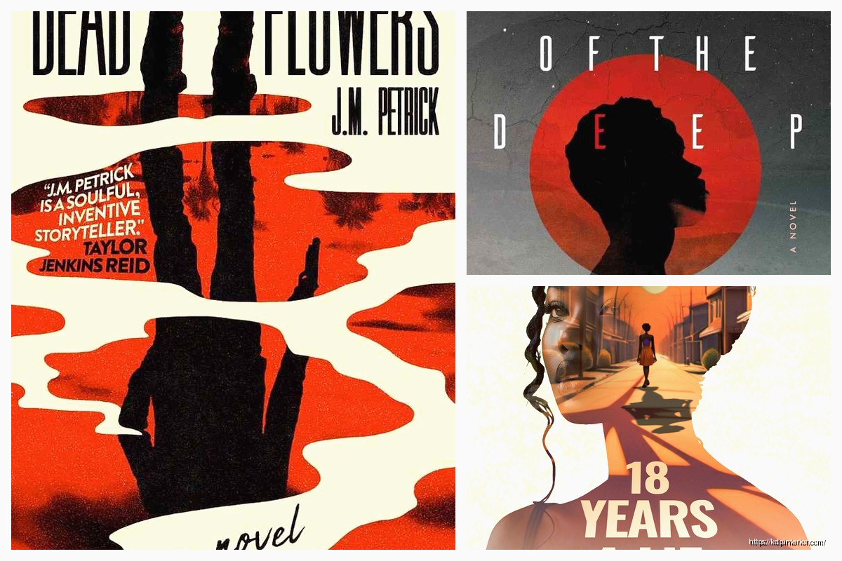
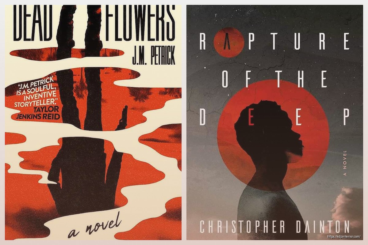
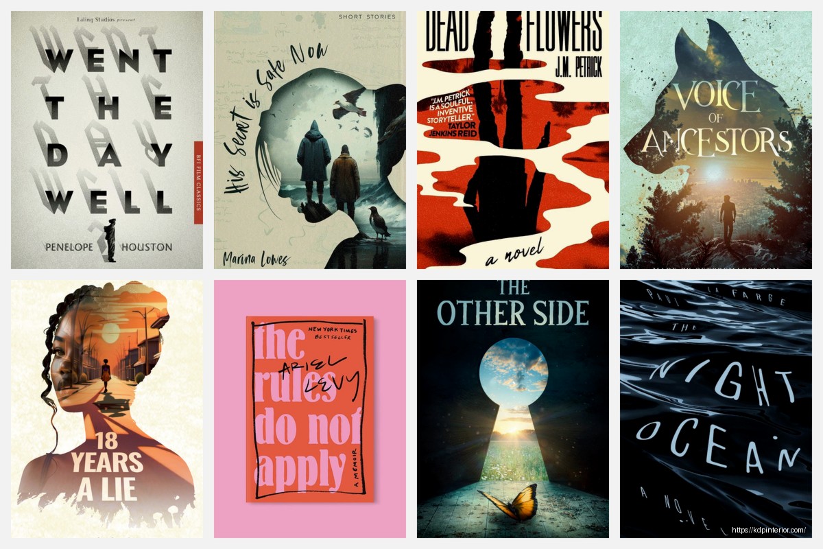
The thing about cover design that took me forever to understand is that you’re not making art, you’re making a tiny thumbnail that needs to stop someone’s scroll. Sounds obvious but like… I wasted probably my first year making these elaborate covers that looked amazing full-size and completely disappeared at thumbnail size.
Here’s what I look for when I’m analyzing successful covers:
Typography hierarchy – Can you read the title in under 2 seconds when it’s tiny? The bestselling low-content books almost always have huge, bold titles. I’m talking like 60-70% of the cover is just the title text. My cat literally walked across my keyboard while I was testing this last week and somehow made the text even BIGGER and honestly it looked better.
Color contrast – This is gonna sound weird but I literally squint at covers to see if they still make sense when blurry. If you can’t distinguish the text from the background when squinting, it won’t work as a thumbnail. Dark text on light backgrounds or vice versa – high contrast always wins.
Negative space – Newer designers pack way too much stuff onto covers. The covers that convert best in my experience have like maybe 3 elements max. Title, subtitle if needed, maybe one graphic element or pattern. That’s it.
Specific Niche Examples That Performed Well
I’ve got actual data on this from my own catalog so lemme break down what worked:
For composition notebooks and journals, the minimalist geometric patterns crushed it in 2022-2023. I had this one cover that was literally just a gradient background with a simple line pattern and bold sans-serif text – made like $800 in its first three months which is solid for low-content. The key was the text was MASSIVE and the colors were trendy (sage green and terracotta).
Planners and organizers need to look organized, obviously. Grid layouts, clean lines, maybe a subtle texture. I see a lot of people trying to make planner covers look exciting and fun with lots of graphics but honestly? The boring professional-looking ones with just text and maybe a thin border outsell the fancy ones consistently. My theory is people want their planner to feel serious and productive.
Logbooks and trackers do really well with either ultra-minimal or slightly technical looking designs. Like I have a fitness tracker with just a simple dumbbell icon and bold text that’s been selling steadily for 2+ years. Nothing fancy. The cover basically says “this is a tool, not a decoration” and that’s what people want.
Color Psychology Stuff That Actually Matters
Okay so everyone talks about color psychology like blue = calm and red = exciting but for KDP specifically, here’s what I’ve noticed works:
Neutral palettes (beige, cream, sage, grey) absolutely dominate in the journal and planner space right now. They photograph well for Instagram which means more user-generated content which means more organic reach. I literally choose colors now based on “will someone want to post this on their aesthetic feed?”
Bold single-color covers with white text perform really well for workbooks and activity books. Think bright yellow with black text, or deep navy with white text. High contrast, pops in search results, looks professional.
Pastels work great for anything targeting women 25-45, especially self-care journals, pregnancy trackers, wellness planners. But you gotta use them right – not too babyish, keep it sophisticated.
Wait I forgot to mention – gradients are tricky. They were huge in 2020-2021 but now they can make your cover look dated unless you do them really subtly. I use them more for backgrounds now with solid elements on top.
Font Choices Everyone Gets Wrong
This is like my biggest pet peeve honestly. People use these super decorative script fonts that are completely illegible at thumbnail size. I’m gonna say something controversial – just use sans-serif fonts for 90% of your covers. Arial Black, Montserrat Bold, Bebas Neue, Impact. These fonts are popular because they WORK.
Script fonts can work for wedding planners or very feminine journals but even then, make them huge and pair them with a readable sans-serif subtitle.
Never use more than two fonts on a cover. Title font and maybe a subtitle font. That’s it. I see covers with like four different fonts and it looks chaotic and unprofessional.
Tools and Resources I Actually Use
Canva Pro is pretty much essential at this point. The free version works but you need Pro for the transparent backgrounds and extended library. I’ve designed probably 150+ covers in Canva and it’s just fast. Their templates are actually decent for getting proportions right even if you don’t use the actual design.
Creative Fabrica subscription for graphics and patterns if you’re doing more decorative covers. I think I pay like $10/month and download a ton of elements that I reuse across different covers.
Font Squirrel and Google Fonts for commercial-use fonts. Do NOT just download random fonts from sketchy sites because you can get your account suspended for copyright issues.
Adobe Color for generating color palettes that actually work together. I’m not great at color theory so this tool saves me from making ugly combinations.
Reverse Engineering Bestseller Covers
Here’s my actual process when I’m researching a new niche:
I screenshot like 20-30 bestselling covers in that specific category. Then I literally put them in a grid in Canva or PowerPoint and look for patterns. What colors show up most? What’s the average text size? How much of the cover is text vs graphics? Are there common elements like borders or patterns?
Then I make a list of what’s working and what’s overdone. You wanna be similar enough that people recognize it as part of the category but different enough that you stand out. This is the whole “same but different” thing everyone talks about.
One time I was doing this research for password logbooks and I noticed literally 15 of the top 20 covers used the same lock icon. So I went with a key instead and positioned it differently – that cover ended up being one of my better performers because it was familiar but not identical.
Seasonal and Trend Considerations
If you’re publishing planners or calendars obviously timing matters. But even for evergreen content, paying attention to design trends helps. Like right now the “dopamine decor” trend means bright, maximalist designs are coming back after years of minimalism dominating.
I usually design covers in batches and try to have some that follow current trends and some that are more classic/timeless. The trendy ones might pop fast but date quickly, the classic ones sell steadily forever.
Common Mistakes I Made Early On
Using low-quality graphics that looked pixelated when uploaded. Amazon’s preview is harsh – always design at high resolution and check the preview carefully.
Making covers that I personally loved but didn’t match what was selling. Your taste doesn’t matter, data matters. I had to learn to separate “what I think looks cool” from “what will make money.”
Not testing enough variations. Now I’ll often upload 2-3 covers for similar products with different designs to see what performs better. Sometimes the one I think will flop actually does best.
Overcomplicating things. My best-selling cover of all time is probably the simplest one I ever made – just text and a solid color background. Made over $15k from that single book.
Keeping a Swipe File
I keep a folder on my computer organized by niche with screenshots of covers I like. Not to copy but to reference for layout ideas, color combos, typography scale, etc. I probably have like 500+ covers saved at this point.
Also bookmark Etsy shops that sell printables and digital planners because they’re usually ahead of Amazon trends by a few months. What’s selling on Etsy now will probably hit Amazon KDP in 3-6 months.
Oh and another thing – watch what traditional publishers are doing with their covers. They have actual design teams and market research budgets. If you see a pattern emerging in Barnes & Noble displays or on Goodreads, that’s valuable intel.
The whole cover design thing is honestly more science than art at this point. You’re solving a visual problem – how do I make someone click on THIS book instead of the other 47 books in the search results? Everything else is just execution.
I’m probably gonna redesign like half my catalog this year based on current trends but that’s the game. What worked in 2019 doesn’t work now. You gotta stay current or your books just slowly fade in the rankings.
DISCOVER OUR FREE BEST SELLING PRODUCTS
Editable Canva Lined Journal: Express Your Thoughts – KDP Template
Lined Pages Journal 120 pages Ready to Upload PDF Commercial Use KDP Template 6×9 8.5×11 5×8 for Notebooks, Diaries, Low Content
Lined Pages Journal 120 pages Ready to Upload PDF Commercial Use KDP Template 6×9 8.5×11 5×8 for Notebooks, Diaries, Low Content
Cute Dogs Coloring Book for Kids | Activity Book | KDP Ready-To-Upload
Daily Planner Diary : Diary Planners for Everyday Productivity, 120 pages, 6×9 Size | Amazon KDP Interior
Wolf Coloring KDP interior For Adults, Used as Low Content Book, PDF Template Ready To Upload COMMERCIAL Use 8.5×11"
Coloring Animals Head Book for Kids, Perfect for ages 2-4, 4-8 | 8.5×11 PDF
Printable Blank Comic Book Pages PDF : Create Your Own Comics – 3 Available Sizes
Notes KDP interior Ready To Upload, Sizes 8.5×11 6×9 5×8 inch PDF FILE Used as Amazon KDP Paperback Low Content Book, journal, Notebook, Planner, COMMERCIAL Use
Black Lined Journal: 120 Pages of Black Lined Paper Perfect for Journaling, KDP Notebook Template – 6×9
Student Planner Journal 120 pages Ready to Upload PDF Commercial Use KDP Template 6×9" 8.5×11" for Low Content book
Recipe Journal Template – Editable Recipe Book Template, 120 Pages – Amazon KDP Interior