-
×
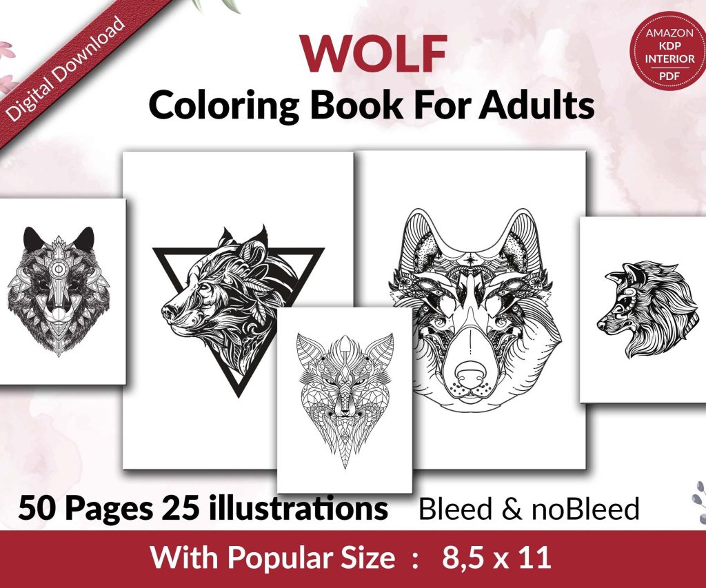 Wolf Coloring KDP interior For Adults, Used as Low Content Book, PDF Template Ready To Upload COMMERCIAL Use 8.5x11"
1 × $0.00
Wolf Coloring KDP interior For Adults, Used as Low Content Book, PDF Template Ready To Upload COMMERCIAL Use 8.5x11"
1 × $0.00
Subtotal: $0.00
Okay so the thing about book cover layout is most people obsess over fonts and colors but completely ignore the actual composition and that’s where like 80% of covers fail right out of the gate.
I was redesigning a cover for one of my planners last month while watching some terrible reality show my wife had on and realized I’d made the same mistake I see everywhere – cramming too much stuff into the frame without thinking about how the eye actually moves across the design.
Everyone talks about the rule of thirds like it’s some magic formula but here’s what actually matters for book covers. Your thumbnail on Amazon is gonna be like 120 pixels tall maybe smaller depending on where it shows up. So when you’re laying out elements you need strong anchor points that read even when the cover is the size of a postage stamp.
I divide my covers into three horizontal bands usually. Top third is where your title goes most of the time unless you’re doing something specific with genre expectations. Middle third is your focal point – could be an image, could be a pattern, whatever your main visual hook is. Bottom third is author name and sometimes a subtitle if you need one.
But here’s the thing and this trips people up constantly… you don’t have to fill all three sections equally. Some of my best-selling covers have like 60% of the space dedicated to one element and the rest is just supporting players.
This concept changed everything for me about two years ago. Visual weight isn’t about physical size it’s about where your eye gets pulled. A small area of bright red has more visual weight than a huge area of pale gray, right?
When I’m laying out a cover I literally squint at my screen until the image goes blurry. Whatever I can still see clearly – that’s got the visual weight. If everything blurs together equally you’ve got a problem because nothing’s standing out.
For low-content books especially you want:
I had this journal cover last year where I put these really intricate mandala designs all over and thought it looked amazing on my 27-inch monitor. Uploaded it to KDP and the thumbnail looked like visual noise. Completely unreadable. Had to strip out like half the detail and make one mandala the hero with everything else super subtle.
Okay so typography placement is where I see the most disasters honestly. People will spend hours finding the perfect font and then just slap it wherever there’s empty space.
Your title needs breathing room. I usually leave at least 15-20% of the cover height as empty space around the title area. Sounds like a lot but when you compress down to thumbnail size that padding is what makes text readable.
Center alignment works great for certain genres – think wellness journals, planners, anything that needs to feel balanced and calm. But if you’re doing center alignment you gotta commit fully. Title centered, author name centered, any decorative elements centered on the same axis.
Left or right alignment can create way more energy and movement though. I do a lot of my productivity planners with left-aligned text because it feels more dynamic and action-oriented.
Oh and another thing – if you’re aligning left or right, don’t just use the edge of the canvas. Pull it in by like 10-15% from the edge. Gives you this nice margin that looks intentional rather than like you just… ran out of room.
Every cover needs one clear focal point and this is where composition really matters. Your focal point is usually gonna be either your main image element OR your title text but it can’t be both with equal weight because then you’re asking the viewer to decide where to look first and people just bounce instead.
I tested this extensively with a series of gratitude journals. First version had a really elaborate floral illustration competing with this big ornate title treatment. CTR on ads was like 0.3% which is terrible. Second version I made the florals way more subtle and let the title dominate – CTR jumped to 1.2%.
Negative space isn’t just empty space it’s actually a design element. I know that sounds pretentious but stick with me. When you leave strategic areas empty your eye naturally flows toward the filled areas.
My most successful planner cover from last year was probably 40% negative space. Just a soft gradient background with the title in the upper third and a small geometric element in the bottom right corner. That little geometric bit created this visual anchor that pulled your eye down and made the whole composition feel intentional instead of sparse.
The trick with negative space is making it look purposeful not lazy. You do this with:
This is gonna sound weird but I think of covers in terms of color zones. Usually no more than three distinct zones maximum.
Zone one might be your background – could be a solid color, gradient, texture, whatever. Zone two is your primary content area where title and main imagery live. Zone three if you use it is usually for author name or a small accent element.
When these zones have clear boundaries even if they’re subtle your composition automatically feels more structured. I do this with planners constantly – background zone in one color family, a band or frame in a contrasting color for the title zone, and then author info in a third complementary shade.
Wait I forgot to mention – when you’re setting up these zones think about contrast ratios. Your text needs at least 4.5:1 contrast ratio against its background to be readable at thumbnail size. There are free online checkers for this and honestly I check every single cover now because I’ve been burned too many times.
Symmetrical layouts feel safe and professional which is great for certain niches. All my budget planners use symmetrical layouts because that audience wants reliability and order.
But asymmetrical balance is way more dynamic when you can pull it off. This is where you have different visual weights on each side of the cover but they still feel balanced overall.
Like I’ll put a large title element in the upper left but then balance it with a smaller but more visually dense image in the lower right. Or heavy text on top with a thin horizontal accent line at the bottom that somehow makes the whole thing feel grounded.
The way I learned to do this was literally by taking successful covers in my niche and drawing lines to map out where the visual weight sat. You start seeing patterns – oh this cover has 70% of the weight in the top half but that one bright accent color at the bottom creates balance.
Diagonal lines or arrangements create way more energy than horizontal or vertical. If you’ve got multiple elements to arrange try setting them on a diagonal axis instead of a grid.
I did this with a series of fitness journals where I had these little icon elements. First layout I did them in a neat grid and it felt stiff and boring. Rotated everything about 15 degrees and arranged them on a diagonal flow – suddenly the whole cover felt more energetic and action-oriented which was perfect for the niche.
Your eye naturally follows diagonal lines so you can actually guide where people look first, second, third just by arranging elements along diagonal axes.
Title should almost always be your largest text element unless you’re in a niche where author name is the draw but if you’re reading this you’re probably not Stephen King so.
I usually do title at 100% size whatever that ends up being, subtitle if needed at 30-40% of title size, and author name at 20-30% of title size. These ratios create clear hierarchy that reads instantly even at thumbnail.
Position matters as much as size though. Elements in the upper half of a composition get noticed first because that’s how we’re trained to read. So if your genre expects the title at the top put it there even if you think it’d look cooler at the bottom.
Once you understand the standard composition rules you can break them strategically. I’ve got a few covers where the title is tiny and tucked in a corner because the main image is so strong it carries the whole design.
But you gotta know what you’re doing and why. I only break composition rules when I’ve tested that the cover still reads clearly at thumbnail size and the genre expectations support something unconventional.
Frames or borders can really help unify a composition especially if you’ve got a lot of disparate elements. Even just a simple rectangular border pulled in from the edges creates this instant sense of structure.
I use subtle borders on probably 30% of my covers. Usually just a thin line in a contrasting color or sometimes a thicker decorative border if the genre supports it.
The thing about borders is they need to feel intentional. A thin elegant border can look sophisticated but if it’s too thick or too ornate it starts feeling dated unless you’re specifically going for vintage aesthetic.
Oh and if you’re doing a border leave adequate padding between the border and your text. I usually do at least 5% of the cover dimensions as padding. Cramped borders make everything feel claustrophobic.
Even if you’re working with flat design elements you can create a sense of depth through layering and overlap. This makes compositions feel more sophisticated and professional.
I’ll put a background texture, then a semi-transparent overlay shape, then text on top of that. Three layers minimum for most of my covers. The layering creates visual interest even when each individual element is simple.
Shadows and highlights help with this too but you gotta be subtle. A soft drop shadow at like 20% opacity can make text pop without looking like a PowerPoint from 2003. I’m talking barely-there shadows that just create a hint of separation between layers.
This should probably have been first but whatever. You absolutely must test your layout at actual thumbnail size before you finalize anything.
I keep a template open with my cover at full size and then the same design shrunk down to 120 pixels tall. I’m constantly checking both while I work because what looks amazing at print size might be completely unreadable at thumbnail.
Things that disappear at thumbnail size: subtle textures, thin lines, small text under like 18pt, intricate details, low-contrast elements.
Things that still work: bold shapes, high contrast, clear typography, simple compositions with one strong focal point.
My cat just knocked over my coffee which is perfect timing I guess because I think that covers the main composition stuff. The key takeaway is just… think about visual hierarchy and what reads at small sizes because that’s where 90% of your sales decisions happen. Nobody’s zooming in to admire your intricate border details they’re scrolling through search results at 2am looking for a planner and you’ve got like one second to make them stop scrolling.
DISCOVER OUR FREE BEST SELLING PRODUCTS
Editable Canva Lined Journal: Express Your Thoughts – KDP Template
Lined Pages Journal 120 pages Ready to Upload PDF Commercial Use KDP Template 6×9 8.5×11 5×8 for Notebooks, Diaries, Low Content
Lined Pages Journal 120 pages Ready to Upload PDF Commercial Use KDP Template 6×9 8.5×11 5×8 for Notebooks, Diaries, Low Content
Cute Dogs Coloring Book for Kids | Activity Book | KDP Ready-To-Upload
Daily Planner Diary : Diary Planners for Everyday Productivity, 120 pages, 6×9 Size | Amazon KDP Interior
Wolf Coloring KDP interior For Adults, Used as Low Content Book, PDF Template Ready To Upload COMMERCIAL Use 8.5×11"
Coloring Animals Head Book for Kids, Perfect for ages 2-4, 4-8 | 8.5×11 PDF
Printable Blank Comic Book Pages PDF : Create Your Own Comics – 3 Available Sizes
Notes KDP interior Ready To Upload, Sizes 8.5×11 6×9 5×8 inch PDF FILE Used as Amazon KDP Paperback Low Content Book, journal, Notebook, Planner, COMMERCIAL Use
Black Lined Journal: 120 Pages of Black Lined Paper Perfect for Journaling, KDP Notebook Template – 6×9
Student Planner Journal 120 pages Ready to Upload PDF Commercial Use KDP Template 6×9" 8.5×11" for Low Content book
Recipe Journal Template – Editable Recipe Book Template, 120 Pages – Amazon KDP Interior