-
×
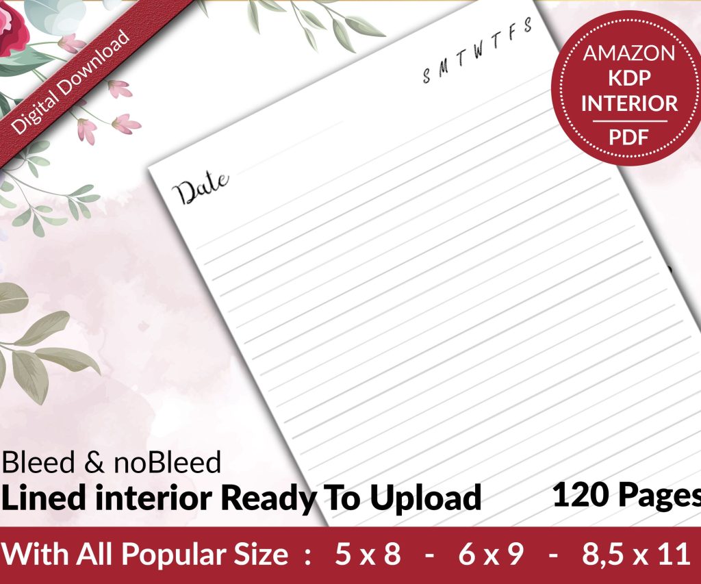 Lined Pages Journal 120 pages Ready to Upload PDF Commercial Use KDP Template 6x9 8.5x11 5x8 for Notebooks, Diaries, Low Content
1 × $0.00
Lined Pages Journal 120 pages Ready to Upload PDF Commercial Use KDP Template 6x9 8.5x11 5x8 for Notebooks, Diaries, Low Content
1 × $0.00
Subtotal: $0.00
Okay so CreateSpace templates are basically legacy now since Amazon merged everything into KDP Print back in 2018, but here’s the thing – I still get questions about this constantly because people have old files or they’re trying to figure out why their cover dimensions seem off.
First thing you gotta understand is CreateSpace used to have their own template generator that was honestly pretty solid. You’d go to their site, punch in your trim size and page count, and boom – they’d spit out a PDF template with guides showing you exactly where your spine should be and where the bleed areas were. The problem now is that site’s gone, so if you’re sitting on an old CreateSpace template or trying to recreate one, you need to know how the math actually worked.
CreateSpace templates had three main sections – front cover, spine, back cover. Pretty standard stuff. But their bleed requirements were 0.125 inches on all sides, which KDP Print still uses actually. So that part didn’t change when they merged.
The spine width calculation is where people mess up constantly. CreateSpace used this formula: (page count / pages per inch) = spine width. The pages per inch varied based on your paper type. For white paper it was roughly 442 pages per inch, cream paper was about 425 pages per inch. So if you had a 200-page book on white paper, your spine would be like 200/442 = 0.45 inches.
Wait I forgot to mention – this only applies to paperbacks obviously. Hardcover wasn’t really a CreateSpace thing until near the end, and even then it was limited.
Let’s say you were doing a 6×9 book with 150 pages on cream paper. Here’s how the old template would break down:
Your spine width would be 150/425 = roughly 0.35 inches
Total width = back cover + spine + front cover + bleed on both sides
That’s 6 + 0.35 + 6 + 0.125 + 0.125 = 12.6 inches wide
Height = 9 + 0.125 + 0.125 = 9.25 inches tall
The thing that drove me nuts back in the day was that CreateSpace’s template generator would sometimes round differently than their actual printing specs, so you’d get a file that looked perfect but then failed their automated check. I probably lost like 20 hours total over the years trying to figure out why covers were getting rejected when my measurements were “correct.”
CreateSpace was pretty strict about keeping text and important design elements at least 0.125 inches away from trim lines. But here’s what nobody tells you – you actually wanted to go even further in, especially on the spine. I always did 0.25 inches minimum from the spine edges because book binding isn’t perfect and your spine could shift slightly during production.
My dog just knocked over my coffee but it’s fine…
The barcode area on the back cover needed to be at least 2×1.2 inches of white or very light colored space, positioned in the lower right corner. CreateSpace would slap their barcode there automatically, and if your design had dark colors or busy patterns in that spot, they’d reject it.
CreateSpace accepted PDF files primarily, but you could also upload JPG, TIFF, or PNG files. The PDF route was always safer though because it preserved your color profiles and resolution settings. They wanted 300 DPI minimum, and honestly anything less than that looked garbage anyway.
Color mode had to be CMYK, not RGB. This is still true for KDP Print. I see people mess this up ALL the time because they design in Canva or some web-based tool that exports RGB by default, then wonder why their colors look muddy when the book arrives. You gotta convert to CMYK before uploading.
Okay so funny story – when CreateSpace shut down their template generator, I panicked because I had like 15 client projects in the pipeline. But then I realized KDP Print’s cover calculator uses almost identical specs. The main differences are super minor.
You can use KDP Print’s cover template generator now and it’ll work for what were essentially CreateSpace specs. Go to kdp.amazon.com, click “Cover Calculator” under Tools & Resources, put in your trim size and page count, select your paper type, and it calculates everything for you.
The spine width might be slightly different – like 0.01 inches – because KDP updated their pages-per-inch calculations slightly. For most books this doesn’t matter at all, but if you’re doing a really thick book (like 400+ pages), you might need to adjust.
CreateSpace had a bunch of trim sizes but these were the most popular:
The 6×9 was like 70% of all books printed through CreateSpace. It’s just that sweet spot where it looks professional, fits on shelves nicely, and keeps printing costs reasonable.
When I was using CreateSpace templates regularly, my workflow went like this – download the template PDF, open it in Photoshop or GIMP, set it as a bottom layer, then design on layers above it. The template had pink lines showing the trim areas and spine position, so you could see exactly where everything would end up.
You needed to extend your background images and colors all the way to the edge of the template (the bleed area) but keep text and logos inside the safe zone. This created what’s called a “full bleed” design where your cover images go right to the edge after trimming.
Oh and another thing – the spine text orientation matters. CreateSpace wanted spine text to read correctly when the book is lying face-up. So if you’re looking at the spine with the front cover on the right, text should read top-to-bottom. Some European publishers do it the opposite way but CreateSpace/KDP follows US standards.
CreateSpace offered matte and glossy laminate finishes. This didn’t affect the template dimensions at all, but it did affect how your cover design looked in person. Glossy made colors pop more and was fingerprint-resistant, but it also showed scratches easier. Matte was more elegant and sophisticated-looking but could make darker colors look slightly duller.
I always designed covers at full brightness and saturation, then when clients chose matte finish, I’d warn them it might look 5-10% less vibrant. Most people didn’t notice or care, but if you were doing a kids book with bright colors, glossy was definitely the better choice.
Font sizing for spines was always tricky. If your spine was less than 0.5 inches wide, you really couldn’t go below 14pt font size or it became unreadable. And honestly, even at 14pt it was pushing it. I’d recommend 16pt minimum for thin spines, 18-20pt for anything standard.
For front cover titles, it depended on your design obviously, but I found that titles needed to be readable in the thumbnail view on Amazon – like when it’s shrunk down to maybe 150 pixels tall. If you couldn’t read the title at that size, it was too small.
Wait this is gonna sound weird but I actually tested this once by uploading covers at different title sizes and checking the conversion rates. Bigger, clearer titles performed noticeably better for sales. Like a 15-20% difference in some cases. So don’t get too artistic with tiny elegant fonts that nobody can read.
This was the biggest headache with CreateSpace covers – getting colors to match what you saw on screen. Even with CMYK conversion, different monitors display colors differently, and printing presses have their own color variations.
CreateSpace used to recommend the FOGRA39 color profile (also called Coated FOGRA39 or ISO Coated v2). If you set your design software to use this profile, your colors would be closer to the final printed result. KDP Print still uses similar profiles.
The reds and bright blues were always the worst offenders. What looked like a vibrant red on your monitor might print as more of a dark pink or burgundy. I learned to order proof copies for any cover with critical color matching needs, especially for clients who were picky about branding colors.
If you’ve got old CreateSpace cover files sitting around, they’ll probably work fine for KDP Print with minimal adjustments. The main thing to check is the spine width calculation – use KDP’s cover calculator to verify your spine dimension is still correct for your page count.
Sometimes the page count changes slightly when moving from CreateSpace to KDP because the interior formatting requirements are a tiny bit different. Like CreateSpace might have allowed slightly tighter margins that KDP flags as too close to the trim edge. So your 200-page book might become 205 pages, which changes your spine width.
Just rebuild the cover template with KDP’s calculator, overlay your old design, adjust if needed, and re-export. Usually takes like 15 minutes max unless you’ve got some complicated spine design that needs repositioning.
Back in the CreateSpace days, I was using Adobe Photoshop for like 80% of cover designs. It handled the template layers well, color management was solid, and exporting to PDF with proper settings was straightforward.
But honestly, GIMP worked fine too if you didn’t wanna pay for Photoshop. It’s free, handles CMYK conversion through plugins, and can work with PDF templates. The interface is clunkier but it gets the job done.
For simpler covers, I’d sometimes use Affinity Publisher or even Canva Pro (though you gotta be careful with Canva’s color modes and export settings). The key was always checking that your final file matched the template specs exactly – dimensions, resolution, color mode, all of it.
One time I was watching that show Dark on Netflix and trying to design a thriller cover at the same time, and I totally messed up the spine placement because I wasn’t paying attention. Had to redo the whole thing. So yeah, maybe don’t multitask on these…
The legacy CreateSpace templates are basically obsolete now but the principles are exactly the same as current KDP Print specs. If you understand how those old templates worked – the bleed, spine calculations, safe zones – you understand how print-on-demand cover design works period. Just use KDP’s current tools and you’re good to go.
DISCOVER OUR FREE BEST SELLING PRODUCTS
Editable Canva Lined Journal: Express Your Thoughts – KDP Template
Lined Pages Journal 120 pages Ready to Upload PDF Commercial Use KDP Template 6×9 8.5×11 5×8 for Notebooks, Diaries, Low Content
Lined Pages Journal 120 pages Ready to Upload PDF Commercial Use KDP Template 6×9 8.5×11 5×8 for Notebooks, Diaries, Low Content
Cute Dogs Coloring Book for Kids | Activity Book | KDP Ready-To-Upload
Daily Planner Diary : Diary Planners for Everyday Productivity, 120 pages, 6×9 Size | Amazon KDP Interior
Wolf Coloring KDP interior For Adults, Used as Low Content Book, PDF Template Ready To Upload COMMERCIAL Use 8.5×11"
Coloring Animals Head Book for Kids, Perfect for ages 2-4, 4-8 | 8.5×11 PDF
Printable Blank Comic Book Pages PDF : Create Your Own Comics – 3 Available Sizes
Notes KDP interior Ready To Upload, Sizes 8.5×11 6×9 5×8 inch PDF FILE Used as Amazon KDP Paperback Low Content Book, journal, Notebook, Planner, COMMERCIAL Use
Black Lined Journal: 120 Pages of Black Lined Paper Perfect for Journaling, KDP Notebook Template – 6×9
Student Planner Journal 120 pages Ready to Upload PDF Commercial Use KDP Template 6×9" 8.5×11" for Low Content book
Recipe Journal Template – Editable Recipe Book Template, 120 Pages – Amazon KDP Interior