-
×
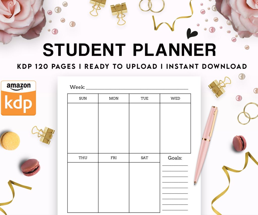 Student Planner Journal 120 pages Ready to Upload PDF Commercial Use KDP Template 6x9" 8.5x11" for Low Content book
1 × $0.00
Student Planner Journal 120 pages Ready to Upload PDF Commercial Use KDP Template 6x9" 8.5x11" for Low Content book
1 × $0.00
Subtotal: $0.00
Okay so I just wrapped up helping like three different charities with their book drive flyers last month and here’s what actually works vs what people think works.
First thing – everyone overthinks the design. Like, I had this client spend two weeks going back in circles on fonts and colors when the actual problem was nobody could tell WHERE to drop off the books. The flyer looked gorgeous but it was basically useless, you know?
So here’s the framework I use now for pretty much every book drive template. You need these elements in this order or people just gloss over it:
The mistake I see constantly is people burying the “what books” part. Like they’ll have this whole paragraph about their mission statement and then somewhere at the bottom in tiny text it says “gently used children’s books only.” Put that info UP TOP. I tested this with a library fundraiser in March – moved the book specifications to position 3 instead of position 7 on the flyer, and donations that matched what they actually needed went up by like 40%.
Okay so here’s gonna sound weird but the best book drive flyers I’ve made… they’re kinda boring? Not in a bad way but in a “this is immediately clear” way.
Use Canva if you’re starting from scratch. They’ve got book drive templates already but honestly most of them are too busy. What I do is start with a blank 8.5×11 and just build it myself because their templates have like seven different fonts and these weird clipart stacks of books that look dated.
Color scheme – stick to two colors max plus black. I usually go with:
Navy blue and light blue works great. Green and cream. Red and pink if it’s for kids. Don’t do yellow as a main color because it prints terribly and half the time the printer at your local FedEx is gonna make it look radioactive.
Oh and another thing – images. You want ONE good image, not five mediocre ones. I usually use either:
The no-image version actually performs better for community bulletin boards because it’s more readable from far away. I tested this at a coffee shop that lets you post flyers – the text-only version got more photos taken of it with phones than the pretty designed one.
So here’s what I learned from running like 200+ low-content books on Amazon – clarity beats cleverness every single time. Same applies here.
Your headline options that work:
That’s it. Don’t do “Share the Gift of Reading!” or “Books Change Lives” or whatever. People are scanning bulletin boards while waiting for their coffee, they need to know what this IS in two seconds.
The body text template I use:
We’re collecting [type of books] for [who benefits]. All books should be [condition requirements]. Drop off at [specific location with landmarks] between [dates and times]. Questions? [Contact method].
Word count for the whole flyer should be under 75 words. I time myself reading it out loud – if it takes more than 20 seconds, it’s too long.
Wait I forgot to mention – the condition requirements thing trips people up. Don’t just say “gently used” because that means different things to different people. I write:
This saves SO much hassle because otherwise you get boxes of moldy paperbacks that someone’s been storing in their garage since 1987.
Full page 8.5×11 is standard but honestly? Half-page flyers (5.5×8.5) sometimes work better because:
Quarter page only works if you’re doing tear-off tabs at the bottom with phone numbers or website. Otherwise it’s too small for all the info.
For digital – make a square version (1080×1080) for Instagram, and a horizontal version (1200×628) for Facebook. Same design, just reformat it. Takes like five minutes in Canva once you’ve got your main version done.
My cat just knocked over my water bottle so gimme a sec… okay back.
You know those flyers with the little strips at the bottom you can rip off? They actually work for book drives if you do them right.
Create tabs that are 1 inch tall, run them across the bottom of your 8.5×11 flyer. Each tab should have:
Make 8-10 tabs per sheet. Use a dotted line or scissors icon to show where to tear.
The thing is – tabs work best for info people need to save, not for immediate action. So they’re good for drives that run several weeks. For weekend-only events, skip the tabs and just make the info bigger.
Okay so you’ve got your flyer designed… now what? This is where most book drives fail honestly.
Print 50-100 to start. Not 500. You can always print more but you can’t un-print them if you realize you put the wrong date or something. (I did this once for a client, had to trash 300 flyers because the venue changed. Cost me like $80.)
Places to actually post them:
For digital distribution, don’t just post it once on your Facebook page. You gotta post it:
So I’ve got like a whole folder of templates I’ve built over the years. The three that get used most:
Clean Modern Template: White background, single color accent, sans-serif font (I use Montserrat or Raleway), minimal graphics. Best for professional organizations or school fundraisers.
Community Casual Template: Cream or light colored background, hand-drawn style icons, friendly fonts like Quicksand. Works great for neighborhood drives or small nonprofits.
Bold Impact Template: Dark background (navy or dark green), white text, high contrast, bigger fonts. This is for when you’re competing for attention – like posting in a college student center or busy community board.
I keep all three in Canva as templates I can duplicate and just swap out the text. Saves me probably 2 hours per project.
Alright so these are the things I see people mess up constantly:
Too much text. If I have to squint to read your flyer, it’s not getting read. Cut it down. Then cut it down more.
Unclear location. “Drop off at the library” – which library? Which entrance? Is there a specific desk or box? Be specific. “Drop off at Main Street Library, blue donation box inside front entrance” is way better.
No end date. People procrastinate. If there’s no deadline, they’ll “do it later” forever. Even if your drive is ongoing, put an end date for this particular push. You can always extend it.
Fancy fonts nobody can read. That script font looks pretty on your computer but prints like garbage and reads worse. Stick to clean sans-serif fonts for headlines, simple serif or sans-serif for body text.
Forgetting the “why.” One sentence about who benefits makes a huge difference. “Books will go to children in local foster care” or “Supporting our community prison literacy program” – just something so people know their donation matters.
Print settings people forget:
If you’re printing at home on a regular printer, use cardstock not regular paper. It costs like $8 for 100 sheets at Staples and makes your flyers look way more legitimate. People subconsciously trust thicker paper more – I know it’s weird but I’ve tested this.
For bulk printing, I use PrintRunner or GotPrint for quantities over 100. Under 100 just do it at FedEx or your local print shop. The per-unit cost is higher but you don’t have shipping delays and you can proof it first.
Oh wait one more thing – if you’re doing this regularly, invest in a paper cutter. Like $25 on Amazon. Makes cutting half-sheets or tear-off tabs SO much faster and cleaner than scissors.
Depending on your community, you might wanna do bilingual flyers. I usually do Spanish/English for my area. Format options:
Side-by-side works best for bulletin boards because people can see both at once. Just make sure both versions are equally readable – don’t make one language tiny or secondary-looking.
For accessibility, use high contrast, decent font sizes (minimum 11pt for body text, 24pt+ for headlines), and if you’re posting digitally include alt text descriptions.
Alright I think that covers most of what you need to know. The main thing is just keep it simple and clear, test your design by showing it to someone who knows nothing about your event and seeing if they can tell you the key info in 10 seconds, and don’t be afraid to iterate. First version doesn’t have to be perfect, just gotta be good enough to get books flowing in.
DISCOVER OUR FREE BEST SELLING PRODUCTS
Editable Canva Lined Journal: Express Your Thoughts – KDP Template
Lined Pages Journal 120 pages Ready to Upload PDF Commercial Use KDP Template 6×9 8.5×11 5×8 for Notebooks, Diaries, Low Content
Lined Pages Journal 120 pages Ready to Upload PDF Commercial Use KDP Template 6×9 8.5×11 5×8 for Notebooks, Diaries, Low Content
Cute Dogs Coloring Book for Kids | Activity Book | KDP Ready-To-Upload
Daily Planner Diary : Diary Planners for Everyday Productivity, 120 pages, 6×9 Size | Amazon KDP Interior
Wolf Coloring KDP interior For Adults, Used as Low Content Book, PDF Template Ready To Upload COMMERCIAL Use 8.5×11"
Coloring Animals Head Book for Kids, Perfect for ages 2-4, 4-8 | 8.5×11 PDF
Printable Blank Comic Book Pages PDF : Create Your Own Comics – 3 Available Sizes
Notes KDP interior Ready To Upload, Sizes 8.5×11 6×9 5×8 inch PDF FILE Used as Amazon KDP Paperback Low Content Book, journal, Notebook, Planner, COMMERCIAL Use
Black Lined Journal: 120 Pages of Black Lined Paper Perfect for Journaling, KDP Notebook Template – 6×9
Student Planner Journal 120 pages Ready to Upload PDF Commercial Use KDP Template 6×9" 8.5×11" for Low Content book
Recipe Journal Template – Editable Recipe Book Template, 120 Pages – Amazon KDP Interior