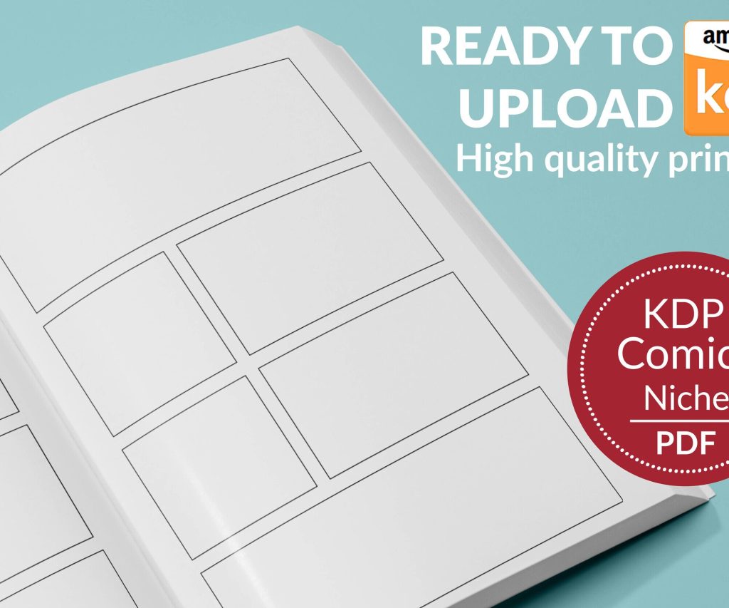
 Printable Blank Comic Book Pages PDF : Create Your Own Comics - 3 Available Sizes
 Subtotal: $0.00
Amazon KDP guide, KDP book publishing
Book Format on Google Docs: Publishing Setup
10
Mar
Mar
Okay so here’s the deal with formatting books in Google Docs for publishing – I literally just walked someone through this yesterday while my cat kept stepping on my keyboard, so it’s fresh in my mind.
Starting With the Right Document Setup
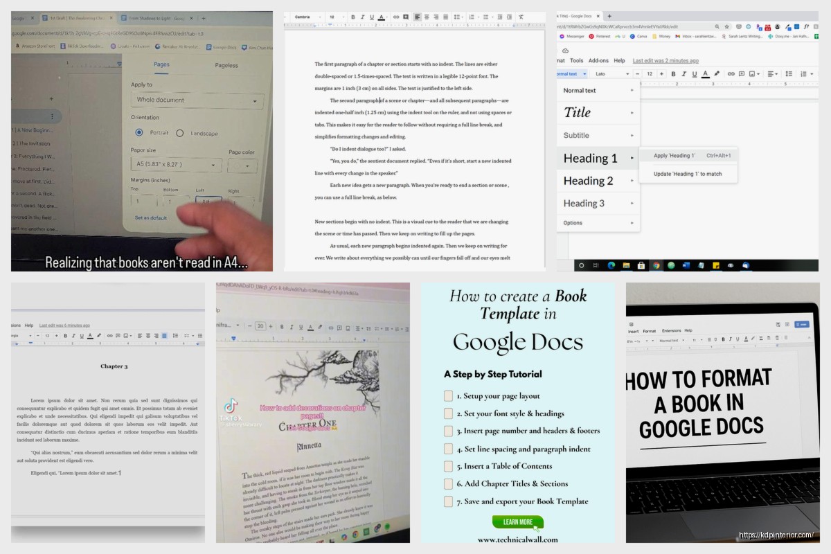
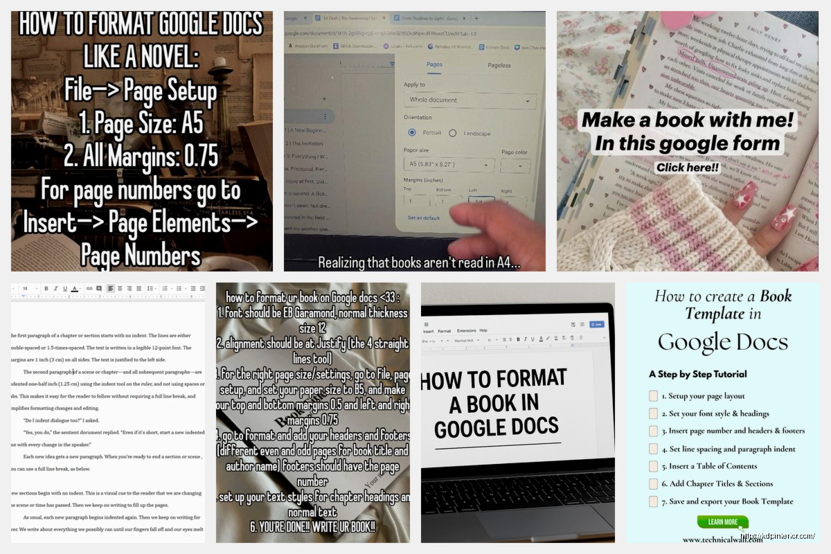
First thing you gotta do is open a blank Google Doc and immediately go to File > Page Setup. This is where most people mess up because they just start typing without thinking about trim size. For KDP, the most common sizes are 6×9 inches for paperbacks or 5×8 if you want something smaller. Problem is Google Docs doesn’t have these as presets.
So what I do is click “Custom” under paper size and manually enter your dimensions. Type in 6 for width and 9 for height, make sure it’s set to inches not centimeters. The margins are super important here – set top and bottom to 0.5 inches, but here’s where it gets tricky… your inside margin (the one closest to the binding) needs to be bigger than your outside margin.
I usually go with 0.75 inches for inside margin and 0.5 inches for outside. This gives you that gutter space so text doesn’t disappear into the spine when someone opens the book. Click “Set as default” so you don’t have to do this every single time.
Font Choices That Actually Work
Now fonts – and this is gonna sound boring but stay with me. You want something readable, not fancy. I see so many new publishers pick these decorative fonts thinking it looks professional and then wonder why readers complain.
Stick with these:
- Garamond (my personal favorite for fiction)
- Georgia (great for nonfiction)
- Times New Roman (classic, can’t go wrong)
- Crimson Text (if you want something a bit different)
Size should be 11pt or 12pt. I know 12pt looks huge on screen but remember you’re looking at it on a monitor – when it’s printed at 6×9 it’s actually pretty standard. Line spacing needs to be either 1.15 or 1.5, definitely not single-spaced because that’s hard to read, and not double-spaced because that’s just wasteful.
Chapter Formatting and Page Breaks
Oh and another thing – chapter breaks. Don’t just hit Enter a bunch of times to start a new chapter on a new page. I did this for my first three books and it was a nightmare when I had to make edits because everything would shift around.
Instead, put your cursor at the end of the chapter and go to Insert > Break > Page Break. Or just use Ctrl+Enter (Cmd+Enter on Mac). This locks that chapter start to a new page no matter what changes you make above it.
For chapter titles, I format them like this:
- Center aligned
- Font size 16pt or 18pt
- Maybe bold or maybe not (depends on the vibe)
- Leave 2-3 blank lines before the actual text starts
You can also add a decorative element if you want, like three asterisks centered between chapters or a small line, but honestly most readers don’t care about that stuff.
Headers and Footers for Page Numbers
Wait I forgot to mention headers and footers. This is actually kinda important for making your book look professional. Go to Insert > Headers & footers > Page number.
Here’s my system: I put page numbers in the footer, centered or on the outside edge (right side for odd pages, left side for even pages). To do the alternating thing in Google Docs is… honestly it’s not great. Google Docs doesn’t handle different odd/even pages as well as Word does.
What you CAN do is check “Different first page” in the header/footer options so your title page doesn’t have a page number. Then just put the page number centered in the footer and call it a day. Most readers won’t notice if it’s not alternating.
Some people also put the book title or author name in the header but I think that looks cluttered for most books. Maybe for nonfiction it makes sense.
Front Matter Setup
Okay so funny story – I published my first book without proper front matter and got roasted in a review for it looking “unprofessional.” So now I always include these pages in order:
- Title page (just the book title and your name, centered)
- Copyright page (copyright year, your name, “All rights reserved,” ISBN if you have one)
- Dedication page (optional but nice)
- Table of contents (if it’s nonfiction, usually skip for fiction)
Each of these should start on a new page using that page break trick I mentioned. The copyright page should be left-aligned and in smaller font, like 9pt or 10pt. Nobody really reads it but it needs to be there.
Table of Contents That Links
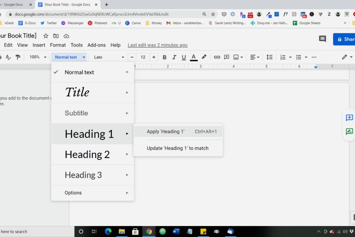
If you need a table of contents, here’s the easiest way – use the heading styles. Select your chapter title and click on the style dropdown (says “Normal text” by default) and change it to “Heading 1” or “Heading 2.”
Once you’ve done that for all chapters, put your cursor where you want the TOC and go to Insert > Table of contents. Pick the one with page numbers. Google Docs will auto-generate it and even make it clickable for the ebook version, which is actually pretty cool.
This is gonna sound weird but I usually create the TOC last, right before I export, because if you do it too early you’ll be updating it constantly as you edit.
Paragraph Formatting Details
Now let’s talk about paragraph indents because this trips people up. The first paragraph of a chapter or after a section break should NOT be indented. Every paragraph after that should have a 0.3 inch or 0.5 inch indent.
To set this up, select all your text (Ctrl+A), then go to Format > Align & indent > Indentation options. Under “Special indent” choose “First line” and set it to 0.3 inches.
But then you need to manually remove the indent from those first paragraphs. Just click at the start of the paragraph and drag the little indent marker back to the left margin. Yeah it’s tedious but it looks right.
Don’t use tab to indent paragraphs. Just don’t. It’ll cause problems when you convert the file.
Images and Graphics If You Need Them
If you’re adding images – like for a cookbook or illustrated book or whatever – make sure they’re high resolution. At least 300 DPI. When you insert them (Insert > Image), right-click and go to “Image options” to make sure they’re set to “Inline” not “Wrap text.”
Also resize them to fit within your margins. An image that goes to the edge of the page in Google Docs might get cut off when printed because of bleed and trim margins. Leave at least 0.25 inches of space around images.
I learned this the hard way with a workbook I made where half the graphics got chopped off on one side. Had to redo the whole thing.
Exporting for KDP Upload
Alright so once your book is formatted, you need to export it correctly. Go to File > Download and here’s where you have options…
For **paperback**: Download as PDF. Make sure you check the document one more time in PDF format before uploading because sometimes fonts can shift slightly. I usually download it, open it in Adobe Reader or whatever, and scroll through every page looking for weird formatting.
For **ebook/Kindle**: Download as EPUB. Google Docs actually exports pretty clean EPUB files now. KDP will convert it to MOBI or whatever format they use automatically. The EPUB option preserves your chapter links and formatting better than uploading a Word doc.
Some people download as Word doc (.docx) instead and that works too, but I’ve had better luck with EPUB for Kindle and PDF for paperback.
The KDP Upload Process Real Quick
When you upload to KDP, they’ll show you a previewer tool. USE IT. I can’t stress this enough. Click through every single page of your book in the previewer. Look for:
- Weird page breaks
- Formatting that didn’t carry over
- Images that shifted
- Chapter titles that look off
- Page numbers that are wrong or missing
For paperbacks, download the actual proof copy if you can afford it. Looking at a physical copy shows you things you’d never catch on screen. I found a weird spacing issue in my third book that was totally invisible in the digital preview but super obvious in print.
Common Mistakes to Avoid
Wait I should mention some things NOT to do because I see these all the time:
Don’t use multiple fonts throughout the book unless you have a really good reason. Stick with one main font and maybe a different one for chapter titles if you want.
Don’t justify text if it creates those weird rivers of white space through paragraphs. Left-aligned with a ragged right edge is totally fine and sometimes looks better.
Don’t forget to turn off “Smart quotes” if you’re writing in a different language or using special characters. It can cause issues. Actually wait, for most English books you WANT smart quotes turned on so they curl the right direction. Just check that they look right.
Don’t make your margins too small trying to fit more words per page. Amazon has minimum margin requirements and if you go below them your book gets rejected.
Quick Troubleshooting Stuff
If your page numbers are showing up on the title page even though you selected “Different first page,” try this – double-click into the footer of page 1, delete the page number manually, then check if it stays gone. Sometimes Google Docs is glitchy about this.
If your fonts look different after exporting, it might be because you used a font that’s not standard. Stick with the ones I listed earlier and you’ll be fine.
If chapters aren’t starting on new pages consistently, you probably used Enter instead of page breaks somewhere. Do a search for multiple paragraph marks and replace them with single ones, then add proper page breaks.
Oh and if you’re working on a Chromebook or something with limited storage, Google Docs is perfect because everything saves to the cloud automatically. I actually write most of my books during my lunch break at my day job and having it cloud-based means I can work from anywhere.
Final File Check Before Publishing
Before you upload anything, do this checklist:
- Print or export one copy and read through it
- Check that all front matter pages are there
- Verify page numbers start where they should
- Make sure chapter headings are consistent
- Look for any formatting weirdness
- Spell check one more time (I know, obvious, but still)
Honestly the biggest thing is just taking your time with it. I used to rush through formatting to get books published faster and ended up with so many errors that I’d have to upload new versions. Now I spend an extra day or two just on formatting and it saves me headaches later.
Google Docs isn’t as powerful as InDesign or even Word for some things, but for most self-published books it works perfectly fine and it’s free which is huge when you’re starting out. I formatted probably my first 50 books entirely in Google Docs before I ever touched anything else.
DISCOVER OUR FREE BEST SELLING PRODUCTS
Editable Canva Lined Journal: Express Your Thoughts – KDP Template
Lined Pages Journal 120 pages Ready to Upload PDF Commercial Use KDP Template 6×9 8.5×11 5×8 for Notebooks, Diaries, Low Content
Lined Pages Journal 120 pages Ready to Upload PDF Commercial Use KDP Template 6×9 8.5×11 5×8 for Notebooks, Diaries, Low Content
Cute Dogs Coloring Book for Kids | Activity Book | KDP Ready-To-Upload
Daily Planner Diary : Diary Planners for Everyday Productivity, 120 pages, 6×9 Size | Amazon KDP Interior
Wolf Coloring KDP interior For Adults, Used as Low Content Book, PDF Template Ready To Upload COMMERCIAL Use 8.5×11"
Coloring Animals Head Book for Kids, Perfect for ages 2-4, 4-8 | 8.5×11 PDF
Printable Blank Comic Book Pages PDF : Create Your Own Comics – 3 Available Sizes
Notes KDP interior Ready To Upload, Sizes 8.5×11 6×9 5×8 inch PDF FILE Used as Amazon KDP Paperback Low Content Book, journal, Notebook, Planner, COMMERCIAL Use
Black Lined Journal: 120 Pages of Black Lined Paper Perfect for Journaling, KDP Notebook Template – 6×9
Student Planner Journal 120 pages Ready to Upload PDF Commercial Use KDP Template 6×9" 8.5×11" for Low Content book
Recipe Journal Template – Editable Recipe Book Template, 120 Pages – Amazon KDP Interior