-
×
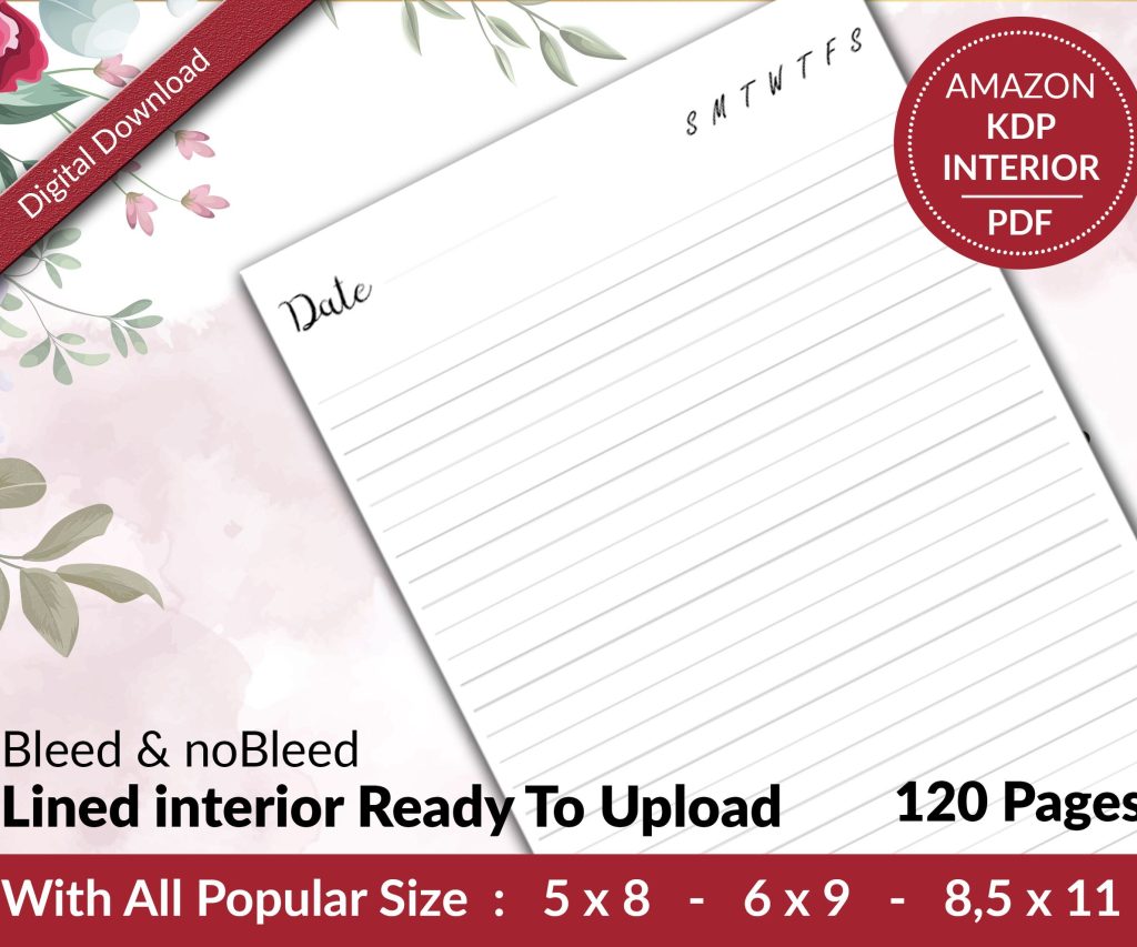 Lined Pages Journal 120 pages Ready to Upload PDF Commercial Use KDP Template 6x9 8.5x11 5x8 for Notebooks, Diaries, Low Content
1 × $0.00
Lined Pages Journal 120 pages Ready to Upload PDF Commercial Use KDP Template 6x9 8.5x11 5x8 for Notebooks, Diaries, Low Content
1 × $0.00
Subtotal: $0.00
Okay so here’s the thing about book formatting templates – I spent like three weeks last month testing different standards because one of my clients got their manuscript rejected twice and honestly it was just formatting issues that could’ve been avoided.
First thing you gotta nail down is trim size because everything flows from that decision. Amazon KDP has like 50+ trim sizes but realistically you’re gonna use maybe five of them. For fiction novels, 6×9 is your safe bet – it’s what readers expect, bookstores recognize it, and honestly it just looks professional sitting on a shelf. I use 5×8 sometimes for shorter novels or when I want that compact literary feel, but that’s more of a stylistic choice.
Non-fiction is where it gets interesting. 8.5×11 is standard for workbooks, planners, anything where people need writing space. I published a productivity journal last year in 8×10 and the reviews were mixed because people expected the full page size. Learned that lesson the hard way.
So margins are where most beginners mess up and I get it because the numbers seem arbitrary. But here’s what I use and it’s based on actual print tests:
The gutter thing is critical because when you hold a thick book open, the binding eats up space. I printed a 400-page book once with 0.5-inch gutters and the text disappeared into the spine. Had to reformat the whole thing and lost like $300 in proof copies.
Wait I forgot to mention – if you’re doing hardcover, add another 0.125 inches to your gutter. The binding is stiffer and you need that extra breathing room.
Look, I’ve tested probably 30 different fonts over the years and honestly just stick with the classics. For body text you want:
Garamond – this is my go-to for fiction, it’s elegant without being pretentious, super readable at 11pt or 12pt
Baskerville – similar vibe to Garamond but slightly more modern, works great for historical fiction or literary stuff
Palatino – I use this for non-fiction because it’s got more weight to it, feels authoritative
For sans-serif stuff like headers or modern non-fiction, Calibri or Helvetica work fine. Don’t get fancy with decorative fonts in body text. Just don’t. I see authors using Papyrus or Comic Sans ironically and it’s not cute, it’s unreadable.
Font size should be 11pt or 12pt for most books. Some literary publishers go down to 10pt but that’s risky for older readers. I did a cookbook at 10pt once and got complaints about readability, bumped it to 11pt in the second edition and those complaints stopped.
Single spacing looks cramped, double spacing wastes paper and looks amateurish. You want 1.15 to 1.3 line spacing for most books. I use 1.2 as my default and it’s worked for like 150+ books at this point.
Paragraph spacing is another thing – either indent first lines by 0.3 inches OR add space between paragraphs, but not both. The both-method screams “I formatted this in Microsoft Word without knowing what I’m doing.”
Oh and first paragraphs after chapter breaks or scene breaks shouldn’t be indented. That’s a traditional publishing standard that looks cleaner.
This is gonna sound weird but I spent two hours last Tuesday arguing with myself about page number placement. Here’s the standard that works:
Put page numbers in the footer, centered or on the outside edge (left for even pages, right for odd pages). Don’t put them on chapter opening pages – it looks cluttered. Your first numbered page should be page 1 of Chapter One, not the title page or copyright page.
Headers typically show book title on the left page and author name on the right page. Or chapter title on the left and book title on the right. I switch it up based on genre – mystery novels I do chapter titles because readers flip back to reference stuff, romance I just do book/author because it’s simpler.
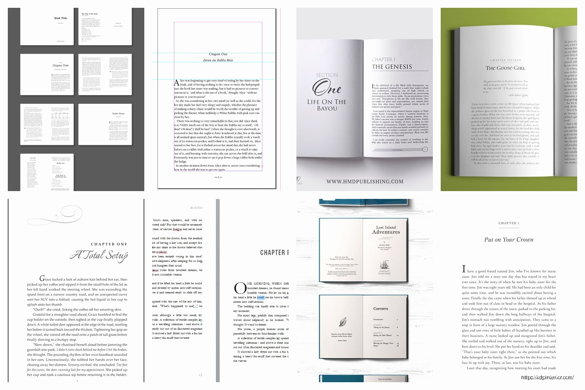
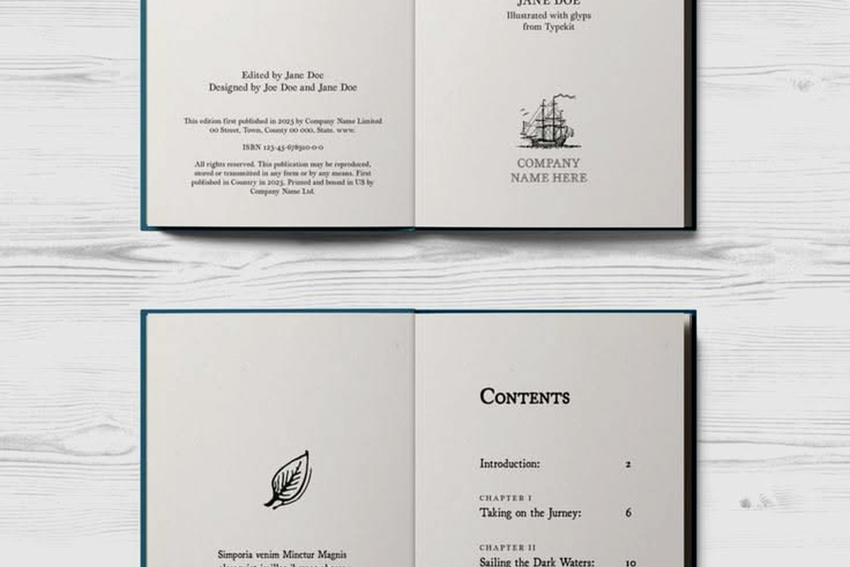
Okay so the front of your book should go in this order and I’ve checked this against like every Big Five publisher:
Don’t number these pages or put headers on them. Roman numerals are old school and honestly unnecessary for indie publishing.
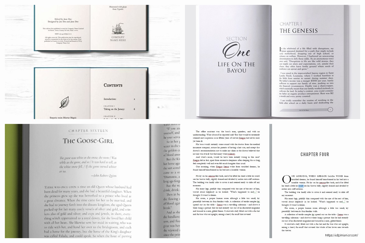
Chapter breaks need visual weight. Here’s my template:
Drop down 2-3 inches from the top margin for chapter openings. Put the chapter number or title in a larger font (16pt-18pt), maybe use a different font family for visual interest. Then drop another inch before starting body text.
Some authors do decorative elements or drop caps for the first letter – that’s fine if it matches your genre. Literary fiction can handle ornate stuff, thriller novels should be cleaner.
Scene breaks within chapters need clear markers. Three asterisks centered (***) or a decorative symbol. Don’t just add extra line spacing because it disappears at page breaks and confuses readers. I learned this from a 1-star review that said my book was “missing scenes” when really it was just unclear scene breaks.
The back of your book is sales real estate. Standard order:
I’ve tested different orders and putting the book list right after “The End” gets the most click-through to other titles. Makes sense because readers just finished and want more.
When you’re exporting your final file, these settings matter way more than people think:
For PDF exports going to KDP Print, use PDF/X-1a:2001 standard. Embed all fonts, set color to CMYK if you have color elements, 300 DPI minimum for images. Amazon’s gonna reject anything below 300 DPI and I’ve seen it happen with author photos that looked fine on screen.
For ebooks, you’re usually exporting to EPUB or uploading a Word doc to KDP. If you go the Word route, use styles for everything – Heading 1 for chapter titles, Normal for body text. Don’t just make text bigger and bold for headers because the conversion to Kindle format will mess it up.
Oh and another thing – tables and text boxes break in ebook conversion like 90% of the time. If you need structured data, use simple HTML tables or just format it as regular text with spacing.
Romance novels – readers expect certain things. Shorter chapters, clear section breaks, sometimes different POV indicators. I use centered text with the character name for POV switches.
Thrillers – tighter line spacing, shorter paragraphs, lots of white space for pacing. The format should feel urgent.
Literary fiction – you can get away with longer paragraphs, more traditional formatting, maybe some experimental layout stuff if it serves the story.
Non-fiction – subheadings every 500-800 words, bullet points for scannability, bold text for key concepts. Readers are skimming for information so make it easy.
If you’re doing covers or interior images that go to the edge of the page, you need 0.125-inch bleed on all sides. That means your image extends past the trim line so when the book is cut, there’s no white border.
Safe zone is 0.25 inches from all edges where you shouldn’t put important text or images. Cutting isn’t perfect and stuff in that zone might get trimmed.
I designed a cookbook with recipes too close to the edge and some copies had ingredients cut off. Had to recall those and reprint. Cost me like $800 in wasted inventory.
Always order a physical proof copy. The PDF preview on KDP is helpful but it doesn’t show you gutter shadows, color accuracy, or how the paper feels. I’ve caught so many issues in proof copies – text too close to binding, margins uneven, fonts rendering weird.
Check every chapter opening, every page number transition, all your front and back matter. Read the physical book or at least flip through thoroughly. My cat knocked over my coffee on one proof copy and honestly it forced me to slow down and actually examine the pages instead of skimming.
For ebooks, test on multiple devices. Kindle Previewer is decent but also check on an actual Kindle, iPad, and phone. Text reflows differently and sometimes your careful formatting breaks on smaller screens.
Double spacing after periods – don’t do it, it’s a typewriter habit that looks dated
Justified text with no hyphenation – creates ugly rivers of white space through your paragraphs
Different margins on different pages – usually happens when copying from multiple documents
Missing page breaks between chapters – chapters should start on a new page always
Inconsistent heading styles – pick a format for chapter titles and stick with it
Using too many fonts – two font families maximum, three if you really need it for special elements
The thing nobody tells you is that formatting is like 40% of whether a book looks professional or self-published in a bad way. Readers might not consciously notice good formatting but they definitely notice bad formatting and it affects reviews.
DISCOVER OUR FREE BEST SELLING PRODUCTS
Editable Canva Lined Journal: Express Your Thoughts – KDP Template
Lined Pages Journal 120 pages Ready to Upload PDF Commercial Use KDP Template 6×9 8.5×11 5×8 for Notebooks, Diaries, Low Content
Lined Pages Journal 120 pages Ready to Upload PDF Commercial Use KDP Template 6×9 8.5×11 5×8 for Notebooks, Diaries, Low Content
Cute Dogs Coloring Book for Kids | Activity Book | KDP Ready-To-Upload
Daily Planner Diary : Diary Planners for Everyday Productivity, 120 pages, 6×9 Size | Amazon KDP Interior
Wolf Coloring KDP interior For Adults, Used as Low Content Book, PDF Template Ready To Upload COMMERCIAL Use 8.5×11"
Coloring Animals Head Book for Kids, Perfect for ages 2-4, 4-8 | 8.5×11 PDF
Printable Blank Comic Book Pages PDF : Create Your Own Comics – 3 Available Sizes
Notes KDP interior Ready To Upload, Sizes 8.5×11 6×9 5×8 inch PDF FILE Used as Amazon KDP Paperback Low Content Book, journal, Notebook, Planner, COMMERCIAL Use
Black Lined Journal: 120 Pages of Black Lined Paper Perfect for Journaling, KDP Notebook Template – 6×9
Student Planner Journal 120 pages Ready to Upload PDF Commercial Use KDP Template 6×9" 8.5×11" for Low Content book
Recipe Journal Template – Editable Recipe Book Template, 120 Pages – Amazon KDP Interior