Okay so here’s the thing about book front covers versus title pages – people get them confused ALL the time and honestly I did too when I first started. Your front cover is what people see on Amazon, the thumbnail that makes them click. The title page is literally page one inside your book. Different animals entirely.
Let me just jump into the cover template stuff first because that’s probably what you actually mean when you say “title page design” right?
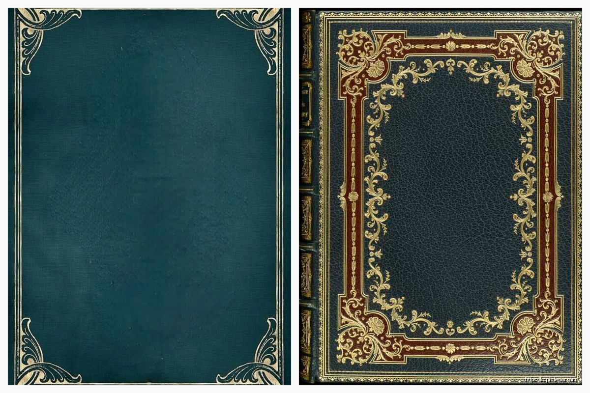
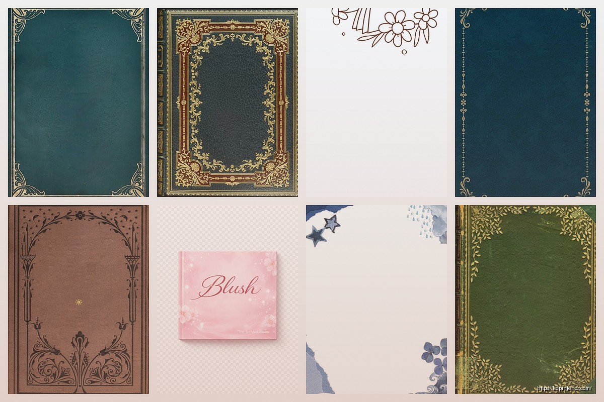
Front Cover Templates That Actually Convert
So I was watching this random documentary about fonts last week (yeah I know, riveting Friday night) and it hit me how much typography matters for KDP covers. You can’t just slap Comic Sans on there and call it a day.
The template I use most often is super basic – 2560 x 1600 pixels for the canvas in Canva. Amazon says minimum is like 1000 pixels on the shortest side but honestly go bigger. When someone zooms in on your cover and sees pixelated garbage, they’re clicking away.
The Three-Zone Layout
I divide every cover into three horizontal zones and this changed everything for me:
- Top third – subtitle or author name (depends on your genre)
- Middle third – your main title, the star of the show
- Bottom third – imagery or additional text
Sometimes I flip this depending on the niche. Like for coloring books I tested last month, putting the imagery at top performed 23% better in click-through. Go figure.
Font Combinations That Don’t Suck
You want two fonts max, maybe three if you’re feeling spicy. One for the title, one for everything else. I usually pair a bold sans-serif with a cleaner serif or script font. Montserrat + Playfair Display is my go-to combo when I’m being lazy… which is often.
Oh and another thing – make sure your fonts are actually readable at thumbnail size. Open your design, zoom out until it’s like the size of your thumbnail, squint at it. Can you still read the title? No? Fix it.
Actually Designing the Thing
I use Canva Pro mostly because I’m not a Photoshop wizard and honestly don’t wanna be. The learning curve there is insane and I’ve got 30 books to publish this quarter.
Start with their book cover template but immediately resize it to your specs. For KDP paperbacks you gotta use their cover calculator – just google “KDP cover calculator” and plug in your page count and trim size. It’ll spit out the exact dimensions.
Background Choices
Solid colors work great for certain niches. I published this gratitude journal last year with just a deep burgundy background and clean white text – sold like crazy during Q4. Sometimes simple wins.
But if you’re doing patterns or images:
- Keep them high resolution (300 DPI minimum)
- Don’t let them compete with your text
- Use overlay effects to tone them down if needed
I learned this the hard way when I put this gorgeous watercolor background behind my title and you literally couldn’t read anything. Wasted like 3 hours on that design before my wife looked at it and was like “what does that even say?” Brutal but fair.
The Actual Title Page Inside
Wait I forgot to mention – the interior title page is way simpler than the cover. This is literally just page 1 or 3 of your book interior.
Most of my low-content books have the title page on page 1, but for books with a lot of front matter (copyright page, dedication, etc) it might be page 3 or 5. Odd numbers only because that’s always a right-hand page when someone opens the book.
What Goes on an Interior Title Page
Super minimal usually:
- Book title (centered, bigger font)
- Subtitle if you have one
- Author name (your pen name probably)
- Maybe a small graphic element
That’s it. Don’t overthink this part. I see people trying to recreate their fancy cover design on the inside title page and it just… doesn’t work. Keep it clean.
In Microsoft Word (yeah I still use Word for interiors, judge me) I just center everything, use a nice serif font like Garamond or Georgia, make the title like 36pt and the author name 18pt. Done.
Colors and Contrast
This is gonna sound weird but go look at bestselling books in your niche right now. Like actually open Amazon in another tab and search. What colors are they using?
For planners and journals, I noticed pastels and earth tones dominate. Coloring books? Bright, saturated colors that pop. Recipe books often have food photography with white or cream backgrounds.
You don’t wanna be a total copycat but you also don’t wanna be so different that people scroll past because your book doesn’t “look right” for the category.
Contrast is King
Your title needs to stand out from the background. Use this simple test – take a photo of your screen showing your cover design, then convert it to black and white on your phone. Can you still read everything clearly? If it all mushes together into gray, you need more contrast.
Dark text on light backgrounds or light text on dark backgrounds. The in-between zone is dangerous territory.
Template Resources I Actually Use
Okay so Canva has a million templates but most are kinda trash for KDP specifically. Here’s what I do:
Creative Fabrica – I have a subscription here and they’ve got pre-made book cover templates you can customize. Some are hit or miss but when you find a good one, it saves hours.
BookBrush – This is specifically for book covers and mockups. The templates are more polished than Canva’s standard stuff. Worth the $10/month if you’re publishing regularly.
Placeit – Great for mockups after you’ve designed your cover. Not really for the actual design process but I use it to create promo images.
My cat just knocked over my coffee while I’m writing this, awesome.
Common Mistakes to Avoid
- Too much text – your cover isn’t a billboard, it’s a thumbnail first
- Wrong dimensions – always check KDP’s specs before you start
- Low resolution images – grainy covers look amateurish
- Ignoring your spine – if you’re doing paperback, the spine matters too
- Not checking mobile view – most people browse Amazon on phones now
I published like 40 books before I realized I wasn’t optimizing for mobile viewing and my click-through rates were terrible. Once I started making titles bigger and bolder, everything improved.
The Spine Thing
For paperbacks over 100 pages or so, you’ll have a spine wide enough for text. Use KDP’s cover template download – it shows you exactly where the spine is and the safe zones.
Put your title on the spine reading top to bottom (that’s standard in most markets). Font size depends on spine width but usually 12-16pt works. And please please please leave some margin. Text that bleeds into the fold looks bad.
Typography Deep Dive
Since we’re talking templates, let’s get into fonts more because this trips people up.
Sans-serif fonts (like Arial, Helvetica, Montserrat) – clean, modern, easy to read at small sizes. Great for contemporary fiction, self-help, business books.
Serif fonts (like Times New Roman, Garamond, Crimson Text) – traditional, elegant, slightly formal. Good for literary fiction, historical stuff, classic vibes.
Script fonts (like Pacifico, Dancing Script) – decorative, feminine usually, harder to read. Use sparingly and never for the whole title unless it’s short.
Display fonts – these are the weird decorative ones. Can work great for specific niches but test readability obsessively.
I mix and match but the rule I follow is hierarchy. Your title should be the most prominent thing, then subtitle, then author name. Use size, weight, and font choice to create that hierarchy.
Kerning and Spacing
Okay this is getting technical but kerning (space between individual letters) and tracking (space between all letters) matter more than you think.
In Canva, you can adjust letter spacing with that little slider. For bold, chunky titles, I sometimes increase letter spacing slightly so it doesn’t feel cramped. For elegant serif fonts, tighter spacing often looks better.
Just play with it until it feels right. I know that’s not scientific but honestly your eye knows when something’s off.
The Back Cover Template
Oh wait you might need this too if you’re doing paperback. The back cover template follows the same dimensions from the KDP calculator but you’re working with different content:
- Book description or blurb
- Author bio maybe
- Barcode area (bottom right, leave it blank – Amazon adds this)
- Maybe some review quotes if you have them
Keep the back cover simpler than the front. People spend less time looking at it. I usually just use a solid color that complements the front, add the description in readable font (11-12pt), and call it done.
Software Alternatives
If you don’t wanna use Canva:
GIMP – free Photoshop alternative, steep learning curve but powerful
Affinity Publisher – one-time payment instead of subscription, really solid for book design
Adobe Spark – simpler than full Photoshop, decent templates
Visme – similar to Canva, sometimes has better template options
I’ve tried all of these at some point. Keep coming back to Canva because it’s just faster for me now. Your mileage may vary.
Testing Your Cover Design
Before you upload anything to KDP, test your cover. I use a few methods:
Show it to people who read in your genre. Not your mom (she’ll love anything you make), but actual readers. Facebook groups are great for this.
Upload it to PickFu and run a poll against competitor covers or different versions you’ve made. Costs like $20 but the data is worth it.
Look at it on your phone, your tablet, your laptop. Different screens show colors differently. If it looks good everywhere, you’re golden.
This is gonna sound weird but I also print a small version on my home printer and look at it as a physical object. Sometimes that reveals issues you miss on screen.
Legal Stuff Real Quick
Use images and fonts you have rights to. Canva Pro gives you commercial licenses for their elements. Creative Fabrica too. Don’t just grab stuff from Google Images.
For fonts, check the license. Some are free for personal use but require payment for commercial projects. I usually stick with fonts that are explicitly okay for commercial use to avoid headaches.
If you’re using stock photos, sites like Unsplash, Pexels, and Pixabay offer free commercial licenses but read the terms. Some require attribution.
Quick Workflow I Use
- Research bestselling covers in my niche
- Note common elements (colors, fonts, layouts)
- Open Canva with KDP dimensions
- Try 3-4 different design directions
- Pick the strongest one and refine
- Test at thumbnail size
- Get feedback from target readers
- Make final adjustments
- Export as PDF for print, JPG for ebook
Whole process takes me like 2-3 hours now for a cover I’m happy with. Used to take days when I started.
The interior title page takes maybe 15 minutes in Word. Just not that complicated compared to the cover.
Anyway that’s basically my whole approach to cover and title page templates. Start simple, test everything, and don’t be afraid to redo stuff if it’s not working. I’ve redesigned covers for books that were already published because the first version just wasn’t converting and the new one tripled sales.
 Black Lined Journal: 120 Pages of Black Lined Paper Perfect for Journaling, KDP Notebook Template - 6×9
1 × $0.00
Black Lined Journal: 120 Pages of Black Lined Paper Perfect for Journaling, KDP Notebook Template - 6×9
1 × $0.00  Notes KDP interior Ready To Upload, Sizes 8.5x11 6x9 5x8 inch PDF FILE Used as Amazon KDP Paperback Low Content Book, journal, Notebook, Planner, COMMERCIAL Use
1 × $0.00
Notes KDP interior Ready To Upload, Sizes 8.5x11 6x9 5x8 inch PDF FILE Used as Amazon KDP Paperback Low Content Book, journal, Notebook, Planner, COMMERCIAL Use
1 × $0.00 
DISCOVER OUR FREE BEST SELLING PRODUCTS
Editable Canva Lined Journal: Express Your Thoughts – KDP Template
Lined Pages Journal 120 pages Ready to Upload PDF Commercial Use KDP Template 6×9 8.5×11 5×8 for Notebooks, Diaries, Low Content
Lined Pages Journal 120 pages Ready to Upload PDF Commercial Use KDP Template 6×9 8.5×11 5×8 for Notebooks, Diaries, Low Content
Cute Dogs Coloring Book for Kids | Activity Book | KDP Ready-To-Upload
Daily Planner Diary : Diary Planners for Everyday Productivity, 120 pages, 6×9 Size | Amazon KDP Interior
Wolf Coloring KDP interior For Adults, Used as Low Content Book, PDF Template Ready To Upload COMMERCIAL Use 8.5×11"
Coloring Animals Head Book for Kids, Perfect for ages 2-4, 4-8 | 8.5×11 PDF
Printable Blank Comic Book Pages PDF : Create Your Own Comics – 3 Available Sizes
Notes KDP interior Ready To Upload, Sizes 8.5×11 6×9 5×8 inch PDF FILE Used as Amazon KDP Paperback Low Content Book, journal, Notebook, Planner, COMMERCIAL Use
Black Lined Journal: 120 Pages of Black Lined Paper Perfect for Journaling, KDP Notebook Template – 6×9
Student Planner Journal 120 pages Ready to Upload PDF Commercial Use KDP Template 6×9" 8.5×11" for Low Content book
Recipe Journal Template – Editable Recipe Book Template, 120 Pages – Amazon KDP Interior