Amazon KDP guide, KDP book publishing
Book Jacket Template: Dust Cover Design
Apr
Okay so I just wrapped up designing like 15 book jackets last week and honestly the whole dust cover thing is way less complicated than people make it sound but there’s definitely some stuff you gotta know upfront.
The Basic Template Structure Nobody Explains Right
So here’s the deal with dust jacket templates – you’re basically creating one long horizontal image that wraps around the entire book. Front cover, spine, back cover, plus these things called flaps that fold inside. Most people screw this up because they think of it as separate pieces but nope, it’s one continuous file.
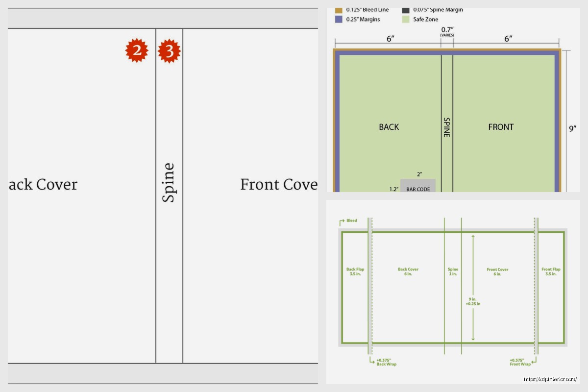
The dimensions are gonna depend on your book size obviously but the formula is pretty straightforward. You need the width of your back cover + spine width + front cover width + left flap + right flap. The flaps are usually 3-4 inches each but I typically go with 3.5 inches because it folds nicer and doesn’t look bulky.
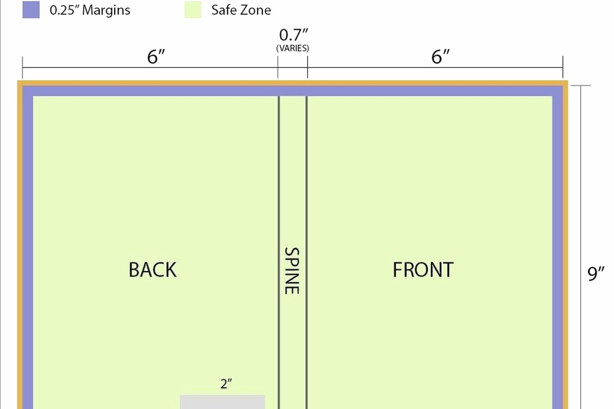
For a standard 6×9 book with let’s say 200 pages, your spine is gonna be around 0.44 inches (you calculate this based on page count and paper type). So your total width would be like 6 inches (back) + 0.44 (spine) + 6 inches (front) + 3.5 (left flap) + 3.5 (right flap) = 19.44 inches wide. Height stays at 9 inches plus you want some bleed so add 0.25 inches top and bottom.
Setting Up Your File
I always work in Adobe InDesign for this stuff because it handles the layout better than Photoshop honestly. My cat literally walked across my keyboard while I was setting up a template yesterday and somehow created a perfect guide line so that was… helpful I guess?
Create your document at the full dimensions with 0.125 inch bleed all around. Then you’re gonna set up guides for each section. This is crucial – mark where your spine starts and ends, where your covers are, where the flaps begin. Without guides you’ll 100% mess up text placement and end up with important stuff in the fold areas.
What Goes Where and Why It Matters
Front cover is obvious – title, author name, main image or design. But the back cover is where people get weird. You want your book description here, maybe an author photo, definitely your barcode if you’re going through traditional channels. Oh and another thing – leave at least 0.25 inches margin from all edges because printers will cut into that space.
The spine is tricky because if your book is under 100 pages the spine might be too narrow for text. For anything under 0.3 inches I usually skip spine text entirely. When you do add spine text it reads from bottom to top when the book is lying face-up. This is industry standard so don’t get creative here.
The Flaps Are Your Secret Weapon
Okay so the flaps are where you can actually do something interesting. Left flap (the one that folds into the front cover) typically has your author bio and photo. Right flap (folds into back cover) usually has more about the book, maybe praise quotes, sometimes a teaser for your next book.
I learned this from screwing it up repeatedly but – don’t put crucial information too close to the fold line. Leave at least 0.5 inches from the fold because that area gets stressed when people open the book and stuff can crack or become unreadable.
Design Software and Actual Workflow
So InDesign is my go-to but if you don’t have Creative Cloud (it’s like $55/month which yeah) you can use Affinity Publisher which is $70 one-time. I’ve used both and honestly Affinity handles this fine for most projects.
Wait I forgot to mention – Canva actually has dust jacket templates now but they’re super basic. I tested them for a client project last month and they work if you’re doing something simple but the moment you want custom sizing or complex layouts you’re gonna hit walls.
My typical workflow is:
- Calculate all dimensions in a spreadsheet first
- Set up document with guides in InDesign
- Place background elements or colors
- Add images making sure they extend into bleed areas
- Place text boxes with proper margins
- Export as PDF with crop marks
Typography Stuff That Actually Matters
Your title font needs to be readable at thumbnail size because people browse online first. I usually go minimum 48pt for titles on a 6×9 cover, bigger if the title is short. For the spine text I never go below 14pt and honestly 16pt is safer.
Body text on the back cover and flaps should be 10-12pt depending on your font choice. I’m partial to Garamond or Minion Pro for book descriptions because they’re readable and have that publishing industry feel. For modern stuff sometimes I’ll use Lato or Montserrat but that’s more for non-fiction.
Line spacing matters more than people think – set it to at least 1.3x your font size. So 11pt text should have like 14-15pt leading. Makes everything more readable especially on the flaps where people are actually trying to read longer paragraphs.
Color Management and Printing Considerations
This is gonna sound weird but you need to work in CMYK color mode not RGB. RGB is for screens, CMYK is for printing. I’ve had clients send me RGB files and wonder why the printed colors look muddy – that’s why.
Set your color profile to “Coated FOGRA39” if you’re in the US or Europe. This matches most commercial printing standards. And honestly test print everything before you do a full run. I use a local print shop for test runs, costs like $15-20 but has saved me from disaster multiple times.
Black text should be pure black (C0 M0 Y0 K100) not rich black for body copy. Rich black (like C60 M40 Y40 K100) is for large dark areas but it can make small text look blurry if registration is slightly off during printing.
Image Resolution and Quality
All images need to be 300 DPI minimum at actual size. So if your front cover is 6 inches wide and you have an image filling it, that image needs to be at least 1800 pixels wide (6 inches × 300 DPI). Lower resolution will look pixelated when printed.
I usually source images from Adobe Stock or Shutterstock. Unsplash and Pexels are free but you gotta be careful with licensing for commercial use. Oh and never ever upscale a low-res image – it’ll look terrible no matter what AI upscaler you use.
Paper Stock and Finish Options
The actual paper you print on changes everything about how your design looks. Gloss finish makes colors pop and is great for photo-heavy covers. Matte finish is more sophisticated and easier to read under lights – I prefer matte for literary fiction and non-fiction.
Paper weight matters too – 100lb gloss text is standard for dust jackets. Don’t go thinner than 80lb or it’ll feel cheap and tear easily. Some premium books use 120lb paper but that’s usually overkill unless you’re doing a special edition.
Coating and Protection
Most printers offer UV coating or aqueous coating. UV is more durable and has that high-gloss look, aqueous is more eco-friendly and gives a softer finish. I usually go aqueous matte for literary stuff and UV gloss for anything visual or commercial.
Spot UV is when you add glossy coating to specific areas over a matte background – looks super premium but adds cost. Only worth it if you’re printing 500+ copies honestly.
Common Mistakes I See All The Time
People put text too close to edges constantly. Your printer will have specific margin requirements but I always use 0.25 inches minimum as a safety buffer. Anything closer risks getting cut off.
Another thing – forgetting about the fold lines. Text that crosses the spine fold is gonna be unreadable. Images that span the spine need to account for like 0.125 inches on each side that basically disappear into the binding.
Oh and barcode placement – it goes on the back cover, bottom right corner usually, at least 0.25 inches from all edges. The barcode needs to be high enough resolution that scanners can read it. I export barcodes at 600 DPI minimum.
File Export Settings
When you export your final PDF make sure you include:
- Crop marks and bleed
- All fonts embedded
- Images at full resolution
- Color profile embedded (CMYK)
- No compression on images
Export as PDF/X-1a format if your printer accepts it – that’s the most reliable standard for commercial printing. Some printers want PDF/X-4 which supports transparency better but check with them first.
Templates and Resources I Actually Use
BookBaby has free templates for different book sizes that are pretty solid starting points. They include all the guides and dimensions already set up. IngramSpark also has templates but they’re more basic.
For design inspiration I browse the New York Times bestseller lists and just look at what traditional publishers are doing. Not to copy obviously but to understand current trends and what works.
I keep a swipe file of dust jackets I like – just photos on my phone when I’m at bookstores. Been doing this for years and it’s honestly more helpful than any design course.
Working With Printers
Always request a proof before full printing. Digital proofs are okay but physical proofs show you exactly how colors and paper texture will look. Costs extra but worth it for any print run over 100 copies.
Ask your printer about their bleed requirements, color specs, and file format preferences before you start designing. Every printer is slightly different and you don’t wanna redo your whole file because you used the wrong specs.
Local print shops are great for short runs under 500 copies. For larger quantities I use PrintNinja or IngramSpark – they have better pricing on volume and the quality is consistent.
Pricing and Timeline Stuff
Design time varies but I usually spend 8-12 hours on a dust jacket from scratch including revisions. If you’re hiring a designer expect to pay $500-2000 depending on complexity and their experience.
Printing timeline is usually 2-3 weeks for custom dust jackets after you approve the proof. Rush services exist but they’re expensive – like 50% upcharge for one-week turnaround.
The whole process from concept to printed jackets in hand typically takes 4-6 weeks if you’re doing everything right and not rushing. Factor that into your book launch timeline.
DISCOVER OUR FREE BEST SELLING PRODUCTS
Editable Canva Lined Journal: Express Your Thoughts – KDP Template
Lined Pages Journal 120 pages Ready to Upload PDF Commercial Use KDP Template 6×9 8.5×11 5×8 for Notebooks, Diaries, Low Content
Lined Pages Journal 120 pages Ready to Upload PDF Commercial Use KDP Template 6×9 8.5×11 5×8 for Notebooks, Diaries, Low Content
Cute Dogs Coloring Book for Kids | Activity Book | KDP Ready-To-Upload
Daily Planner Diary : Diary Planners for Everyday Productivity, 120 pages, 6×9 Size | Amazon KDP Interior
Wolf Coloring KDP interior For Adults, Used as Low Content Book, PDF Template Ready To Upload COMMERCIAL Use 8.5×11"
Coloring Animals Head Book for Kids, Perfect for ages 2-4, 4-8 | 8.5×11 PDF
Printable Blank Comic Book Pages PDF : Create Your Own Comics – 3 Available Sizes
Notes KDP interior Ready To Upload, Sizes 8.5×11 6×9 5×8 inch PDF FILE Used as Amazon KDP Paperback Low Content Book, journal, Notebook, Planner, COMMERCIAL Use
Black Lined Journal: 120 Pages of Black Lined Paper Perfect for Journaling, KDP Notebook Template – 6×9
Student Planner Journal 120 pages Ready to Upload PDF Commercial Use KDP Template 6×9" 8.5×11" for Low Content book
Recipe Journal Template – Editable Recipe Book Template, 120 Pages – Amazon KDP Interior