Amazon KDP guide, KDP book publishing
Book Journal Template: Reading Tracker Design
Apr
Okay so I just redesigned like fifteen reading tracker templates last month and here’s what actually works versus what people THINK they want.
The Basic Structure Nobody Gets Right
Most people start with this massive complicated spread that tracks everything and it’s just… look, readers abandon those in like three days. I tested this with my own products and the simpler templates consistently outsell the fancy ones by about 3:1.
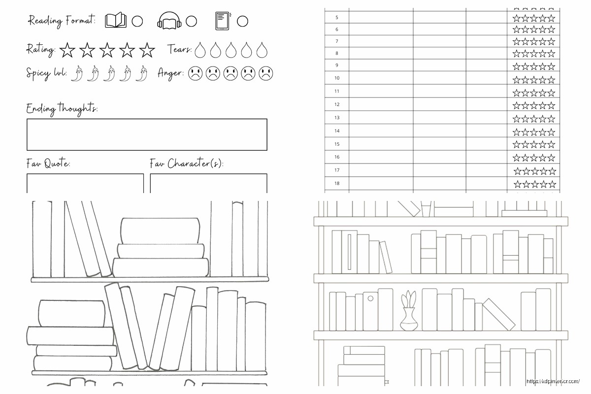
You need basically four core sections and that’s it. Book info page, reading log, review/notes space, and some kind of challenge tracker if you wanna include that. Everything else is fluff that makes your template look impressive but tanks actual usage.
The book info section should have title, author, genre, page count, date started, date finished. That’s the bare minimum. I like adding a little spot for where you got the book (library, purchased, borrowed) because apparently people really care about that? Found that out by accident when I added it to one template and got weirdly specific positive reviews about it.
Layout Choices That Actually Matter
Here’s where I messed up initially – I was designing these templates at like 8.5×11 because that’s standard, right? But then I realized most people either want something portable (6×9) or something that sits on their desk (8.5×11 but landscape orientation). The landscape thing is gonna sound weird but it actually works better for tracking multiple books simultaneously.
For the reading log section, you’ve got two approaches. Daily log style where there’s a row for each day with pages read, time spent, notes. Or session-based where each entry is just whenever you pick up the book. The session-based performs way better in sales but I honestly think daily tracking is more useful if someone actually wants to build a habit.
I do this thing where I include both options in different sections and let the user pick. Adds like two extra pages but the flexibility is worth it.
The Visual Design Stuff
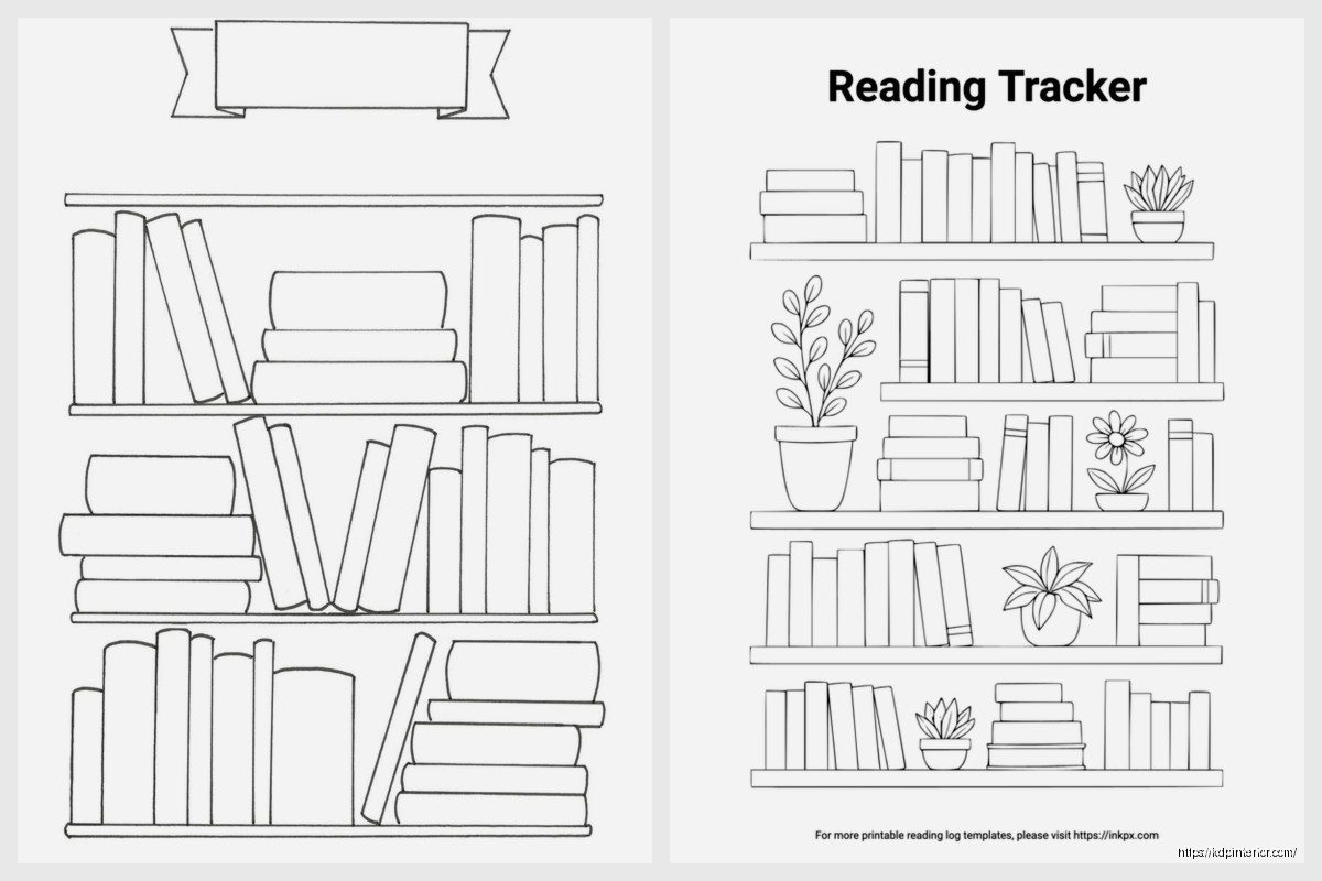
Minimalist sells. I cannot stress this enough. My first templates had all these decorative borders and little book illustrations and they looked cute but conversion was terrible. Stripped everything down to clean lines, lots of white space, maybe one accent element per page and boom – sales doubled.
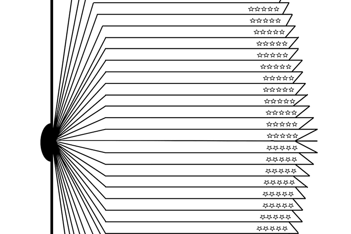
You want enough structure that it’s not just blank pages but not so much that it feels restrictive. I usually do light gray lines or boxes, nothing heavy. The rating systems work best as simple 5-star outlines or numerical scales. Those elaborate rating categories (plot, characters, writing style, etc.) look good in mockups but readers find them annoying to fill out consistently.
Features People Actually Use
Reading challenges are huge right now. Include a yearly goal tracker – books per month, total pages, genres to explore. I added a “diverse authors” tracker to one template last year and it became my best seller, so there’s definitely demand for that kind of thing.
Monthly wrap-up pages work really well too. Just a simple page at the end of each month for listing books completed, favorite of the month, total pages. My dog literally chewed up my prototype notebook while I was testing this layout which was incredibly annoying but also I guess it proved the paper quality was… durable? Anyway.
The Review Section Design
This is where templates either shine or fail completely. You need enough prompts to be helpful but not so many that it feels like homework. I settled on this format that works pretty well:
- Quick rating and one-line summary at the top
- 3-5 guided prompts (favorite character, memorable quotes, main themes)
- Big open space for free-form notes
- Recommendation section – who would like this book
The recommendation part is key because people love recommending books but never remember who they wanted to tell about what. It’s like a built-in feature that adds value without adding complexity.
Oh and another thing – include a mood/emotion tracker. Sounds fluffy but it actually helps people pick their next read based on how different books made them feel. I was skeptical about this but the data doesn’t lie.
Technical Specs for KDP
If you’re selling these, you gotta think about printing costs. Stay under 120 pages if possible to keep in the lower price bracket. I usually aim for 100-110 pages which gives you enough content without pricing yourself out.
Bleed settings matter more than you’d think. Set up your templates with 0.125″ bleed on all sides. I’ve had so many returns because people don’t get this right and their borders get cut off weird.
For interior design, stick to black and white unless you’re targeting premium pricing. Color interiors jack up the cost too much for most reading journals. The one exception is if you’re doing something really niche and beautiful where the higher price point makes sense.
Font Choices Nobody Talks About
Use boring fonts. Seriously. I tested like twenty different combinations and the clear winners were just… Arial, Times New Roman, Garamond, Georgia. The decorative handwriting-style fonts that look so pretty in mockups? They test terribly for actual usability.
Keep headers at 16-18pt, subheaders at 12-14pt, body text at 10-11pt. Any smaller and older readers complain, any bigger and it looks childish.
Extra Features That Boost Value
Bookshelf inventory pages are surprisingly popular. Just simple tables where people can catalog their physical TBR pile. I added this almost as an afterthought to fill out page count and it gets mentioned in reviews constantly.
Reading statistics pages for the end of the year. Total books read, average rating, most-read genre, longest book, shortest book. People love this stuff for their Instagram stories or whatever.
A section for book club notes if you want to target that market. Discussion questions, member thoughts, meeting dates. It’s a whole separate audience that’ll pay slightly more for targeted features.
Wait I forgot to mention – definitely include a books-to-read list at the back. Like 20-30 rows minimum. People are always adding to their TBR and having it in the same place as their reading log just makes sense.
The Challenge Tracker Deep Dive
So there’s different types of challenges you can include. The basic yearly number goal, obviously. But also:
Genre diversity challenges – read one book from 10 different genres
Author diversity – various categories here
Book length challenges – one book over 500 pages, one under 200, etc.
Decade challenges – books from different publication decades
Recommendation challenges – books suggested by friends, family, etc.
I include templates for like 3-4 different challenge types and let people choose. The visual progress trackers work better than simple checklists. Little circles to color in, thermometer-style bars, that kind of thing.
Habit Tracking Integration
This might be overkill for some users but there’s definitely a market for it. Monthly habit trackers specifically for reading – did you read today, yes or no. Super simple grid, 31 boxes per month.
Some people want time-based tracking too. “I read for 30 minutes today” rather than page counts. I usually include both options on the same page because different people track differently and it’s not worth creating separate products for each preference.
Design Mistakes I Made So You Don’t Have To
Don’t put too much on one page. I tried cramming book info, rating, and notes all onto one sheet and it was just cluttered and unusable. Spread it across 2-3 pages per book even though it feels wasteful.
Headers and page numbers are essential. I skipped these on my first template because minimalism or whatever and got multiple complaints about it being hard to navigate.
The binding margin thing – make sure you leave enough inner margin space (at least 0.5″) or text gets lost in the spine. Learned this one the hard way when my test print came back and half the prompts were unreadable.
Don’t get too creative with page layouts. I did this diagonal design once that looked cool but was actually annoying to write in. Stick to standard top-to-bottom, left-to-right flow.
Market Research Stuff
Look at what’s already selling on Amazon but don’t just copy it. I spent like a week going through the top 50 reading journals and noticed patterns. Minimalist covers sell better than busy ones. “Simple” and “no-nonsense” in titles perform well. Readers want functional, not fancy.
The BookTok audience wants aesthetic but usable. Lots of white space, maybe some subtle decorative elements, Instagram-friendly layouts. Different from the traditional book club crowd who want more comprehensive tracking.
Price point testing showed $6.99-$8.99 is the sweet spot for 100-page templates. Go lower and it looks cheap, higher and you need to justify it with premium features or paper quality.
Oh and you can definitely create variations – one for fiction readers, one for non-fiction, one for specific genres like romance or thriller readers. The niche ones sell fewer copies but often at higher prices with less competition.
The whole thing takes maybe 3-4 days to design properly if you know what you’re doing. Use Canva or InDesign, set up your master pages with the grid, then it’s just repetition with variations. I was watching The Bear while designing my last batch and it actually helped me focus somehow? Anyway, that’s pretty much everything I’ve learned from selling these things for the past few years.
DISCOVER OUR FREE BEST SELLING PRODUCTS
Editable Canva Lined Journal: Express Your Thoughts – KDP Template
Lined Pages Journal 120 pages Ready to Upload PDF Commercial Use KDP Template 6×9 8.5×11 5×8 for Notebooks, Diaries, Low Content
Lined Pages Journal 120 pages Ready to Upload PDF Commercial Use KDP Template 6×9 8.5×11 5×8 for Notebooks, Diaries, Low Content
Cute Dogs Coloring Book for Kids | Activity Book | KDP Ready-To-Upload
Daily Planner Diary : Diary Planners for Everyday Productivity, 120 pages, 6×9 Size | Amazon KDP Interior
Wolf Coloring KDP interior For Adults, Used as Low Content Book, PDF Template Ready To Upload COMMERCIAL Use 8.5×11"
Coloring Animals Head Book for Kids, Perfect for ages 2-4, 4-8 | 8.5×11 PDF
Printable Blank Comic Book Pages PDF : Create Your Own Comics – 3 Available Sizes
Notes KDP interior Ready To Upload, Sizes 8.5×11 6×9 5×8 inch PDF FILE Used as Amazon KDP Paperback Low Content Book, journal, Notebook, Planner, COMMERCIAL Use
Black Lined Journal: 120 Pages of Black Lined Paper Perfect for Journaling, KDP Notebook Template – 6×9
Student Planner Journal 120 pages Ready to Upload PDF Commercial Use KDP Template 6×9" 8.5×11" for Low Content book
Recipe Journal Template – Editable Recipe Book Template, 120 Pages – Amazon KDP Interior