 Editable Canva Lined Journal: Express Your Thoughts - KDP Template
 Subtotal: $0.00
Amazon KDP guide, KDP book publishing
Book Layout Design: Typography & Spacing Guide
14
May
May
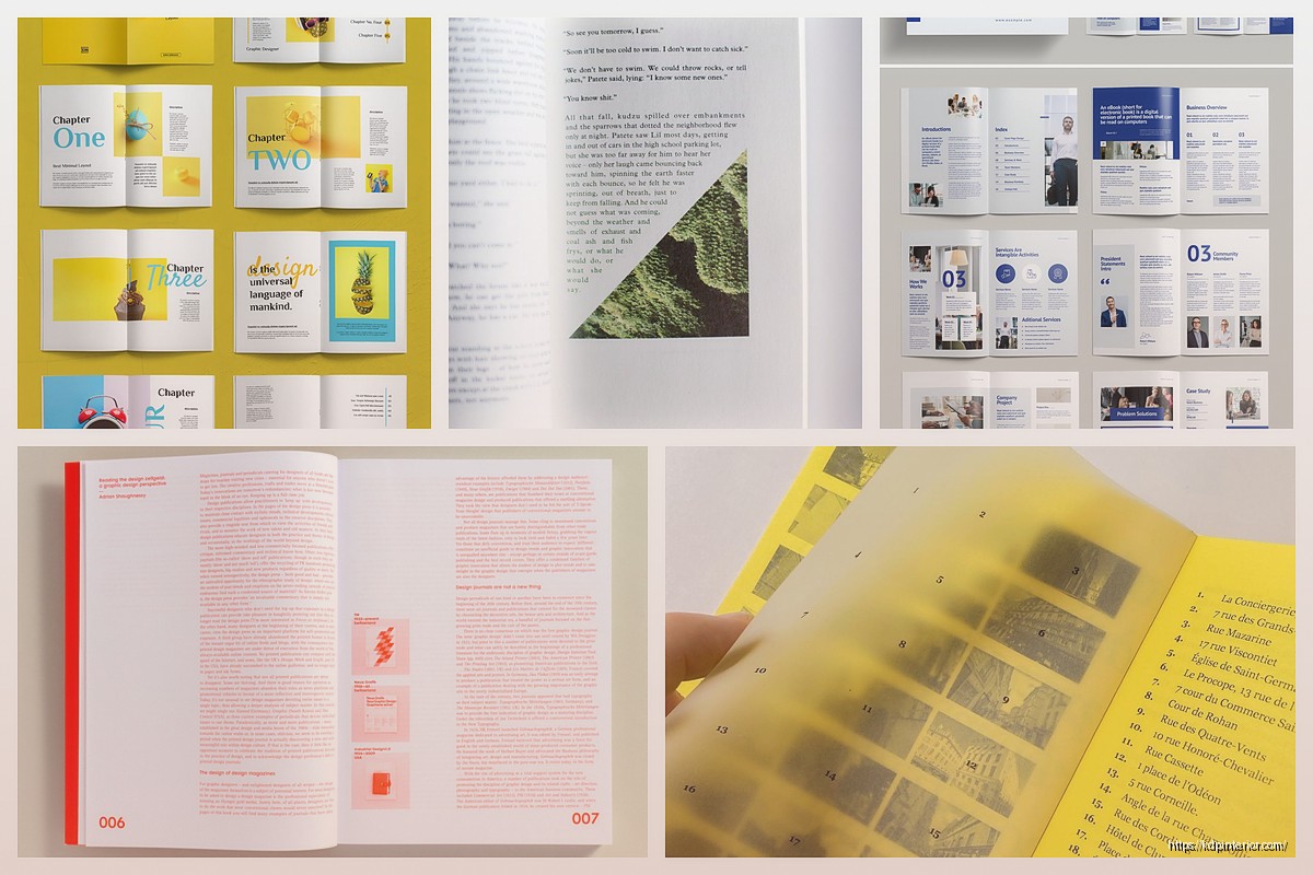
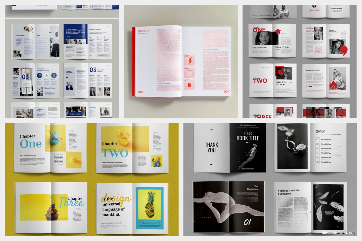
Okay so typography and spacing is literally where most self-published books fall apart and I tested this theory last month by buying like 15 random KDP books just to see what people are doing wrong…
The font choice thing is gonna sound basic but here’s what actually matters. You need a serif font for body text in print books, period. I use Garamond or Minion Pro for like 90% of my projects because they’re readable and don’t look self-published. Sans serif fonts like Arial or Helvetica? Those are for chapter headings only or ebooks where people read on screens. I made the mistake in 2019 of using Calibri for an entire cookbook interior and got roasted in reviews about it being “hard to read.”
Your body text should be 10pt to 12pt depending on the font. Garamond looks smaller so I usually go 11pt or 11.5pt. Times New Roman can handle 10.5pt or 11pt. But here’s the thing nobody tells you – download a print proof before you approve anything because what looks good on your screen is completely different on actual paper.
Leading is the space between lines and this is where people mess up constantly. Your leading should be 120% to 145% of your font size. So if you’re using 11pt font, your leading should be around 13pt to 16pt. I typically stick with 14pt to 15pt for most projects. Too tight and your text looks cramped and exhausting to read. Too loose and it looks like a middle school essay trying to hit page count requirements.
Line length is critical and I didn’t figure this out until like year three. Your lines should be 60 to 70 characters wide including spaces. For a 6×9 book that usually means 1-inch margins on all sides, maybe 0.75 inches if you’re trying to save pages. I use 0.875 inches on the gutter (the inside margin near the binding) because you lose some space in the binding process. Amazon actually has a gutter margin calculator but honestly just add an extra 0.125 inches to your inside margin and you’re good.
Oh and another thing – your margins need to be consistent throughout the whole book. I see people with different margins on chapter pages versus regular pages and it looks so amateur. Set your master page template and stick with it.
Paragraph formatting is where it gets interesting. You’ve got two options – first line indent or block paragraphs with space between. Never do both, that’s like wearing a belt and suspenders. For fiction and most nonfiction I use first line indent of 0.3 inches with no space between paragraphs. For business books or technical stuff, block paragraphs with 6pt space after works better. The first paragraph after a chapter heading or subheading should NOT be indented though, that’s just a typography rule that looks cleaner.
Chapter headings need hierarchy and I spent way too long figuring out the right balance. Your chapter title should be like 18pt to 24pt depending on your book size. Chapter numbers can be smaller and in a different style. I usually do:
- Chapter number in 14pt uppercase sans serif
- Chapter title in 20pt serif matching body font
- About 3 to 5 line spaces before the body text starts
Drop caps are cool but honestly skip them unless you really know what you’re doing. They need specific formatting and can break when you convert files.
Wait I forgot to mention widows and orphans – these are single lines that get stranded at the top or bottom of pages. You gotta hunt these down and fix them manually. In Word or InDesign you can set it to avoid them automatically but you still need to check every page. I usually adjust tracking (letter spacing) by -5 to +5 to pull or push a line, or I’ll rewrite a sentence to make it shorter or longer. My cat knocked over my coffee while I was doing this for a 300-page book last week and I lost like two hours of widow hunting because I hadn’t saved. Save constantly.
Hyphenation is another debate. I turn it on but limit consecutive hyphens to two lines max. Too many hyphens looks choppy and slows reading down. But no hyphenation gives you weird spacing issues especially with justified text. Speaking of which – always use justified alignment for print books. Left-aligned looks unfinished. Center-aligned is only for poetry or specific design choices.
Page numbers (folios) should be in the header or footer, not both. I put them in the footer centered or in the outside corner (left on left pages, right on right pages). Use the same font as your body text but maybe 1pt smaller. Don’t put page numbers on chapter opening pages or title pages, looks cleaner without them.
Front matter spacing is its own beast. Your title page, copyright page, dedication – these need more breathing room than body text. I usually increase leading to like 180% and add extra space between elements. The copyright page is legally required to have specific info but make it readable. I see people cramming everything together in 8pt font and it’s just ugly.
Subheadings within chapters should have space before and after. I do 12pt space before and 6pt space after for my main subheadings. They should be in a heavier weight (bold) or slightly larger size than body text, maybe 12pt or 13pt if your body is 11pt. Keep them in the same font family though, don’t go mixing serif and sans serif randomly.
This is gonna sound weird but test your layout by printing a few pages at home before ordering a proof. Your home printer isn’t perfect but you can spot obvious issues like margins being too small or text being too light. I printed page 47 of a journal I was making and realized my gray text was too light to photocopy, which mattered for the workbook sections.
Okay so funny story – I once spent three days perfecting a layout and then realized I’d set it up for 6×9 when the book was supposed to be 8.5×11. Always double-check your trim size in your document settings before you start. Amazon offers like a dozen trim sizes and each one needs different margin proportions.
Fonts to avoid completely: Comic Sans obviously, Papyrus, Courier unless you’re doing something intentionally typewriter-style, Brush Script, anything that looks handwritten unless it’s actually meant to be handwriting. I downloaded a “professional” font bundle once that was basically all display fonts that look cool for logos but are unreadable for body text.
For ebooks the rules change. Use sans serif fonts or let the reader choose their own font. Don’t set fixed line heights, let them be responsive. Your margins are handled by the device so focus on paragraph spacing and heading hierarchy instead. Ebook formatting is like a whole separate conversation though.
Tracking and kerning – tracking is overall letter spacing and kerning is spacing between specific letter pairs. Most of the time you leave these alone but if you need to squeeze or expand text to fix widows or page count, adjusting tracking by -10 to +10 is acceptable. Don’t go beyond that or it becomes noticeable. I’ve seen people compress text so much it looks like a ransom note.
Special characters need attention too. Use proper curly quotes not straight quotes, em dashes not double hyphens, ellipses not three periods (though honestly the three periods thing is more acceptable now). These details separate professional layouts from amateur ones. Find and replace is your friend – search for — and replace with em dashes, search for straight quotes and replace with curly ones.
Section breaks within chapters need visual indication. Either use extra space (like 2 or 3 blank lines) or a centered ornament like *** or a small graphic. Don’t just run sections together, readers need that mental pause.
Running headers are optional but can be useful for nonfiction. Book title on left pages, chapter title on right pages, same font and size as page numbers. I skip these for fiction usually because they’re not necessary and can look cluttered in smaller trim sizes.
The gutter margin thing is actually more important than people realize. If your inside margins are too small, text disappears into the binding and readers have to crack the spine to read it. I use 0.875 inches minimum for books under 200 pages and 1 inch for thicker books. Amazon’s margin guidelines are bare minimum – add extra space for better readability.
Bleeds matter if you have images or colored backgrounds that extend to the page edge. You need 0.125 inches of bleed on all sides that will be trimmed off. Your important content (text, logos) needs to stay 0.25 inches away from trim edges. I messed this up on a planner design and half the dates got cut off on the outer edge.
Testing different layouts side by side helps. I usually mockup three versions with different font combinations and spacing options then print them to compare. What looks good on screen doesn’t always work in print. Paper color affects readability too – cream paper is easier on the eyes for long reading sessions than bright white.
Consistency is honestly more important than any single choice. Pick your fonts, sizes, and spacing rules then apply them throughout the entire book. A consistent mediocre layout looks more professional than an inconsistent great layout. Make a style guide document for yourself with all your settings so you can replicate it for future books.
Your layout should be invisible – readers shouldn’t notice the design, they should just read comfortably. If someone mentions your typography in a review it’s either really good or really bad. Most of the time you want them focused on content not format.
The software matters less than you’d think. I use InDesign for complex layouts but Atticus or Vellum work great for standard books. Microsoft Word can handle basic layouts if you know what you’re doing with styles and master pages. Don’t let software be an excuse for poor typography choices.

DISCOVER OUR FREE BEST SELLING PRODUCTS
Editable Canva Lined Journal: Express Your Thoughts – KDP Template
Lined Pages Journal 120 pages Ready to Upload PDF Commercial Use KDP Template 6×9 8.5×11 5×8 for Notebooks, Diaries, Low Content
Lined Pages Journal 120 pages Ready to Upload PDF Commercial Use KDP Template 6×9 8.5×11 5×8 for Notebooks, Diaries, Low Content
Cute Dogs Coloring Book for Kids | Activity Book | KDP Ready-To-Upload
Daily Planner Diary : Diary Planners for Everyday Productivity, 120 pages, 6×9 Size | Amazon KDP Interior
Wolf Coloring KDP interior For Adults, Used as Low Content Book, PDF Template Ready To Upload COMMERCIAL Use 8.5×11"
Coloring Animals Head Book for Kids, Perfect for ages 2-4, 4-8 | 8.5×11 PDF
Printable Blank Comic Book Pages PDF : Create Your Own Comics – 3 Available Sizes
Notes KDP interior Ready To Upload, Sizes 8.5×11 6×9 5×8 inch PDF FILE Used as Amazon KDP Paperback Low Content Book, journal, Notebook, Planner, COMMERCIAL Use
Black Lined Journal: 120 Pages of Black Lined Paper Perfect for Journaling, KDP Notebook Template – 6×9
Student Planner Journal 120 pages Ready to Upload PDF Commercial Use KDP Template 6×9" 8.5×11" for Low Content book
Recipe Journal Template – Editable Recipe Book Template, 120 Pages – Amazon KDP Interior