Amazon KDP guide, KDP book publishing
Book Layout: Interior Design Principles
May
Okay so layout is honestly where most people completely screw up their books and don’t even realize it until they get reviews saying “couldn’t read this” or “looked unprofessional.” I’ve published over 200 books and the interior design stuff… it’s not sexy but it’s literally what keeps people from returning your book in the first 48 hours.
Margins Are Your First Battle
Start with margins because Amazon will reject your book if you mess this up. You need at least 0.5 inches on all sides for paperback, but here’s what I actually do – I use 0.75 inches on top and bottom, then 0.875 inches on the outside edge and 1 inch on the inside (gutter). The gutter is the side that gets bound, and people need to be able to read without cracking the spine like they’re breaking into a safe.
For ebooks this doesn’t matter as much but for print? Critical. I learned this the hard way when my first 50 journals came back and people literally couldn’t write in the middle sections without destroying the binding.
The Gutter Gets Bigger With Page Count
Oh and another thing – if your book is over 300 pages, bump that gutter to 1.25 inches. Thick books need more room or the text disappears into the spine. I was watching The Bear last week while formatting a 400-page workbook and almost missed this, would’ve been a disaster.
Font Choices That Don’t Make People Hate You
Use serif fonts for body text in print books. Garamond, Baskerville, Caslon – these are readable for long stretches. I use Garamond at 11pt for most of my books and it works perfectly. Sans-serif fonts like Arial or Helvetica are fine for headings but they’re exhausting to read for pages and pages.
For ebooks though, flip this – many e-readers handle sans-serif better, but honestly Amazon overrides your font choice half the time anyway so don’t stress too much. I usually just go with a standard serif and let the Kindle do its thing.
Size Matters More Than You Think
Body text should be 10-12pt depending on your font. Garamond at 11pt is my sweet spot. Times New Roman needs to be 12pt because it reads smaller. Headers can be 14-18pt for h2 tags and 12-14pt for h3s.
Wait I forgot to mention – test print a copy before you order 500 books. I once formatted an entire recipe book at 9pt because it looked fine on my screen and when the proof arrived I needed a magnifying glass. My cat knocked it off my desk and I didn’t even pick it up for two days because I was so annoyed.
Line Spacing and Leading
Line spacing (leading) should be 1.15 to 1.5 for body text. Single spacing looks cramped and cheap. Double spacing wastes paper and looks like a high school essay. I use 1.25 for most books – gives enough breathing room without feeling loose.
Paragraph spacing is where people get weird. You either indent the first line (0.3-0.5 inches) OR you add space between paragraphs. Don’t do both. That’s amateur hour. I prefer indents for fiction and narrative nonfiction, space between for how-to books and technical stuff.
The First Paragraph Thing
Oh and don’t indent the first paragraph after a heading or chapter start. That’s a traditional publishing standard that makes your book look legit. First paragraph sits flush left, everything after gets indented.
Headers and Footers Actually Matter
Put page numbers in the footer, outside corner. Book title on even pages (left side), chapter title on odd pages (right side) in the header. Use a smaller font like 9 or 10pt. This is gonna sound weird but don’t put headers on chapter opening pages – looks cleaner without them.
For ebooks, skip the running headers entirely. They’re pointless when people can jump around digitally and they just clutter the screen.
Chapter Starts Need Drama
Start chapters about 1/3 down the page. Gives visual weight and signals “something new is starting here.” I always right-align my chapter numbers or use a decorative element, then put the chapter title below in a larger font.
Drop caps are cool if you’re doing fiction or anything that wants to feel classic. First letter of the first word gets blown up to 2-3 lines tall. But if you do this, commit – every chapter needs one or it looks inconsistent.
Scene Breaks and Section Dividers
Use three centered asterisks (* * *) or a decorative symbol for scene breaks within chapters. Don’t just add extra line spacing because formatters sometimes collapse those and suddenly your time jump looks like a continuation.
The White Space Secret
This is where I see people mess up constantly – they try to cram too much onto each page. White space is not wasted space. It’s breathing room. It makes your book feel professional and easy to read.
If you’re doing a workbook or journal, embrace the white space. People need room to write, think, absorb. My top-selling journals have maybe 40% content and 60% space and that’s intentional.
Alignment Issues
Body text should be justified (aligned on both left and right edges) for print books. Creates clean edges and looks professional. BUT watch out for rivers – those awkward white space gaps that run vertically through justified text. If you see them, adjust hyphenation settings or rewrite the sentence.
For ebooks, use left-aligned text. Justified text on e-readers creates weird spacing issues because screen sizes vary. Not worth fighting.
Hyphenation Is Annoying But Necessary
Turn on hyphenation for print books with justified text, but set it to hyphenate words longer than 6 characters and avoid more than 2 hyphens in a row. Too many hyphens looks like a ladder on the right edge of your page.
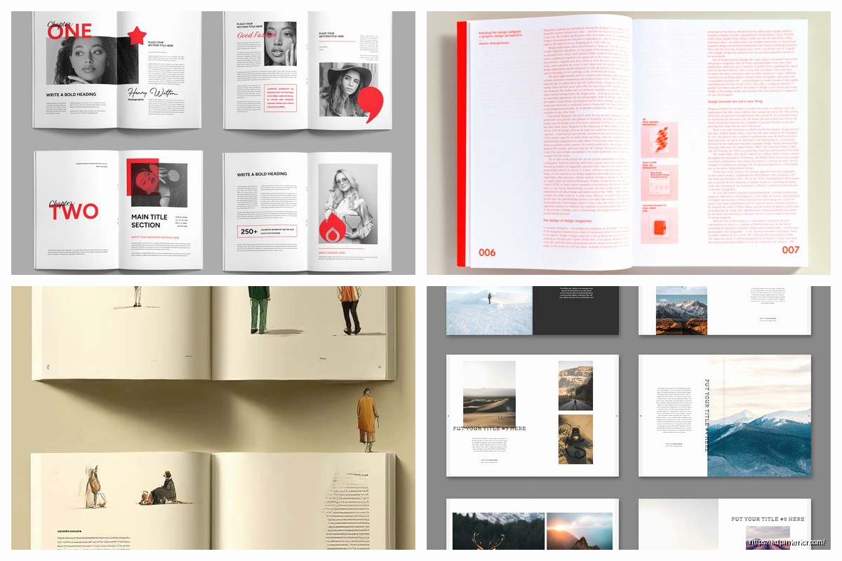
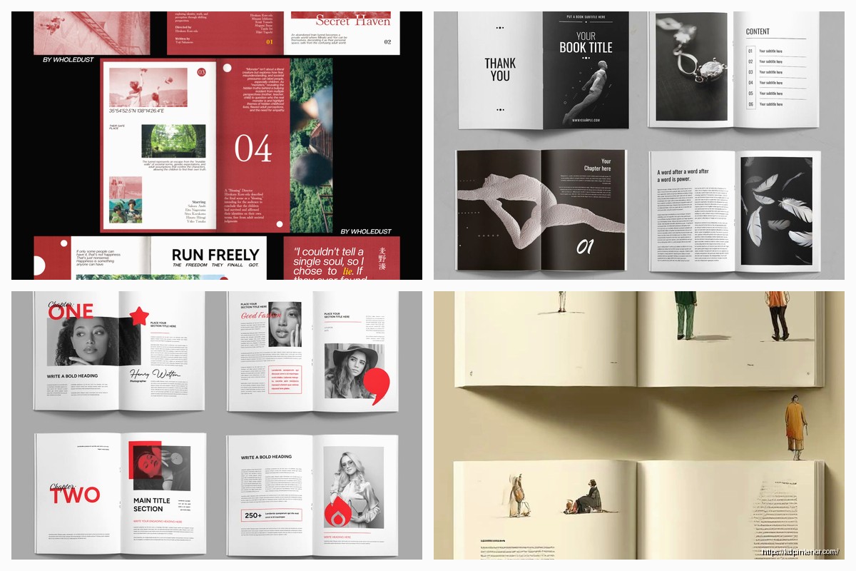
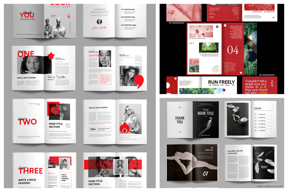
Images and Graphics
If you’re including images, they need to be at least 300 DPI for print. Anything less looks pixelated and cheap. Center your images or make them full-bleed (extending to the edge) with that 0.125 inch bleed Amazon requires.
Add captions below images in a smaller italic font, maybe 9 or 10pt. Keep images within the text margins unless you’re doing full-bleed intentionally.
For ebooks, keep images under 5MB total for your whole book or you’ll trigger higher delivery fees. Compress them but not so much they look terrible. I use TinyPNG before importing them into my manuscript.
Lists and Bullet Points
Indent your lists about 0.3 inches from the left margin. Use hanging indents so the bullet or number sits out to the left and the text wraps neatly underneath. Space between list items if they’re more than one line each, otherwise keep them tight.
- Bullet points work for unordered lists
- Keep them consistent throughout your book
- Don’t switch between styles randomly
Numbered lists for sequential steps or ranked items. Pretty straightforward but you’d be surprised how many people mix and match inappropriately.
The Dreaded Orphans and Widows
An orphan is a single line of a paragraph at the bottom of a page. A widow is a single line at the top of the next page. Both look sloppy. Most word processors have settings to prevent these – turn them on.
If you still get them, manually adjust by adding or removing a word, or force a page break earlier. I spend probably 20% of my formatting time hunting these down in print books.
Front Matter and Back Matter Structure
Front matter order: title page, copyright page, dedication (optional), table of contents, foreword/preface (if you have one). Keep it minimal. Nobody wants to click through 15 pages before the actual content starts, especially in ebooks.
Back matter: about the author, other books by you, call to action (sign up for my email list), acknowledgments if you want. The about page is crucial – people who finish your book are hot leads for your other work.
Copyright Page Essentials
Copyright year and your name, ISBN if it’s print, disclaimer if needed, edition information. Don’t overthink this. Mine is like 5 lines max.
Consistency Is Everything
Whatever design choices you make, stick with them throughout the entire book. Same fonts, same spacing, same header style. I keep a style guide document for each book series so I can replicate the exact formatting across multiple titles.
Nothing screams amateur louder than chapter 3 looking different from chapter 8 because you changed your mind halfway through.
Tools That Actually Work
I format everything in Microsoft Word or Atticus now. Atticus is newer but handles both ebook and print from one file which is amazing. Costs like $150 one-time but worth it if you’re publishing multiple books.
Vellum is great if you’re on Mac. I’m not so I can’t use it but everyone who has it swears by it.
For covers and interior graphics I use Canva Pro, but that’s a different conversation.
The Proof Copy Is Non-Negotiable
Order a physical proof before you publish. I don’t care how perfect it looks on your screen. Print reveals things you’ll never catch digitally – weird page breaks, images that are too dark, margins that feel cramped.
I’ve caught catastrophic errors in proof copies that would’ve killed my book if I’d gone straight to publication. Cost me an extra week and $15 but saved my reputation.
Ebook Specific Weirdness
Ebooks reflow based on device and user settings so you have less control. Don’t use absolute positioning or fixed layouts unless you’re doing a children’s book or something heavily visual.
Keep formatting simple – basic styles, clean hierarchy, minimal tables. Complex layouts break on different devices and you’ll get bad reviews.
Test your ebook on Kindle Previewer and the actual Kindle app on your phone before publishing. The previewer catches most issues but real devices sometimes surprise you.
Okay so that’s like 90% of what you need to know about interior layout. The rest is just practice and paying attention to what professional books look like. Grab some bestsellers in your genre and study how they handle all this stuff – margins, fonts, spacing, chapter starts. Then copy what works.
DISCOVER OUR FREE BEST SELLING PRODUCTS
Editable Canva Lined Journal: Express Your Thoughts – KDP Template
Lined Pages Journal 120 pages Ready to Upload PDF Commercial Use KDP Template 6×9 8.5×11 5×8 for Notebooks, Diaries, Low Content
Lined Pages Journal 120 pages Ready to Upload PDF Commercial Use KDP Template 6×9 8.5×11 5×8 for Notebooks, Diaries, Low Content
Cute Dogs Coloring Book for Kids | Activity Book | KDP Ready-To-Upload
Daily Planner Diary : Diary Planners for Everyday Productivity, 120 pages, 6×9 Size | Amazon KDP Interior
Wolf Coloring KDP interior For Adults, Used as Low Content Book, PDF Template Ready To Upload COMMERCIAL Use 8.5×11"
Coloring Animals Head Book for Kids, Perfect for ages 2-4, 4-8 | 8.5×11 PDF
Printable Blank Comic Book Pages PDF : Create Your Own Comics – 3 Available Sizes
Notes KDP interior Ready To Upload, Sizes 8.5×11 6×9 5×8 inch PDF FILE Used as Amazon KDP Paperback Low Content Book, journal, Notebook, Planner, COMMERCIAL Use
Black Lined Journal: 120 Pages of Black Lined Paper Perfect for Journaling, KDP Notebook Template – 6×9
Student Planner Journal 120 pages Ready to Upload PDF Commercial Use KDP Template 6×9" 8.5×11" for Low Content book
Recipe Journal Template – Editable Recipe Book Template, 120 Pages – Amazon KDP Interior