Amazon KDP guide, KDP book publishing
Book Layout Template: Interior Design Grids

Apr
Okay so grids are basically the skeleton of your entire book and I cannot stress enough how many times I’ve seen people skip this step and then wonder why their 300-page journal looks like a ransom note.
Here’s the thing about interior design grids – they’re not just lines on a page, they’re your positioning system for literally everything. Text blocks, images, page numbers, headers, margins. Everything snaps to the grid and that’s what makes a book look professional versus looking like someone’s first attempt at Microsoft Word.
So first thing you gotta understand is baseline grids versus layout grids because they work together but they’re different. Baseline grid is all about your text line height – it’s the invisible horizontal lines that your text sits on. Layout grid is the bigger structure with columns and margins that defines where stuff can actually go on the page.
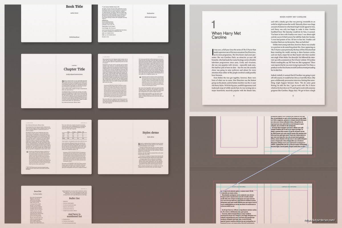
I usually start with a 12-column grid for most books because it’s super flexible. You can do single column text (all 12 columns), two-column layouts (6-6 split), three columns (4-4-4), whatever. The math just works out cleaner. For KDP books specifically, the 6×9 trim size works beautifully with a 12-column grid where each column is about 0.375 inches wide with like 0.125 inch gutters between them.
Wait I forgot to mention – your margins matter way more than you think. Amazon’s got minimum margin requirements (0.5 inches for most trim sizes, but 0.625 for books over 150 pages on the binding side). But honestly those minimums are too tight. I always go with at least 0.75 inches on the inside/binding margin, 0.5 on the outside, and 0.625 on top and bottom. Gives the book room to breathe and you’re not gonna have text disappearing into the gutter when someone’s trying to read.
My dog literally just knocked over my coffee while I’m writing this but anyway…
The baseline grid is where things get technical but it’s actually simple once you get it. Your body text size determines everything else. Let’s say you’re using 11pt font for body text (pretty standard for 6×9 books). Your leading (line spacing) should be 120-140% of that, so like 13.2pt to 15.4pt. I usually go with 14pt leading for 11pt text because it’s readable without being too loose.
Here’s what nobody tells you – your baseline grid increment should match your leading exactly. So if you’re using 14pt leading, your baseline grid is set to 14pt. This means every element on your page can align to these invisible horizontal lines. Headers, body text, captions, page numbers – everything locks to the same grid and creates this visual rhythm that readers don’t consciously notice but their eyes definitely appreciate.
Oh and another thing about setting this up in InDesign (which is what you should be using, not Word, please don’t use Word for this)… You go to Preferences > Grids and set your baseline grid to start at your top margin. So if your top margin is 0.625 inches, that’s where your baseline grid starts. Then it repeats every 14pt (or whatever your leading is) down the page.
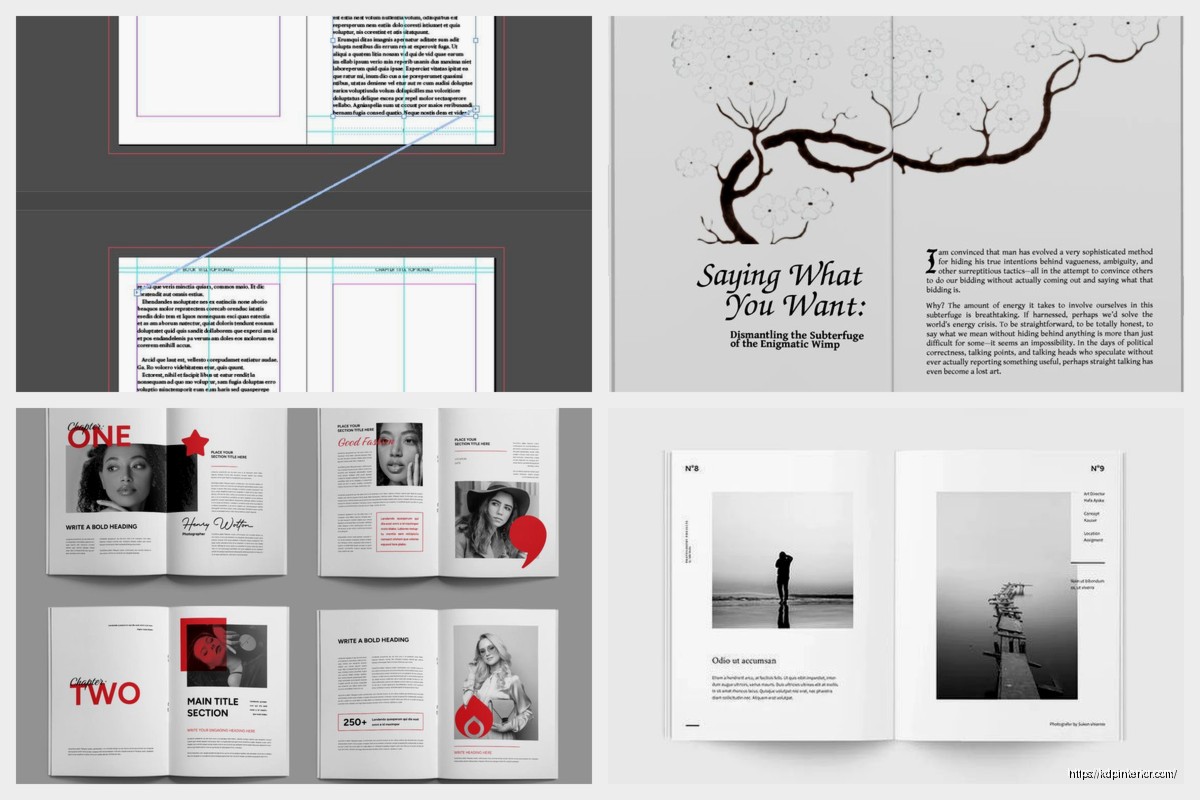
Column grids are the vertical structure and this is where you make decisions based on your content type. Novels and text-heavy books? Single column is fine, you don’t need fancy grid systems. But if you’re doing workbooks, planners, cookbooks, any kind of low-content book with mixed elements… you need that 12-column flexibility.
I made a gratitude journal last month and used a 4-column grid which gave me these nice balanced sections for prompts and writing spaces. The 4-column setup meant I could easily create boxes and sections that felt intentional rather than random. Everything was proportional – a box could be 1 column wide, 2 columns, 3 columns, or full-width 4 columns. The variety kept things interesting but it all still felt cohesive.
This is gonna sound weird but I actually sketch my grids on paper first before I touch InDesign. Just rough boxes and lines to figure out what I need. Because once you set up your master pages with the grid system, changing it later is a massive pain. You want to know your structure before you commit.
Setting up master pages with your grid – this is critical. In InDesign you create master pages (A-Master, B-Master, whatever you need) and each master has your grid already built in. Then you apply those masters to your actual pages and boom, instant consistency. Your A-Master might be for chapter openers, B-Master for regular text pages, C-Master for pages with images and text, whatever your book needs.
For each master page you’re setting:
– Margin guides (those margin measurements I mentioned)
– Column guides (your 12-column grid or whatever you chose)
– Baseline grid (invisible but it’s there, trust me)
– Any recurring elements like headers, footers, page numbers
The baseline grid thing… okay so in InDesign you can actually view it. View > Grids & Guides > Show Baseline Grid. It’ll show you all those horizontal lines. At first it looks overwhelming like graph paper had a baby with a ruled notebook but you’ll start seeing how everything aligns.
Here’s a trick I learned year three of doing this – use a modular grid for planners and workbooks. Modular grid is basically your columns AND rows creating boxes/modules. So like a 12-column grid with horizontal divisions every inch or every 2 baseline grid increments or whatever makes sense. These modules become your building blocks for page elements. A calendar grid? That’s just modules arranged in a 7-column pattern. A habit tracker? Modules stacked vertically with labels.
Getting text to align to baseline grid in InDesign – you select your text frame, go to paragraph options (or the paragraph panel), and there’s a little icon that says “Align to Baseline Grid.” Click that and your text will snap to those horizontal lines. Sometimes this creates weird spacing issues though, like if you have a heading with extra space before it, InDesign might add extra space to make things align. You gotta balance baseline alignment with natural spacing and sometimes you override it for specific elements.
Page numbers should ALWAYS align to the baseline grid. Put them on your master pages, style them consistently (I usually do 9pt or 10pt font, centered or outside aligned depending on the book), and make sure they snap to the grid. Nothing looks more amateur than page numbers floating randomly in the margin space.
For KDP specifically, watch out for bleed if you’re doing full-bleed designs (images or colors extending to the page edge). Amazon wants 0.125 inch bleed on all sides, and your grid needs to account for that. So your actual design area is trim size plus 0.125 inches on each side. A 6×9 book with bleed becomes 6.25×9.25 in your setup. Your margins and grid still work with the trim size though, not the bleed size.
White space is part of your grid system too. Don’t fill every module or column just because it’s there. The grid gives you structure but negative space is what makes the content readable and not overwhelming. I see so many planners and workbooks that cram stuff into every available pixel and it’s exhausting to look at.
Oh wait, gutter width between columns – I usually do 0.1875 inches (about 13.5pt) for text-based layouts and can go tighter like 0.125 inches for workbooks where you’re not flowing text between columns. The gutter just needs to visually separate the columns enough that your eye doesn’t jump across by accident.
One thing that screwed me up for months when I started – assuming the grid has to be visible in the final PDF. It doesn’t. The grid is only for YOU during design. It’s guides and structure. When you export to PDF for KDP, none of those grid lines show up. They’re just there to help you position elements consistently. I actually had someone ask me once how to turn off the grid lines in their uploaded book and I was like… that’s not a thing that can happen, you probably have actual lines drawn somewhere.
Testing your grid system – make like 10 different page layouts using the same grid. If the grid works, all 10 pages should feel like they’re from the same book even if the content is totally different. That’s when you know your grid is doing its job.
For low-content books especially, your grid determines how usable the book is. A poorly designed planner with inconsistent spacing and misaligned elements? People notice even if they don’t know WHY it bothers them. But a planner where everything lines up, where writing lines are evenly spaced, where boxes and sections have clear hierarchy? That’s the grid working.
I’m gonna be honest, my first like 20 books had terrible grid systems or no grid at all and they still sold okay but they didn’t get great reviews. Once I started actually using proper grids and being intentional about baseline alignment and modular structure, my review ratings went up. People could tell something was different even though nobody ever said “wow great grid system” in a review.
Last thing – save your grid setups as templates. Once you nail a 6×9 grid that works, save that InDesign file as your template. Same with 8.5×11, 5×8, whatever trim sizes you use regularly. Don’t rebuild the grid from scratch every single time because you’ll inevitably make it slightly different and then your books won’t have that consistent professional feel across your catalog.
The grid is invisible infrastructure but it’s literally the difference between books that look self-published versus books that look traditionally published. Worth the time to set up properly.
DISCOVER OUR FREE BEST SELLING PRODUCTS
Editable Canva Lined Journal: Express Your Thoughts – KDP Template
Lined Pages Journal 120 pages Ready to Upload PDF Commercial Use KDP Template 6×9 8.5×11 5×8 for Notebooks, Diaries, Low Content
Lined Pages Journal 120 pages Ready to Upload PDF Commercial Use KDP Template 6×9 8.5×11 5×8 for Notebooks, Diaries, Low Content
Cute Dogs Coloring Book for Kids | Activity Book | KDP Ready-To-Upload
Daily Planner Diary : Diary Planners for Everyday Productivity, 120 pages, 6×9 Size | Amazon KDP Interior
Wolf Coloring KDP interior For Adults, Used as Low Content Book, PDF Template Ready To Upload COMMERCIAL Use 8.5×11"
Coloring Animals Head Book for Kids, Perfect for ages 2-4, 4-8 | 8.5×11 PDF
Printable Blank Comic Book Pages PDF : Create Your Own Comics – 3 Available Sizes
Notes KDP interior Ready To Upload, Sizes 8.5×11 6×9 5×8 inch PDF FILE Used as Amazon KDP Paperback Low Content Book, journal, Notebook, Planner, COMMERCIAL Use
Black Lined Journal: 120 Pages of Black Lined Paper Perfect for Journaling, KDP Notebook Template – 6×9
Student Planner Journal 120 pages Ready to Upload PDF Commercial Use KDP Template 6×9" 8.5×11" for Low Content book
Recipe Journal Template – Editable Recipe Book Template, 120 Pages – Amazon KDP Interior