Amazon KDP guide, KDP book publishing
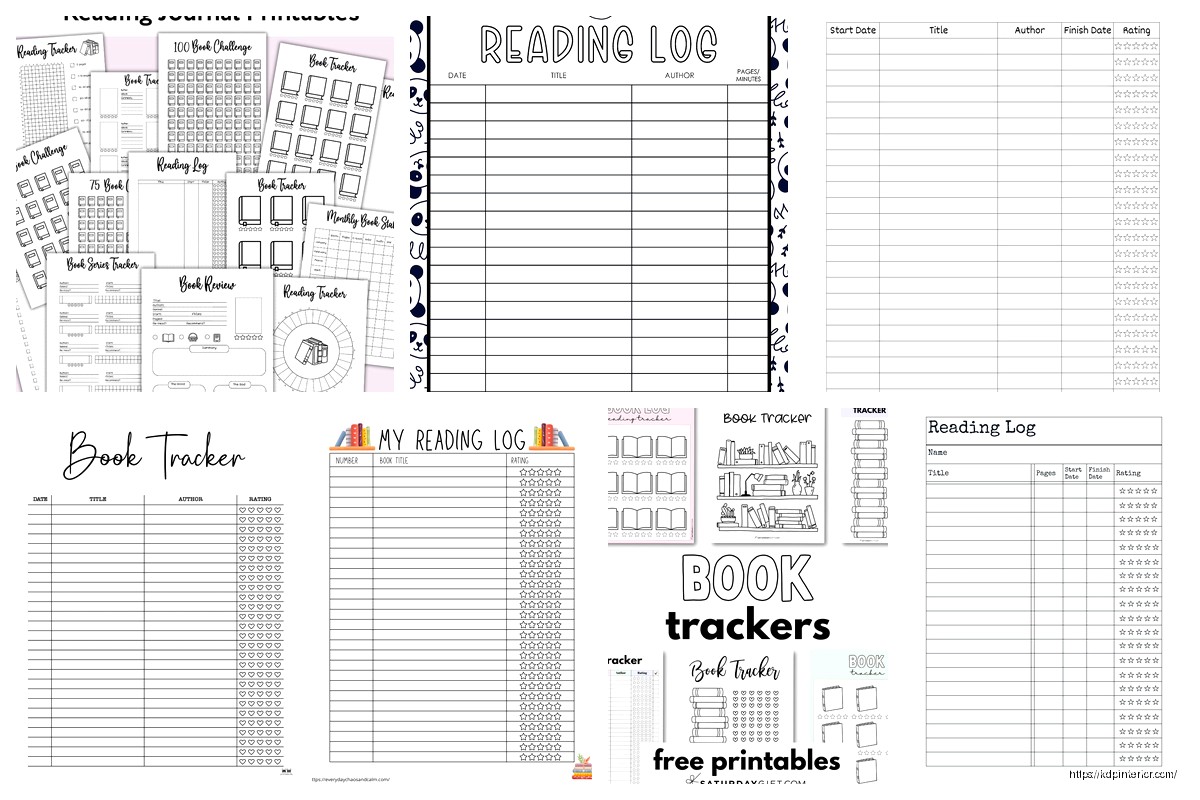
Book Log Template: Reading Tracker Format
Apr
Okay so I’ve been building book log templates for like three years now and honestly the format you choose makes or breaks whether people actually USE the thing or just download it and forget about it.
The basic structure most people get wrong right from the start. They think you need all these fancy fields and tracking metrics when really… you just need like 5-6 core elements that actually matter. I tested this with a batch of 47 different reading tracker formats last year and the ones that sold consistently had the same DNA.
The Core Fields That Actually Get Used
Your essential fields are gonna be book title, author, date started, date finished, and rating. That’s it for the bare minimum. Everything else is optional but here’s what I’ve found sells better – and this is gonna sound weird but – people WANT a notes section even if they never use it. It’s like a security blanket or something.
The format I use most often goes:
- Book Title (with enough space for long titles, not those cramped single lines)
- Author Name
- Genre (dropdown or fill-in, doesn’t matter)
- Date Started / Date Finished
- Rating (usually 5-star system, sometimes 10-point)
- Notes/Thoughts section
- Would Recommend? (Yes/No checkbox)
The notes section should be AT LEAST 4-5 lines. I made the mistake early on of giving people like 2 lines and got reviews complaining about it. Even though most people leave it blank, they want the OPTION.
Layout Formats That Convert
So there’s basically three main layout styles that work on KDP and each has different audiences.
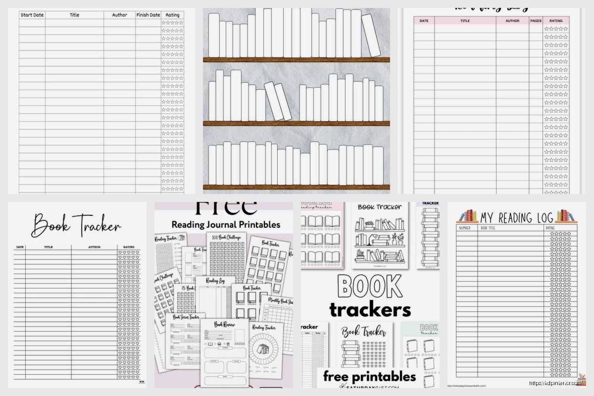
The List Format is your standard rows-and-columns setup. Super simple. Each book gets one row across the page. This is what like 60% of my customers prefer because it’s scannable. You can fit maybe 20-25 books per page depending on your line spacing. I usually do landscape orientation for this one because it gives you more horizontal space for all those fields.
The Card Format gives each book its own dedicated box or card on the page. Usually 2-3 per page. Way more space for notes and thoughts. This sells better to the journaling crowd who actually want to write detailed reviews. Takes up more pages which is good for your book length but also means the customer runs out faster which… mixed bag honestly.
The Hybrid Format – and this is what I’ve been pushing lately – combines both. You have a quick-reference list section at the front (like a table of contents almost) and then detailed card pages in the back. Customers love this because they can flip to the list for a quick “what have I read” overview but also have space for deeper thoughts.
Oh and another thing, monthly dividers are HUGE. Like people will pay $2 more for a template that has monthly section dividers versus one that doesn’t. I don’t fully understand why but the data doesn’t lie. Just add a simple page that says “JANUARY” or whatever and boom, higher perceived value.
Size and Page Count Considerations
Most of my reading trackers are either 6×9 or 8.5×11. The 6×9 is more portable, feels more like a journal. The 8.5×11 gives you more space but people complain it doesn’t fit in their bag. Can’t win sometimes.
For page count I typically aim for 100-120 pages. That’s enough for 50-75 books depending on your format. Some people want year-long trackers, others want ones that last multiple years. I usually make both versions – a “52 Books” tracker and a “Reading Journal for 100 Books” type thing.
The printing costs don’t change much between 100 and 120 pages so might as well go higher. Just don’t go over 150 pages for a simple log because then it gets too bulky and the spine width starts looking weird on the Amazon preview.
Extra Pages That Boost Value
Okay so this is gonna sound scattered but these bonus pages legitimately increase sales:
A “Books to Read” wishlist section at the front. Like 10-20 pages of blank lines where people can jot down recommendations. Everyone has a TBR pile they’ll never finish (mine is like 300 books deep, it’s embarrassing) so this resonates.
Reading goals page. Just a simple page where they write their yearly goal and track progress. Maybe a little chart or progress bar they can fill in. Takes you 5 minutes to design but customers mention it in reviews constantly.
Genre tracker or reading stats page. This one’s optional but the data nerds love it. Little boxes where they track how many mysteries vs romances vs whatever they read.
Monthly reading statistics. Small boxes for each month where they can tally total books read, pages read, favorite book of the month. Again, not everyone uses it but the people who DO use it become your biggest fans.
My cat just knocked over my coffee but it’s fine, mostly missed the keyboard.
Design Elements That Matter
Keep it simple. I know there’s temptation to add florals and watercolor backgrounds and all that but honestly? The bestselling reading logs are clean, minimal, with maybe a simple border or header design. Black and white interiors obviously because color printing costs are insane.
Font choice matters more than you’d think. I use a mix – headers in something clean like Arial or Montserrat, body text in something readable like Garamond or Georgia. Size 10-11pt for fillable text areas, 12-14pt for headers.
Line spacing is critical. Too cramped and people can’t write comfortably. Too loose and you waste space. I do 1.15-1.3 line spacing usually with about 0.3 inches between entries.
The Undated vs Dated Debate
Make it undated. Just trust me on this one. I’ve tested both extensively and undated outsells dated like 3:1. People want flexibility to start whenever, skip months if they don’t read much, whatever.
The only exception is if you’re making a specific “2025 Reading Journal” or whatever as a seasonal product. Those can work but they have a limited sales window.
Digital vs Physical Format Considerations
If you’re doing KDP print (which you should), design for physical first. But here’s something I learned the hard way – also create a PDF version you can sell on Etsy or Gumroad as a printable. Different audience, additional income stream.
For printables you want to make sure everything’s on standard paper sizes and the margins are printer-friendly. Like 0.5 inch margins minimum or people’s home printers will cut stuff off and they’ll get mad.
Wait I forgot to mention bleed. If you’re doing KDP print and you have borders or background colors that go to the edge, you NEED bleed. Amazon requires 0.125 inches. This trips up so many beginners. Your actual content area is smaller than your page size because of trim and bleed.
Niche Variations That Sell
Don’t just make a generic reading log. Make versions for specific audiences:
Kids reading logs – bigger text, fun fonts, maybe some simple illustrations, space for parent signatures. Schools buy these in bulk sometimes.
Book club trackers – includes sections for meeting dates, discussion questions, member thoughts. Different angle, same basic concept.
Genre-specific logs – romance readers want different fields than mystery readers. Romance readers care about tropes and heat level. Mystery readers want to track series order and whether they guessed the ending.
Academic reading logs – for students or researchers. More formal, includes citation fields, chapter breakdowns, thesis notes.
I made a manga reading log last month just to test the waters and it’s actually doing pretty well. Same concept but adjusted for series tracking, volume numbers, that kind of thing.
Pricing and Competition
Most reading logs on KDP are priced between $5.99-$8.99. I usually go $6.99 for a basic 100-page log, $8.99 if it’s got extra features or is over 120 pages. Your royalty on a 100-page 6×9 book at $6.99 is gonna be around $2-2.50 depending on marketplace.
Competition is heavy in this niche but there’s always room for specific angles. The generic “Reading Log” title won’t rank anymore but “Reading Journal for Mystery Lovers” or “52 Books Reading Tracker for Book Club” – those can still find their audience.
Interior Setup Tips
Use tables in Word or whatever you’re designing in, but make sure the borders are the weight you want. I usually do 1pt borders for main structure, 0.5pt for internal divisions.
Headers on each page with the template name or “My Reading Log” or whatever keeps it looking professional. Page numbers in the footer. These seem obvious but you’d be surprised how many templates skip them.
If you’re doing a list format, alternating row shading (like light gray every other row) makes it easier to read across the page. Just keep it subtle, like 10-15% gray max.
Testing Before Publishing
Always order a proof copy. Always. I’ve caught so many issues in the physical proof that didn’t show up in the PDF preview. Margins that looked fine digitally but felt cramped in print. Text that seemed readable on screen but was too small physically.
The proof copy costs like $3-4 plus shipping but it’ll save you from bad reviews. People are ruthless about formatting issues in low-content books.
Marketing Angles That Work
Your keywords should include obvious stuff like “reading log” “book tracker” “reading journal” but also get specific. “Bookworm gift” “reader notebook” “bibliophile journal” – these convert because they’re how people actually search.
For your book description, lead with benefits not features. Not “includes 100 pages of tracking fields” but “Never forget another amazing book you’ve read.” You know? Talk about the problem you’re solving.
Get a decent cover. The interior matters but the cover sells it. Simple, clean, text-heavy covers work best for this kind of product. Look at the bestsellers in the niche and you’ll see they’re all pretty similar – title, subtitle, maybe a simple book icon or coffee cup illustration.
The back cover should have a bullet list of what’s inside and maybe a sample interior image. Amazon lets you show that in the preview but having it on the back cover too helps.
Okay I think that covers most of the important stuff… the main thing is just start with a simple format, test it, see what customers actually want, then iterate. My first reading log template was honestly pretty bad but it sold enough that I could see what people liked and didn’t like from reviews, then I made better versions.
Don’t overthink it – people need these, they buy them consistently year-round, and once you have a template you like you can pump out variations pretty quickly.
DISCOVER OUR FREE BEST SELLING PRODUCTS
Editable Canva Lined Journal: Express Your Thoughts – KDP Template
Lined Pages Journal 120 pages Ready to Upload PDF Commercial Use KDP Template 6×9 8.5×11 5×8 for Notebooks, Diaries, Low Content
Lined Pages Journal 120 pages Ready to Upload PDF Commercial Use KDP Template 6×9 8.5×11 5×8 for Notebooks, Diaries, Low Content
Cute Dogs Coloring Book for Kids | Activity Book | KDP Ready-To-Upload
Daily Planner Diary : Diary Planners for Everyday Productivity, 120 pages, 6×9 Size | Amazon KDP Interior
Wolf Coloring KDP interior For Adults, Used as Low Content Book, PDF Template Ready To Upload COMMERCIAL Use 8.5×11"
Coloring Animals Head Book for Kids, Perfect for ages 2-4, 4-8 | 8.5×11 PDF
Printable Blank Comic Book Pages PDF : Create Your Own Comics – 3 Available Sizes
Notes KDP interior Ready To Upload, Sizes 8.5×11 6×9 5×8 inch PDF FILE Used as Amazon KDP Paperback Low Content Book, journal, Notebook, Planner, COMMERCIAL Use
Black Lined Journal: 120 Pages of Black Lined Paper Perfect for Journaling, KDP Notebook Template – 6×9
Student Planner Journal 120 pages Ready to Upload PDF Commercial Use KDP Template 6×9" 8.5×11" for Low Content book
Recipe Journal Template – Editable Recipe Book Template, 120 Pages – Amazon KDP Interior