Amazon KDP guide, KDP book publishing
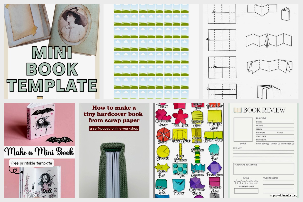
Book Making Template: DIY Publishing Guide
Mar
Okay so here’s the actual process I use for book templates
Look, I was literally up until 2am last night rebuilding a client’s interior template because they tried to wing it with Canva and… yeah that didn’t work out. So this is fresh in my mind and I’m gonna walk you through the whole thing before I forget half of it.
First thing – and I know this sounds backwards – you gotta figure out your trim size before you even open any software. Amazon’s got specific dimensions they work with, and if you just make something random you’re gonna hate yourself later. The most common ones I use are 6×9 for most books, 8.5×11 for workbooks and planners, and 5×8 if you’re doing like a pocket journal thing.
The margins are where everyone screws up. Amazon requires a minimum inside margin (that’s the gutter where the binding is) and it changes based on page count. Under 150 pages you need 0.375 inches, 150-300 pages needs 0.5 inches, and it keeps going up from there. Outside margins can be 0.25 inches minimum but honestly I do 0.5 just to be safe because stuff shifts sometimes during printing.
Setting up your master template file
So I use Microsoft Word for most of my templates because it’s what most people already have, but also because it exports to PDF really cleanly. Google Docs works too but the formatting can get wonky when you download it.
Open Word and go to Layout > Size > More Paper Sizes. Punch in your dimensions. For a 6×9 book that’s width 6 inches, height 9 inches. Then immediately go to Layout > Margins > Custom Margins and set your margins based on that page count thing I mentioned.
Here’s something I learned the hard way after like my 40th book – set up your master pages as SECTIONS not just pages. You want different sections for front matter, main content, and back matter because they need different page numbering styles. Front matter usually gets roman numerals (i, ii, iii) or no numbers at all, main content gets regular numbers starting at 1.
The front matter section
Your front matter includes title page, copyright page, maybe a dedication if you’re doing that, table of contents if it’s a longer book. For low-content books like journals you can skip most of this but you NEED a copyright page or Amazon might flag it.
Title page should be clean. Book title in a bigger font, your author name below it. I usually center everything and use like 24pt for the title and 14pt for the author name. Don’t go crazy with fonts – stick to one or two max for the whole book.
Copyright page needs: Copyright © [year] by [your name], All rights reserved, and the standard disclaimer about no reproduction without permission. I’ve got a template for this I just copy-paste every time because who wants to rewrite that. Oh and add your edition number if it’s not the first edition.
Actually designing the interior pages
This is where it gets fun or frustrating depending on your mood. For low-content books you’re basically creating repeating page layouts. Like if you’re making a lined journal, you need to make one perfect lined page and then duplicate it 100 times or whatever.
In Word you can insert a table and format it to create lines. Make a table with 1 column and like 30 rows, adjust the row height to give you the line spacing you want, then format the borders so only the bottom border of each cell shows. Boom, lined paper. Remove the outside borders of the table completely.
Wait I forgot to mention – before you do any of this design work, go to View and turn on the ruler and gridlines. You need to see where things are sitting on the page or you’ll end up with stuff too close to the margins.
Page headers and footers
Most books have either the book title or chapter title in the header and page numbers in the footer. Or vice versa, whatever you prefer. To set this up in Word, double-click at the top or bottom of a page to open the header/footer area.
For page numbers specifically, use the Insert Page Number function instead of just typing numbers. This makes them automatically update which is crucial. I usually put them in the footer, centered or on the outside edge (right side for odd pages, left side for even pages – this is called “different odd and even pages” in Word and you enable it under Header & Footer Tools).
Pro tip that saved me hours – you probably don’t want page numbers on your title page or copyright page. So make sure your front matter section has page numbers turned off. You do this by going to that section, opening the header/footer, and checking “Different First Page” then just leaving that first page blank.
Fonts and readability
Okay so fonts matter more than you think. For the main body text of regular books I always use serif fonts like Garamond, Georgia, or Times New Roman. Size 10 or 11 depending on the font. Sans-serif fonts like Arial or Calibri look weird in printed books – they’re for screens.
Line spacing should be 1.15 or 1.5, not single-spaced and definitely not double-spaced. Single is too cramped, double wastes pages and looks like a high school essay. Paragraph spacing is usually 0pt before and 6pt after.
For low-content books like planners the rules are different. You can use whatever fonts match your aesthetic. I’ve done planners with super decorative headers and it works fine because the functional parts (the lines or boxes people write in) are simple.
Actually creating different types of book interiors
Let me break down the specific approaches for different book types because a lined journal is way different from a recipe book or whatever.
Lined journals
These are the simplest. You need good consistent lines across every page. The table method I mentioned works but honestly for journals I usually just use a template I bought once for like $8 and modify it. Sometimes it’s worth spending a few bucks to save hours of formatting.
If you’re making it from scratch though – 25 to 30 lines per page works for a 6×9 journal. Space them evenly. You can add a small header area at the top of each page for dates or titles, maybe 0.5 inches worth of space before the lines start.
Planners and organizers
These are more complex because you’ve got multiple elements – calendars, to-do lists, goal pages, habit trackers, whatever. You’re essentially designing multiple page types and then arranging them in a logical order.
I design each page type as its own Word document first, get it perfect, then copy them all into one master document in the right order. Calendars you can make with tables – 7 columns for days of the week, 5 or 6 rows for weeks. Format the table borders to be clean and simple.
My cat just knocked over my coffee but it missed the laptop thank god.
For habit trackers you want a grid, which again is just a table. Maybe 31 columns for days of the month and however many rows for the habits you’re tracking. Add a column on the left for the habit names.
Coloring books
Totally different beast. You need actual images not just text formatting. The images have to be black line art on white background, clean lines, not too detailed but not too simple either.
If you’re creating the art yourself you’d use Illustrator or Procreate or something. If you’re buying art or using public domain stuff, make sure it’s high resolution – at least 300 DPI. Insert the images into Word, one per page, and make sure they’re sized to fit within your margins.
Oh and for coloring books specifically, use thicker paper when you publish. Amazon’s standard paper is 60lb which is fine for text but colors can bleed through. You want 70lb at minimum for coloring books.
Recipe books and cookbooks
These need a template for each recipe page. I usually do recipe title at the top, then two sections – ingredients list on the left or top, instructions below or on the right. Maybe a notes section at the bottom.
Use bullet points or numbered lists for ingredients and instructions. Make sure there’s enough space for each recipe – don’t cram things. Usually 1-2 pages per recipe depending on complexity. You can add a photo space if you have recipe photos, but plain text cookbooks are totally fine too.
The technical stuff about exporting and file prep
Okay so once your interior is designed you need to export it properly for Amazon. This is where people mess up constantly and I’ve seen some truly cursed PDF files in my time.
Export as PDF from Word. Use Save As > PDF, but before you click save, hit the Options button. Make sure “ISO 19005-1 compliant (PDF/A)” is checked. This creates a standardized PDF that printers can work with consistently.
After you export, OPEN THE PDF and check it page by page. I know it’s tedious but you gotta do it. Look for weird formatting shifts, images that moved, text that reflowed wrong, page numbers that skipped or duplicated. This happens more often than you’d think.
Check your margins again in the PDF. Sometimes things shift slightly during export. Open the file in Adobe Reader, go to Print, and select “Print with custom scale” or use the ruler tool to measure margins. They need to meet Amazon’s minimums or your file gets rejected.
File size and image optimization
Amazon has a 650 MB limit for interior files which sounds like a lot but if you’ve got a coloring book with 100 high-res images you can hit it. If your file is too big you need to optimize the images.
Use Adobe Acrobat (the paid one not just Reader) or an online PDF compressor. There are free ones that work fine. Just don’t compress so much that images look pixelated. You want to balance file size with quality.
For text-only books file size is rarely an issue. A 200-page text book is usually under 5 MB.
Creating a book cover template that actually works
Covers are separate from interiors on Amazon but you need to design them to match. Amazon has a cover calculator tool that tells you the exact dimensions based on your page count and paper type.
A cover is one big image that wraps around the whole book – front cover, spine, back cover all in one file. The dimensions change based on page count because more pages = thicker book = wider spine.
For a 120-page book with white paper at 6×9 trim size, your cover file would be roughly 12.5 inches wide by 9 inches tall. That includes the front (6 inches), spine (0.5 inches), and back (6 inches). Use Amazon’s calculator for exact dimensions don’t guess.
Add bleed to your cover – that’s extra image area that extends past the trim line. Amazon requires 0.125 inches of bleed on all sides. So if your cover is 12.5×9, your actual file should be 12.75×9.25 to include bleed.
Designing in Canva vs Photoshop
Canva is fine for covers if you’re not doing anything super complex. They have book cover templates built in. Just make sure you set custom dimensions to match what Amazon’s calculator told you. Download as PNG or PDF, highest quality.
Photoshop gives you more control obviously. Set up your file at 300 DPI which is print resolution. 72 DPI is for screens and will look blurry when printed. This is like the number one mistake beginners make.
Layer your design so you can adjust things easily. Background layer, then images, then text on top. Keep important elements (text, logos, faces) away from the spine area and at least 0.25 inches from all trim edges. This is the “safety zone” where you know nothing will get cut off.
Cover templates I actually reuse
I’ve got a Photoshop template file that I’ve used probably 80 times now. It’s got all the guides set up for 6×9 books at different page counts. I just swap out the background colors, images, and text for each new book.
The template has layers for: background, main image/graphic, overlay effects, title text, subtitle text, author name, back cover text, spine text, and barcodes (Amazon adds the barcode automatically so I just have a placeholder layer for reference).
Having this template saves me like an hour per book because I’m not setting up guides and margins from scratch every single time.
Testing your template before you publish
Before you upload anything to Amazon you should test it. Order a proof copy. Yes it costs like $5-10 but it’s worth it to see the actual physical book.
I cannot tell you how many times something looked perfect on screen and then the printed version had issues. Text too close to the gutter so it’s hard to read. Images that looked fine on screen but printed too dark. Margins that were technically acceptable but looked weird in person.
When you get your proof copy, check these things: open the book flat and make sure text in the gutter is readable, flip through and make sure page elements are consistent and lined up, look at image quality, check that the cover colors match what you expected, read a few pages to catch typos you missed on screen.
oh and write in it if it’s a journal or planner. Literally test whether the lines are spaced well, whether there’s enough room to write, whether the layout actually makes sense functionally. I’ve redesigned journal pages after testing them because what seemed logical in design was awkward to actually use.
Setting up template variations for different niches
Once you’ve got one solid template you can modify it for different purposes pretty easily. Like I’ve got my base 6×9 lined journal template and I’ve made versions with different line spacing, different header styles, with/without prompts, with/without dates.
For gratitude journals I add a prompt at the top of each page like “Today I’m grateful for…” or “Three good things that happened today.” For goal planners I add specific sections for quarterly goals, monthly breakdown, weekly tasks. It’s all the same base layout just with different elements.
This is how I got to 200+ books without designing 200 completely unique interiors from scratch. You create maybe 10-15 solid templates and then you variation-ize them (that’s not a word but whatever).
Organizing your template library
Keep your templates organized or you’ll waste so much time searching for files. I’ve got a folder structure like: Templates > Journals > 6×9 > Lined. Then inside that folder I have the Word template, the PDF export, notes about margins and specs, and example covers.
Name your files clearly. Not “journal_template_final_v2_FINAL.docx” but something like “6x9_lined_journal_120pages_template.docx” so you know what it is six months from now.
Also keep a spreadsheet or document with specs for each template. What trim size, page count range, margin settings, fonts used, any special formatting notes. Future you will thank past you for this.
Common problems and how I fix them
Text getting cut off near margins – you didn’t leave enough margin space. Go back and increase your margins by 0.1 inches and re-export. Check the PDF again.
Page numbers showing up where they shouldn’t – section breaks aren’t set up right. In Word you need to insert section breaks between your front matter and main content, then unlink the headers/footers between sections. This lets you have different page numbering in each section.
Lines or borders not printing – they’re probably too thin. Any lines should be at least 0.5pt thick, preferably 1pt. Thinner lines can disappear or print inconsistently.
Images looking pixelated – they’re not high enough resolution. You need 300 DPI at the final print size. So if your image prints at 4×4 inches, it needs to be 1200×1200 pixels minimum (4 inches × 300 DPI).
File getting rejected by Amazon – check your PDF version, make sure margins meet minimums, make sure the file isn’t corrupted. Sometimes just re-exporting fixes it. If it keeps getting rejected, check the specific error message Amazon gives you because it usually tells you what’s wrong.
Cover spine text cutting off – spine text should be at least 0.0625 inches from the spine edges which are where it folds. If your spine is narrow (under 0.4 inches) skip spine text entirely because it won’t print well anyway.
The page count has to be specific
Amazon requires page counts to be multiples of 4 for paperbacks. So you can have 100 pages or 104 pages but not 102 pages. This is because of how the printing process works with signatures of paper.
If your content ends up at a weird number like 103 pages, just add blank pages at the end until you hit 104. Or add more content like notes pages or a bonus section or whatever makes sense for your book type.
Pricing your books based on your template costs
This isn’t strictly about templates but it matters when you’re planning what to create. Amazon’s printing costs are based on page count and trim size. More pages = higher printing cost = higher minimum price.
A 120-page 6×9 book costs around $3 to print. Amazon takes their cut and then you get royalties. If you price it at $8.99, you might get $2-3 in royalties per sale. Price it at $12.99 and you get more like $4-5 per sale.
DISCOVER OUR FREE BEST SELLING PRODUCTS
Editable Canva Lined Journal: Express Your Thoughts – KDP Template
Lined Pages Journal 120 pages Ready to Upload PDF Commercial Use KDP Template 6×9 8.5×11 5×8 for Notebooks, Diaries, Low Content
Lined Pages Journal 120 pages Ready to Upload PDF Commercial Use KDP Template 6×9 8.5×11 5×8 for Notebooks, Diaries, Low Content
Cute Dogs Coloring Book for Kids | Activity Book | KDP Ready-To-Upload
Daily Planner Diary : Diary Planners for Everyday Productivity, 120 pages, 6×9 Size | Amazon KDP Interior
Wolf Coloring KDP interior For Adults, Used as Low Content Book, PDF Template Ready To Upload COMMERCIAL Use 8.5×11"
Coloring Animals Head Book for Kids, Perfect for ages 2-4, 4-8 | 8.5×11 PDF
Printable Blank Comic Book Pages PDF : Create Your Own Comics – 3 Available Sizes
Notes KDP interior Ready To Upload, Sizes 8.5×11 6×9 5×8 inch PDF FILE Used as Amazon KDP Paperback Low Content Book, journal, Notebook, Planner, COMMERCIAL Use
Black Lined Journal: 120 Pages of Black Lined Paper Perfect for Journaling, KDP Notebook Template – 6×9
Student Planner Journal 120 pages Ready to Upload PDF Commercial Use KDP Template 6×9" 8.5×11" for Low Content book
Recipe Journal Template – Editable Recipe Book Template, 120 Pages – Amazon KDP Interior