Okay so square book mockups are honestly something I slept on for like two years and that was stupid because they convert crazy well on Pinterest and Instagram. Like I was just doing the standard 3D mockups with the perspective angles and everything, but then I tested some square formats last month and… yeah, let me break this down.
First thing – square doesn’t mean your actual book is square. It means the mockup image itself is 1:1 ratio, which sounds obvious but I’ve had people ask me if they need to reformat their entire book. No. You’re just changing how you present it visually for marketing. Your book on Amazon stays whatever dimensions it actually is.
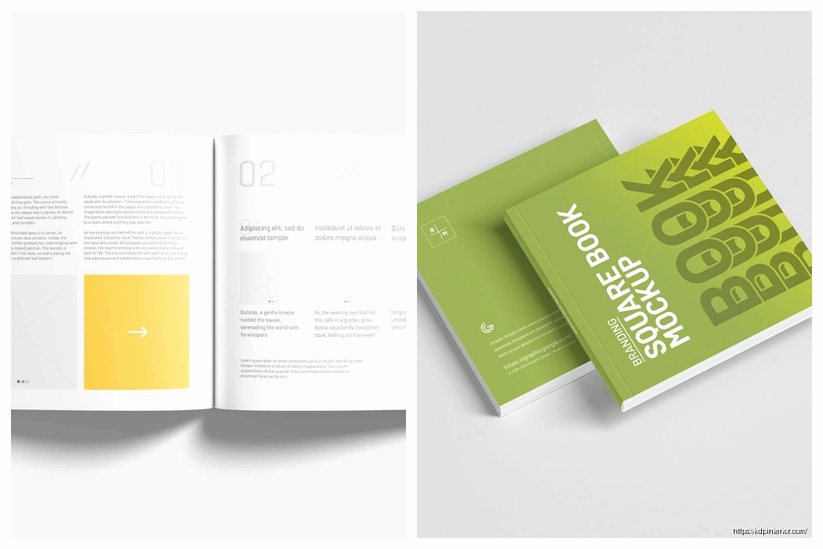
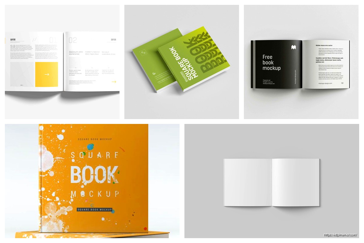
The main formats I’m using now are the flat lay style, the simple floating cover, and what I call the “lifestyle prop” setup. Flat lay is where you photograph or design the book laying flat on a surface with other stuff around it – coffee cup, glasses, plants, whatever. This performs insanely well on Instagram because it looks native to the platform. I tested this with a budget planner I published in November and got like 3x the engagement compared to my regular angled mockups.
For creating these you’ve got a few options. Placeit is the easiest if you’re not design-savvy at all. They have templates specifically for square formats and you just upload your cover. Costs about $15/month or you can pay per mockup. I keep the subscription because I’m making these constantly but if you’re only doing a few books maybe just pay the $8 per download.
Canva works too and honestly I’ve been using it more lately because you have more control. They have mockup templates but here’s the trick – don’t just use their templates straight up because everyone does that and your images look generic. Start with a template then customize it. Change the background, swap out the props, adjust the shadows. Takes an extra 10 minutes but makes a huge difference.
Oh and another thing, the shadow layer is super important. A lot of people skip this or use the default shadow and it looks fake. You want a soft shadow that matches where the light would actually come from. In Canva you can add multiple shadow layers with different opacities to make it look more realistic. I usually do one darker shadow close to the book edge and one lighter shadow that extends further out.
Photoshop is obviously the pro option if you know what you’re doing. I use Smart Objects for book mockups which basically means you create a template once and then you can just swap in different covers by double-clicking. Saves so much time when you’re doing multiple books. There’s a learning curve though and honestly if you’re just starting out it’s probably overkill.
The floating cover style is probably the simplest – just your book cover centered on a colored or textured background in a square format. Sounds basic but it actually performs really well for Facebook ads. I think because it’s so clean and the cover itself is the focus. No distractions. For this I usually make the background a complementary color to whatever’s on my cover. If my cover is mostly blue I might do a warm beige background or vice versa.
Wait I forgot to mention dimensions. For Instagram you want 1080×1080 pixels minimum. Pinterest can handle square but honestly vertical (2:3 ratio) performs better there so I wouldn’t prioritize square mockups for Pinterest unless you’re also making vertical ones. Facebook and Twitter work great with square though.
My cat just knocked over my water bottle which is perfect timing because let me tell you about mistakes I made early on… I was creating these mockups at like 500×500 pixels because I thought smaller file size was better for web. Wrong. They looked pixelated and unprofessional. Always start at least 1080×1080 even if you’re gonna compress it later. You can always size down but you can’t add quality back in.
Lifestyle prop mockups are where it gets fun but also more time-consuming. This is where you’re showing the book in an actual scene – like on a desk with a laptop, or next to a breakfast setup, or in someone’s hands. These require either actual photography or more advanced design skills. I do both depending on the book.
For physical photos I literally just use my iPhone. Natural lighting near a window works best. I’ve got this one spot in my office where the light hits perfectly around 10am and I probably shoot 80% of my mockups there. Set up your scene, place the book (or a printed cover wrapped around a similar-sized book), take like 50 shots from different angles, pick the best one.
Pro tip that changed everything for me – use portrait mode on your phone if it has it. The background blur makes it look way more professional. Also shoot from directly above for flat lays. I mean like straight down, perpendicular to the surface. I use a small stepladder because holding your phone above your head gets tiring and the angle’s never quite right.
If you’re doing digital lifestyle mockups you’re basically compositing elements together. This is where Photoshop really shines but you can kinda do it in Canva too with their layering features. You need background images, prop images (PNG files with transparent backgrounds), and your book cover. Then you layer everything and adjust the lighting so it looks cohesive.
Yellow Images is my go-to for isolated prop PNGs. They have thousands of objects already cut out – coffee cups, plants, office supplies, tech gadgets, whatever. It’s a subscription but there are free alternatives if you search for “free PNG objects” though the quality varies a lot.
This is gonna sound weird but one of my best-performing square mockups is super minimal. Black book cover on a white background, small shadow, nothing else. I made it in like 2 minutes for a journal I was promoting and it outperformed these elaborate setups I’d spent an hour on. Sometimes simple just works better because people can actually see what you’re selling.
Color psychology matters here too. I noticed my planners with mockups using warm backgrounds (creams, light browns, soft oranges) performed better than cool backgrounds. But for my tech-related books the opposite was true – blues and grays converted better. Test this stuff for your niche because it varies.
Okay so funny story, I was creating mockups for a recipe book and kept putting kitchen props around it – wooden spoons, ingredients, all that obvious stuff. Conversions were meh. Then I made one with the book next to a tablet and a cup of tea, more of a “cozy reading” vibe instead of “active cooking” vibe, and that one crushed it. Sometimes the context you’re selling isn’t the usage context, it’s the aspirational context. People bought the cookbook because they wanted that peaceful moment planning meals, not because they were actively cooking right then.
For text on your mockups, keep it minimal or skip it entirely for some versions. I usually make multiple versions of each mockup – one with no text, one with just the book title, one with a short benefit statement. Then I test them. The no-text versions often perform better organically but the versions with text can work better for ads where you need to communicate quickly.
Font choice if you do add text… stick with clean sans-serif fonts for most stuff. Montserrat, Raleway, Poppins – these are all free on Google Fonts and look professional. Script fonts are tempting but hard to read at small sizes and Instagram/Facebook are definitely small sizes when people are scrolling on their phones.
One mistake I see constantly is making the book too small in the frame. You’ve got a square canvas, use it. The book should take up a good portion of the image. I usually aim for the book to fill about 50-60% of the frame for simple mockups, maybe 40% if there are props taking up space. Any smaller and people scrolling can’t read your title clearly.
Speaking of titles, make sure your cover design itself is legible at small sizes before you even make mockups. I’ve had to redesign covers because the text was too small or too detailed to read in thumbnails. Square mockups actually help you test this because if your cover looks good in a square Instagram post, it’ll probably look good in Amazon search results too.
Batch creating these saves so much time. When I’m in mockup mode I’ll crank out like 20 different versions in one session. Different backgrounds, different props, different layouts. Then I’ve got a library to pull from for social media, ads, email newsletters, whatever. I keep them all organized in folders by book title and mockup style.
File formats matter – save as PNG for anything with transparency, JPEG for final mockups you’re posting. PNG files are bigger but higher quality. JPEG is compressed but loads faster. For social media posting JPEG is usually fine. For ads where quality matters more I use PNG.
Oh wait, animation. Square animated mockups are something I just started testing. Like a subtle 3D rotation or pages flipping. These get way more attention in feeds because they stand out from static images. You can make simple animations in Canva Pro (they have this feature now) or use a tool like Animatron. More advanced option is After Effects but that’s definitely not necessary unless you’re really into video stuff.
The page flip animation works particularly well for books with interior content you wanna show off – like planners, journals, coloring books. Shows people what they’re actually getting. I made one for a daily planner where it flips through a few pages then shows the cover again and that video ad had a 40% lower cost per click than my static image ads.
For print books you can also do spine mockups in square format, especially for thicker books. Like showing the book standing upright so you see the spine and part of the cover. This works better than you’d think for building brand recognition if you’re creating a series. People start recognizing your spine design.
Consistency across your mockups helps too. I try to use similar backgrounds or props for books in the same niche so there’s a cohesive brand feel. All my budget planners have this consistent light wood background aesthetic. All my tech guides use this dark desk setup with a laptop. Makes your catalog look professional when people visit your author page or website.
Free tools if you’re on a tight budget – Canva free version, Pixlr for photo editing, Remove.bg for cutting out backgrounds from photos. You can create decent mockups without spending anything, it just takes more manual work. I started with all free tools and gradually upgraded as I made money.
The biggest thing honestly is just making multiple versions and testing them. What works for my audience might flop for yours. I track which mockup images drive the most clicks in my ads, which ones get the most engagement on social media, which ones convert best in emails. Then I make more like the winners and ditch the losers. Sounds obvious but you’d be surprised how many people just make one mockup and use it everywhere forever.
Alright I think that covers most of the practical stuff about square mockups. The main takeaway is they’re not complicated, you just gotta actually make them and test different styles. Start simple, see what works, iterate from there.
 Recipe Journal Template - Editable Recipe Book Template, 120 Pages - Amazon KDP Interior
1 × $0.00
Recipe Journal Template - Editable Recipe Book Template, 120 Pages - Amazon KDP Interior
1 × $0.00  Lined Pages Journal 120 pages Ready to Upload PDF Commercial Use KDP Template 6x9 8.5x11 5x8 for Notebooks, Diaries, Low Content
1 × $0.00
Lined Pages Journal 120 pages Ready to Upload PDF Commercial Use KDP Template 6x9 8.5x11 5x8 for Notebooks, Diaries, Low Content
1 × $0.00 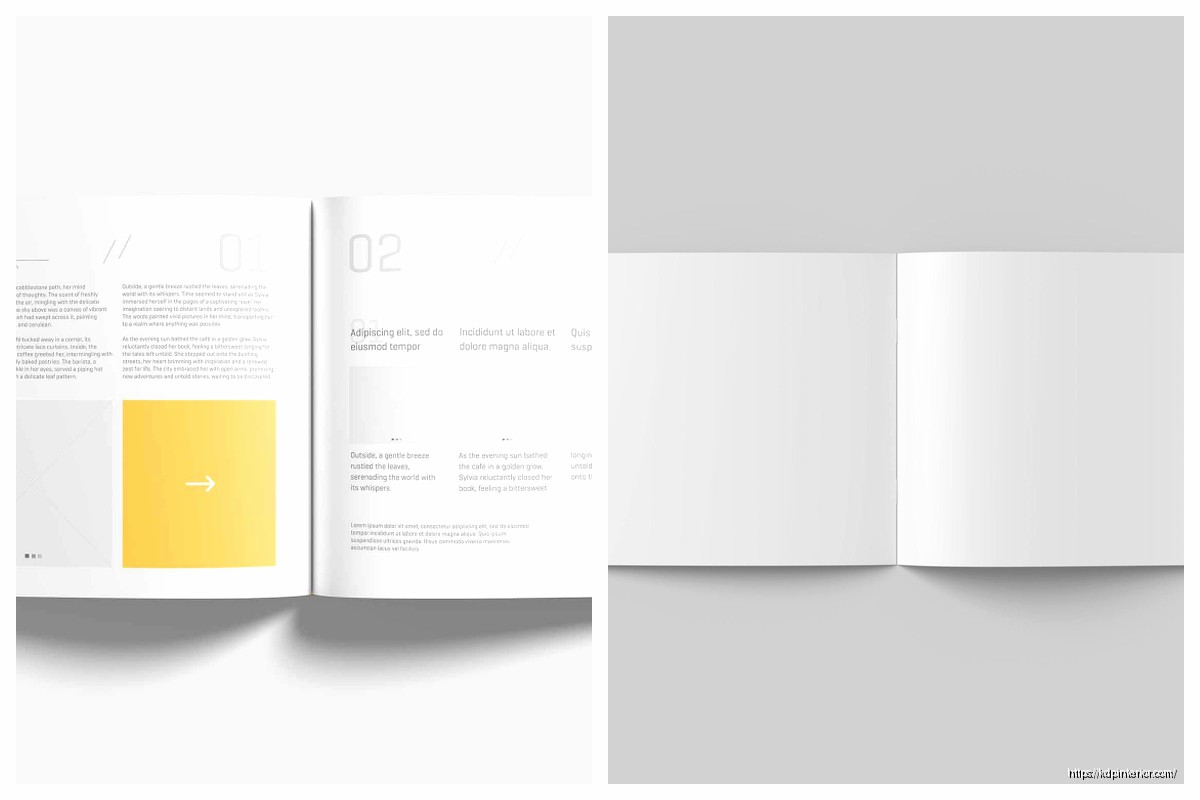
DISCOVER OUR FREE BEST SELLING PRODUCTS
Editable Canva Lined Journal: Express Your Thoughts – KDP Template
Lined Pages Journal 120 pages Ready to Upload PDF Commercial Use KDP Template 6×9 8.5×11 5×8 for Notebooks, Diaries, Low Content
Lined Pages Journal 120 pages Ready to Upload PDF Commercial Use KDP Template 6×9 8.5×11 5×8 for Notebooks, Diaries, Low Content
Cute Dogs Coloring Book for Kids | Activity Book | KDP Ready-To-Upload
Daily Planner Diary : Diary Planners for Everyday Productivity, 120 pages, 6×9 Size | Amazon KDP Interior
Wolf Coloring KDP interior For Adults, Used as Low Content Book, PDF Template Ready To Upload COMMERCIAL Use 8.5×11"
Coloring Animals Head Book for Kids, Perfect for ages 2-4, 4-8 | 8.5×11 PDF
Printable Blank Comic Book Pages PDF : Create Your Own Comics – 3 Available Sizes
Notes KDP interior Ready To Upload, Sizes 8.5×11 6×9 5×8 inch PDF FILE Used as Amazon KDP Paperback Low Content Book, journal, Notebook, Planner, COMMERCIAL Use
Black Lined Journal: 120 Pages of Black Lined Paper Perfect for Journaling, KDP Notebook Template – 6×9
Student Planner Journal 120 pages Ready to Upload PDF Commercial Use KDP Template 6×9" 8.5×11" for Low Content book
Recipe Journal Template – Editable Recipe Book Template, 120 Pages – Amazon KDP Interior