-
×
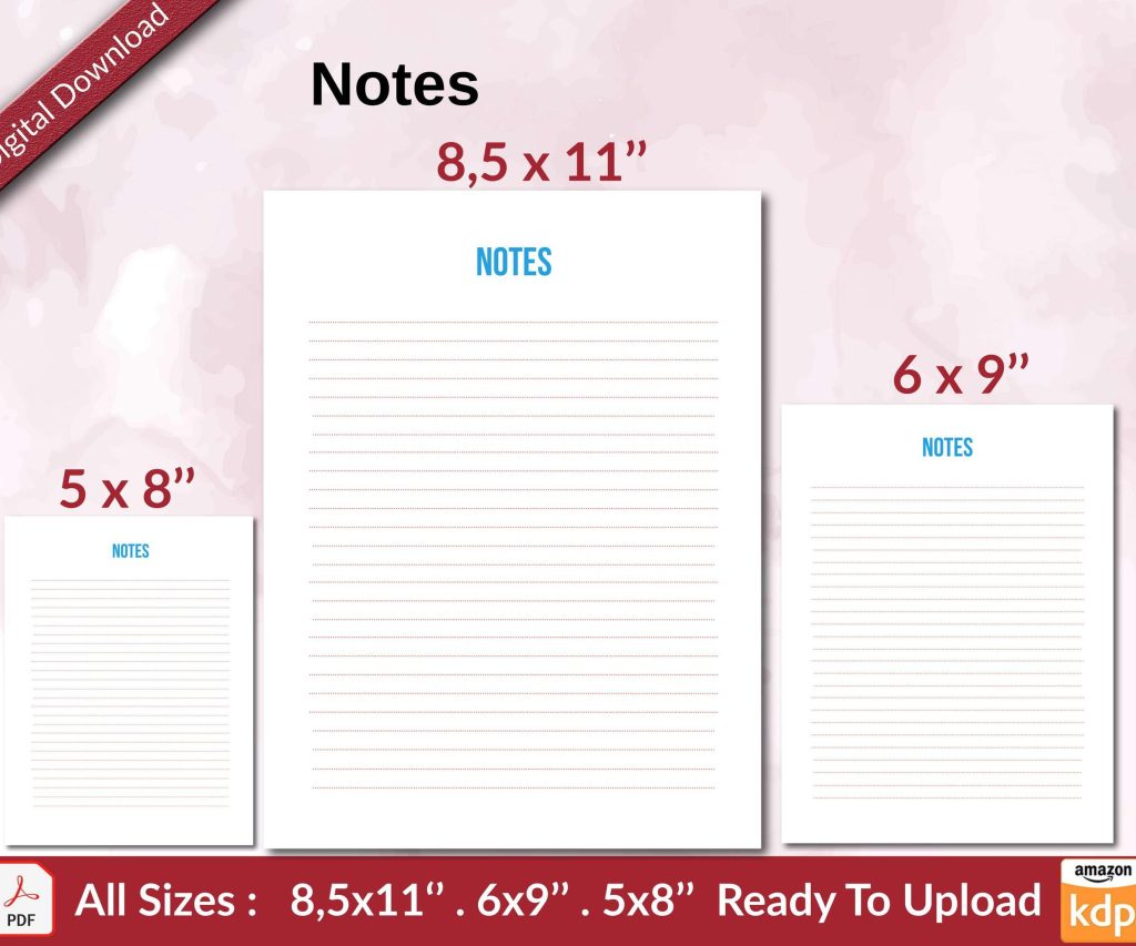 Notes KDP interior Ready To Upload, Sizes 8.5x11 6x9 5x8 inch PDF FILE Used as Amazon KDP Paperback Low Content Book, journal, Notebook, Planner, COMMERCIAL Use
1 × $0.00
Notes KDP interior Ready To Upload, Sizes 8.5x11 6x9 5x8 inch PDF FILE Used as Amazon KDP Paperback Low Content Book, journal, Notebook, Planner, COMMERCIAL Use
1 × $0.00
Subtotal: $0.00
Okay so typography on book pages is honestly where most people screw up their entire layout and don’t even realize it until they’ve already uploaded to KDP and wonder why their book looks kinda… off.
First thing – you can’t just slap any font on your pages and call it done. I learned this the hard way back in 2018 when I published this journal that used like four different fonts because I thought it looked “creative” and the reviews absolutely roasted me. People couldn’t even articulate why they didn’t like it, they just said it felt unprofessional.
For body text, stick with serif fonts. Times New Roman, Garamond, Baskerville, Caslon – these exist for a reason. They’re readable over long passages because the little feet on the letters (the serifs) guide your eye along the line. I usually go with Garamond at 11pt for most of my books because it’s got this elegant thing going on without being pretentious.
Sans-serif fonts like Arial or Helvetica? Save those for headlines or modern non-fiction where you want a clean corporate look. I used Helvetica for a productivity planner once and it worked great because that’s the vibe – clean, minimal, no-nonsense.
So point size is the actual size of your font, and leading (pronounced “ledding” which confused me for like a year) is the space between lines. The rule I follow is your leading should be about 120% of your point size. If you’re using 10pt font, set your leading to 12pt. This gives enough breathing room that lines don’t crash into each other.
I see so many KDP books with cramped text where the ascenders and descenders are practically touching and it’s just… exhausting to read. Your reader’s eyes need rest stops, basically.
Oh and another thing – don’t go below 9pt for body text unless you’re doing something super specific like a bible or reference book where small text is expected. I tried 8.5pt once thinking I could fit more content per page and save on printing costs. The book looked like it was designed for ants. Not worth it.
This is gonna sound weirdly specific but the optimal line length is between 50-75 characters including spaces. That’s roughly 9-12 words per line. When lines are too long, your reader’s eye has trouble finding the start of the next line. Too short and it feels choppy, like reading a narrow newspaper column.
For a standard 6×9 book, I usually set my margins at:
The inside margin needs to be bigger because of the binding. I published a 300-page book once with only 0.5 inches on the gutter and people literally couldn’t read the words near the spine without cracking the book open hard. Amazon’s preview tool will show you this if you check the interior preview carefully.
Wait I forgot to mention – your headers should be in a smaller point size than body text, usually 9pt or 10pt. I put them about 0.5 inches from the top of the page. Running headers typically show the book title on the left page and chapter title on the right page, or author name on left and title on right. Don’t put headers on chapter opening pages though, that looks cluttered.
Page numbers (folios) go in the footer, usually centered or on the outside edge. Outside edge looks more professional in my opinion because it’s easier to find when you’re flipping through. Start numbering after your front matter – so your intro or first chapter is actually page 1, not your title page.
Okay so this is where it gets into the details but it matters. You’ve got two main options for paragraphs: indented first line or block style with space between paragraphs. Never do both. That’s like wearing a belt and suspenders – pick one.
For traditional books (fiction, most non-fiction), use indented paragraphs with 0.25-0.3 inch indents and no space between paragraphs. This creates a continuous flow that keeps readers moving through the text. The exception is the first paragraph after a chapter opening or section break – that one stays flush left with no indent.
Block paragraphs with spacing work better for modern business books, textbooks, or anything with lots of short sections. But then you gotta make sure your spacing between paragraphs is consistent – I use 6pt or 8pt after each paragraph.
Always justify your body text for print books. Left-aligned text has that ragged right edge that looks fine on websites but amateurish in print. Justification creates clean edges on both sides which is what readers expect in a physical book.
The problem with justification is it can create rivers of white space running through your text if you’re not careful. These happen when the spacing between words gets stretched out weird to make lines fit. InDesign has better algorithms for this than Word, honestly. In Word, you can help prevent rivers by enabling hyphenation – but not too much hyphenation or it looks choppy.
My rule is no more than two consecutive lines ending in hyphens. Three in a row looks like a ladder and it’s distracting.
Your chapter titles need to be obviously different from body text. I usually go 18pt to 24pt for chapter titles, sometimes in a complementary font. If my body is Garamond, I might use Garamond Bold or switch to something like Trajan for titles. Just keep it in the same family or make sure the fonts actually complement each other.
Subheadings should create a clear hierarchy. If your chapter title is 22pt, make your H2 subheads 14pt bold, and your H3 subheads 12pt bold or italic. The reader should be able to scan the page and immediately understand the structure.
For emphasis within body text, use italics. Bold is too heavy for most situations unless you’re writing a textbook or workbook where you need to highlight key terms. I see people using underlines sometimes and that just screams 1990s Word document. Don’t do that.
Quotes, excerpts, lists – these need different treatment. For block quotes, I indent them an additional 0.25 inches on both sides and sometimes use a slightly smaller point size like 10pt if my body is 11pt. This visually separates them from the main text.
Lists should have consistent spacing. Bullet points or numbers need to align properly, and the text after them should hang indent if it wraps to a second line. Nothing looks worse than a bulleted list where the second line starts under the bullet instead of under the text.
This is gonna sound weird but I used to think every page needed to be packed with text to give readers their money’s worth. Then I published a poetry book where white space was part of the design and realized – empty space makes the filled space more impactful.
Don’t be afraid of short pages at chapter ends. Trying to stretch text to fill a page or squishing text to avoid a widow (single line at the top of a page) just makes everything look forced. Sometimes a chapter ends halfway down the page and that’s fine.
Section breaks within chapters need clear indication. I use either a blank line with a centered symbol (like * * * or a small ornament) or just extra space – about three blank lines worth. This signals to the reader that we’re shifting scenes or topics without starting a new chapter.
Okay so funny story – I once designed an entire 250-page book and didn’t order a proof copy because I was being cheap and impatient. The PDF looked perfect on my screen. The printed book had text that was way smaller than I expected and the margins felt cramped. Screens lie to you about how things will look in print.
Always order a physical proof. I know it costs like $5-10 and takes a few days but you’ll catch things you’d never see on screen. Look for:
I usually flip through the proof while watching TV or whatever (currently rewatching The Office for the millionth time) and mark up pages with sticky notes where something feels off. Trust your gut – if a page makes you squint or feels somehow wrong, it probably needs adjustment.
Word can work for basic layouts but it fights you on consistency. Styles are your friend if you’re using Word – set up paragraph styles for body text, chapter titles, subheads, everything. Then when you need to change something, you change the style once and it updates throughout the entire book.
I switched to InDesign a few years ago and yeah there’s a learning curve but the control is worth it. You can set up master pages with your margins and headers, then just flow your text in. The typography tools are way more sophisticated.
For simple projects like journals or planners with repeating layouts, I’ve even used Canva successfully. It’s not ideal for long-form text books but for layout-heavy projects it’s actually pretty quick.
Using too many fonts. Stick to two, maybe three max – one for body, one for headings, possibly one for special elements.
Ignoring recto/verso page differences. Odd pages are on the right, even pages on the left. Your headers and page numbers should reflect this – don’t put the same thing on both sides.
Forgetting about bleed for covers but then having elements too close to edges on interior pages. Keep important text at least 0.25 inches from any trim edge.
Not using proper em dashes and en dashes. Hyphens, en dashes, and em dashes are different lengths for different purposes. Em dashes—like this—for breaks in thought. En dashes for ranges like 2020–2023. Hyphens for hyphenated-words.
Oh and another thing – widows and orphans. A widow is a single line at the top of a page or column, an orphan is a single line at the bottom. Both look awkward. Adjust your text slightly to avoid them – add or cut a word, adjust tracking slightly, whatever it takes.
After you’ve got your layout set up, print out like 10 random pages and read them in different lighting. Harsh overhead light, warm lamp light, natural daylight. Can you read it comfortably in all conditions? Does your eye flow naturally down the page or do you keep losing your place?
I have my wife read sample pages sometimes because she’ll straight up tell me “this feels crowded” or “I keep losing my line” and that’s the feedback you need. Not everyone’s gonna analyze leading and kerning, but everyone knows when something’s hard to read.
The goal is invisible design. Readers shouldn’t notice your typography – they should just have a comfortable reading experience. When someone reviews your book and talks about the content without mentioning layout issues, you nailed it.
DISCOVER OUR FREE BEST SELLING PRODUCTS
Editable Canva Lined Journal: Express Your Thoughts – KDP Template
Lined Pages Journal 120 pages Ready to Upload PDF Commercial Use KDP Template 6×9 8.5×11 5×8 for Notebooks, Diaries, Low Content
Lined Pages Journal 120 pages Ready to Upload PDF Commercial Use KDP Template 6×9 8.5×11 5×8 for Notebooks, Diaries, Low Content
Cute Dogs Coloring Book for Kids | Activity Book | KDP Ready-To-Upload
Daily Planner Diary : Diary Planners for Everyday Productivity, 120 pages, 6×9 Size | Amazon KDP Interior
Wolf Coloring KDP interior For Adults, Used as Low Content Book, PDF Template Ready To Upload COMMERCIAL Use 8.5×11"
Coloring Animals Head Book for Kids, Perfect for ages 2-4, 4-8 | 8.5×11 PDF
Printable Blank Comic Book Pages PDF : Create Your Own Comics – 3 Available Sizes
Notes KDP interior Ready To Upload, Sizes 8.5×11 6×9 5×8 inch PDF FILE Used as Amazon KDP Paperback Low Content Book, journal, Notebook, Planner, COMMERCIAL Use
Black Lined Journal: 120 Pages of Black Lined Paper Perfect for Journaling, KDP Notebook Template – 6×9
Student Planner Journal 120 pages Ready to Upload PDF Commercial Use KDP Template 6×9" 8.5×11" for Low Content book
Recipe Journal Template – Editable Recipe Book Template, 120 Pages – Amazon KDP Interior