Amazon KDP guide, KDP book publishing
Book Page Layout Template: Interior Design Grid
Apr
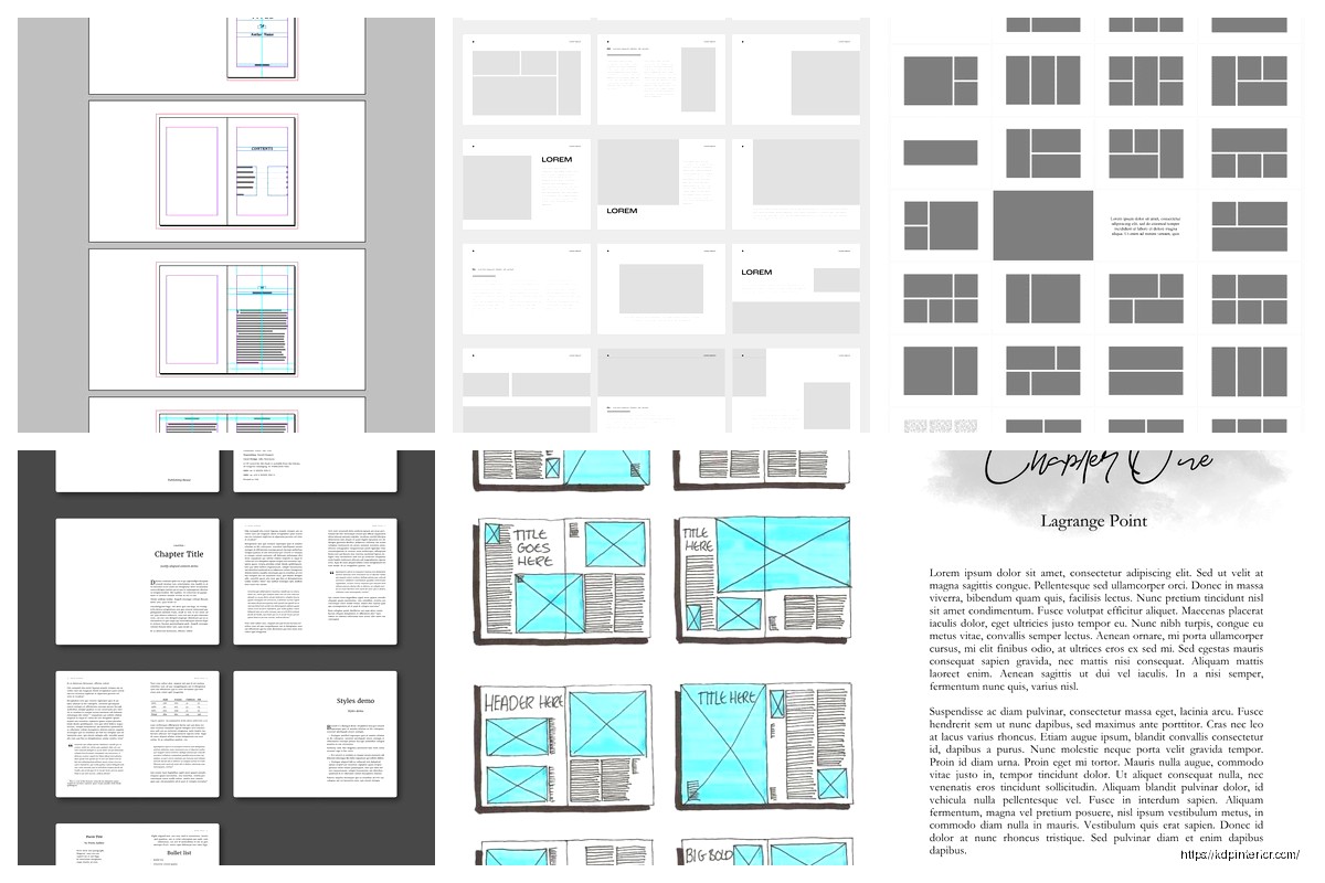
Okay so the whole grid thing for book page layouts isn’t as complicated as people make it sound but you gotta understand the basics first otherwise you’re just throwing margins around hoping something looks professional.
The standard setup I use for most low-content books is a 12-column grid. Sounds excessive but hear me out – it gives you way more flexibility than you’d think. When I first started doing this back in 2018 I was just eyeballing everything and my interiors looked… fine? But not great. Then I watched my girlfriend use InDesign for her actual design job and realized oh crap I’ve been doing this the hard way.
Why Grids Actually Matter for KDP Books
Most people think grids are just for fancy magazine layouts but they’re literally what separates amateur-looking planners from ones that sell. The grid controls your margins, your gutters, where elements sit on the page, consistency across 100+ pages. Without it you’re manually measuring every single element and trust me that gets old around page 15.
The basic structure I recommend:
- Outer margins: 0.5 inches minimum (KDP trims can be brutal)
- Inner margins (gutter): 0.625 to 0.75 inches depending on page count
- Top margin: 0.5 inches
- Bottom margin: 0.625 inches (slightly more for page numbers)
That gutter measurement is super important. Books under 100 pages can get away with 0.625 but anything thicker needs more or the text disappears into the binding. I learned this the hard way on a 300-page journal that looked perfect on screen but was basically unreadable in the middle when printed.
Setting Up Your Grid in Different Programs
If You’re Using Canva
Canva doesn’t have true grid systems which is annoying but you can fake it pretty well. Create a custom dimension – let’s say 6×9 inches for a standard book. Then use the ruler guides which you turn on in View settings.
Drag guides to mark your margins. I literally have a template saved with guides already positioned at 0.5 inches from each edge and 0.75 from the spine side. Then I save it as “6×9 Grid Template” and duplicate it for every new project.
The columns thing is trickier in Canva. What I do is create thin rectangle shapes, make them like 20% opacity, and position them where my columns would be. So for a 12-column grid on a 6-inch wide page with 0.5-inch margins on each side, you’ve got 5 inches of working space. Divide by 12 and each column is roughly 0.416 inches. Yeah I know that’s annoying math.
Wait I forgot to mention – you don’t actually need all 12 columns for most layouts. The point is having them AVAILABLE. A simple lined journal might only use columns 2-11, leaving 1 and 12 as margin space. But a more complex planner could have a sidebar in columns 1-3 and main content in 4-12.
InDesign Users
If you’re using InDesign this is way easier. When you create a new document there’s literally a margins and columns section. Set up your margins first, then tell it how many columns you want. I usually do 3 columns and then subdivide mentally because 12 columns in the setup panel looks cluttered.
The baseline grid is another thing entirely – that’s for aligning text consistently. I set mine to 14pt usually because most body text in planners is 10-12pt and this gives nice spacing. You can turn on View > Grids & Guides > Show Baseline Grid and suddenly everything snaps into perfect alignment.
Oh and another thing – InDesign has master pages which are a lifesaver. Set up your grid once on the master page and it applies to every page automatically. Changed my life when I figured that out around year 3 of publishing.
Practical Grid Applications for Different Book Types
Lined Journals
Super simple. You barely need a complex grid honestly. I use a 6-column grid for these – columns 1 and 6 are margins, columns 2-5 are for the lines. Makes it easy to add a small margin decoration or date box in column 1 without messing up the line alignment.
The lines themselves should be 0.25pt to 0.5pt weight maximum. Anything thicker looks like notebook paper from elementary school. I use #D3D3D3 gray usually, not black. Black lines are too harsh and make writing harder to read.
Planners and Organizers
This is where the 12-column grid really shines. Think about a weekly spread – you might want:
- Columns 1-2: Time stamps or priorities section
- Columns 3-12: Seven days divided into equal sections
Or a daily planner:
- Columns 1-8: Main schedule/tasks
- Columns 9-12: Notes or habit tracker sidebar
The grid lets you maintain these proportions consistently. Without it you’re gonna have Tuesday’s box slightly narrower than Wednesday’s and it looks sloppy even if customers can’t articulate why.
Notebooks with Mixed Content
I published a goal-setting workbook last year that had lined pages, dot grid pages, and blank pages for sketching. Used the same 12-column grid for all of them to keep margins consistent. The lined pages used columns 2-11, dot grid used 1-12 (dots can go closer to edges), and blank pages had just the margin guides visible in my template but no actual content.
Common Grid Mistakes I See All The Time
Not accounting for bleed. If your book has bleed (like if there’s background color or images touching the edge), your document size needs to be 0.125 inches larger on all sides. So a 6×9 becomes 6.25×9.25. But your GRID doesn’t change – it’s still based on the trim size. This messed me up for probably my first 20 books.
Making gutters too small. I mentioned this before but it’s worth repeating. My cat knocked over my coffee last week onto a proof copy and while cleaning it up I noticed how much the binding was eating into the text. That book had a 0.5-inch gutter and 250 pages. Rookie mistake, even after doing this for years you still screw up sometimes.
Inconsistent spacing between elements. The grid should dictate where headers sit, where page numbers go, how much space is between a title and the content below it. I use a 3-grid-unit rule – everything is spaced in multiples of 3 units. So if my grid unit is roughly 0.125 inches, spacing is either 0.375 or 0.5 or 0.75 inches. Never random amounts like 0.43 inches.
The Baseline Grid Thing
This is gonna sound weird but baseline grids changed how my interiors looked more than column grids did. A baseline grid is horizontal lines that your text aligns to. It ensures every line of text sits at the same height across pages.
Set it to your leading measurement (line spacing). So if you’re using 12pt font with 14pt leading, set the baseline grid to 14pt. Then in your text frame options, select “align to baseline grid” and boom – perfect alignment.
The reason this matters: when you have content on both sides of a page (which you do in books), you want the lines to match up. Hold a printed page to the light and if the text on the back shows through between the lines on the front, you nailed it. If text on the back sits right under text on the front making it darker, your baseline grid is off.
Quick Setup Process
Here’s my actual workflow when starting a new book template:
- Determine trim size and page count
- Calculate gutter width based on page count
- Set up document with margins and 12-column grid
- Add baseline grid at my leading measurement
- Create master page with page numbers and any recurring elements
- Save as template
- Design 2-3 different page layouts using the grid
- Apply and duplicate as needed
The whole process takes maybe 30 minutes now but when I started it was like 3 hours of fiddling around.
Testing Your Grid
Always order a proof. I know it costs money but you cannot see grid issues on screen reliably. I’ve had books where everything looked perfect digitally but the printed version had elements too close to the spine or text that wrapped weird.
What I check in proofs:
- Can you read text in the gutter easily?
- Are margins consistent throughout?
- Do facing pages feel balanced?
- Is there any content within 0.125 inches of the trim edge that could get cut?
Oh wait, speaking of testing – use different paper types if KDP offers them for your book. Cream paper shows ink bleed differently than white paper. A grid that works on white might have lines that are too heavy on cream.
Advanced Grid Techniques
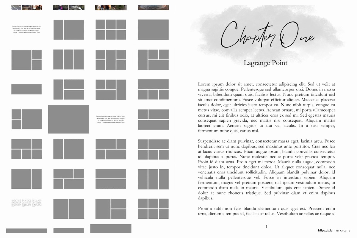
Once you’re comfortable with basic grids you can get fancy. Modular grids are where you divide your page into equal rectangular modules – like a 4×6 grid creating 24 boxes. Good for calendar pages or habit trackers.
I used a modular grid for a meal planning book that did really well in 2021. Each module was one meal or shopping list section. Made the whole book feel organized and intentional even though it was pretty simple content.
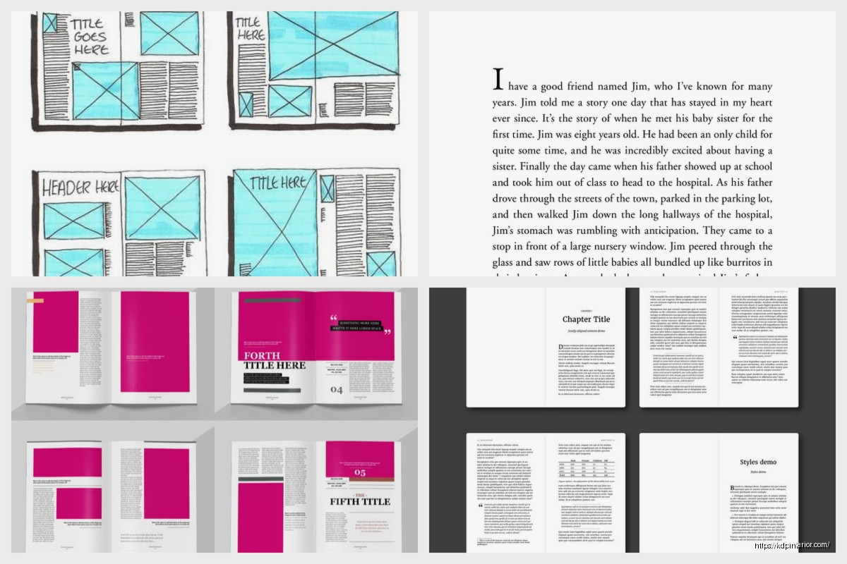
Hierarchical grids are more freeform but still structured. You might have a dominant content area following an 8-column grid and a secondary sidebar on a 4-column grid. The columns don’t necessarily align but they’re all based on the same underlying measurements.
Software-Specific Grid Tips
Affinity Publisher: Works almost exactly like InDesign for grids. Way cheaper too. The only annoying thing is the baseline grid is in a different menu location and I always forget where.
Microsoft Word: Don’t. I mean you CAN use tables to fake a grid but it’s painful and I only recommend it if you’re doing a super simple project. Use View > Gridlines to see the snap grid but it’s not a true layout grid.
Google Docs: Same as Word, just don’t. Fine for text-heavy books with minimal formatting but not for actual designed interiors.
Adobe Illustrator: Weirdly good for book interiors if you’re doing one page at a time. Set up your artboards as book pages, use guides to create your grid, and the precision is excellent. Just tedious for multi-page books.
I probably use Canva for 60% of my books, InDesign for 30%, and Affinity for 10% depending on complexity and what I’m feeling that day.
Grid Sizing for Different Trim Sizes
The 12-column thing works for most sizes but here’s what I actually use:
- 5×8 books: 10-column grid (smaller page, fewer columns needed)
- 6×9 books: 12-column grid (sweet spot)
- 8.5×11 books: 16-column grid (more space to work with)
- Square books (8×8): 12-column grid works fine
The goal is having enough columns that you can create varied layouts but not so many that the math gets stupid.
Alright so that’s basically my entire approach to grid systems for book interiors. It seems complicated at first but once you build a few templates you’ll just reuse them forever with minor tweaks. I’ve got probably 15 different grid templates saved and 90% of my books use one of those 15 setups.
The key thing is consistency within each book and giving yourself enough margin for error with the gutter and outer edges. Everything else is just making it look intentional.
DISCOVER OUR FREE BEST SELLING PRODUCTS
Editable Canva Lined Journal: Express Your Thoughts – KDP Template
Lined Pages Journal 120 pages Ready to Upload PDF Commercial Use KDP Template 6×9 8.5×11 5×8 for Notebooks, Diaries, Low Content
Lined Pages Journal 120 pages Ready to Upload PDF Commercial Use KDP Template 6×9 8.5×11 5×8 for Notebooks, Diaries, Low Content
Cute Dogs Coloring Book for Kids | Activity Book | KDP Ready-To-Upload
Daily Planner Diary : Diary Planners for Everyday Productivity, 120 pages, 6×9 Size | Amazon KDP Interior
Wolf Coloring KDP interior For Adults, Used as Low Content Book, PDF Template Ready To Upload COMMERCIAL Use 8.5×11"
Coloring Animals Head Book for Kids, Perfect for ages 2-4, 4-8 | 8.5×11 PDF
Printable Blank Comic Book Pages PDF : Create Your Own Comics – 3 Available Sizes
Notes KDP interior Ready To Upload, Sizes 8.5×11 6×9 5×8 inch PDF FILE Used as Amazon KDP Paperback Low Content Book, journal, Notebook, Planner, COMMERCIAL Use
Black Lined Journal: 120 Pages of Black Lined Paper Perfect for Journaling, KDP Notebook Template – 6×9
Student Planner Journal 120 pages Ready to Upload PDF Commercial Use KDP Template 6×9" 8.5×11" for Low Content book
Recipe Journal Template – Editable Recipe Book Template, 120 Pages – Amazon KDP Interior