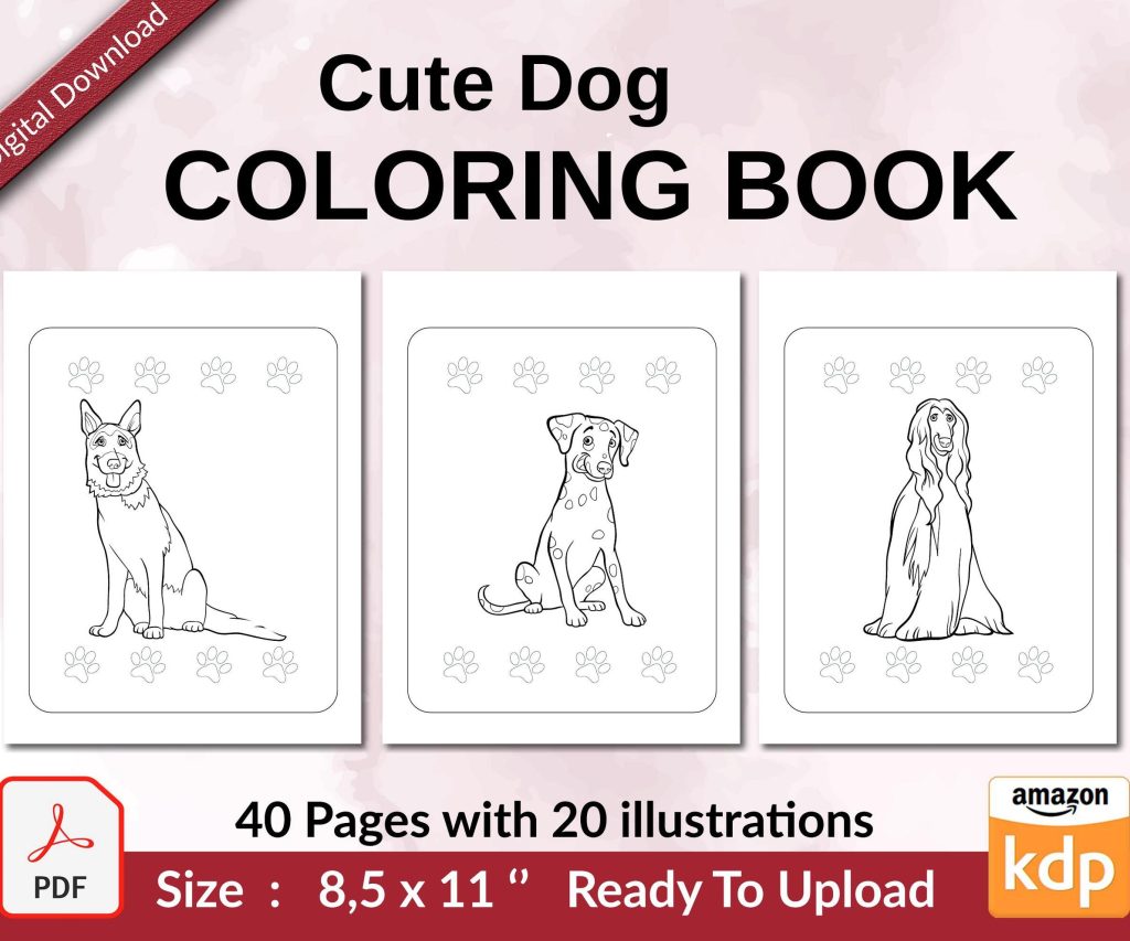
 Cute Dogs Coloring Book for Kids | Activity Book | KDP Ready-To-Upload
 Subtotal: $0.00
Amazon KDP guide, KDP book publishing
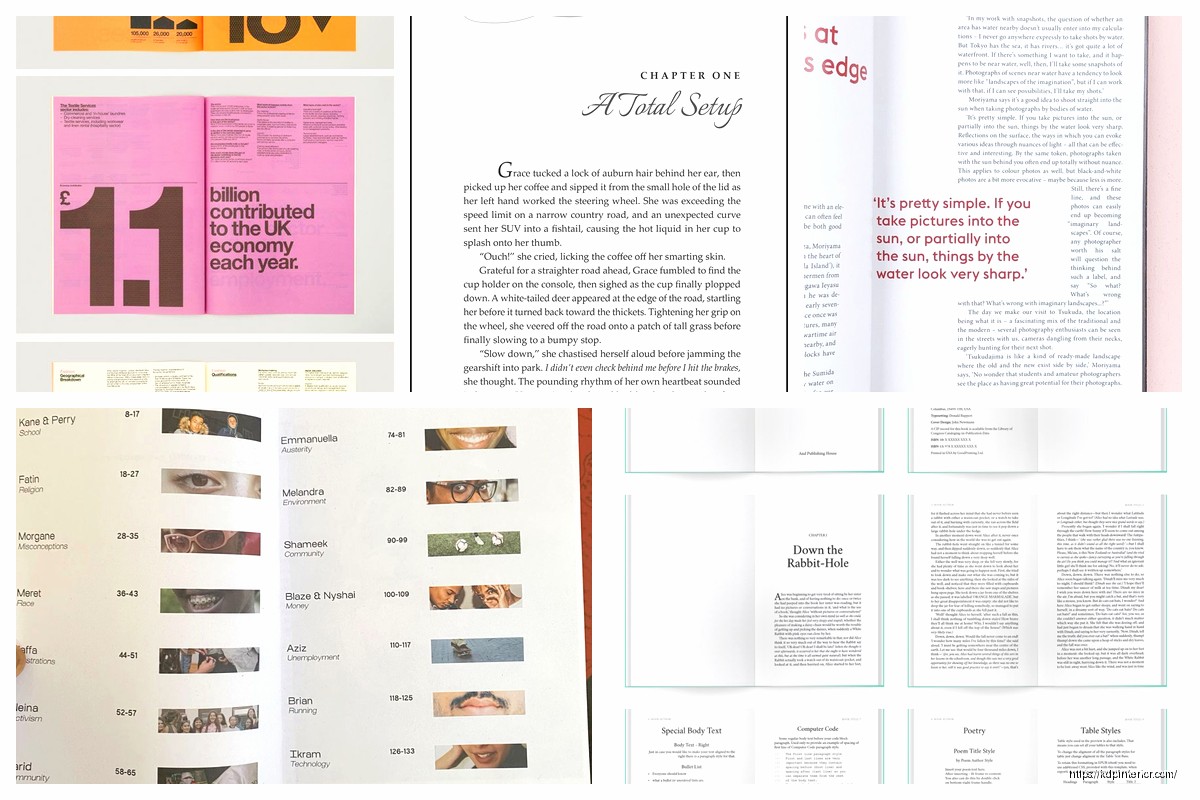
Book Page Layout: Typography & Margins Guide
16
May
May
Okay so here’s the deal with book page layout – I was literally up until 2am last night fixing a client’s manuscript that looked like someone just hit “print” without thinking about margins and honestly it’s such an easy thing to mess up but also super fixable.
Start With Your Trim Size Because Everything Flows From That
The trim size is basically the physical dimensions of your book and this determines EVERYTHING else. Most of my books are 6×9 because it’s the sweet spot for non-fiction and Amazon’s POD pricing doesn’t penalize you for it. But I’ve done 5×8 for journals and 8.5×11 for workbooks and each one needs different margin treatment.
Here’s what I learned the hard way – your margins need to account for the gutter (that’s the inside margin where the binding is) and if you don’t add extra space there, words literally disappear into the spine. I once printed 50 copies of a planner before realizing half the content was unreadable because I used 0.5″ on all sides like an idiot.
The Margin Formula I Actually Use
For a standard 6×9 book:
- Inside margin (gutter): 0.75″ to 1″ depending on page count
- Outside margin: 0.5″ to 0.75″
- Top margin: 0.75″
- Bottom margin: 0.75″ to 1″
The thicker your book, the bigger that inside margin needs to be. Under 150 pages? You can probably get away with 0.75″. Over 300 pages? Go with 1″ or even 1.125″ because thick books don’t lay flat and readers will hate you if they have to crack the spine to read sentences.
Typography Stuff That Actually Matters
Okay so fonts – this is where people get weird and start choosing fonts because they “look cool” but here’s the thing, your book isn’t a wedding invitation. Readability is literally the only thing that matters.
Serif vs Sans Serif
For body text you want serif fonts. Always. I don’t care what your graphic designer friend says. Times New Roman, Garamond, Palatino, Baskerville – these fonts have those little feet on the letters and they guide the eye across the page. It’s not just tradition, there’s actual eye-tracking studies on this.
Sans serif is fine for headers or modern business books where you’re trying to look corporate but for a 200-page book someone’s gonna read for hours? Serif.
My go-to is Garamond at 11pt. Sometimes 10.5pt if the book is running long and I need to save pages (because Amazon POD pricing jumps at certain page count thresholds and sometimes cutting 10 pages saves you like $0.80 per book in printing costs).
Font Size Real Talk
10pt is too small unless you’re doing academic publishing. 12pt looks like a large print edition. 11pt is the goldilocks zone for most books with normal leading (that’s the space between lines).
Oh and another thing – leading should be 120% to 145% of your font size. So if you’re using 11pt font, your leading should be around 13-14pt. In Word this is called “line spacing” and you want it set to “Multiple” at 1.15 or 1.2. Not single spaced. Never single spaced unless you hate your readers.
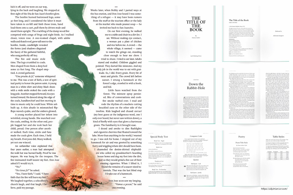
The Stuff Nobody Tells You About Layout
Wait I forgot to mention – headers and footers are where people screw up constantly. You need running headers (that’s the book title or chapter name at the top of pages) but they can’t be too big or too close to the body text.
My setup:
- Header font: Same as body but 9pt
- Header position: 0.5″ from top edge
- Page numbers: Bottom center or outer corners
- First page of chapters: No header, page number optional
This is gonna sound weird but I don’t put headers on chapter opening pages because it looks cluttered. The chapter title is already there taking up space so adding a running header too is just… unnecessary.
Chapter Starts and White Space
Your chapters should start about 2-3 inches from the top of the page. Not at the very top. That white space signals “hey this is something new” to the reader’s brain. I usually drop down about 6-8 line spaces before the chapter title.
And the first paragraph after a chapter title or section break? No indent. Every other paragraph gets a 0.3″ to 0.5″ indent but that first one sits flush left. It’s a typography convention that’s been around forever and it just looks right.
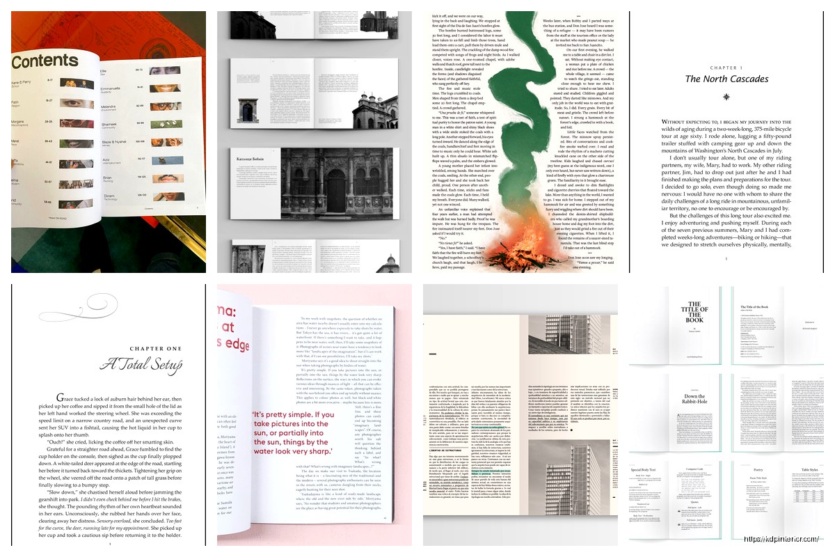
Paragraph Spacing That Doesn’t Look Stupid
Okay so you have two choices for separating paragraphs – indents or line breaks. Pick ONE. Not both. I see manuscripts all the time with indented paragraphs AND extra space between them and it’s like… why? You’re wasting paper and it looks amateurish.
For most books I do indents (0.3″ to 0.5″) with no extra spacing between paragraphs. The indent signals “new paragraph” and you don’t need vertical space too.
BUT for business books or books with lots of short paragraphs, sometimes no indent with a 0.1″ to 0.15″ space between paragraphs works better. Just be consistent. My cat just knocked over my coffee which is great timing because I needed a break anyway.
Alignment Settings
Body text should be left-aligned or justified. I prefer justified because it gives that clean book look with straight margins on both sides, but you gotta watch for rivers (those weird white space patterns that run down the page when justified text creates gaps).
If you’re using justified text in Word or InDesign, turn on hyphenation. Otherwise you get weird spacing issues where words are stretched apart to fill the line. Hyphenation breaks words across lines and fixes that problem.
Page Count Considerations Nobody Talks About
Here’s something I learned around year 3 of doing this – Amazon KDP has pricing tiers based on page count. A 108-page book costs basically the same to print as a 24-page book, but a 109-page book jumps to the next pricing tier.
So sometimes I adjust margins or font size or leading by tiny amounts to hit under a threshold. It’s not dishonest, it’s just smart formatting. If I can save 8 pages by going from 1″ bottom margins to 0.85″ bottom margins, and it doesn’t hurt readability, why wouldn’t I?
The page count tiers that matter most:
- 24-108 pages
- 109-246 pages
- 247-400 pages
- 401-550 pages
Check the actual pricing calculator on KDP before finalizing your layout because sometimes adding 2 pages puts you in a new tier and suddenly your profit per book drops by 30%.
Recto vs Verso Pages
Recto = right-hand pages. Verso = left-hand pages. Chapters should always start on recto pages which means sometimes you need to add a blank verso page before a new chapter. This is normal. Don’t try to fill every single page with content.
And if you’re doing headers with chapter names, typically the book title goes on verso pages and the chapter title goes on recto pages. Or you can do chapter titles on both. Just don’t do book title on both sides because that’s boring.
Software Specific Stuff
Most people start with Word which is fine but Word kinda sucks at maintaining consistent formatting across long documents. I still use it for like 60% of my books but here’s what you gotta do:
Set up master pages or use section breaks properly. Your front matter (title page, copyright, table of contents) shouldn’t have the same headers as your main content. Use section breaks to separate them and apply different header/footer rules to each section.
For margins in Word, don’t just set them in Page Layout. Go to Page Setup and choose “Mirror margins” if you’re doing print books. This automatically makes your inside and outside margins flip on alternating pages which is what you want for proper book layout.
When to Use InDesign Instead
If your book has lots of images or tables or you need precise control over everything, InDesign is worth learning. The learning curve is steep but once you get it, formatting books takes like 1/3 of the time.
I switched to InDesign for my workbooks and planners because the grid system makes everything line up perfectly. For text-heavy books with minimal formatting I still use Word because it’s faster.
Checking Your Layout Before Publishing
Always always always order a proof copy. The PDF preview on KDP is helpful but it doesn’t show you how the physical book feels. I’ve caught so many issues in proof copies that looked fine on screen:
- Text too close to the gutter that’s hard to read
- Headers that look fine digitally but feel too close to body text in print
- Margins that seemed reasonable but make the pages look cramped
- Font sizes that render smaller in print than on screen
The proof copy costs like $3-5 depending on your book size and you can usually get it in 3-5 days. Just wait for it. I know you’re excited to launch but launching with bad formatting means bad reviews and returns.
Common Mistakes I See Constantly
Using center alignment for body text. Just don’t. It’s hard to read for more than a paragraph.
Forgetting to remove extra spaces between sentences. One space after periods, not two. This isn’t typewriter era anymore.
Making margins too small to save pages – it backfires because readers complain the book feels crowded. I’d rather have a 180-page book with good margins than a 165-page book with cramped margins.
Not accounting for bleed on covers but that’s a different topic entirely.
Using too many font styles in one book. Pick one for body text, maybe one for headers, and stick with it. I see books with like 5 different fonts and it looks like a ransom note.
The Actual Workflow I Use
Okay so when I format a book here’s my process: Set up the page size and margins first. Then choose the font and size. Then format the front matter (title page, copyright, TOC). Then do a test print of like 3-4 pages to see how it feels. Adjust if needed. Then format the whole manuscript. Then do chapter breaks and page numbering. Then add headers/footers. Then proof read while checking for widows and orphans (those single lines at the top or bottom of pages that look awkward).
Widows and orphans are annoying but fixable – adjust tracking slightly or add/remove a word or force a page break. Don’t let single words sit alone on a line or single lines start/end pages if you can help it.
Last thing – keep a template file with your settings so you don’t have to rebuild everything for each book. I have templates for 6×9, 5×8, and 8.5×11 with all my preferred settings already configured. Saves probably 30 minutes per book.
Honestly once you do this a few times it becomes second nature and you can format a 200-page book in like 2-3 hours. But that first book gonna take you forever and that’s normal. Just take your time and check everything twice before uploading.
DISCOVER OUR FREE BEST SELLING PRODUCTS
Editable Canva Lined Journal: Express Your Thoughts – KDP Template
Lined Pages Journal 120 pages Ready to Upload PDF Commercial Use KDP Template 6×9 8.5×11 5×8 for Notebooks, Diaries, Low Content
Lined Pages Journal 120 pages Ready to Upload PDF Commercial Use KDP Template 6×9 8.5×11 5×8 for Notebooks, Diaries, Low Content
Cute Dogs Coloring Book for Kids | Activity Book | KDP Ready-To-Upload
Daily Planner Diary : Diary Planners for Everyday Productivity, 120 pages, 6×9 Size | Amazon KDP Interior
Wolf Coloring KDP interior For Adults, Used as Low Content Book, PDF Template Ready To Upload COMMERCIAL Use 8.5×11"
Coloring Animals Head Book for Kids, Perfect for ages 2-4, 4-8 | 8.5×11 PDF
Printable Blank Comic Book Pages PDF : Create Your Own Comics – 3 Available Sizes
Notes KDP interior Ready To Upload, Sizes 8.5×11 6×9 5×8 inch PDF FILE Used as Amazon KDP Paperback Low Content Book, journal, Notebook, Planner, COMMERCIAL Use
Black Lined Journal: 120 Pages of Black Lined Paper Perfect for Journaling, KDP Notebook Template – 6×9
Student Planner Journal 120 pages Ready to Upload PDF Commercial Use KDP Template 6×9" 8.5×11" for Low Content book
Recipe Journal Template – Editable Recipe Book Template, 120 Pages – Amazon KDP Interior