-
×
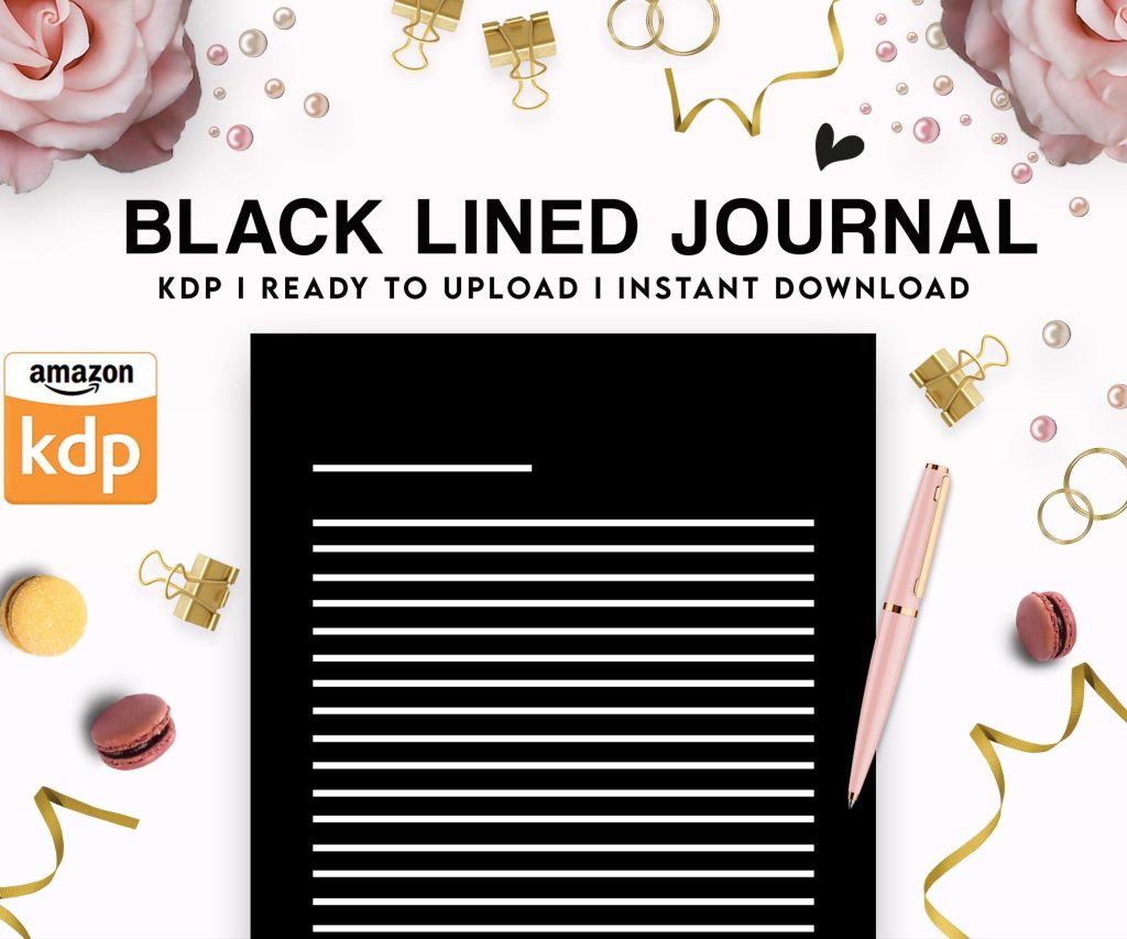 Black Lined Journal: 120 Pages of Black Lined Paper Perfect for Journaling, KDP Notebook Template - 6×9
1 × $0.00
Black Lined Journal: 120 Pages of Black Lined Paper Perfect for Journaling, KDP Notebook Template - 6×9
1 × $0.00
Subtotal: $0.00
Black Lined Journal: 120 Pages of Black Lined Paper Perfect for Journaling, KDP Notebook Template - 6×9
1 × $0.00 Subtotal: $0.00
Okay so here’s the thing about book interior templates that nobody really explains properly – you need to figure out your trim size FIRST before you even think about margins or headers or any of that stuff. I wasted like three weeks last year designing templates in 6×9 when half my niches perform better in 8.5×11, which was just… anyway.
Most low-content books you’re gonna stick with 6×9, 8.5×11, or 8×10. The 6×9 is your standard notebook/journal size, feels professional, people are used to it. I use this for literally 60% of my books. The 8.5×11 is better for workbooks, planners, anything where people need writing space. And 8×10 is this weird middle ground that works great for kids’ activity books or composition notebooks.
Don’t get fancy with 5×8 or custom sizes unless you’ve got a specific reason. Amazon’s printing costs jump around on unusual sizes and it’s just not worth the headache for most projects.
So margins are where everyone screws up initially including me. KDP requires minimum 0.25 inches on outside, top, and bottom. But the gutter (inside margin where the binding is) needs to be bigger – like 0.375 inches minimum but honestly I go 0.5 inches on anything over 100 pages.
Here’s what I actually use:
The gutter thing is crucial because if you don’t leave enough room, text disappears into the binding and customers leave angry reviews. I learned this the hard way with a prayer journal in 2019 that got like fifteen 1-star reviews before I figured out what was happening.
Most people use Word or Google Docs which is fine for simple stuff but gonna be honest, once you’re doing this seriously you need InDesign or at least Affinity Publisher. I fought this for like two years because Adobe’s subscription pricing is annoying, but the time you save is insane.
If you’re sticking with Word though, here’s the setup. Go to Layout > Size > More Paper Sizes and punch in your exact trim size. Then do Layout > Margins > Custom Margins and set your numbers. Make SURE you set it to “Mirror margins” if you’re doing anything with headers or page numbers, otherwise odd and even pages won’t flip properly.
Oh and another thing – set your document to start on the right page. Books always open with page 1 on the right side. This seems obvious but I’ve seen so many templates mess this up.
For low-content books you usually don’t need headers. Like a lined journal doesn’t need “JOURNAL” at the top of every page, that’s just wasted space. But for workbooks, logbooks, or anything with sections, headers help people navigate.
I typically do:
Page numbers are more important. Bottom center is easiest, but I like bottom outside corners (left on left pages, right on right pages) because it feels more professional. Start numbering after your title page and copyright page – usually page 1 is actually the third or fourth page of the PDF.
Your PDF needs to start with:
I usually add a “This book belongs to” page after copyright for journals and notebooks. People like personalizing stuff and it adds perceived value for literally one extra page of design work.
Nobody talks about this enough – your font choice matters way more for interiors than covers. For body text in workbooks or guided journals, stick with clean sans-serif fonts. Arial is boring but readable. Helvetica if you have it. Montserrat or Open Sans if you want something slightly more modern.
For decorative elements or headers you can get creative but don’t go nuts. I made a gratitude journal last year with this elaborate script font for the prompts and got feedback that people couldn’t read it easily. Switched to a simple serif font and sales actually improved.
Font size depends on your audience. Standard is 11pt or 12pt for adults. If you’re targeting older users (like prayer journals or health trackers) bump it to 14pt. Kids’ books need bigger, obviously – 16pt minimum.
Wait I forgot to mention line spacing. This is huge for writing journals or planners. I use exactly 1.5 line spacing for most prompted journals, gives enough room to write comfortably. For pure lined journals I calculate the spacing based on standard ruled paper – about 0.31 inches between lines for college ruled, 0.38 for wide ruled.
This is where templates either look professional or like garbage. You don’t need much decoration but what you include needs to be consistent.
For line thickness on borders or dividers, I stick with 0.5pt to 1pt. Anything thicker looks clunky when printed. Colors should be in CMYK not RGB – this catches people all the time. That bright blue on your screen turns purple when printed because RGB doesn’t convert well.
If you’re using graphics or icons, make sure they’re at least 300 DPI. I use Creative Fabrica for most of my elements now, their licensing is straightforward for commercial use. Just… read the licenses, seriously. I almost got in trouble using some Freepik stuff that wasn’t actually allowed for book interiors.
Okay so bleed is confusing but necessary if any design element touches the edge of your page. KDP wants 0.125 inches of bleed on all sides. This means your document is actually bigger than your trim size.
A 6×9 book becomes 6.25 x 9.25 with bleed. You extend any background colors or graphics past the actual page edge into that bleed area, then KDP trims it down. This prevents white edges if the cutting isn’t perfectly precise.
Most of my low-content books don’t need bleed because everything stays inside the margins anyway. But planners with full-page background colors or bordered pages absolutely need it.
The actual interior pages depend totally on your niche but here’s what works:
Lined journals: Just horizontal lines, consistent spacing, maybe a date field at the top. Don’t overthink it.
Planners: I do a weekly spread across two pages usually. Left page has Monday-Wednesday, right page has Thursday-Sunday. Monthly calendars are their own thing, I use a standard grid with enough room in each day box for actual writing.
Workbooks: Mix of instruction text, writing lines, and checkbox elements. Leave way more white space than you think you need. Cramped pages test poorly.
Logbooks: Tables are your friend. Set them up with proper column widths – I usually make the date column narrower and give more space to description fields. My cat just knocked over my coffee while I’m writing this which is perfect timing honestly.
This is gonna sound weird but print a physical copy before you upload anything. Not from KDP, just from your home printer or a local print shop. You’ll catch spacing issues, margin problems, text that’s too small – all kinds of stuff that looks fine on screen but fails in physical form.
I review every template in PDF form at 100% zoom, then at actual size view if my software has it. Check that:
For the PDF export, use PDF/X-1a:2001 settings if you’re in InDesign. This flattens everything and embeds fonts properly. From Word you just export as PDF but check the “ISO 19005-1 compliant” option.
I’ve got like forty different base templates now and honestly you don’t need that many starting out. Build these core ones first:
Basic lined journal (6×9), basic planner weekly spread (8.5×11), simple logbook with table layout (6×9), composition notebook style (8×10 if you’re doing school stuff).
Each template should be modular – meaning you can swap out header text or adjust line spacing without rebuilding the whole thing. I save everything as master templates then duplicate and customize for specific projects.
Not enough writing space between prompts in guided journals – people get mad about this fast. Inconsistent spacing between elements – your eye catches it even if you don’t consciously notice. Page numbers that skip or restart randomly because you didn’t set up sections properly.
Headers that are too big and dominate the page. Copyright pages with weird formatting or too much legal text – keep it simple. And the biggest one: not accounting for the gutter properly so content disappears into the binding.
Also bleed on books that don’t need it just adds complications. If your design doesn’t touch the edges, don’t set up bleed. Simpler is better for most low-content interiors.
The interior is honestly more important than the cover for repeat customers and reviews. Someone might buy because of your cover but they review based on whether the interior actually works for them. I’ve had mediocre covers with great interiors outsell beautiful covers with poorly designed pages.
Test everything, keep your templates organized, and don’t try to reinvent the wheel for every book. Once you’ve got solid base templates the actual production time drops to like an hour per book instead of a full day.
DISCOVER OUR FREE BEST SELLING PRODUCTS
Editable Canva Lined Journal: Express Your Thoughts – KDP Template
Lined Pages Journal 120 pages Ready to Upload PDF Commercial Use KDP Template 6×9 8.5×11 5×8 for Notebooks, Diaries, Low Content
Lined Pages Journal 120 pages Ready to Upload PDF Commercial Use KDP Template 6×9 8.5×11 5×8 for Notebooks, Diaries, Low Content
Cute Dogs Coloring Book for Kids | Activity Book | KDP Ready-To-Upload
Daily Planner Diary : Diary Planners for Everyday Productivity, 120 pages, 6×9 Size | Amazon KDP Interior
Wolf Coloring KDP interior For Adults, Used as Low Content Book, PDF Template Ready To Upload COMMERCIAL Use 8.5×11"
Coloring Animals Head Book for Kids, Perfect for ages 2-4, 4-8 | 8.5×11 PDF
Printable Blank Comic Book Pages PDF : Create Your Own Comics – 3 Available Sizes
Notes KDP interior Ready To Upload, Sizes 8.5×11 6×9 5×8 inch PDF FILE Used as Amazon KDP Paperback Low Content Book, journal, Notebook, Planner, COMMERCIAL Use
Black Lined Journal: 120 Pages of Black Lined Paper Perfect for Journaling, KDP Notebook Template – 6×9
Student Planner Journal 120 pages Ready to Upload PDF Commercial Use KDP Template 6×9" 8.5×11" for Low Content book
Recipe Journal Template – Editable Recipe Book Template, 120 Pages – Amazon KDP Interior